Organizing Content for Better Control
Overview
At the end of our last lesson, we learned how to more precisely control our styling by using multiple elements inside the same CSS selector. Using a more complex selector allowed us to style only the links inside of the navigation we had built, excluding the links that were not included in that same navigation. This technique is called specificity and understanding just how this works will play a major role in the final page layout.
In this lesson we’ll learn more about using specificity and how to create structures in HTML to help us use specificity to style different parts of our page. We’ll work on calling out single elements using specificity as well as groups of elements that all belong to the same chunk of our page like “header”, “footer”, and “section”.
Lesson Setup
Let’s get started. Like usual, we need to create our lesson folder structure, our initial HTML file and connect it up with a new stylesheet.
Folder Setup
- Create a new Lesson09 folder inside of Bob
- Create two subfolders: notes and root
- Inside the root folder, create your images folder and your css folder
- Download the lesson 09 resources from here.
- Move those images into your images folder for this lesson
HTML Setup
- Open up TextMate
- File > New to open a new file
- Code in your boilerplate HTML making sure to add a title to the page. I’m calling mine: Specificity: Organizing HTML Content for Better CSS Control.
- Make sure that your boilerplate includes the
<meta name="viewport" content="width=device-width, initial-scale=1" />we learned in lesson 8 to ensure the site works properly on a mobile device. - Save your HTML file to your Lesson10 root folder with the name: lesson09.html
- Open and Preview your page in the browser, checking to make sure your page title is appearing correctly.
CSS Setup
- Open up TextMate
- File > New to open a new file
- File > Save
- Navigate to the “css” folder you created
- Name your file, style.css
- Hit Save
- Attach this stylesheet to our HTML page. Type:
<link href="css/style.css rel="stylesheet" />into the head section of our lesson10.html file. - File > Save the HTML file
Your HTML should now look like this:
<!doctype html>
<html>

	<head>
		<title>Specificity: Organizing HTML Content for Better CSS Control</title>
		<meta name="viewport" content="width=device-width, initial-scale=1" />
		<link href="css/style.css" rel="stylesheet" />
	</head>

	<body>

	</body>

</html>
Note: You may have noticed that I’ve shortened the lesson setup to a list of action steps above. If you need a refresher on folder and file organization see the lesson 3 setup section.
Let’s test to make sure our pages connected correctly.
- Navigate back to your new CSS file.
- Let’s change the background color of the body element. Type:
body {on an open line and hit Enter - Now, type the property we want to change:
background-color: - Type:
pink;and hit Enter - Close the CSS block, type:
} - Save this file and Refresh the browser
If your background turned pink, then you are set. Everything is working correctly. You can go ahead and delete that CSS block, so we can start fresh.
Initial HTML Content
In this lesson, we’ll be using the same HTML content that we left off with in the last lesson. The work we did in Lesson 8 will serve as a great head start. You can simply copy from your lesson08.html or from below and paste it between the body tags in your HTML file.
<a href="#mobilenav"><img src="images/hamburger.png"/></a>

<img src="images/logo.png" />

<img src="images/banner.png" />

<h1>Cookies Inc</h1>

<h2 id="Do">What We Do</h2>
<p>Lorem ipsum dolor sit amet, consectetur adipiscing elit. Nulla sollicitudin congue sem et pretium. Sed pulvinar volutpat facilisis. Sed velit risus, consequat sit amet sollicitudin a, ultrices nec nisl. Nullam ac dolor purus. In ac mi quis urna lobortis venenatis. Sed interdum, arcu a volutpat pretium, nisl velit auctor elit, at venenatis turpis mi a nisl. Integer at porttitor urna. Nulla sem mauris, pulvinar bibendum tristique vitae, pulvinar vel elit. Aenean sollicitudin quam sit amet lectus elementum sit amet suscipit sem feugiat. Fusce aliquam euismod diam, at placerat felis fringilla et. Vivamus sagittis suscipit dapibus. Donec molestie tristique quam, sed sodales justo volutpat eu. Sed pellentesque sollicitudin tempus. Donec at sem eu massa tempor porta congue id purus.</p>

<h3>Exciting Things to Come</h3>
<p>Lorem ipsum dolor sit amet, consectetur adipiscing elit. Morbi consectetur ullamcorper eleifend. Mauris dapibus ligula vitae leo semper a aliquam felis fringilla. Pellentesque dapibus lacus sed orci vulputate ultrices. Quisque mollis nisl id nibh cursus sodales pretium non justo. Sed id dui vel velit posuere consectetur eget quis elit. Sed est augue, euismod et scelerisque nec, consectetur eget odio. Ut volutpat blandit velit lobortis tempus. Phasellus at ante a augue iaculis hendrerit tempor in felis. Aliquam justo massa, tempor vitae dignissim ultricies, semper et augue. Nam mollis pretium purus at faucibus. Etiam a metus arcu, ut vestibulum ligula.</p>
<p>Proin dictum viverra orci, eu condimentum lorem vulputate quis. Proin suscipit pulvinar est. Quisque tincidunt, tellus sed scelerisque posuere, nulla orci pellentesque ante, non scelerisque tellus arcu at mi. Aenean lobortis interdum dolor, et dapibus elit volutpat vitae. Duis massa leo, aliquam eu posuere non, porta quis lorem. Sed dapibus leo vel diam lacinia id consequat enim egestas. Donec a purus vitae turpis iaculis scelerisque.</p>
<p>Nunc eget tincidunt ipsum. Quisque nec turpis tortor. Phasellus vitae sapien ante. Nunc suscipit faucibus commodo. Duis vel semper metus. Sed suscipit tempus ligula id posuere. Integer lectus massa, tempor gravida scelerisque ut, varius nec tellus. In metus purus, faucibus non condimentum in, elementum ac ligula. Curabitur pharetra, lectus volutpat viverra auctor, ligula nulla condimentum lorem, eu venenatis orci massa vel est. Donec sem mi, adipiscing ut scelerisque congue, egestas non neque.</p>

<h2 id="Done">What We've Done</h2>
<p>Aenean egestas urna non quam pellentesque nec rhoncus lacus adipiscing. Proin condimentum aliquam metus, nec auctor elit cursus vel. Nam posuere lectus augue, vitae ullamcorper lorem. Morbi pellentesque, nunc ut iaculis imperdiet, erat ante vehicula tortor, interdum congue dolor neque quis nibh. Suspendisse hendrerit lectus in ante vestibulum vitae luctus felis tempor. Cras viverra sagittis felis vitae elementum. Vestibulum est elit, varius adipiscing interdum sed, pulvinar ac mauris. Sed turpis erat, rhoncus non viverra in, rutrum vitae nisi.</p>
<p>Vivamus mollis quam et tellus scelerisque auctor. Donec nisl lacus, semper sit amet interdum eu, fringilla tempus sapien. Lorem ipsum dolor sit amet, consectetur adipiscing elit. Aenean ut dui justo. Nullam vel dolor ante. Sed non massa ut nunc posuere sollicitudin. Suspendisse potenti. In viverra ante eu quam dignissim ac condimentum lacus tincidunt. Praesent semper justo eget eros sodales id lobortis lectus iaculis. Praesent ornare ante eget nibh hendrerit quis ornare libero ornare.</p>

<h3>Awards and Recognition</h3>
<p>Curabitur vel purus turpis, blandit fringilla justo. Donec imperdiet gravida imperdiet. Nunc dui sem, tincidunt id mollis non, ultricies id libero. Maecenas in elit id mauris auctor aliquet. Duis ullamcorper egestas lorem a consequat. Praesent blandit laoreet ligula, vel cursus elit pretium sit amet. Praesent pharetra, massa vel volutpat vehicula, neque lorem sollicitudin dui, at placerat leo metus vel magna. Aliquam facilisis diam id massa mollis fringilla. Praesent sit amet ornare urna. Aliquam a est arcu. Vivamus scelerisque aliquam tempor. Etiam tempus libero eget orci faucibus vehicula. Aliquam volutpat erat turpis. Mauris lacus neque, sollicitudin vitae hendrerit id, mollis vitae elit. Vestibulum eu velit lectus.</p>
<p>Nam varius condimentum eros non lacinia. Proin a dolor dui. Nam vel adipiscing mi. Nam vel mauris eget arcu lobortis dapibus. Sed sollicitudin magna ac mauris gravida quis semper felis commodo. Etiam libero nisl, congue in ornare ac, vulputate at metus. Mauris ut convallis sem. Cras lobortis lacus id leo tristique et mattis lorem malesuada. Phasellus ac neque orci. Sed nec justo a libero placerat egestas. Donec congue, odio tincidunt semper pretium, diam nisi vestibulum est, nec vulputate nunc nibh semper elit. Morbi non nibh ut velit cursus venenatis. Nam pellentesque, ligula vitae eleifend pellentesque, orci diam bibendum massa, non luctus lorem nulla congue nisi.</p>

<h2 id="Think">What We're Thinking</h2>
<p>In hac habitasse platea dictumst. Etiam malesuada, nisl consequat convallis congue, nisl nisi viverra lacus, vitae sagittis nibh ante at dolor. Sed consectetur, enim sit amet molestie gravida, libero odio aliquam mauris, at euismod risus urna nec leo. Nulla rutrum mattis tincidunt. Nulla lacus felis, tincidunt a bibendum eget, commodo nec risus. Quisque quis eros magna, id sollicitudin neque. Nunc ut nibh non justo faucibus condimentum eget sit amet arcu.</p>

<h3>We Are Passionate About our Process</h3>
<p>Suspendisse eleifend nisl ut enim imperdiet pulvinar venenatis ante tempus. Pellentesque eu metus eu purus vestibulum vulputate vulputate vitae mi. Morbi justo nisi, ullamcorper at interdum sit amet, mollis ac neque. Phasellus id odio nec eros lobortis dignissim sed a libero. Ut vitae arcu neque, eget consectetur velit. Pellentesque sed massa vel tellus vehicula iaculis eu a arcu. Nunc semper lobortis orci sit amet ullamcorper.</p>
<p>Donec luctus bibendum mi, id aliquet eros semper egestas. Curabitur sed velit id dui vestibulum fermentum. Maecenas venenatis ultrices nunc, vitae interdum enim pretium ut. Quisque vestibulum, augue sit amet blandit placerat, tellus justo egestas nisi, a gravida justo nulla sit amet risus. Curabitur congue aliquam congue. Praesent mi diam, feugiat eu congue at, tempus ut lectus. Morbi sapien turpis, interdum eget semper vitae, congue sit amet lorem. Integer luctus enim ut urna vehicula hendrerit. Mauris id arcu ligula, sit amet auctor augue. Nullam tincidunt turpis vitae libero rhoncus ut laoreet tortor ornare. Quisque et lectus purus, ultrices ultrices lorem. Vestibulum vel libero ut mi luctus suscipit. Quisque viverra, neque in auctor dignissim, justo eros euismod libero, at tincidunt augue massa eget lorem. Fusce tincidunt nunc eu arcu pretium interdum. Phasellus ultricies, est id facilisis imperdiet, sapien dolor consequat ligula, et ornare massa lacus vel enim. Vivamus pellentesque risus ac ante faucibus elementum.</p>
<p>Nulla ultricies dolor ac lorem fermentum lobortis et fermentum enim. Phasellus lobortis bibendum arcu, a hendrerit tellus pulvinar ac. Duis sit amet consequat purus. Cras ultrices pellentesque quam, at adipiscing lectus auctor eu. Morbi ante augue, malesuada vestibulum luctus id, suscipit ac nisi. Morbi consequat massa et est vulputate eleifend. Nam facilisis viverra dolor quis feugiat. Mauris leo lacus, tristique sit amet iaculis vitae, feugiat sed mi. Proin at vehicula eros. Proin et ante purus. In non nisl augue, id pulvinar dui. Aenean pharetra tempus sapien, id consequat dui luctus at. Donec non ipsum eget mauris sagittis elementum.</p>

<h2 id="Who">Who We Are</h2>
<p>Etiam et justo in magna pharetra venenatis. Integer mollis est et mauris iaculis hendrerit. Quisque non risus sem, nec volutpat lacus. Mauris lacinia metus suscipit massa consequat non vulputate sapien vulputate. Donec mattis, neque eget mollis dictum, urna diam laoreet purus, eu ultrices diam elit sit amet orci. Proin eget mi et orci viverra malesuada. Morbi ac justo quam, in varius orci. Curabitur id justo sed erat tristique rhoncus id id massa. Aliquam vitae tortor a lectus porttitor ultricies.</p>

<h3>Our Staff</h3>

<h4>Bill Bobs</h4>
<figure>
	<img src="images/placeholder.png"/>
</figure>
<p>Lorem ipsum dolor sit amet, consectetur adipiscing elit. Morbi consectetur ullamcorper eleifend. Mauris dapibus ligula vitae leo semper a aliquam felis fringilla. Pellentesque dapibus lacus sed orci vulputate ultrices. Quisque mollis nisl id nibh cursus sodales pretium non justo. Sed id dui vel velit posuere consectetur eget quis elit. Sed est augue, euismod et scelerisque nec, consectetur eget odio. Ut volutpat blandit velit lobortis tempus. Phasellus at ante a augue iaculis hendrerit tempor in felis. Aliquam justo massa, tempor vitae dignissim ultricies, semper et augue. Nam mollis pretium purus at faucibus. Etiam a metus arcu, ut vestibulum ligula.</p>

<h4>Clementine Brown</h4>
<figure>
	<img src="images/placeholder.png"/>
</figure>
<p>Proin dictum viverra orci, eu condimentum lorem vulputate quis. Proin suscipit pulvinar est. Quisque tincidunt, tellus sed scelerisque posuere, nulla orci pellentesque ante, non scelerisque tellus arcu at mi. Aenean lobortis interdum dolor, et dapibus elit volutpat vitae. Duis massa leo, aliquam eu posuere non, porta quis lorem. Sed dapibus leo vel diam lacinia id consequat enim egestas. Donec a purus vitae turpis iaculis scelerisque.</p>

<h4>Dave Biggs</h4>
<figure>
	<img src="images/placeholder.png"/>
</figure>
<p>Nunc eget tincidunt ipsum. Quisque nec turpis tortor. Phasellus vitae sapien ante. Nunc suscipit faucibus commodo. Duis vel semper metus. Sed suscipit tempus ligula id posuere. Integer lectus massa, tempor gravida scelerisque ut, varius nec tellus. In metus purus, faucibus non condimentum in, elementum ac ligula. Curabitur pharetra, lectus volutpat viverra auctor, ligula nulla condimentum lorem, eu venenatis orci massa vel est. Donec sem mi, adipiscing ut scelerisque congue, egestas non neque.</p>

<h2 id="Contact">Contact Us</h2>
<p>Morbi cursus est at lacus semper pretium et sed eros. Nullam tortor dolor, lacinia eu tincidunt in, pharetra nec elit. Ut adipiscing convallis nunc, imperdiet eleifend justo vestibulum hendrerit. Maecenas auctor tristique dui, ac pulvinar orci vulputate nec. Proin id tortor risus, vel aliquet orci. Integer ligula dolor, pretium id ultrices sit amet, elementum in orci. Integer mollis felis at turpis eleifend ullamcorper consectetur libero aliquet. Cras ac mollis massa. Cras sed orci magna. Nam et ante a lectus placerat pharetra sed at sem. Maecenas quam orci, eleifend et rutrum ut, tincidunt vitae massa. Suspendisse id metus magna. Duis fringilla lacus quis neque facilisis porta. Nullam id aliquam diam.</p>

<h3>Join Our Staff</h3>
<p>Aenean egestas urna non quam pellentesque nec rhoncus lacus adipiscing. Proin condimentum aliquam metus, nec auctor elit cursus vel. Nam posuere lectus augue, vitae ullamcorper lorem. Morbi pellentesque, nunc ut iaculis imperdiet, erat ante vehicula tortor, interdum congue dolor neque quis nibh. Suspendisse hendrerit lectus in ante vestibulum vitae luctus felis tempor. Cras viverra sagittis felis vitae elementum. Vestibulum est elit, varius adipiscing interdum sed, pulvinar ac mauris. Sed turpis erat, rhoncus non viverra in, rutrum vitae nisi.</p>
<p>Vivamus mollis quam et tellus scelerisque auctor. Donec nisl lacus, semper sit amet interdum eu, fringilla tempus sapien. Lorem ipsum dolor sit amet, consectetur adipiscing elit. Aenean ut dui justo. Nullam vel dolor ante. Sed non massa ut nunc posuere sollicitudin. Suspendisse potenti. In viverra ante eu quam dignissim ac condimentum lacus tincidunt. Praesent semper justo eget eros sodales id lobortis lectus iaculis. Praesent ornare ante eget nibh hendrerit quis ornare libero ornare.</p>

<p>Email Bill Bobs at <a href="mailto:billbobs@example.com">billbobs@example.com</a> for more information</p>

<ul id="mobilenav">
	<li><a href="#Do">What We Do</a></li>
	<li><a href="#Done">What We've Done</a></li>
	<li><a href="#Think">What We're Thinking</a></li>
	<li><a href="#Who">Who We Are</a></li>
	<li><a href="#Contact">Contact Us</a></li>
</ul>
Initial CSS Styles
We’ll borrow from Lesson 8’s CSS file as well. You can simply copy and paste it after your boilerplate from your style.css from lesson 8 or from below:
img {
  max-width: 100%;
}

ul {
  list-style: none;
  background-color: yellow;
  padding-left: 0;
}

ul a {
  background-color: pink;
  display: block;
  padding: 25px;
  margin-bottom: 5px;
  text-align: center;
  text-decoration: none;
  color: black;
  font-size: 2em;
}
Once everything has been saved, here’s what your browser should look like. (fig. 1)
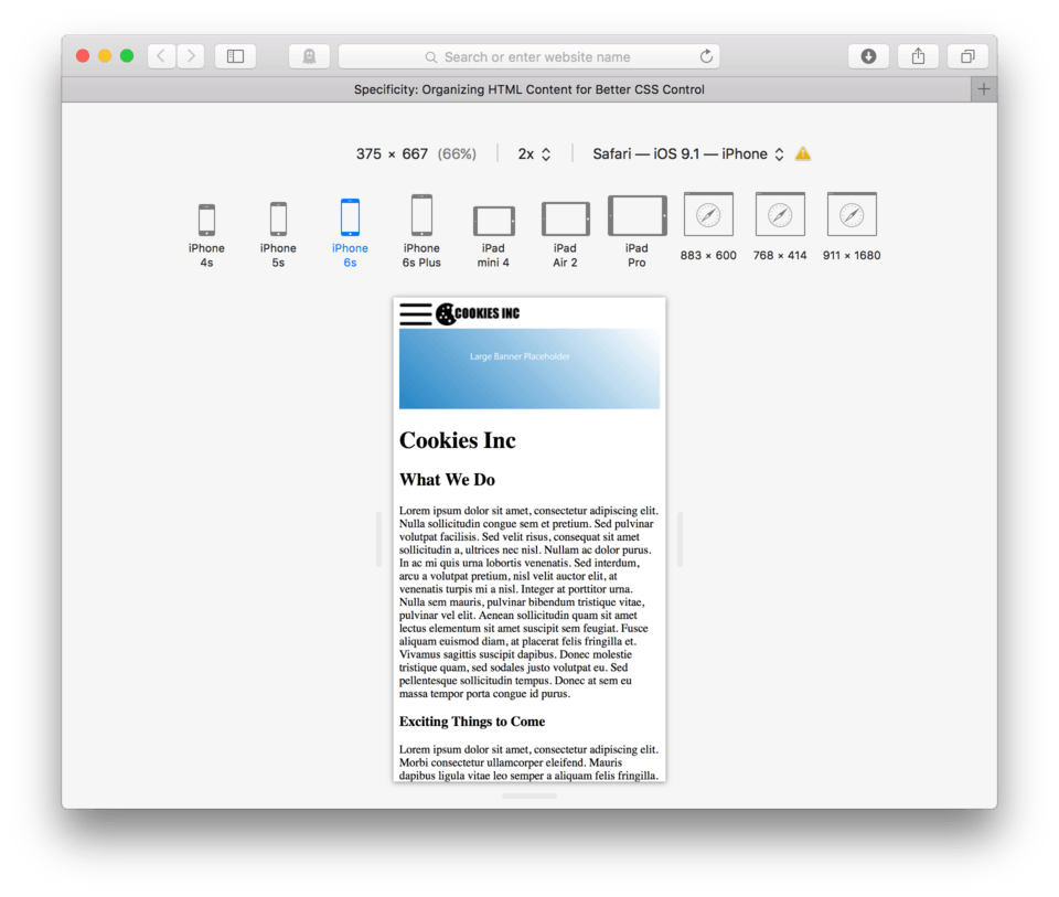
As you might notice, my browser is in Responsive design Mode, which lets you select from many common devices and screen sizes. It’s really nice because you can switch between them at any time. I’m going to use the iPhone 6 setting as my goal for the small screen design.
Specificity
Specificity is a very fancy word that essentially means that in order to apply CSS styles in a predictable way either to a bunch of HTML elements at the same time or to just a single element, you need to know what to use as the CSS selector to get those results.
So far we’ve been able to mostly get away with using just the single HTML element name for styling. We understand by now that if we want all h2 elements to by styled in a certain way, we can simply use h2 { as the selector. This is great when we want to apply our new style to every single h2 element, or every single paragraph element, and every single image element like we have been, but what happens if we only want certain h2s, certain paragraphs, or a certain image to be styled in a particular way?
Nested Elements
In the last lesson we found out that we could refer to elements nested inside other elements. We learned that if we only wanted to style our navigation links that we could say, “Hey links that live inside an unordered list, do this!” This is an example of nested element specificity. We found out that if we used a more specific description of our links (that they lived inside an ul) to eliminate any links on the page that didn’t live in an unordered list that we could target just the links we wanted to style.
This can be a great solution for issues like our navigation links, that is if we can be sure that no other elements share that exact same selector (that there are no other links that live inside an unordered list) on our page. As we saw the end of the last lesson, there may be times where we have more than one set of links living in different unordered lists on the page. This happens frequently when a page gets more complex. In many cases, a page will have more than one navigation, for example, and would then also respond to our selector ul a { since it would also have links living inside an unordered list. In cases where we might have need to be more specific, we can add in some new HTML tags that help us organize the page into sections.
Adding Header and Footer Elements
HTML offers some great tags for helping us with problems of specificity by adding extra organizational structure to our page. You are already probably a bit familiar with the terms header and footer in regard to web design.
Header Element
The header is usually what we call the top of the page that includes the logo, the navigation, and sometimes other things like a tagline or a search bar. We already have a few of these things, a hamburger button and a logo. Let’s go ahead and wrap these elements in a set of <header></header> tags. Make sure to tab in the logo and the hamburger button so it’s easy tell that those elements are nested inside your new header element.
Here’s how the beginning of your HTML content should now look:
...

<header>
	<a href="#mobilenav"><img src="images/hamburger.png"/></a>
	<img src="images/logo.png" />
</header>

<img src="images/banner.png" />

...
Note: Notice that I didn’t include the
<img />tag that holds the banner.png inside the header tags. This is a judgement call on my part, I typically don’t consider banner images part of the header. I like to think of those as being part of the changing content of the page, whereas I think of the header as being the same (or very similar) on every page of a website. Some people like to include the banner on each page, but I sit in a different camp using banner (sometimes called hero images) only on the homepage.
Setting up the header like this has a couple of advantages. First, it makes my code more organized and easier to scan. I can very quickly see what elements I have in my header in case I need to make edits, or I can easily find the header in case I want to make any additions. This is especially good when pages start to accumulate a lot of code.
Another great advantage is that now I have a new element I can use when considering specificity for nested elements. If I wanted my CSS to talk directly to the hamburger button image link, I could now use header a { as the selector. So only the link (or links if there is more than one) that lives inside the header tag will respond to that CSS command leaving other links on my page alone.
Footer Element
When we talk about footers in web design, we are referring to the content that usually appears consistently at the bottom of every page of any website. This content varies pretty widely, but it’s pretty common to see site navigation, contact information, links to social media as well as all sort of other bits of company information. Like the header, this content rarely changes between the pages in any given website, so it’s nice to have that content grouped together in a footer element.
The footer element works much like the header element. It allows us to organize the content that we’d typically think of as footer content into one group. Again this is great for making code easier to scan and read and also helps us for specifying nested elements within that part of our content. Let’s go ahead and wrap our unordered list in a pair of <footer></footer> tags.
Here’s how the bottom of your HTML content should now look:
...

<p>Email Bill Bobs at <a href="mailto:billbobs@example.com">billbobs@example.com</a> for more information</p>

<footer>
	<ul id="mobilenav">
		<li><a href="#Do">What We Do</a></li>
		<li><a href="#Done">What We've Done</a></li>
		<li><a href="#Think">What We're Thinking</a></li>
		<li><a href="#Who">Who We Are</a></li>
		<li><a href="#Contact">Contact Us</a></li>
	</ul>
</footer>
Let’s add another common bit of footer content to our HTML. We’ll add a copyright statement using a paragraph tag.
- After the unordered list, hit Enter to make room
- Add
<p>to begin our copyright paragraph - We’re going to use the fancy copyright symbol to make our site look a little more polished. To do that we have to use a special bit of code. Type:
©to create the © symbol. - Now hit Space and type:
2016 - Now close the paragraph:
</p>
Here’s how your footer HTML should look:
<footer>
<ul id="mobilenav">
<li><a href="#Do">What We Do</a></li>
<li><a href="#Done">What We've Done</a></li>
<li><a href="#Think">What We're Thinking</a></li>
<li><a href="#Who">Who We Are</a></li>
<li><a href="#Contact">Contact Us</a></li>
</ul>
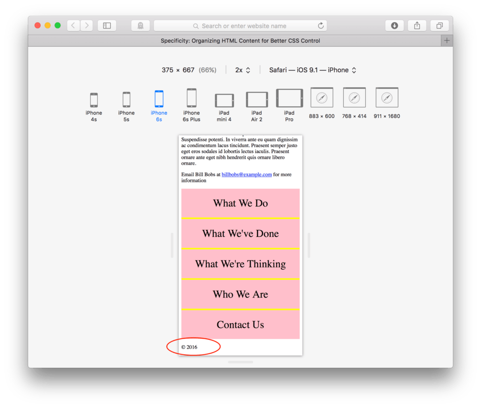
<p>© 2016</p>
</footer>
and here’s how it looks in the browser. You’ll see that your copyright statement shows up directly below the navigation. (fig. 2)
Ok, now let’s say we want to center that copyright paragraph. If we were to just say p { in our CSS, we know that every paragraph in our whole page would then be centered. In order to make sure only that particular paragraph gets centered, we can use our new footer tag to increase our specificity.
Let’s give it a try.
- Locate your CSS file
- Type:
footer p {to specify that we want to style the paragraph that lives inside the footer. - To center, we use the property: text-align. Type:
text-align: - For the value, we use:
center; - End the CSS block. Hit Enter and then
}
Here’s how my CSS looks:
footer p {
	text-align: center;
}
and here’s how it looks in the browser. (fig. 3)
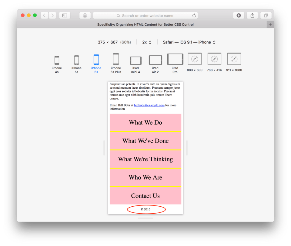
If things went well, only our copyright paragraph centered. All other paragraphs on the page are still left aligned, all thanks to specificity.
Using the Nav Element
HTML offers us a pair of tags to help us organize and identify any navigation in our page. We can wrap any unordered list in a pair of <nav></nav> tags to allow us to use as a nested selector or just to help us scan through our code and more easily identify and edit our site navigation. Let’s go ahead and add some nav tags around our unordered list that holds our navigation. Make sure to use tabs to make your code even easier to scan later.
Here’s how your footer HTML should look:
<footer>
<nav>
<ul id="mobilenav">
<li><a href="#Do">What We Do</a></li>
<li><a href="#Done">What We've Done</a></li>
<li><a href="#Think">What We're Thinking</a></li>
<li><a href="#Who">Who We Are</a></li>
<li><a href="#Contact">Contact Us</a></li>
</ul>
</nav>
<p>© 2016</p>
</footer>
Doing this now only helps you later when you need to make changes, but it can help us differentiate different navigation systems. Later when we start working on a full-screen site, we’ll be swapping our hamburger button for a more standard button system for our links. Now, we can specify whether or not we want to make styling changes to footer nav { or header nav { allowing us to style them individually.
Using the Section Element
Another new element used for organization in this is the section element. The section element is great for organizing the main content of any given page. For example, our current site, has five h2s that we’ve used for navigation purposes. These five h2s each represent the beginning of a series of elements that for reading and organizational purposes, could be lumped together for styling or just for ease of editing your code later.
Let’s go ahead and organize our content more. We can wrap each of our h2s and their related elements in a pair of <section></section> tags.
- Before the first h2 “What We Do” add an opening section tag:
<section>. - Before the second opening h2 tag, close the section:
</section> - Hit Enter and then open a new section tag:
<section> - Scroll till you find the end of that section, right before the next h2. End the section tag:
</section> - Repeat this for each of the three remaining sections of content. Make sure to tab in so you can easily see what’s inside of each section.
Here’s how your HTML should look:
...

<section>
	<h2 id="Do">What We Do</h2>
	<p>Lorem ipsum dolor sit amet, consectetur adipiscing elit. Nulla sollicitudin congue sem et pretium. Sed pulvinar volutpat facilisis. Sed velit risus, consequat sit amet sollicitudin a, ultrices nec nisl. Nullam ac dolor purus. In ac mi quis urna lobortis venenatis. Sed interdum, arcu a volutpat pretium, nisl velit auctor elit, at venenatis turpis mi a nisl. Integer at porttitor urna. Nulla sem mauris, pulvinar bibendum tristique vitae, pulvinar vel elit. Aenean sollicitudin quam sit amet lectus elementum sit amet suscipit sem feugiat. Fusce aliquam euismod diam, at placerat felis fringilla et. Vivamus sagittis suscipit dapibus. Donec molestie tristique quam, sed sodales justo volutpat eu. Sed pellentesque sollicitudin tempus. Donec at sem eu massa tempor porta congue id purus.</p>

	<h3>Exciting Things to Come</h3>
	<p>Lorem ipsum dolor sit amet, consectetur adipiscing elit. Morbi consectetur ullamcorper eleifend. Mauris dapibus ligula vitae leo semper a aliquam felis fringilla. Pellentesque dapibus lacus sed orci vulputate ultrices. Quisque mollis nisl id nibh cursus sodales pretium non justo. Sed id dui vel velit posuere consectetur eget quis elit. Sed est augue, euismod et scelerisque nec, consectetur eget odio. Ut volutpat blandit velit lobortis tempus. Phasellus at ante a augue iaculis hendrerit tempor in felis. Aliquam justo massa, tempor vitae dignissim ultricies, semper et augue. Nam mollis pretium purus at faucibus. Etiam a metus arcu, ut vestibulum ligula.</p>

	<p>Proin dictum viverra orci, eu condimentum lorem vulputate quis. Proin suscipit pulvinar est. Quisque tincidunt, tellus sed scelerisque posuere, nulla orci pellentesque ante, non scelerisque tellus arcu at mi. Aenean lobortis interdum dolor, et dapibus elit volutpat vitae. Duis massa leo, aliquam eu posuere non, porta quis lorem. Sed dapibus leo vel diam lacinia id consequat enim egestas. Donec a purus vitae turpis iaculis scelerisque.</p>
	<p>Nunc eget tincidunt ipsum. Quisque nec turpis tortor. Phasellus vitae sapien ante. Nunc suscipit faucibus commodo. Duis vel semper metus. Sed suscipit tempus ligula id posuere. Integer lectus massa, tempor gravida scelerisque ut, varius nec tellus. In metus purus, faucibus non condimentum in, elementum ac ligula. Curabitur pharetra, lectus volutpat viverra auctor, ligula nulla condimentum lorem, eu venenatis orci massa vel est. Donec sem mi, adipiscing ut scelerisque congue, egestas non neque.</p>
</section>


<section>
	<h2 id="Done">What We've Done</h2>
	<p>Aenean egestas urna non quam pellentesque nec rhoncus lacus adipiscing. Proin condimentum aliquam metus, nec auctor elit cursus vel. Nam posuere lectus augue, vitae ullamcorper lorem. Morbi pellentesque, nunc ut iaculis imperdiet, erat ante vehicula tortor, interdum congue dolor neque quis nibh. Suspendisse hendrerit lectus in ante vestibulum vitae luctus felis tempor. Cras viverra sagittis felis vitae elementum. Vestibulum est elit, varius adipiscing interdum sed, pulvinar ac mauris. Sed turpis erat, rhoncus non viverra in, rutrum vitae nisi.</p>
	<p>Vivamus mollis quam et tellus scelerisque auctor. Donec nisl lacus, semper sit amet interdum eu, fringilla tempus sapien. Lorem ipsum dolor sit amet, consectetur adipiscing elit. Aenean ut dui justo. Nullam vel dolor ante. Sed non massa ut nunc posuere sollicitudin. Suspendisse potenti. In viverra ante eu quam dignissim ac condimentum lacus tincidunt. Praesent semper justo eget eros sodales id lobortis lectus iaculis. Praesent ornare ante eget nibh hendrerit quis ornare libero ornare.</p>

	<h3>Awards and Recognition</h3>
	<p>Curabitur vel purus turpis, blandit fringilla justo. Donec imperdiet gravida imperdiet. Nunc dui sem, tincidunt id mollis non, ultricies id libero. Maecenas in elit id mauris auctor aliquet. Duis ullamcorper egestas lorem a consequat. Praesent blandit laoreet ligula, vel cursus elit pretium sit amet. Praesent pharetra, massa vel volutpat vehicula, neque lorem sollicitudin dui, at placerat leo metus vel magna. Aliquam facilisis diam id massa mollis fringilla. Praesent sit amet ornare urna. Aliquam a est arcu. Vivamus scelerisque aliquam tempor. Etiam tempus libero eget orci faucibus vehicula. Aliquam volutpat erat turpis. Mauris lacus neque, sollicitudin vitae hendrerit id, mollis vitae elit. Vestibulum eu velit lectus.</p>
	<p>Nam varius condimentum eros non lacinia. Proin a dolor dui. Nam vel adipiscing mi. Nam vel mauris eget arcu lobortis dapibus. Sed sollicitudin magna ac mauris gravida quis semper felis commodo. Etiam libero nisl, congue in ornare ac, vulputate at metus. Mauris ut convallis sem. Cras lobortis lacus id leo tristique et mattis lorem malesuada. Phasellus ac neque orci. Sed nec justo a libero placerat egestas. Donec congue, odio tincidunt semper pretium, diam nisi vestibulum est, nec vulputate nunc nibh semper elit. Morbi non nibh ut velit cursus venenatis. Nam pellentesque, ligula vitae eleifend pellentesque, orci diam bibendum massa, non luctus lorem nulla congue nisi.</p>
</section>

<section>
	<h2 id="Think">What We're Thinking</h2>
	<p>In hac habitasse platea dictumst. Etiam malesuada, nisl consequat convallis congue, nisl nisi viverra lacus, vitae sagittis nibh ante at dolor. Sed consectetur, enim sit amet molestie gravida, libero odio aliquam mauris, at euismod risus urna nec leo. Nulla rutrum mattis tincidunt. Nulla lacus felis, tincidunt a bibendum eget, commodo nec risus. Quisque quis eros magna, id sollicitudin neque. Nunc ut nibh non justo faucibus condimentum eget sit amet arcu.</p>

	<h3>We Are Passionate About our Process</h3>
	<p>Suspendisse eleifend nisl ut enim imperdiet pulvinar venenatis ante tempus. Pellentesque eu metus eu purus vestibulum vulputate vulputate vitae mi. Morbi justo nisi, ullamcorper at interdum sit amet, mollis ac neque. Phasellus id odio nec eros lobortis dignissim sed a libero. Ut vitae arcu neque, eget consectetur velit. Pellentesque sed massa vel tellus vehicula iaculis eu a arcu. Nunc semper lobortis orci sit amet ullamcorper.</p>
	<p>Donec luctus bibendum mi, id aliquet eros semper egestas. Curabitur sed velit id dui vestibulum fermentum. Maecenas venenatis ultrices nunc, vitae interdum enim pretium ut. Quisque vestibulum, augue sit amet blandit placerat, tellus justo egestas nisi, a gravida justo nulla sit amet risus. Curabitur congue aliquam congue. Praesent mi diam, feugiat eu congue at, tempus ut lectus. Morbi sapien turpis, interdum eget semper vitae, congue sit amet lorem. Integer luctus enim ut urna vehicula hendrerit. Mauris id arcu ligula, sit amet auctor augue. Nullam tincidunt turpis vitae libero rhoncus ut laoreet tortor ornare. Quisque et lectus purus, ultrices ultrices lorem. Vestibulum vel libero ut mi luctus suscipit. Quisque viverra, neque in auctor dignissim, justo eros euismod libero, at tincidunt augue massa eget lorem. Fusce tincidunt nunc eu arcu pretium interdum. Phasellus ultricies, est id facilisis imperdiet, sapien dolor consequat ligula, et ornare massa lacus vel enim. Vivamus pellentesque risus ac ante faucibus elementum.</p>
	<p>Nulla ultricies dolor ac lorem fermentum lobortis et fermentum enim. Phasellus lobortis bibendum arcu, a hendrerit tellus pulvinar ac. Duis sit amet consequat purus. Cras ultrices pellentesque quam, at adipiscing lectus auctor eu. Morbi ante augue, malesuada vestibulum luctus id, suscipit ac nisi. Morbi consequat massa et est vulputate eleifend. Nam facilisis viverra dolor quis feugiat. Mauris leo lacus, tristique sit amet iaculis vitae, feugiat sed mi. Proin at vehicula eros. Proin et ante purus. In non nisl augue, id pulvinar dui. Aenean pharetra tempus sapien, id consequat dui luctus at. Donec non ipsum eget mauris sagittis elementum.</p>
</section>

<section>
	<h2 id="Who">Who We Are</h2>
	<p>Etiam et justo in magna pharetra venenatis. Integer mollis est et mauris iaculis hendrerit. Quisque non risus sem, nec volutpat lacus. Mauris lacinia metus suscipit massa consequat non vulputate sapien vulputate. Donec mattis, neque eget mollis dictum, urna diam laoreet purus, eu ultrices diam elit sit amet orci. Proin eget mi et orci viverra malesuada. Morbi ac justo quam, in varius orci. Curabitur id justo sed erat tristique rhoncus id id massa. Aliquam vitae tortor a lectus porttitor ultricies.</p>

	<h3>Our Staff</h3>

	<h4>Bill Bobs</h4>
	<figure>
		<img src="images/placeholder.png"/>
	</figure>
	<p>Lorem ipsum dolor sit amet, consectetur adipiscing elit. Morbi consectetur ullamcorper eleifend. Mauris dapibus ligula vitae leo semper a aliquam felis fringilla. Pellentesque dapibus lacus sed orci vulputate ultrices. Quisque mollis nisl id nibh cursus sodales pretium non justo. Sed id dui vel velit posuere consectetur eget quis elit. Sed est augue, euismod et scelerisque nec, consectetur eget odio. Ut volutpat blandit velit lobortis tempus. Phasellus at ante a augue iaculis hendrerit tempor in felis. Aliquam justo massa, tempor vitae dignissim ultricies, semper et augue. Nam mollis pretium purus at faucibus. Etiam a metus arcu, ut vestibulum ligula.</p>

	<h4>Clementine Brown</h4>
	<figure>
		<img src="images/placeholder.png"/>
	</figure>
	<p>Proin dictum viverra orci, eu condimentum lorem vulputate quis. Proin suscipit pulvinar est. Quisque tincidunt, tellus sed scelerisque posuere, nulla orci pellentesque ante, non scelerisque tellus arcu at mi. Aenean lobortis interdum dolor, et dapibus elit volutpat vitae. Duis massa leo, aliquam eu posuere non, porta quis lorem. Sed dapibus leo vel diam lacinia id consequat enim egestas. Donec a purus vitae turpis iaculis scelerisque.</p>

	<h4>Dave Biggs</h4>
	<figure>
		<img src="images/placeholder.png"/>
	</figure>
	<p>Nunc eget tincidunt ipsum. Quisque nec turpis tortor. Phasellus vitae sapien ante. Nunc suscipit faucibus commodo. Duis vel semper metus. Sed suscipit tempus ligula id posuere. Integer lectus massa, tempor gravida scelerisque ut, varius nec tellus. In metus purus, faucibus non condimentum in, elementum ac ligula. Curabitur pharetra, lectus volutpat viverra auctor, ligula nulla condimentum lorem, eu venenatis orci massa vel est. Donec sem mi, adipiscing ut scelerisque congue, egestas non neque.</p>
</section>

<section>
	<h2 id="Contact">Contact Us</h2>
	<p>Morbi cursus est at lacus semper pretium et sed eros. Nullam tortor dolor, lacinia eu tincidunt in, pharetra nec elit. Ut adipiscing convallis nunc, imperdiet eleifend justo vestibulum hendrerit. Maecenas auctor tristique dui, ac pulvinar orci vulputate nec. Proin id tortor risus, vel aliquet orci. Integer ligula dolor, pretium id ultrices sit amet, elementum in orci. Integer mollis felis at turpis eleifend ullamcorper consectetur libero aliquet. Cras ac mollis massa. Cras sed orci magna. Nam et ante a lectus placerat pharetra sed at sem. Maecenas quam orci, eleifend et rutrum ut, tincidunt vitae massa. Suspendisse id metus magna. Duis fringilla lacus quis neque facilisis porta. Nullam id aliquam diam.</p>

	<h3>Join Our Staff</h3>
	<p>Aenean egestas urna non quam pellentesque nec rhoncus lacus adipiscing. Proin condimentum aliquam metus, nec auctor elit cursus vel. Nam posuere lectus augue, vitae ullamcorper lorem. Morbi pellentesque, nunc ut iaculis imperdiet, erat ante vehicula tortor, interdum congue dolor neque quis nibh. Suspendisse hendrerit lectus in ante vestibulum vitae luctus felis tempor. Cras viverra sagittis felis vitae elementum. Vestibulum est elit, varius adipiscing interdum sed, pulvinar ac mauris. Sed turpis erat, rhoncus non viverra in, rutrum vitae nisi.</p>
	<p>Vivamus mollis quam et tellus scelerisque auctor. Donec nisl lacus, semper sit amet interdum eu, fringilla tempus sapien. Lorem ipsum dolor sit amet, consectetur adipiscing elit. Aenean ut dui justo. Nullam vel dolor ante. Sed non massa ut nunc posuere sollicitudin. Suspendisse potenti. In viverra ante eu quam dignissim ac condimentum lacus tincidunt. Praesent semper justo eget eros sodales id lobortis lectus iaculis. Praesent ornare ante eget nibh hendrerit quis ornare libero ornare.</p>

	<p>Email Bill Bobs at <a href="mailto:billbobs@example.com">billbobs@example.com</a> for more information</p>
</section>

...
Using the Class Attribute
Okay, not let’s say we want to change the background color of just a few of our sections. If we wanted to have every other section have a yellow background, how should we go about that? You might immediately leap to using specificity, but we quickly run into a problem. Because all five of our sections are using section tags, using section { background-color: yellow; } would then mean that all sections would then have yellow backgrounds.
If we wanted to specify that only the first, third, and fifth section are to have colored backgrounds, we need to find a way to differentiate just those sections. Fortunately, HTML offers us an attribute to add to the element to do just this. The attribute is called “class” and it’s whole job is to give elements a handle to use in the CSS. The class attribute is written: class=.
A class attribute is very similar to the ID attribute, however, unlike the ID attribute, the same class name can be given to multiple elements, essentially giving us a way to group together elements for styling purposes. So, if we wanted to change the background color of certain sections, we could add a class attribute with the same name to each of the section tags. Then using those as the selectors, we can style them in our CSS.
That was a lot, I know. Maybe an example would help.
Okay, so what needs to happen is that we need to add a class to our first, third, and fifth section tag. Let’s use “bgorange” as the name between the double quotation marks for each of those meaning orange background.
Find the first <section> tag. Add class="bgorange" to the end of the tag, but before the >, similar to how we did the id attribute on the h2s for the site navigation.
Here’s how your HTML should look for the first section:
<section class="bgorange">
	<h2 id="Do">What We Do</h2>
	<p>Lorem ipsum dolor sit amet, consectetur adipiscing elit. Nulla sollicitudin congue sem et pretium. Sed pulvinar volutpat facilisis. Sed velit risus, consequat sit amet sollicitudin a, ultrices nec nisl. Nullam ac dolor purus. In ac mi quis urna lobortis venenatis. Sed interdum, arcu a volutpat pretium, nisl velit auctor elit, at venenatis turpis mi a nisl. Integer at porttitor urna. Nulla sem mauris, pulvinar bibendum tristique vitae, pulvinar vel elit. Aenean sollicitudin quam sit amet lectus elementum sit amet suscipit sem feugiat. Fusce aliquam euismod diam, at placerat felis fringilla et. Vivamus sagittis suscipit dapibus. Donec molestie tristique quam, sed sodales justo volutpat eu. Sed pellentesque sollicitudin tempus. Donec at sem eu massa tempor porta congue id purus.</p>

	<h3>Exciting Things to Come</h3>
	<p>Lorem ipsum dolor sit amet, consectetur adipiscing elit. Morbi consectetur ullamcorper eleifend. Mauris dapibus ligula vitae leo semper a aliquam felis fringilla. Pellentesque dapibus lacus sed orci vulputate ultrices. Quisque mollis nisl id nibh cursus sodales pretium non justo. Sed id dui vel velit posuere consectetur eget quis elit. Sed est augue, euismod et scelerisque nec, consectetur eget odio. Ut volutpat blandit velit lobortis tempus. Phasellus at ante a augue iaculis hendrerit tempor in felis. Aliquam justo massa, tempor vitae dignissim ultricies, semper et augue. Nam mollis pretium purus at faucibus. Etiam a metus arcu, ut vestibulum ligula.</p>

	<p>Proin dictum viverra orci, eu condimentum lorem vulputate quis. Proin suscipit pulvinar est. Quisque tincidunt, tellus sed scelerisque posuere, nulla orci pellentesque ante, non scelerisque tellus arcu at mi. Aenean lobortis interdum dolor, et dapibus elit volutpat vitae. Duis massa leo, aliquam eu posuere non, porta quis lorem. Sed dapibus leo vel diam lacinia id consequat enim egestas. Donec a purus vitae turpis iaculis scelerisque.</p>
	<p>Nunc eget tincidunt ipsum. Quisque nec turpis tortor. Phasellus vitae sapien ante. Nunc suscipit faucibus commodo. Duis vel semper metus. Sed suscipit tempus ligula id posuere. Integer lectus massa, tempor gravida scelerisque ut, varius nec tellus. In metus purus, faucibus non condimentum in, elementum ac ligula. Curabitur pharetra, lectus volutpat viverra auctor, ligula nulla condimentum lorem, eu venenatis orci massa vel est. Donec sem mi, adipiscing ut scelerisque congue, egestas non neque.</p>
</section>
Repeat this for the third and fifth sections.
Here’s how your HTML should look for the beginning of each of those sections:
<section>
	<h2 id="Done">What We've Done</h2>
	...
</section>

<section class="bgorange">
	<h2 id="Think">What We're Thinking</h2>
	...
</section>

<section>
	<h2 id="Who">Who We Are</h2>
	...
</section>

<section class="bgorange">
	<h2 id="Contact">Contact Us</h2>
	...
</section>
Save your html file.
Now let’s write the CSS to change the background color for these new classes.
- Locate your CSS file
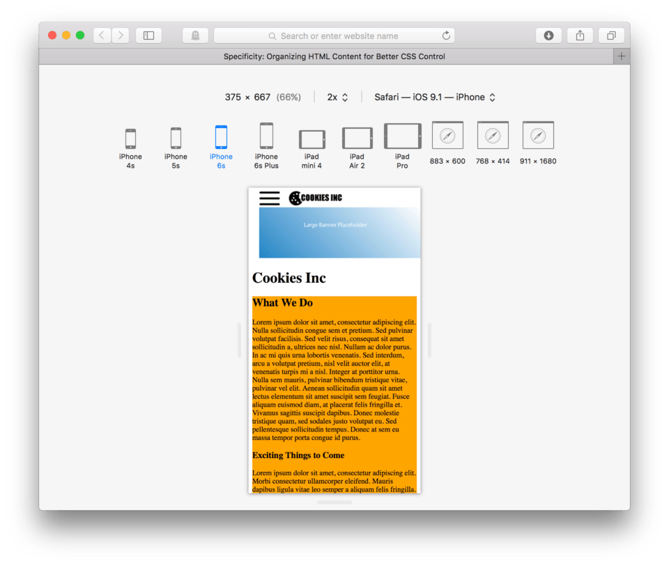
- Let’s start by tell our sections to all have an orange background. At the end of your current CSS document, type
section {as the selector. - For the property and value:
background-color: orange; - Close the CSS block
} - Save and Refresh your site
Here’s my CSS:
section {
	background-color: orange;
}
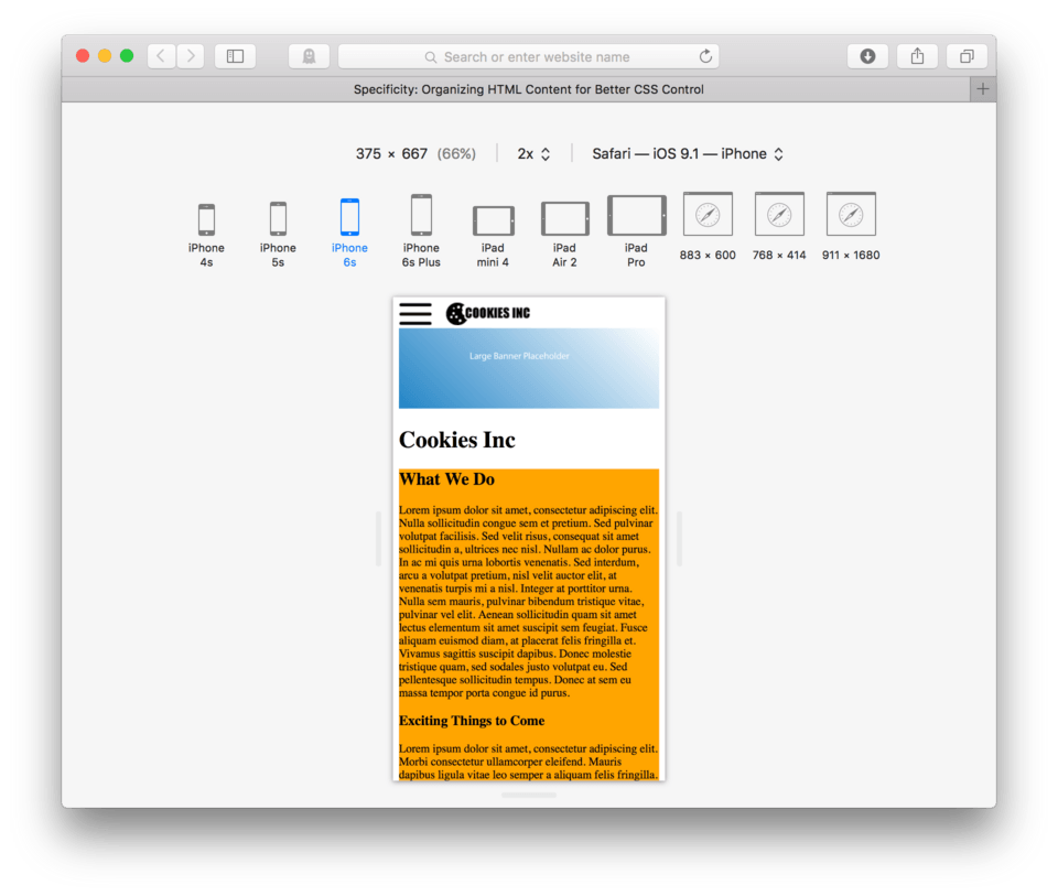
and here’s how it looks in the browser. (fig. 4)
As we expected, each of our sections took on an orange background. To select only our sections with the class="bgorange" we need to edit our selector. We use a . (period) to say “with the class of” in CSS. So in order to use sections with the class of “bgorange”, we would use the selector: section.bgorange {. It’s important to notice that there isn’t a space between the section and the period, these need to be written without spaces to say “section with a class of” rather than class who lives inside of a section like we do with nested elements.
Note: It seems worth calling this out. Notice that when we use a class or an id in the CSS, we don’t put a space between the selector element and the class or id. Spaces tell CSS that someting is inside something else, like when we said
ul athat space indicated that there was a link inside of an unordered list. When instead of a space we use a # or a . we are saying with the id of or the class of respectively.
Ok, so let’s go back to our CSS and add our class to our selector.
- Edit the CSS selector by adding
.bgorangeto the section.section.bgorange { - Save and Refresh
Here’s my CSS:
section.bgorange {
	background-color: orange;
}
and here’s how it looks in the browser. (fig. 5)
You’ll see that my example (and hopefully yours too) shows that only the sections with the class of “bgorange” now have orange backgrounds. The class= attribute is a really great tool. The real benefit it is allows you to attach a CSS “handle” to any HTML element we want to share a certain property with any other property.
Using the ID Attribute as a Selector
We’ve been working our way from less specific CSS selectors like using the element name to more specific by using classes to pick and choose which elements get certain styling. The more specific we can be, the greater level of precision we can get on exactly what piece of our HTML gets styled what way.
The most specific we can get is to use the element as the selector coupled with it’s id attribute. Remember when we added the id attribute to our h2s? We discussed adding this for anchored navigation but it has a second use which is even more powerful.
Giving an element and id attribute (id=), means you are giving it a name, but not just any name… an absolutely unique name. You should not ever repeat an id. Think of them like social security numbers, every person has one of their own. Classes can be reused on multiple elements, but id’s are all unique and should not be reused for any reason.
Because the id is unique, then if you use the element and it’s id in the CSS, there can be no other element that has that in common and you can style just that single element if you so choose. A good example of an element that might need to be uniquely styled would be the logo of our website. It seems to be sitting awefully close to our hamburger button. It might be better to give it just a little bit of breathing room by setting it to have some margin on the left.
Now, we wouldn’t want to do this to all images, so using img as a CSS selector doesn’t seem appropriate. We could use a class, but there is only one logo image so that doesn’t seem appropriate either. Instead, we will use the an id – because id’s are for elements that only appear once one the page.
To test this, let’s go ahead and add id="logo" to our logo <img /> tag.
- Find you HTML file
- Add
id="logo"to our logo<img />tag. This can be before or after thesrc=attribute.` - Save
- Find you CSS file and locate your CSS block that talks to our images:
img { - Now we need to decide how much breathing room we want our logo to have. Let’s go ahead and use the property and value:
margin-left: 15px;to give it 15 pixels of space on the left - Save and Refresh
Here’s my CSS:
img {
	max-width: 100%;
	margin-left: 15px;
}
and here’s how it looks in the browser. (fig. 6)
Do you see what’s happening? All of our images now have 15 pixels of empty space on the left. The problem is that we only wanted to address the logo image, not all the images. In order to do this we need to be more specific. We can’t use the nested trick because both the hamburger button and the logo are both images that live inside the header. That’s where the id= attribute comes in. We can use that to say, “Hey image with the name logo, you should give yourself 15 pixels of space on the left.” To use an id as a selector we use a # similar to when we use it in an address for anchored links. To make sure we are talking to the image with the id equal to logo, we write: img#logo { as the selector. Notice there is not space between the element and the id, this is the same situation as we find when we use classes for selectors. Spaces mean inside of, no space means with.
Let’s go ahead and add a new CSS block addressing just our logo by saying, All images with the id attribute equal to “logo” have a margin on the left of 15 pixels.
- Begin a new CSS block
- Use
img#logo {as the selector - Move the
margin-left: 15px;from theimg {to our new block - Save and Refresh
Here’s my CSS:
img {
	max-width: 100%;
}

img#logo {
	margin-left: 15px;
}
and here’s how it looks in the browser. (fig. 7)
We can see now that our other images have returned to their respective locations. They are responsible for listening only to the img {. The logo is now responsible for listening to the img#logo because that is the most specific set of instructions. It’s kinda like saying to a group of students, “All of you stand up, but Jake you need to sit down.” Everyone but Jake would be standing, even though he fits the “everyone” description, he still sits because was given more specific instructions to follow.
Lesson Conclusion
We’ve done a lot of work to get to now CSS selectors and to understand specificity. It’s hopefully beginning to make sense that you can use generic element selectors to style all elements of the same kind at once, you can use nested selectors to style only elements within other elements, and finally you can use classes to style select elements and lastly you can use ids to style a singular element.
We learned how to chunk our HTML content into organized sections that make our code easier to read and also give us more opportunity to style portions of the content independently. To accomplish this we learned some new HTML tags: <header>/<header>, <footer></footer>, <nav></nav> and <section></section>.
Next, we will look at how to use custom web fonts.