Navigation & Mobile First Design
- Navigation & Mobile First Design
Overview
In this lesson we’ll combine some of our previously learned skills to build fully functional site navigation using an unordered list. We’ll also add to our list knowledge by learning how to link to specific content on our page using a new kind of link, the anchored link.
This lesson will begin to focus on design and styling issues related to a mobile or small device environment. This will include learning about ways to deal with very large images, creating and styling a mobile optimized navigation, and using anchored links to promote scrolling over clicking which is easier for our mobile users.
Lesson Setup
Let’s get started. Like usual, we need to create our lesson folder structure, our initial HTML file and connect it up with a new stylesheet.
Folder Setup
- Create a new Lesson 08 folder inside of Bob
- Create two subfolders: notes and root
- Inside the root folder, create two subfolders, an images folder and a css folder
- Download the lesson 8 resources from here.
- Move those images into your images folder for this lesson
HTML Setup
- Open up TextMate
- File > New to open a new file
- Code in your boilerplate HTML making sure to add a title to the page. I’m calling mine: Navigation and Mobile First Design.
- Save your HTML file to your Lesson18 root folder with the name: lesson08.html
- Open and Preview your page in the browser, checking to make sure your page title is appearing correctly.
CSS Setup
Let’s go ahead and create a CSS file and attach it to our HTML file.
- Open up TextMate
- File > New to open a new file
- File > Save
- Navigate to the “css” folder you created
- Name your file, style.css
- Hit Save
- Attach this stylesheet to our HTML page. Type:
<link href="css/style.css rel="stylesheet" />into the head section of our lesson09.html file. - File > Save the HTML file
Go ahead and double-check your work against mine. Your HTML should now look like this:
<!doctype html>
<html>

	<head>
		<title>Navigation and Mobile First Design</title>
		<link href="css/style.css" rel="stylesheet" />
	</head>

	<body>

	</body>

</html>
Note: You may have noticed that I’ve shortened the lesson setup to a list of action steps above. If you need a refresher on folder and file organization see the lesson 3 setup section.
Let’s test to make sure our pages connected correctly.
- Navigate back to your new CSS file.
- Let’s change the background color of the body element. Type:
body {on an open line and hit Enter - Now, type the property we want to change:
background-color: - Type:
pink;and hit Enter - Close the CSS block, type:
} - Save this file and Refresh the browser
If your background turned pink, then you are set. Everything is working correctly. You can go ahead and delete that CSS block, so we can start fresh.
Setting the Viewport
This time we need to add a new piece to our head section. We need to add a <meta> tag to tell the browser that our site is mobile friendly.
- Navigate back to your HTML file.
- On a new line in your head section type:
<meta name="viewport" content="width=device-width, initial-scale=1" />
Your HTML should now look like this:
<!doctype html>
<html>

	<head>
		<title>Navigation and Mobile First Design</title>
		<link href="css/style.css" rel="stylesheet" />
		<meta name="viewport" content="width=device-width, initial-scale=1" />
	</head>

	<body>

	</body>

</html>
Note that it is very important to include this <meta> tag from now on in order to build our websites in a mobile friendly way. You should now consider it a part of your HTML boilerplate.
Initial HTML Content
So we can really focus on the new stuff, I have already prepared a bulk of the HTML that we are going to begin this lesson with.
- In your HTML file, copy and paste the following in-between your empty
<body></body>tags:
<img src="images/logo.png" />

<img src="images/banner.png" />

<h1>Cookies Inc</h1>

<h2>What We Do</h2>
<p>Lorem ipsum dolor sit amet, consectetur adipiscing elit. Nulla sollicitudin congue sem et pretium. Sed pulvinar volutpat facilisis. Sed velit risus, consequat sit amet sollicitudin a, ultrices nec nisl. Nullam ac dolor purus. In ac mi quis urna lobortis venenatis. Sed interdum, arcu a volutpat pretium, nisl velit auctor elit, at venenatis turpis mi a nisl. Integer at porttitor urna. Nulla sem mauris, pulvinar bibendum tristique vitae, pulvinar vel elit. Aenean sollicitudin quam sit amet lectus elementum sit amet suscipit sem feugiat. Fusce aliquam euismod diam, at placerat felis fringilla et. Vivamus sagittis suscipit dapibus. Donec molestie tristique quam, sed sodales justo volutpat eu. Sed pellentesque sollicitudin tempus. Donec at sem eu massa tempor porta congue id purus.</p>

<h3>Exciting Things to Come</h3>
<p>Lorem ipsum dolor sit amet, consectetur adipiscing elit. Morbi consectetur ullamcorper eleifend. Mauris dapibus ligula vitae leo semper a aliquam felis fringilla. Pellentesque dapibus lacus sed orci vulputate ultrices. Quisque mollis nisl id nibh cursus sodales pretium non justo. Sed id dui vel velit posuere consectetur eget quis elit. Sed est augue, euismod et scelerisque nec, consectetur eget odio. Ut volutpat blandit velit lobortis tempus. Phasellus at ante a augue iaculis hendrerit tempor in felis. Aliquam justo massa, tempor vitae dignissim ultricies, semper et augue. Nam mollis pretium purus at faucibus. Etiam a metus arcu, ut vestibulum ligula.</p>

<p>Proin dictum viverra orci, eu condimentum lorem vulputate quis. Proin suscipit pulvinar est. Quisque tincidunt, tellus sed scelerisque posuere, nulla orci pellentesque ante, non scelerisque tellus arcu at mi. Aenean lobortis interdum dolor, et dapibus elit volutpat vitae. Duis massa leo, aliquam eu posuere non, porta quis lorem. Sed dapibus leo vel diam lacinia id consequat enim egestas. Donec a purus vitae turpis iaculis scelerisque.</p>
<p>Nunc eget tincidunt ipsum. Quisque nec turpis tortor. Phasellus vitae sapien ante. Nunc suscipit faucibus commodo. Duis vel semper metus. Sed suscipit tempus ligula id posuere. Integer lectus massa, tempor gravida scelerisque ut, varius nec tellus. In metus purus, faucibus non condimentum in, elementum ac ligula. Curabitur pharetra, lectus volutpat viverra auctor, ligula nulla condimentum lorem, eu venenatis orci massa vel est. Donec sem mi, adipiscing ut scelerisque congue, egestas non neque.</p>


<h2>What We've Done</h2>
<p>Aenean egestas urna non quam pellentesque nec rhoncus lacus adipiscing. Proin condimentum aliquam metus, nec auctor elit cursus vel. Nam posuere lectus augue, vitae ullamcorper lorem. Morbi pellentesque, nunc ut iaculis imperdiet, erat ante vehicula tortor, interdum congue dolor neque quis nibh. Suspendisse hendrerit lectus in ante vestibulum vitae luctus felis tempor. Cras viverra sagittis felis vitae elementum. Vestibulum est elit, varius adipiscing interdum sed, pulvinar ac mauris. Sed turpis erat, rhoncus non viverra in, rutrum vitae nisi.</p>
<p>Vivamus mollis quam et tellus scelerisque auctor. Donec nisl lacus, semper sit amet interdum eu, fringilla tempus sapien. Lorem ipsum dolor sit amet, consectetur adipiscing elit. Aenean ut dui justo. Nullam vel dolor ante. Sed non massa ut nunc posuere sollicitudin. Suspendisse potenti. In viverra ante eu quam dignissim ac condimentum lacus tincidunt. Praesent semper justo eget eros sodales id lobortis lectus iaculis. Praesent ornare ante eget nibh hendrerit quis ornare libero ornare.</p>

<h3>Awards and Recognition</h3>
<p>Curabitur vel purus turpis, blandit fringilla justo. Donec imperdiet gravida imperdiet. Nunc dui sem, tincidunt id mollis non, ultricies id libero. Maecenas in elit id mauris auctor aliquet. Duis ullamcorper egestas lorem a consequat. Praesent blandit laoreet ligula, vel cursus elit pretium sit amet. Praesent pharetra, massa vel volutpat vehicula, neque lorem sollicitudin dui, at placerat leo metus vel magna. Aliquam facilisis diam id massa mollis fringilla. Praesent sit amet ornare urna. Aliquam a est arcu. Vivamus scelerisque aliquam tempor. Etiam tempus libero eget orci faucibus vehicula. Aliquam volutpat erat turpis. Mauris lacus neque, sollicitudin vitae hendrerit id, mollis vitae elit. Vestibulum eu velit lectus.</p>
<p>Nam varius condimentum eros non lacinia. Proin a dolor dui. Nam vel adipiscing mi. Nam vel mauris eget arcu lobortis dapibus. Sed sollicitudin magna ac mauris gravida quis semper felis commodo. Etiam libero nisl, congue in ornare ac, vulputate at metus. Mauris ut convallis sem. Cras lobortis lacus id leo tristique et mattis lorem malesuada. Phasellus ac neque orci. Sed nec justo a libero placerat egestas. Donec congue, odio tincidunt semper pretium, diam nisi vestibulum est, nec vulputate nunc nibh semper elit. Morbi non nibh ut velit cursus venenatis. Nam pellentesque, ligula vitae eleifend pellentesque, orci diam bibendum massa, non luctus lorem nulla congue nisi.</p>

<h2>What We're Thinking</h2>
<p>In hac habitasse platea dictumst. Etiam malesuada, nisl consequat convallis congue, nisl nisi viverra lacus, vitae sagittis nibh ante at dolor. Sed consectetur, enim sit amet molestie gravida, libero odio aliquam mauris, at euismod risus urna nec leo. Nulla rutrum mattis tincidunt. Nulla lacus felis, tincidunt a bibendum eget, commodo nec risus. Quisque quis eros magna, id sollicitudin neque. Nunc ut nibh non justo faucibus condimentum eget sit amet arcu.</p>

<h3>We Are Passionate About our Process</h3>
<p>Suspendisse eleifend nisl ut enim imperdiet pulvinar venenatis ante tempus. Pellentesque eu metus eu purus vestibulum vulputate vulputate vitae mi. Morbi justo nisi, ullamcorper at interdum sit amet, mollis ac neque. Phasellus id odio nec eros lobortis dignissim sed a libero. Ut vitae arcu neque, eget consectetur velit. Pellentesque sed massa vel tellus vehicula iaculis eu a arcu. Nunc semper lobortis orci sit amet ullamcorper.</p>
<p>Donec luctus bibendum mi, id aliquet eros semper egestas. Curabitur sed velit id dui vestibulum fermentum. Maecenas venenatis ultrices nunc, vitae interdum enim pretium ut. Quisque vestibulum, augue sit amet blandit placerat, tellus justo egestas nisi, a gravida justo nulla sit amet risus. Curabitur congue aliquam congue. Praesent mi diam, feugiat eu congue at, tempus ut lectus. Morbi sapien turpis, interdum eget semper vitae, congue sit amet lorem. Integer luctus enim ut urna vehicula hendrerit. Mauris id arcu ligula, sit amet auctor augue. Nullam tincidunt turpis vitae libero rhoncus ut laoreet tortor ornare. Quisque et lectus purus, ultrices ultrices lorem. Vestibulum vel libero ut mi luctus suscipit. Quisque viverra, neque in auctor dignissim, justo eros euismod libero, at tincidunt augue massa eget lorem. Fusce tincidunt nunc eu arcu pretium interdum. Phasellus ultricies, est id facilisis imperdiet, sapien dolor consequat ligula, et ornare massa lacus vel enim. Vivamus pellentesque risus ac ante faucibus elementum.</p>
<p>Nulla ultricies dolor ac lorem fermentum lobortis et fermentum enim. Phasellus lobortis bibendum arcu, a hendrerit tellus pulvinar ac. Duis sit amet consequat purus. Cras ultrices pellentesque quam, at adipiscing lectus auctor eu. Morbi ante augue, malesuada vestibulum luctus id, suscipit ac nisi. Morbi consequat massa et est vulputate eleifend. Nam facilisis viverra dolor quis feugiat. Mauris leo lacus, tristique sit amet iaculis vitae, feugiat sed mi. Proin at vehicula eros. Proin et ante purus. In non nisl augue, id pulvinar dui. Aenean pharetra tempus sapien, id consequat dui luctus at. Donec non ipsum eget mauris sagittis elementum.</p>

<h2>Who We Are</h2>
<p>Etiam et justo in magna pharetra venenatis. Integer mollis est et mauris iaculis hendrerit. Quisque non risus sem, nec volutpat lacus. Mauris lacinia metus suscipit massa consequat non vulputate sapien vulputate. Donec mattis, neque eget mollis dictum, urna diam laoreet purus, eu ultrices diam elit sit amet orci. Proin eget mi et orci viverra malesuada. Morbi ac justo quam, in varius orci. Curabitur id justo sed erat tristique rhoncus id id massa. Aliquam vitae tortor a lectus porttitor ultricies.</p>

<h3>Our Staff</h3>

<h4>Bill Bobs</h4>
<figure>
	<img src="images/placeholder.png"/>
</figure>
<p>Lorem ipsum dolor sit amet, consectetur adipiscing elit. Morbi consectetur ullamcorper eleifend. Mauris dapibus ligula vitae leo semper a aliquam felis fringilla. Pellentesque dapibus lacus sed orci vulputate ultrices. Quisque mollis nisl id nibh cursus sodales pretium non justo. Sed id dui vel velit posuere consectetur eget quis elit. Sed est augue, euismod et scelerisque nec, consectetur eget odio. Ut volutpat blandit velit lobortis tempus. Phasellus at ante a augue iaculis hendrerit tempor in felis. Aliquam justo massa, tempor vitae dignissim ultricies, semper et augue. Nam mollis pretium purus at faucibus. Etiam a metus arcu, ut vestibulum ligula.</p>

<h4>Clementine Brown</h4>
<figure>
	<img src="images/placeholder.png"/>
</figure>
<p>Proin dictum viverra orci, eu condimentum lorem vulputate quis. Proin suscipit pulvinar est. Quisque tincidunt, tellus sed scelerisque posuere, nulla orci pellentesque ante, non scelerisque tellus arcu at mi. Aenean lobortis interdum dolor, et dapibus elit volutpat vitae. Duis massa leo, aliquam eu posuere non, porta quis lorem. Sed dapibus leo vel diam lacinia id consequat enim egestas. Donec a purus vitae turpis iaculis scelerisque.</p>

<h4>Dave Biggs</h4>
<figure>
	<img src="images/placeholder.png"/>
</figure>
<p>Nunc eget tincidunt ipsum. Quisque nec turpis tortor. Phasellus vitae sapien ante. Nunc suscipit faucibus commodo. Duis vel semper metus. Sed suscipit tempus ligula id posuere. Integer lectus massa, tempor gravida scelerisque ut, varius nec tellus. In metus purus, faucibus non condimentum in, elementum ac ligula. Curabitur pharetra, lectus volutpat viverra auctor, ligula nulla condimentum lorem, eu venenatis orci massa vel est. Donec sem mi, adipiscing ut scelerisque congue, egestas non neque.</p>

<h2>Contact Us</h2>
<p>Morbi cursus est at lacus semper pretium et sed eros. Nullam tortor dolor, lacinia eu tincidunt in, pharetra nec elit. Ut adipiscing convallis nunc, imperdiet eleifend justo vestibulum hendrerit. Maecenas auctor tristique dui, ac pulvinar orci vulputate nec. Proin id tortor risus, vel aliquet orci. Integer ligula dolor, pretium id ultrices sit amet, elementum in orci. Integer mollis felis at turpis eleifend ullamcorper consectetur libero aliquet. Cras ac mollis massa. Cras sed orci magna. Nam et ante a lectus placerat pharetra sed at sem. Maecenas quam orci, eleifend et rutrum ut, tincidunt vitae massa. Suspendisse id metus magna. Duis fringilla lacus quis neque facilisis porta. Nullam id aliquam diam.</p>

<h3>Join Our Staff</h3>
<p>Aenean egestas urna non quam pellentesque nec rhoncus lacus adipiscing. Proin condimentum aliquam metus, nec auctor elit cursus vel. Nam posuere lectus augue, vitae ullamcorper lorem. Morbi pellentesque, nunc ut iaculis imperdiet, erat ante vehicula tortor, interdum congue dolor neque quis nibh. Suspendisse hendrerit lectus in ante vestibulum vitae luctus felis tempor. Cras viverra sagittis felis vitae elementum. Vestibulum est elit, varius adipiscing interdum sed, pulvinar ac mauris. Sed turpis erat, rhoncus non viverra in, rutrum vitae nisi.</p>
<p>Vivamus mollis quam et tellus scelerisque auctor. Donec nisl lacus, semper sit amet interdum eu, fringilla tempus sapien. Lorem ipsum dolor sit amet, consectetur adipiscing elit. Aenean ut dui justo. Nullam vel dolor ante. Sed non massa ut nunc posuere sollicitudin. Suspendisse potenti. In viverra ante eu quam dignissim ac condimentum lacus tincidunt. Praesent semper justo eget eros sodales id lobortis lectus iaculis. Praesent ornare ante eget nibh hendrerit quis ornare libero ornare.</p>

<p>Email Bill Bobs at <a href="mailto:billbobs@example.com">billbobs@example.com</a> for more information</p>
- Save and Refresh the HTML file in the browser
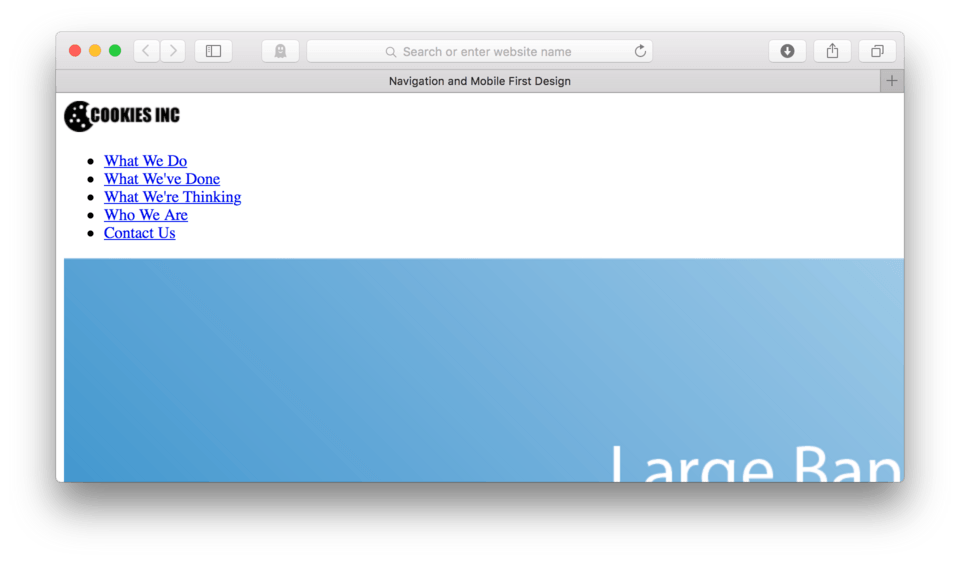
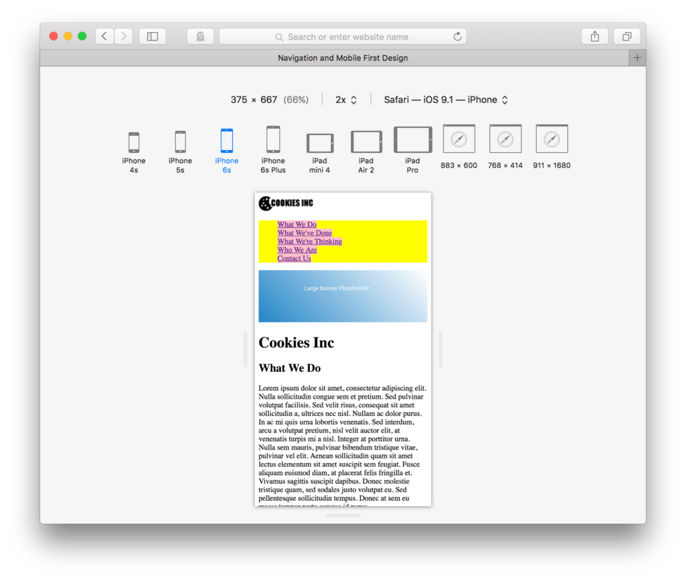
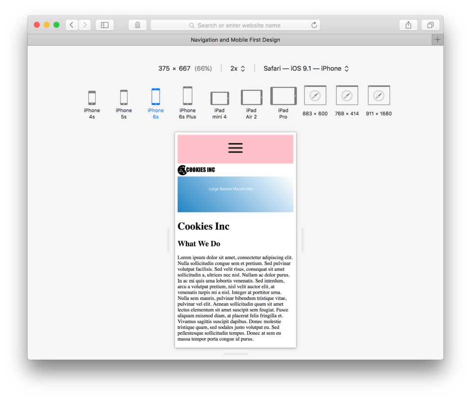
Here’s how it should look like in the browser. (fig. 1)
You’ll notice that the large banner image is actually very large and to see it all we need to scroll to the right. This is on purpose, and later we’ll learn how best to handle this huge image.
You’ll also notice I’m using fake body text (we call that lorem ipsum) for the paragraphs. It does a nice job of looking like body text as it adds words of different lengths, spaces, and punctuation to approximate what a paragraph of text would look like.
We’re dealing with a ton of content this time. Lots of different possibilities for CSS styling.
Building Navigation with a UL
To make this long scrolling site easier to read and navigate we’re going to create navigation. Taking a look at our content, it looks like it would make the most sense to use our h2s as the major links for our navigation:
- What We Do
- What We’ve Done
- What We Are Thinking
- Who We Are
- Contact Us
Just about every website creates their primary site navigation using an unordered list of links and we are no exception.
First, we’ll need to determine the best place to put our navigation. Looking at our site and using what we know about other websites out there, the navigation can appear above or below the logo. Most often we see it below it, so let’s also place ours below.
- After the
<img />tag with the logo, hit Enter - To begin your unordered list type
<ul>and hit Enter - Hit Tab and begin your first list item and type
<li> - Our first h2 is “What We Do”, we need to create a link where that phrase becomes our link text. Type:
<a href=" ">What We Do</a>(Leave thehref=attribute just a single blank space for now). - Close the list item
</li>and hit Enter - Create a new list item with a link for “What We’ve Done”:
<li><a href=" ">What We've Done</a></li>and hit Enter - Repeat for “What We’re Thinking”, “Who We Are”, and “Contact Us”. Make sure to create a new list item and link for each one.
- Move to a new line and close the unordered list:
</ul> - Save and Refresh in the browser
Here’s my HTML so far:
...

<img src="images/logo.png" />

<ul>
	<li><a href=" ">What We Do</a></li>
	<li><a href=" ">What We've Done</a></li>
	<li><a href=" ">What We're Thinking</a></li>
	<li><a href=" ">Who We Are</a></li>
	<li><a href=" ">Contact Us</a></li>
</ul>

<img src="images/banner.png" />

<h1>Cookies Inc</h1>

...
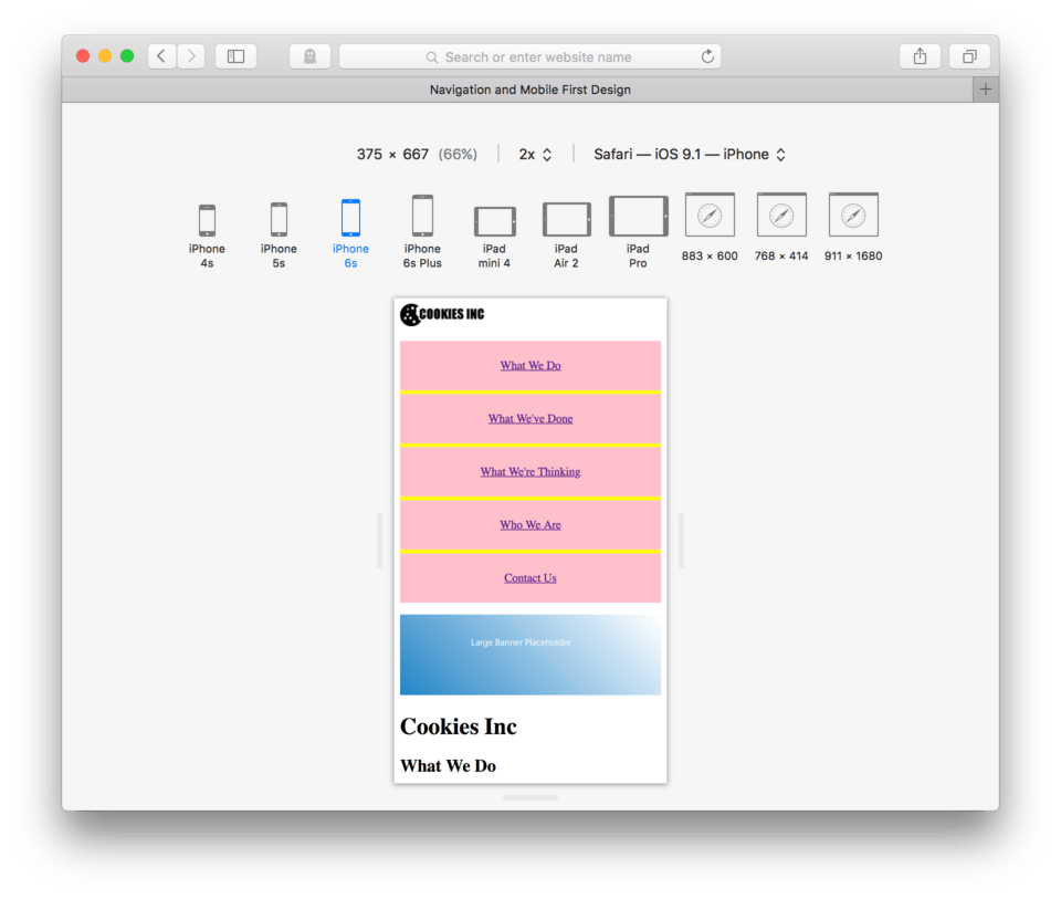
And here’s how it should look in the browser. (fig. 2)
We have combined two HTML elements that we’ve previously learned to create this navigation. We used an unordered list to organize our 5 primary page links and we’ve used our link element to create buttons to click that will eventually move us to the correct place on the page. This is the basic structure of every navigation you will likely ever write. Coding it this way gives us lots of control when we move to styling using CSS.
Anchored Links
We discussed creating many different kinds of links a few lessons back. I deliberately skipped one as I wanted to wait until we had a practice site with enough content to demonstrate just how handy anchored links can be.
Anchored links allow us to create buttons that send us to any bit of content we want in a page. We can “anchor” our navigational link to another element in the page, creating that connection and helping our user to find the content they need more quickly.
Setting the Anchor
To use an anchored link, we must establish a connection between our <a> and the element we need to link to. This will involve learning a new attribute, the id= attribute. This attribute is used to name (or identify) an element. Inside the double quotation marks, we can use any word we want, as long as it is unique (and I’d recommend descriptive) to the element it’s naming.
Note: Anchor names work best without spaces in them. So, if you’d like to use an anchor name like “My Anchor” consider using a hyphen instead of a space like “My-Anchor”.
So, let’s go ahead and add our id= attribute to our first h2. The attribute goes inside the opening tag, just like all our other attributes. Let’s use “Do” as the name for our h2. It’s short and sweet and descriptive to what that particular element is.
- Locate the first h2 tag in your HTML
- Type:
id="Do"after theh2but before the>
It should now look like this:
<h2 id="Do">What We Do</h2>
That is the first part. We have just dropped the anchor. Now we have to connect the link. To do this we have to go back up to the link we created in the navigation and enter the address in our href= attribute. The address for an anchored link that exists in the same page is very simple. You use a # and then call it by name. The # indicates we are looking for an id= attribute and the name tells the browser which one specifically.
- Locate the “What We Do” link in the navigation we created earlier.
- Between the double quotation marks where we had only a space, Delete the space and type
#Do - Save and Refresh
My navigation HTML now looks like this:
<ul>
	<li><a href="#Do">What We Do</a></li>
	<li><a href=" ">What We've Done</a></li>
	<li><a href=" ">What We're Thinking</a></li>
	<li><a href=" ">Who We Are</a></li>
	<li><a href=" ">Contact Us</a></li>
</ul>
Ok, now let’s see if it works in our browser. Make sure you have refreshed.
Now go ahead and click “What We Do” from our unordered list navigation. If things are working correctly, your page should have snapped the “What We Do” section to the top of the window. (fig. 3)
Let’s do the same for the other h2 elements in our page. For each one we’ll need to add an id= attribute.
- Add
id="Done"to<h2>What We've Done</h2> - Add
id="Think"to<h2>What We're Thinking</h2> - Add
id="Who"to<h2>Who We Are</h2> - Add
id="Contact"to<h2>Contact Us</h2> - Save and Refresh
Ok good. We’ve set the anchors. Now, let’s go add addresses to the rest of our navigation. Remember to Delete the space and replace it instead with a # and the id name we gave each h2 element.
Here’s my current HTML with the updated links:
<ul>
	<li><a href="#Do">What We Do</a></li>
	<li><a href="#Done">What We've Done</a></li>
	<li><a href="#Think">What We're Thinking</a></li>
	<li><a href="#Who">Who We Are</a></li>
	<li><a href="#Contact">Contact Us</a></li>
</ul>
Go ahead and try out each one in your browser. Each should move the element with matching id name to the top. There might be one exception however, the Contact Us may not move all the way up, depending on how wide you have your browser pulled open.
Here’s how they look in my browser. (fig. 4)
See how Contact Us is only a little above halfway up the page rather than at the very top? This happens because the browser doesn’t have enough content below the anchor to scroll up any higher. Essentially we ran out of window. If we were to make our browser window narrower we could get it all the way up, but remember we can never predict exactly what our end users will be doing. So, we just do our best and let the browser help us. (fig. 5) shows what happens when I narrow my window as much as Safari allows. You can see that Contact Us now hits the top.
Other Types of Anchored Links
You might be wondering if you can link to an anchor on another page of your website. You can. You can link to any element with an id= attribute assigned to it. If that element is not in the same page as your link, you need to add the address of the page to the beginning of that link.
So, if our link is in our home.html file and our anchor is on our services.html file, in order to link to it we would need to say, <a href="services.html#name"> to make that happen. This would tell the browser to go look in our root folder for our neighbor, services.html, then scan that file for an id="name" and snap that to the top (or as close to the top as you can get it).
Styling For Mobile
We encounter websites every day on a variety of different devices. In any given day I may be using any one of my five personal devices to be viewing the same webpage at various times in the day depending on the situation. This is true for many of our users, they all have lots of different devices that all have different size screens and different number of pixels.
Because we can’t plan for the exact screen size (or even a reasonable range) that our website will be viewed in, we need to make sure we design it so that it looks good and more importantly, is functional, at any screen size or resolution. There are lots of ideas and strategies that you may have heard about how to go about doing this, but I like to use a mobile first approach and combine it with responsive web design.
Mobile First Approach
The premise of mobile first is to design for the smallest screen size that is reasonable (say the average iPhone 5 at the time of this writing) first. This is a concept that a very smart guy named Luke Wroblewski thought up a few years back. Luke taught us that we should prioritize the smallest screens first, concerning ourselves with content and functionality over the bells and whistles that the bigger screens offer but don’t really add to the actual web content.
He wrote a whole book on the subject if you are interested in learning about the tiny details more specifically.
Responsive Design Mode
In order to work properly on our mobile first design, we’ll need to change our browser settings so we can easily preview our site using the correct dimensions for a small mobile device. Both Safari and Firefox make this very easy in their more recent versions. I will be using Safari, but either will do and Firefox is available for free for either Mac or PC.
To find this mode in Safari:
- From the top menu, Safari > Preferences
- Click the Advanced Tab
- Check the box at the bottom Show Develop in Menu Bar
- Close the preferences panel
- Now, you should see Develop in the top menu
- Choose Enter Responsive Design Mode from the dropdown menu
- Select iPhone 6 from the top options
Note: If you use Firefox, you can find the Responsive Design Mode under the Tools > Web Developer > Responsive Design View menu. No preferences should need to be changed.
Here’s what my browser looks like in responsive design mode. (fig. 6)
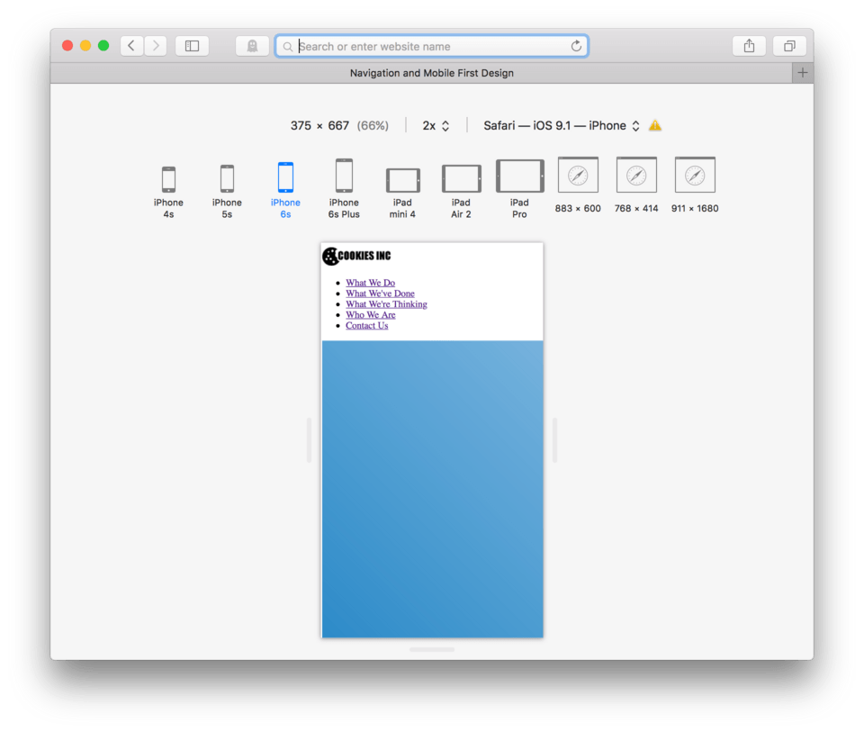
As you’ll notice, you can select from many common devices and screen sizes. It’s really nice because you can switch between them as well. I’m going to use the iPhone 6 setting as my goal for the small screen design.
Dealing with Images
Now that you are all setup using Safari or Firefox using the new “Responsive Design Mode/View” you are probably thinking, wow that banner image is huge. You’re right, that is our first order of business.
There are many techniques out there for handling images, some more technologically advanced than others. The approach I’m about to use to deal with large images is a middle-of-the road approach. If you remember back a few lessons, I explained about high resolution displays and the image resolution needs they demand? This is a case where we will do our very best to create the best experience for the most number of people, as there is no perfect solution for everyone.
The best part of this approach is that it is very simple. We can use our CSS to tell all images in our page that the largest they can ever be is 100% of the available width. Essentially, we tell images that they are free to be full size if they fit, and if they don’t, they will automatically scale themselves. It doesn’t matter the screen size or if it is ever changing, the image will take on an elastic personality.
- Locate your CSS file
- We need to talk to the images directly, so we need to use
img {as our CSS selector. Go ahead and type that in and hit Enter - The property we’ll use in this case is
max-width:. This is what lets the image know how much of the available space it can take up. - If we want to allow it to take up 100% of the screen, we can type:
100%;as the value and hit Enter - Close the block, type
} - Save and Refresh
Here’s my CSS:
img {
	max-width: 100%;
}
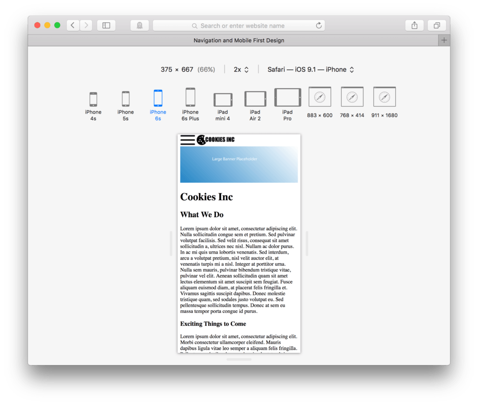
and here’s how it now looks in my browser. (fig. 7)
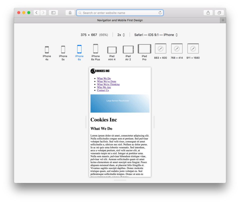
You can see that our banner image now looks much better. No matter which device we select from the top menu, it will still fit on the page. Images with max-width: 100%; applied to them will continue to grow with the browser until they are as large as they are, essentially they grow until they run out of resolution.
This magic img { max-width: 100%; } is absolutely essential when designing for mobile devices. It should become part of your workflow, I’d recommend adding it to your CSS boilerplate so you remember to use it every time you begin a new site.
Dealing With Text
The really great thing about text elements in HTML is that they pretty much handle themselves in mobile. Text is already ‘responsive’ – the word we use to describe elements that change based on the width of the browser or device screen.
Since text already expands and contracts based on available width, there is no fanciness we need to do to make it work. Of course, we can still style it to match our desired theme, but there is nothing that needs to be done to have it entirely functional on the small screen, the primary goal of mobile first design. If you scroll your page a bit you’ll see what I mean. No matter which device, the text is still perfectly legible as you can see in (fig. 8).
Styling our Navigation
Mobile design has a different set of challenges from large screen design. The idea of using a finger or thumb to navigate rather than a mouse presents a range of issues that we need to consider. The first and foremost consideration is that a finger is much bigger and much less precise than the mouse cursor.
If we were to keep our links as small and as close together as they appear now, it would near impossible for a user to hit the correct link. This would cause frustration and lots of errors. It’s our job to make our site is as functional and usable as possible, so our first order of business is to make the links easily accessed by even the biggest and clumsiest of thumbs.
Removing the Bullets
Unordered lists use bullets to indicate each of the list items. This is great in some cases, but for navigation this just gets in the way. We are about to use CSS to remove them.
- Locate your CSS file
- Bullets belong to the parent element (the ul) rather than the individual list items. This means that to remove them, I want to use:
ul {as my selector. - The property we need to use to remove them is
list-style: - The value to remove the bullets is
none; - Hit Enter and close the block with
} - Save and Refresh
Here’s my CSS:
img {
	max-width: 100%;
}

ul {
	list-style: none;
}
and here’s how it looks in the browser: (fig. 9)

The bullets are now gone from our list. Checkmark.
Creating Larger Buttons (Hit Points)
In any link, the spot where a user needs to click (or touch) to activate the link is called the hit point or hit target. In a text link like the one we currently have, the hit point is just the text. The user needs to click directly on the text to use the link. This normally isn’t a problem when a user has a mouse, but when they are using fingers to navigate a touch device, they typically need a much bigger hit target to be accurate.
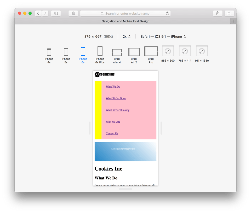
In order to more clearly see the anatomy of our navigation, let’s go ahead and add background colors to each of the elements involved.
- Add a
background-color: yellow;to theul - Add a
background-color: orangeto theli - Add a
background-color: pinkto thea
Your CSS should now look like this:
img {
	max-width: 100%;
}

ul {
	list-style: none;
	background-color: yellow;
}

li {
	background-color: orange;
}

a {
	background-color: pink;
}
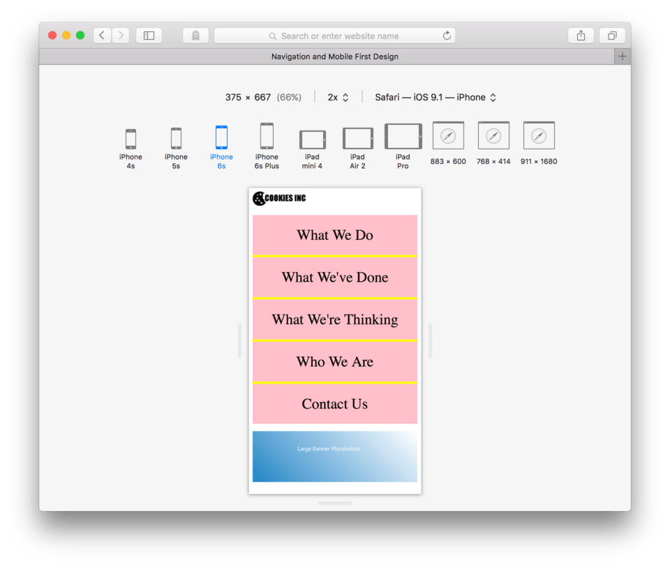
and your browser should now look like this: (fig. 10)
We can now clearly see the different parts of the list structure. Where we used to have bullets, we can still see the yellow of the unordered list peeking though. Each list item is tightly stacked to form a solid orange rectangle, so we know that both the unordered list and the list items are block-level as they are taking up the full width.
It might be hard to see the unordered list, but if you delete the background color on the list items, you’ll see it’s there, just behind the orange. (fig. 11) We do see, however that the links are inline elements as the pink tightly wraps just the text. This is essentially our hit target at this point.
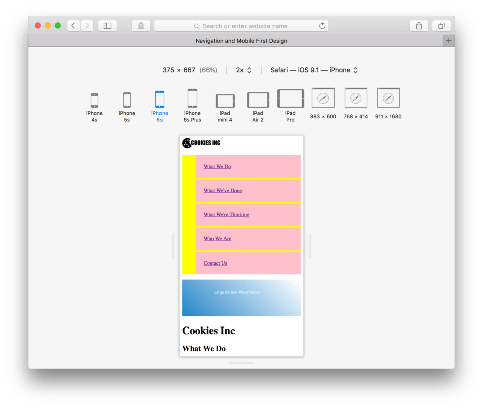
To increase the hit target on a text link in this case, we need to do two things. First we need to promote our link from an inline element to a block-level element. This will expand our pink, (our hit target) to the full width of the screen. It will also allow us to put padding on our link as inline elements aren’t important enough for the browser to acknowledge a request like padding.
- We’ll use
a {for our selector to address the link directly - To promote the link from inline to block, we’ll use the property
display: - The value we would use in this case is
block; - To add padding, we use the property
padding:. - Let’s try
25px;for our value to start. - Close the block:
} - Save and Refresh
Here’s my new CSS for my link:
a {
	background-color: pink;
	display: block;
	padding: 25px;
}
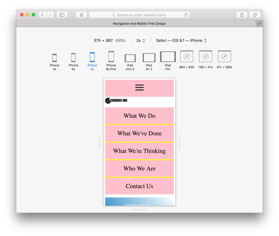
and here’s how it looks in the browser. (fig. 12)
If you hover over the pink portion of our navigation, you’ll see that the hit targets are now much bigger and they do indeed span the entirety of the pink area. This is a good start, but we now have two new problems to solve. The first is that the links touch one another so we cannot tell where one link stops and the next starts, and the second is that we need to get rid of the yellow unordered list stripe that is appearing on the left side of our navigation.
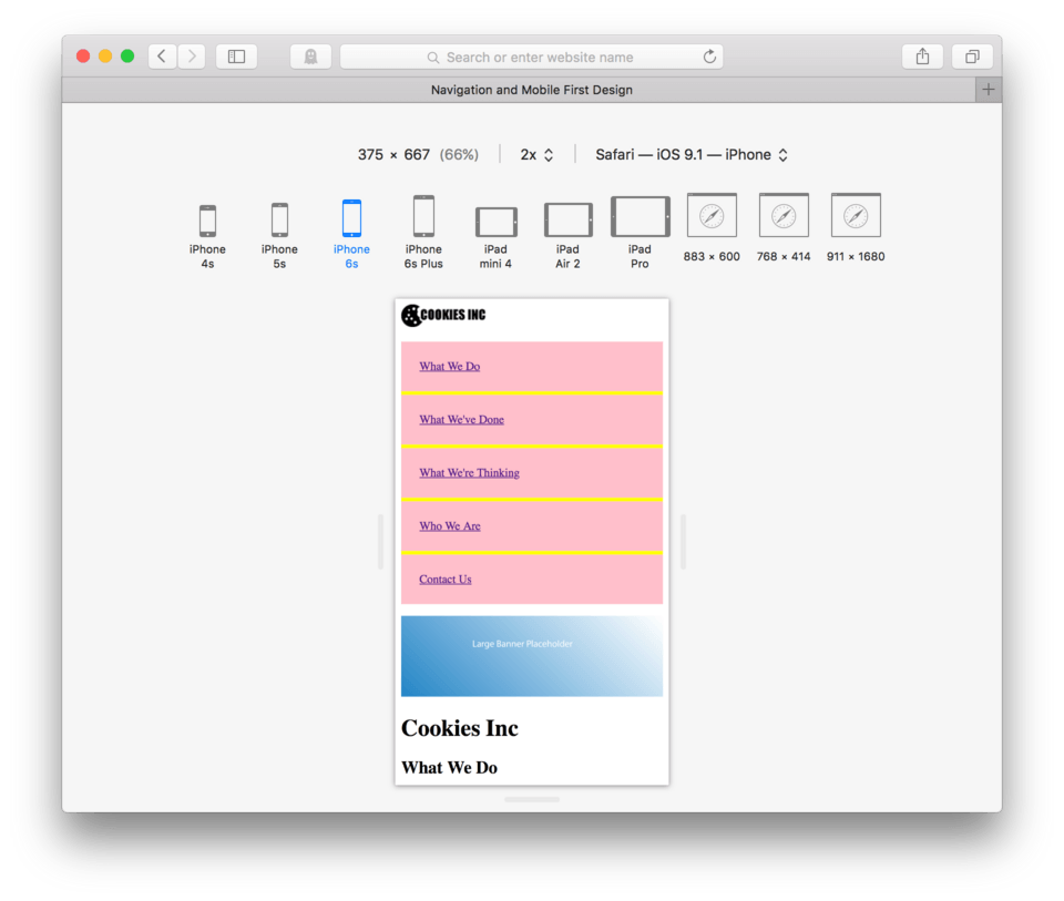
Creating Separation Between Links
If we remember our box model, we know that the best way to move objects apart, or rather to create space around element, is to use margin. Margin will allow us to separate our links with an invisible barrier. Since we only will need to have the margin between the links which stack vertically, we only need to add the margin to the bottom of each of our links.
- Add
margin-bottom: 5px;to your link CSS and hit Enter - Close the CSS block,
} - Save and Refresh
Here’s my CSS:
a {
	background-color: pink;
	display: block;
	padding: 25px;
	margin-bottom: 5px;
}
and here’s how it looks in the browser. (fig. 13)
That did work to create visual separation and actual separation between our links. We can also now see that the unordered list (our yellow background) does expand the full width of our screen proving that the unordered list is indeed a block-level element.
Removing the Leftover UL
Now to take care of the extra yellow leftover on the left side of our navigation. We’ve determined this yellow belongs to our unordered list element. To do this we need to know that this extra space is being created by a default padding on the left side of our ul. To remove it we simply need to set the padding-left of our ul to 0;.
The CSS looks like this:
ul {
	list-style: none;
	background-color: yellow;
	padding-left: 0;
}
and here’s how it looks in the browser. (fig. 14)
As you can see, our big yellow rectangle is gone, however the space created by the margin we just put on our links allows the yellow of the unordered list to show. In many cases, it is nice to choose a color, if you would prefer to change the yellow to another color, you simply change the background-color: of the ul to whatever you like. By deleting the background-color: property and it’s value, the space between the links will be whatever the background of the body element is instead.
Centering the Link Text
To make this look a little more polished, let’s begin styling the text. First off I’d like to center the text inside the link. To to this, I can add the property text-align: to my link CSS and the value center;. We can center any text inside a block-level element this way. You simply tell the block-level element: text-align: center; in the CSS for your link, a {.
Here’s the CSS:
a {
	background-color: pink;
	display: block;
	padding: 25px;
	margin-bottom: 5px;
	text-align: center;
}
and here’s how it looks in my browser. (fig. 15)
Removing the Underline
To remove the underline, we can use the property we learned a few lessons back for links: text-decoration: with the value: none;.
Add text-decoration: none; to your link CSS, a {
Here’s the CSS:
a {
	background-color: pink;
	display: block;
	padding: 25px;
	margin-bottom: 5px;
	text-align: center;
	text-decoration: none;
}
and here’s how it looks in my browser. (fig. 16)

Editing Link Color and Size
We also learned a while back how to change the color of any text element and a link is no different. To change the color of our link text, we can use the property: color: with and color value we like.
Let’s change our link text to black by adding color: black; to our link CSS.
While we’re here, let’s also make the text larger. Let’s increase our font-size: property to a value of 2em;.
Here’s the CSS:
a {
	background-color: pink;
	display: block;
	padding: 25px;
	margin-bottom: 5px;
	text-align: center;
	text-decoration: none;
	color: black;
	font-size: 2em;
}
and here’s how it looks in my browser. (fig. 17)
Appropriate Mobile Navigation Location
So now that we’ve made a much more mobile-friendly navigation for our mobile user in terms of hit targets, we now need to think a bit more about functionality from a larger site perspective. In a website design for the large screen it often makes sense to have the navigation at the very top. Users expect this, but on a mobile site, having the navigation at the top, at least in the form we have it now, is creating a huge barrier for our user in terms of actually looking at the site content. We are using up most of the screen with navigation and that isn’t good for usability. Some mobile users actually prefer scrolling to find content over using site navigation as scrolling is actually much faster and easier on a mobile device than on a larger screen like a computer or laptop.
The Hamburger Button
We encounter mobile and mobile-friendly websites all the time. For a while, the web design world wasn’t so sure how to deal with navigation, but more recently it’s become natural to both designers and users to use a small icon in the top corner to indicate navigation. This icon is usually a square made of three lines. (fig. 18) In the business we lovingly refer to it as the hamburger button (because it looks like a hamburger).

When a user touches the hamburger button they are presented with site navigation. The actual set of navigation links is usually hidden from view until it’s initiated by the user. There are many very fancy ways of hiding our navigation from our users and bringing it up when they ask, but almost all of them require knowing a special programming language called javascript. Later on we’ll learn a little about this, but for now I’m going to show you a perfectly acceptable way to accomplish this using only HTML and CSS.
Let’s go ahead and add our hamburger button. You should already have this as an image available in your images folder. It’s called “hamburger.png”.
- Locate your HTML file
- Even before the logo, add an image link using the hamburger.png as your link image. For the address just leave a blank space for now between the double quotes.
<a href=" "><img src="images/hamburger.png"/></a> - Save and Refresh
Here’s the HTML:
<a href=" "><img src="images/hamburger.png"/></a>
<img src="images/logo.png" />

...
and here’s how it looks in my browser. (fig. 19)
So, we’ve successfully added our hamburger button. You might be wondering why it is pink and spanning the full screen width, you might not have expected that from an image link. You need to remember that CSS can’t read your mind, it can only take orders. In your CSS you used the selector a {. This told the browser all links. The image link is no exception and now that we’re talking about this, neither is your “mailto” link below. Scroll down, take a look. (fig. 20)
CSS remember stands for Cascading Style Sheets. The cascade is exactly what is happening here. The style applied to any applicable element unless we do something special to stop it. I’ll come back to this, but for not I want to keep working on plugging in our navigation.
Relocating the Navigation
We are going to move our unordered list that contains our site navigation to the very bottom of the page, right before we close our body tag. This will keep it out of our way (and our users way) until they need it. When they need it, they can bring it up to the top by clicking our brand new hamburger button. The great thing is we already learned how to do this using anchored links.
- Highlight the entire unordered list from
<ul>through</ul>to make sure you have the whole thing. - Edit > Cut
- Move your cursor to the bottom of your code, just before the
</body>tag. - Edit > Paste to past the unordered list.
- Save and Refresh
Here’s how the end of your HTML should look:
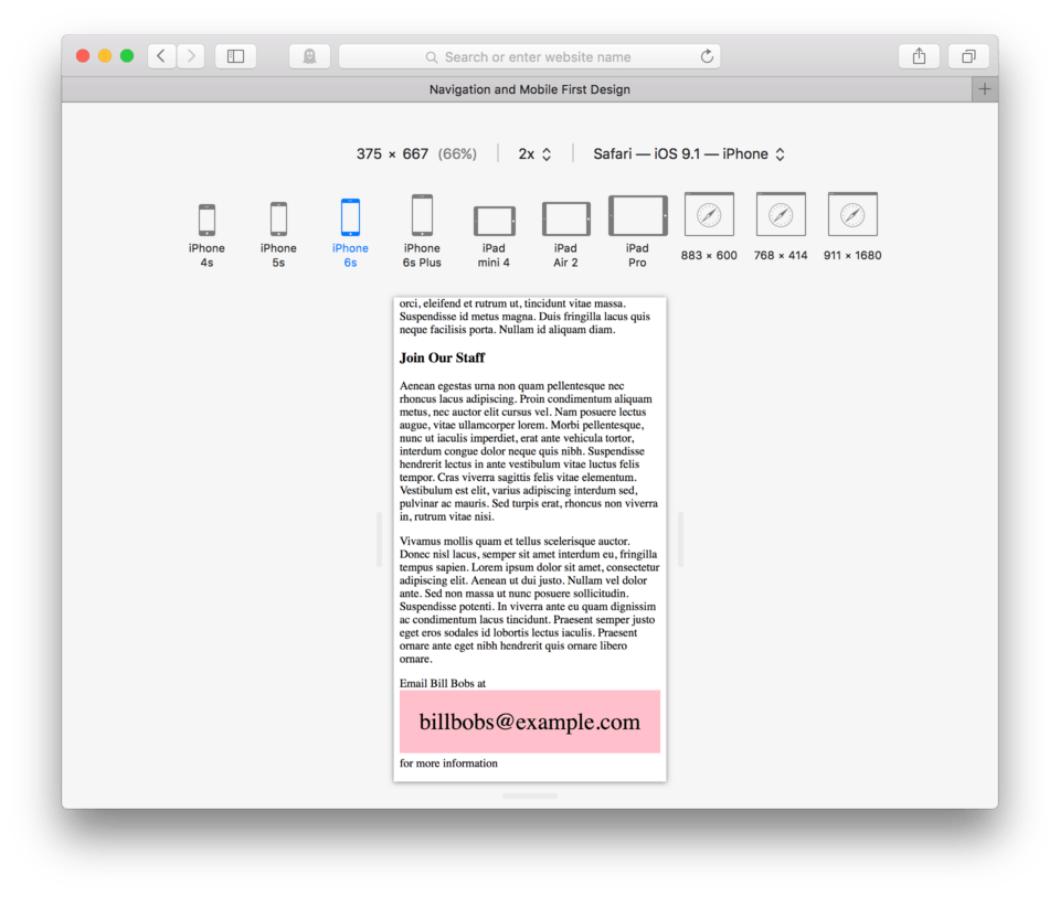
		...

		<p>Email Bill Bobs at <a href="mailto:billbobs@example.com">billbobs@example.com</a> for more information</p>

		<ul>
			<li><a href="#Do">What We Do</a></li>
			<li><a href="#Done">What We've Done</a></li>
			<li><a href="#Think">What We're Thinking</a></li>
			<li><a href="#Who">Who We Are</a></li>
			<li><a href="#Contact">Contact Us</a></li>
		</ul>
	</body>

</html>
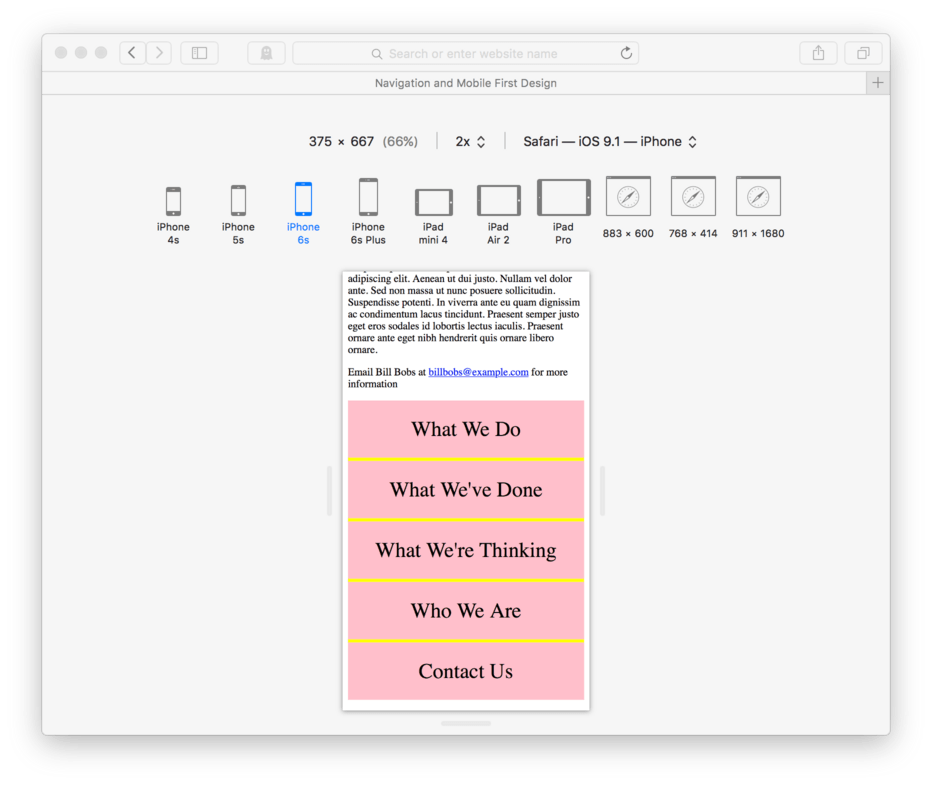
We see that the top of our page no longer has a navigation. It now only has the hamburger button viewable. (fig. 21)
If we scroll to the bottom of our page, we can see the navigation has found it’s new home after our mailto link. (fig. 22)
Great, we’re almost done. We just need to setup our anchor and our address. To set the anchor we need to give our navigation an id attribute, id=. Let’s name our list mobilenav.
- Add
id="mobilenav"to the opening<ul>tag. - Now, to set the address up in our hamburger button link, we’ll need to replace the space with
#mobilenav - Save and Refresh
The HTML on my navigation ul looks like this:
<ul id="mobilenav">
	<li><a href="#Do">What We Do</a></li>
	<li><a href="#Done">What We've Done</a></li>
	<li><a href="#Think">What We're Thinking</a></li>
	<li><a href="#Who">Who We Are</a></li>
	<li><a href="#Contact">Contact Us</a></li>
</ul>
The HTML on my hamburger button link looks like this:
<a href="#mobilenav"><img src="images/hamburger.png"/></a>
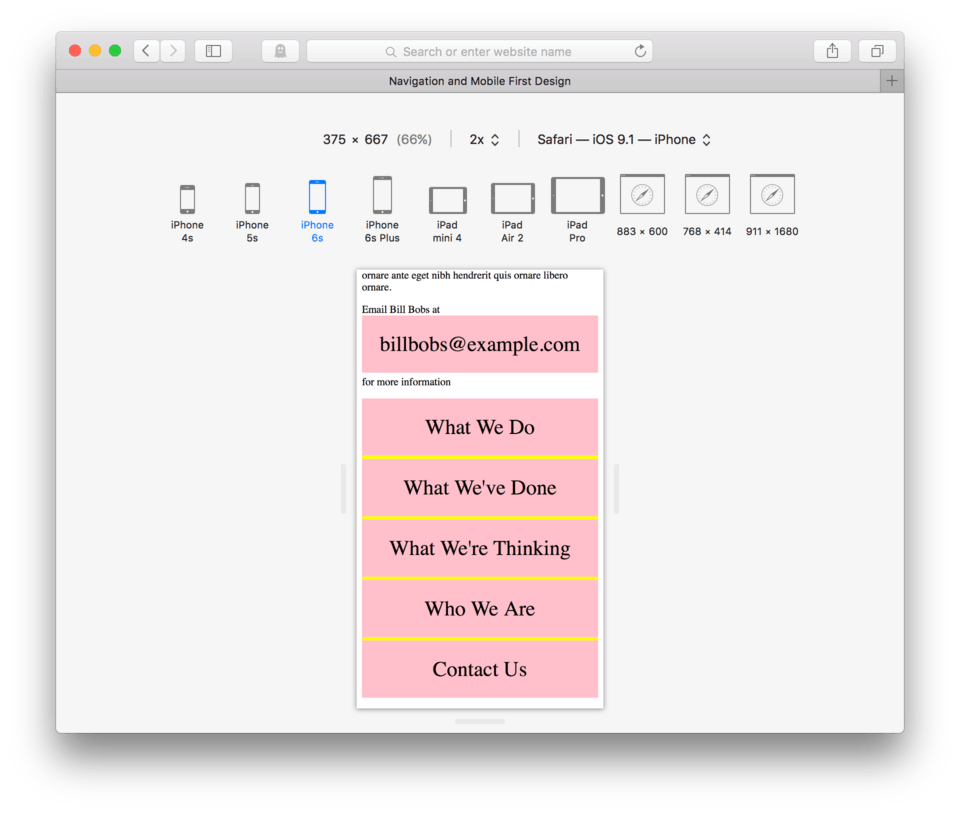
Now, when we visit our site in our browser and refresh. We can click our hamburger button and our navigation should come into view. We can now navigate to any section of our site from our new navigation structure. (fig. 23)
Differentiating Navigation Links From Other Links
Now, our last task is to work on our CSS a bit so that our other site links like the hamburger button or the mailto link do not follow the same commands as our navigation. The easiest way to do this is using more specific selectors. Instead of saying simply all links, we can say all links inside of an unordered list. This would eliminate the hamburger button image link and the mailto link because they do not live inside an unordered list parent.
To change our selection from links, to links inside of unordered lists, we need to change our selector from a { to ul a {. Adding the ul and a space to the a tells the browser that it is to look for the first element in the list first, so in this case, and unordered list. The space says, now look for this element nested inside the first. So again, in our case, it will look for links that live inside of unordered lists. Let’s test this out.
- Change your
a {toul a { - Save and Refresh
Here’s my new link CSS:
ul a {
	background-color: pink;
	display: block;
	padding: 25px;
	margin-bottom: 5px;
	text-align: center;
	text-decoration: none;
	color: black;
	font-size: 2em;
}
and here’s how the top of my page looks in the browser (fig. 24)
and here’s how the bottom of my page looks in the browser (fig. 25)
In both cases our links that aren’t part of an unordered list return to their default states. These more specific selectors are very useful and we’ll begin using them more and more in upcoming lessons. The CSS term to remember is specificity.
Lesson Conclusion
We covered a ton of stuff in this lesson. In fact, we actually made a nearly complete mobile website. It’s fully functional on any size screen but prioritized for the small screen. That’s way cool, good job.
We learned about dealing with large images and text in a small screen environment. We learned how to create a navigation using an unordered list to organize our list items and then how to style and design that navigation to work well for our mobile users. We leaned about anchored links to navigation within a page and for use in hamburger button style mobile navigation.
Lastly we tiptoed just a bit into using more specific selectors, or specificity, in our CSS to identify only certain elements of the same type.
Next up, we will learn how to better organize our content for more control.