Box Model
Overview
Last lesson we starting working on styling our HTML content using CSS. We got our feet wet learning how to use HTML elements as CSS selectors and using certain pairs of properties (color:, line-height:, font-size:, background:, and font-family:) and values (things like colors and sizes). In this lesson, we’ll continue working on using CSS to control our page presentation, but we’ll be focusing on spatial properties, or maybe better put, the anatomy of an HTML element as CSS sees it. We’ll look at controlling the space inside and around each element and how different CSS declarations work to control them.
Lesson Setup
Let’s get started. Like usual, we need to create our lesson folder structure, our initial HTML file and connect it up with a new stylesheet.
Folder Setup
- Create a new Lesson07 folder inside of Bob
- Create two subfolders: notes and root
- Inside the root folder, create a css folder
HTML Setup
- Open up TextMate
- File > New to open a new file
- Code in your boilerplate HTML making sure to add a title to the page. I’m calling mine: The Box Model.
- Save your HTML file to your Lesson07 root folder with the name: lesson07.html
- Open and Preview your page in the browser, checking to make sure your page title is appearing correctly.
CSS Setup
Now, let’s create a new stylesheet for our HTML document.
- Open up TextMate
- File > New to open a new file
- File > Save
- Navigate to the “css” folder you created
- Name your file, style.css
- Hit Save
- Attach this stylesheet to our HTML page. Type:
<link href="css/style.css rel="stylesheet" />into the head section of our lesson07.html file. - File > Save the HTML file
Go ahead and double-check your work against mine. Your HTML should now look like this:
<!doctype html>
<html>

	<head>
		<title>The Box Model</title>
		<link href="css/style.css" rel="stylesheet" />
	</head>

	<body>

	</body>

</html>
Note: You may have noticed that I’ve shortened the lesson setup to a list of action steps above. If you need a refresher on folder and file organization see the lesson 3 setup section.
Let’s test to make sure our pages connected correctly.
- Navigate back to your new CSS file.
- Let’s change the background color of the body element. Type:
body {on an open line and hit Enter - Now, type the property we want to change:
background-color: - Type:
pink;and hit Enter - Close the CSS block, type:
} - Save this file and Refresh the browser
If your background turned pink, then you are set. Everything is working correctly. You can go ahead and delete that CSS block, so we can start fresh.
Understanding the Box Model
Let’s move back to our HTML document and work on adding some content.
- Add an h1 to your HTML. Let’s just type:
<h1>This is an h1</h1>and hit Enter - Let’s add a paragraph, type:
<p>This is a paragraph</p> - Save and Refresh
Here’s my HTML:
<h1>This is an h1</h1>
<p>This is a paragraph</p>
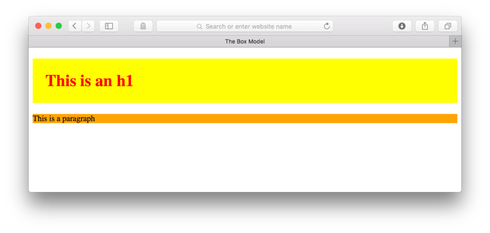
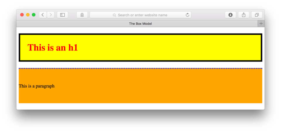
Your site should now look something like this: (fig. 1)
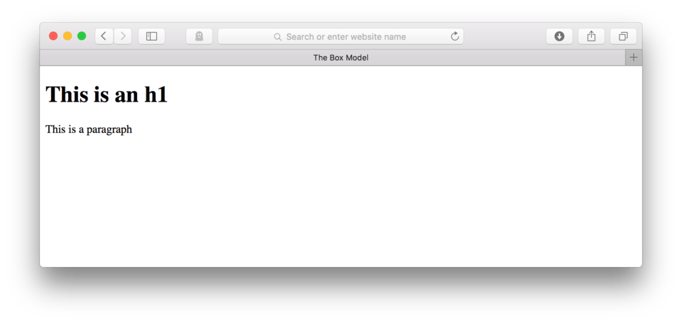
By now, we are pretty familiar with the HTML stuff and could probably have predicted how this would look, but it never hurts to make sure.
Ok, now let’s start our styling.
- Locate your CSS file and type:
h1 {to select the h1 as the element to be styled - Let’s change the text color, type:
color: red; - Ok, now to close the block, hit Enter and type:
} - Save and Refresh
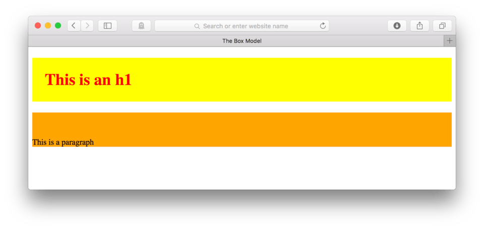
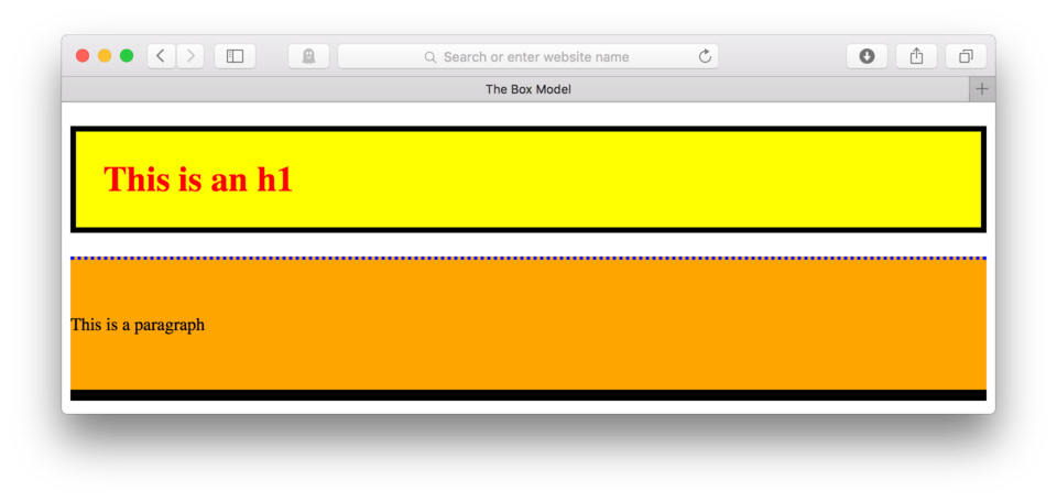
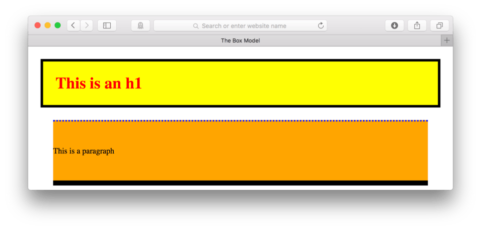
Here’s my CSS:
h1 {
	color: red;
}
and here’s how it looks in the browser. (fig. 2)
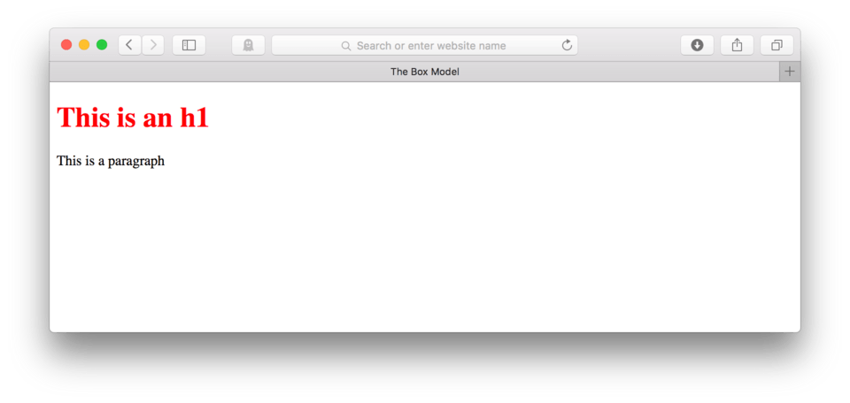
This is a bit of a review from the last lesson. We see that we can easily change the text color using a simple CSS property and a color value of our choice.
To understand the box model, we need to know that browsers see everything as a box. Each HTML element is, to the browser at least, a box that has certain physical characteristics: it has a width, a height, space around it, space inside of it, some content, and sometimes a border.
Using CSS, we have a special set of properties that can control each of these things, but we before we can start learning how to control them, we first must try to understand them. This is particularly important with the box model stuff as these changes can effect some of the other elements around them.
Okay, now let’s explore a little more about this whole box model thing using our CSS file. In order to do that, let’s add a background color to the h1.
- Find you CSS file
- After your color declaration but before you end the block, hit Enter to make room for a new property.
- Just like when we changed the background color of the body, we can change the background color of any HTML element, so we can type:
background-color: yellow; - Save and Refresh in your browser
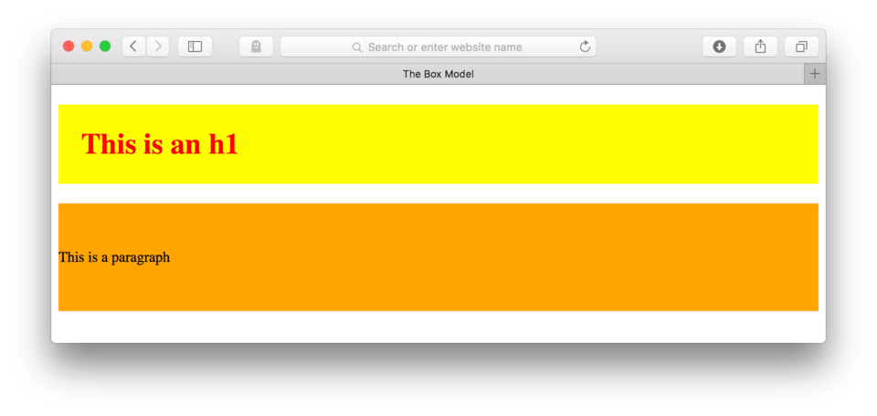
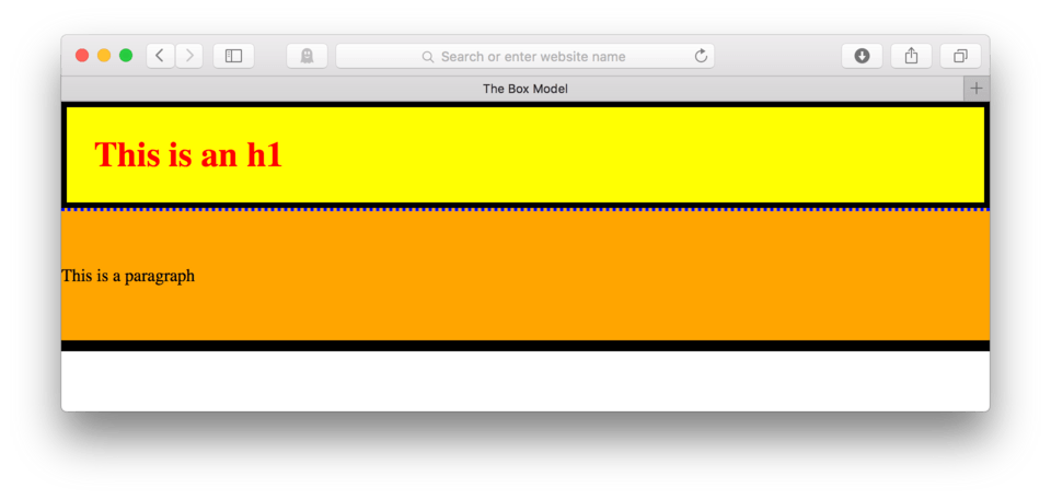
Here’s my CSS:
h1 {
	color: red;
	background-color: yellow;
}
and here’s how it looks in the browser. (fig. 3)
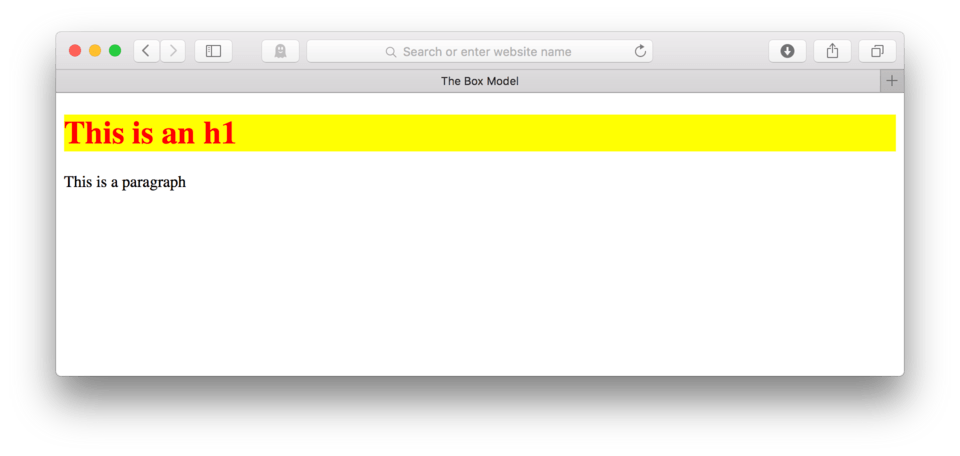
Remember back in an earlier lesson when we talked about block-level vs. inline elements and their behaviors? See how the yellow spans nearly the whole width of the browser? That is because an h1 is a block-level element. We can now see that the element does actually span the width, it just took adding a color to help visualize it. This yellow helps us see what the browser sees when we use an h1 element. It sees a box, represented by the yellow, that has content inside (the text).
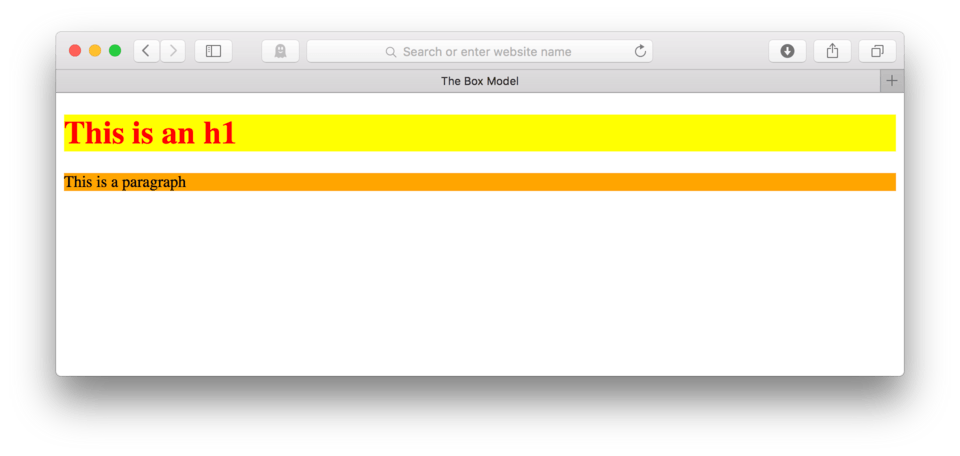
Let’s make the paragraph background orange. Go ahead and try this one on your own.
When you are finished, you can check your work against mine.
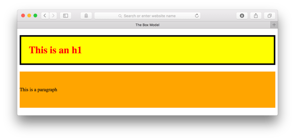
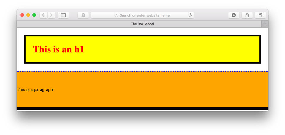
Here’s my CSS:
h1 {
	color: red;
	background-color: yellow;
}

p {
	background-color: orange;
}
and here’s what it looks like when I refresh the browser. (fig. 4)
Box Model Properties
Okay, so now that we know that the browser sees everything in a box, and we’ve been able to prove that block-level boxes are full width of our screen, now we can now look at the other characteristics of the box.
Padding
Padding is the CSS property that controls the space inside the box, but around the content. I’ll try and explain this a little bit better, but I think it would help if first, we worked on the CSS to see what I mean.
- Let’s add a property to your
h1 {. After the line that changes the background color, hit Enter to move to the next line - Now, type:
padding:as the property - Padding, like font-size, is a measurement that can use various units. For now, let’s stick with pixels. For the value, type:
25px; - Save and Refresh your browser
Here’s my CSS:
h1 {
	color: red;
	background-color: yellow;
	padding: 25px;
}
and here’s how it looks in the browser. (fig. 5)
See how the yellow expanded? That is the padding, it is essentially the space around the content, but inside the box. Adding padding the way we did, put an extra 25 pixels of yellow box on all four sides of our content.
Let’s add some padding to our paragraph. This time, let’s only add padding to the top.
- Inside your CSS for your paragraph, hit Enter to make some space
- Type:
padding-top: 50px; - Save and Refresh
Here’s my CSS:
h1 {
	color: red;
	background-color: yellow;
	padding: 25px;
}

p {
	background-color: orange;
	padding-top: 50px;
}
and here’s how it looks in the browser. (fig. 6)
See that? We can add padding to any side of our content by specifying it in the property. We used padding-top: to add it just to the top, but we could have said: padding-left:, padding-right:, or padding-bottom: to have added it to any other side.
If we want to add padding to both the top and the bottom, we can write a second CSS line (called a declaration), like this:
p {
	background-color: orange;
	padding-top: 50px;
	padding-bottom: 50px;
}
Which would result in padding on both the top and bottom. (fig. 7)
Okay, so we have a handle on padding, let’s now talk about another box model property, the border.
Border
A border, simply put, is a line be it solid, dashed, dotted, etc. that can be used to style the outer perimeter an element.
Okay, so if our content is at the center of our box, and the padding is wrapped around the content, the border is then wrapped around the padding.
Let’s see this in practice. We’ll add a border to our h1.
- Add the property:
border:to you h1 block - The border property needs three values, one for line width, one for line type, and the third for line color. Let’s make a 5 pixel, solid, black line like this:
1px solid black; - Save your file and Refresh in your browser
The CSS looks like this:
h1 {
	color: red;
	background-color: yellow;
	padding: 25px;
	border: 5px solid black;
}
and in the browser, I’ve got this: (fig. 8)
The border we just added is that thick black line that now wraps around our padding. Just like the padding, we can specify just one side as well. Let’s try adding a border just to the top of our paragraph to test it out.
- Add the property:
border-top:to your paragraph block - Let’s make the border a 3 pixel dotted blue line, add:
3px dotted blue; - Save and Refresh
The CSS looks like this:
p {
	background-color: orange;
	padding-top: 50px;
	padding-bottom: 50px;
	border-top: 3px dotted blue;
}
and in the browser, I’ve got this: (fig. 9)
See the blue dots running across the paragraph? That’s our border. We can specify any side by using the properties: border-top:, border-left:, border-right:, or border-bottom: just like we could with the padding.
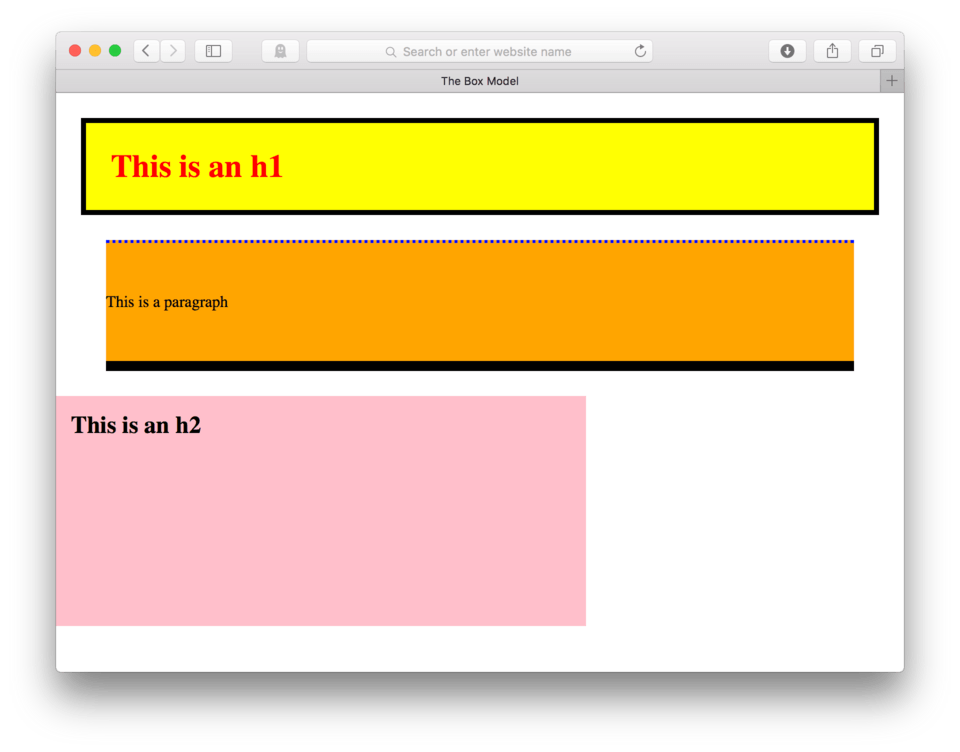
Go ahead and add a 10 pixel solid black line to the bottom of our paragraph to look like (fig. 10)
You can check your work. Here’s my current CSS:
p {
	background-color: orange;
	padding-top: 50px;
	padding-bottom: 50px;
	border-top: 3px dotted blue;
	border-bottom: 10px solid black;
}
Margin
We now have content, padding, and border working together to build our box. Let’s add the next property, margin to the mix. I like to think of the last several properties as inside the box and margin as being outside the box. Margin is the space around the outside of the metaphorical box, the invisible bubble that doesn’t allow other objects to get too close.
Every element has some margin already installed by default. If we want to get technical (and we will) margin is what is creating the white space between our h1 and our p in our page. Let’s go ahead and prove it.
CSS Margin Reset
Before setting any new margin, let’s turn off any existing default browser margin with a magic trick that will automatically remove any default margin on any of our HTML elements.
- At the beginning of your CSS, before your h1, type a new selector,
* {to say “every element in the page” - Hit Enter
- Add the property:
margin: - Add the value:
0;to turn off all margin defaults - Close the block with a
} - Save and Refresh
Here’s my current CSS:
* {
	margin: 0;
}

h1 {
	color: red;
	background-color: yellow;
	padding: 25px;
	border: 5px solid black;
}

p {
	background-color: orange;
	padding-top: 50px;
	padding-bottom: 50px;
	border-top: 3px dotted blue;
	border-bottom: 10px solid black;
}
And here’s how it looks in my browser (fig. 11)
See how the white space disappeared? Even the tiny bit of white that was on the left and right side of our h1 and p elements is gone. That is because that space was actually default margin placed on the body element. The white space between the h1 and the p was default margin placed on those elements.
This reset technique can be used on any webpage to reset any default margin on the page. Often you’ll also want to add padding: 0; to the reset as well. This way you can control all the spacing manually on your site giving you precise control over your layout.
Now that we’ve zeroed out all default margin, let’s go ahead and add some back in.
- Add the property:
margin:to your h1 - To create equal margin on all four sides, type:
25px;as the value - Save and Refresh
Here’s my CSS:
h1 {
    color: red;
    background-color: yellow;
    padding: 25px;
    border: 5px solid black;
		margin: 25px;
}
and here’s how it looks in the browser. (fig. 12)
Adding 25 pixels of margin to all four sides of our h1, added equal parts white space to the outside of that box. The 25 pixels on the top moved us town from the chrome of the browser. The 25 pixels on the left and right are giving us white space from the sides of the browser window and the 25 pixels on the bottom keeps us from touching the paragraph element.
Margin does belong to the element and to the box of the element, but the best way to think of it is that it is an invisible barrier. The dimensions do become part of the element, but what we see is white space.
Like border or padding, we can add margin just to individual sides. Let’s go ahead and add 50 pixels of margin to the left and right side of our paragraph to test this out.
- Add
margin-left: 50px;to your paragraph block - Hit Enter
- Add
margin-right: 50px; - Save and Refresh
Here’s my CSS:
p {
    background-color: orange;
    padding-top: 50px;
    padding-bottom: 50px;
    border-top: 3px dotted blue;
    border-bottom: 10px solid black;
		margin-left: 50px;
		margin-right: 50px;
}
and here’s how it looks in the browser. (fig. 13)
As we expected, we now have 50 pixels of white space on either side of our orange paragraph box. We do need to be careful to remember that margin is still included in our box, meaning that the element still spans 100% of the screen, it’s just that now the invisible portion of the box, the margin, is taking up part of that space.
Width and Height
The last two properties that we can alter that effect our box is the box width and the box height. I hesitate to include these guys (therefore I put them at the end) because it’s actually best not to mess with these unless you have to. The default height and width for any box element is auto; meaning that the browser automatically sets it based on the content and other box properties that are already set. This generally works really well.
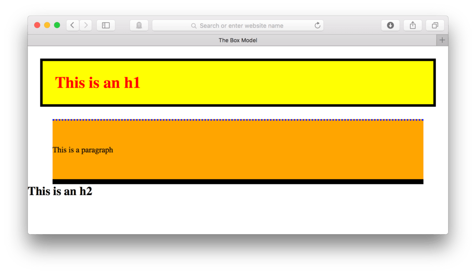
That being said, there are times when you’ll want to set specific values for an element. So we don’t confuse our other properties, let’s add a new HTML element to try this out on.
- Add
<h2>This is an h2</h2>to the end of your HTML content - Save and Refresh
Here’s how your HTML should look:
<h1>This is an h1</h1>
<p>This is a paragraph</p>

<h2>This is an h2</h2>
and here’s how it looks in the browser. (fig. 14)
Now, let’s style that h2 to have a pink background, 15 pixels of padding, and 25 pixels of top margin to look like (fig. 15).
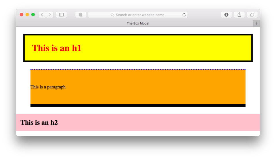
Ok, you can double-check your work. Here’s my CSS:
h2 {
	background-color: pink;
	padding: 15px;
	margin-top: 25px;
}
Ok, cool? Let’s now look at controlling the width of this.
- Add
width: 500px;to your h2 CSS block - Save and Refresh
Here’s my CSS:
h2 {
	background-color: pink;
	padding: 15px;
	margin-top: 25px;
	width: 500px;
}
and here’s how it looks in the browser. (fig. 16)
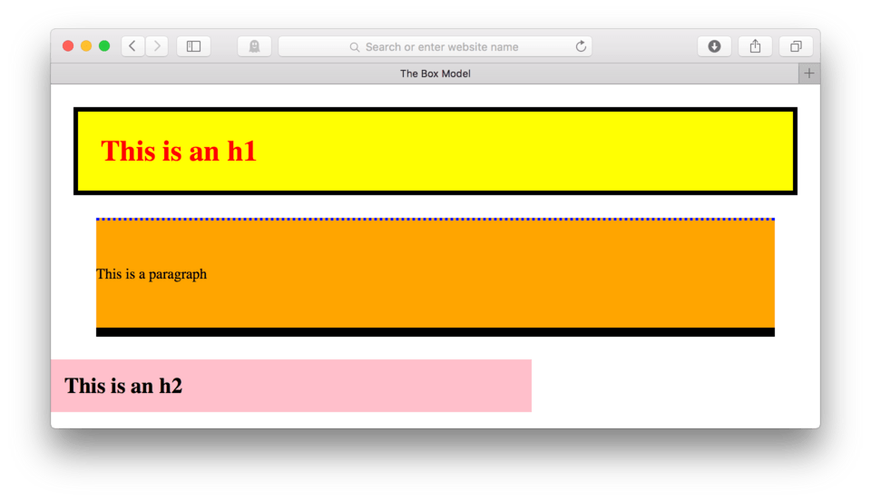
Now, depending on how wide you have your browser pulled open, you should see that the h2 is only 500 pixels wide. It still won’t let anyone fill the empty space created on the right because it maintains its block-level status, but visually we now have some control of the width.
Let’s try height.
- Add
height: 200px;to the h2 CSS block - Save and Refresh
Here’s my CSS so far:
h2 {
	background-color: pink;
	padding: 15px;
	margin-top: 25px;
	width: 500px;
	height: 200px;
}
and here’s how it should look in the browser. (fig. 17)
Actual Box Measurements - Do The Math
Okay, so on first glance we might assume that our pink box is 500 pixels wide and 200 pixels tall because that is what we told it to be, unfortunately that isn’t exactly the case. Width and height are just properties whose values get added to the overall box, they don’t actually control the size of the box. Instead, we need to add together all of the pieces of the box to know for sure how big it is.
Take a look at (fig. 18). I used a special tool to show me the measurements of my h2 according to the browser.
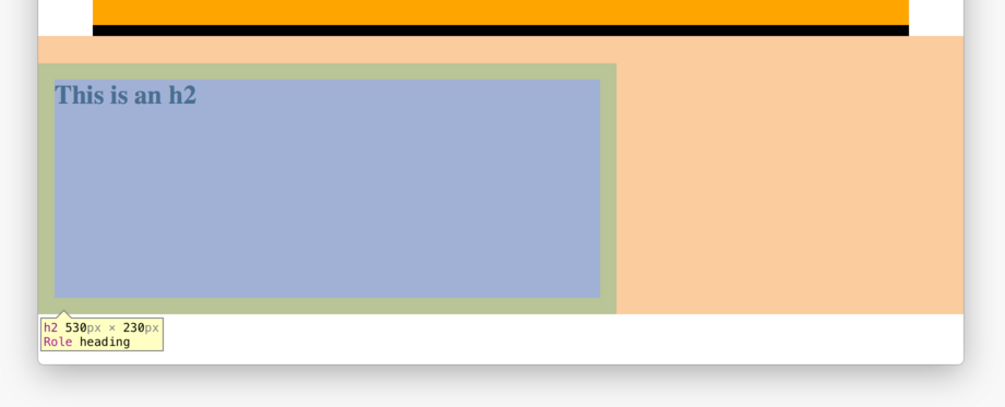
This is a nice visualization of what the browser is seeing when it looks at my h2. First, in the small yellow box on the top left, we can see that the measurements according to Safari are 530px by 230px. Let’s see if we can figure out where those numbers are coming from.
This tool is also color coding our element. The blue rectangle in the center represents our content. Typically this blue rectangle would be tightly wrapped around our text, but because we altered the width and the height, we now see that these actually altered the width and the height of our content, not the box itself.
Next, if we take a look at the green rectangle we can get a good look at the padding. Remember we set 15 pixels of padding on all four sides? We can now see that those pixels are added outside our content, and add 30 extra pixels to both the height and the width of our element. That is where the browser is getting its measurement of 530 x 230 pixels. Content plus padding. If we had a border, those pixels too would get added to the final dimensions.
Finally we can see the margin represented in orange. Though it isn’t being calculated into the size of the element, those pixels are still taking up space in our browser and holding elements apart, so we need to make sure that we take those values into account.
Text Alignment
Now that we’ve taken the time to try and understand how the browser sees our content, we can take advantage of the opportunities that this allows. We have already discussed controlling the space inside and outside of the box using padding and margin, but we can also control how the content is situated inside the box.
The default alignment for all elements in HTML is left;. This makes sense that the browser would set the default this way because we know that left aligned text is easiest to read. That is why novels, textbooks, and almost all other long-form text is always left aligned.
There are times where we want to change that alignment. Sometimes we might want to use text that is right aligned or centered to achieve a certain design effect. Seeing where the content such as text lives inside a box helps us do that. Now that we know that at least for block-level elements, that our box expands the full width of our screen, we know that we can move that text around inside that box. The CSS declaration we use to do this is text-align: and the acceptable values are left;, right;, and center;.
Since left; is also the default, if we text to be left aligned, we don’t have to actually include any CSS, however if we wanted to change that to, let’s say a center alignment, we could and our content would then center itself inside the box. The same is true if we wanted to ask our content to right align.
Let’s try it out. We’ll ask our h1 to align itself in the center of the box.
- Locate your CSS file
- Add:
text-align: center;to yourh1 {CSS block - Save and Refresh
Here’s my CSS:
h1 {
    color: red;
    background-color: yellow;
    padding: 25px;
    border: 5px solid black;
		margin: 25px;
		text-align: center;
}
and here’s how it looks in the browser. (fig. 19)
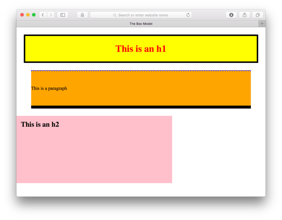
If things worked correctly, our h1 should now be centered inside its box.
Let’s ask our h2 to be right aligned.
- Add:
text-align: right;to yourh2 {CSS block - Save and Refresh
Here’s my CSS:
h2 {
	background-color: pink;
	padding: 15px;
	margin-top: 25px;
	width: 500px;
	height: 200px;
	text-align: right;
}
and here’s how it looks in the browser. (fig. 20)
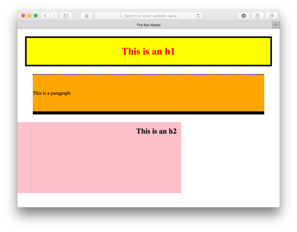
Did it work? Is your h2 right aligned inside its box? Hopefully so. You’ll also notice that even though we told it to be text-align: right; it still stays 15px away from the right edge of the box. This is because we set the padding on all four sides of the box to be 15 pixels. Because the pixels are on the outside of the content, the content cannot invade that space. Essentially what happens is that the content will always look first to its left and its right to see if there is any margin, border, or padding, and make sure to align itself based on whatever space if leftover.
Note: You can use
text-align:on any block-level element to achieve horizontally aligned content. This is even the case when you wish to center inline element such as links or images, provided they live inside a block-level parent element. A good example of this would be an image living inside a figure tag. Even though an image is an inline element, because it lives inside a block-level parent, we can center it by asking the parent element (in this case the figure tag) totext-align:which will result in all content and nested content and HTML (like an image) to respond to the command.
Lesson Conclusion
That’s pretty much it. The box model is the typical model used to describe the way a browser sees HTML elements and the CSS properties used to control those elements. It’s important to know that the actual height and width of any element is a combination of these properties and their values.
We learned techniques on controlling the different types of spaces created by the box model and the behavior of the content according to the different spaces. We also learned that by default all element have some default settings on margin and sometimes padding that we can remove using a universal selector * { to automatically remove all default spacing so we can more precisely control our own spatial relationships.
Next up, navigation and mobile first design.