Images & Captions
Overview
In this lesson we’ll continue to explore writing the HTML code that allows a browser to recognize content (text, images, video, etc). Specifically, we’ll learn about how browsers understand and display images including captions and descriptive text for when an image cannot be seen. We’ll learn about the baked in display properties for images and how they differ from the text elements we learned in the previous lesson.
Lesson Setup
Before we start, we’ll need to get organized and create our lesson folders.
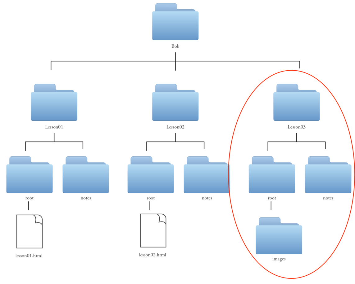
- Let’s begin by creating a new folder inside of our Bob folder for this lesson and name it Lesson03. The Lesson01, Lesson02, and Lesson03 folders should be side by side, make sure that one doesn’t accidentally live inside the other.
- Now, inside of the Lesson03 folder let’s create two new folders. One folder for our notes (and any other materials we may collect for reference while working on this lesson) and a root folder (to hold the new website we’ll be creating for the lesson).
- This time there is a twist, inside the root folder, we need to add another folder. This folder will hold the images we will use for our site. Best practice is to name this folder images.
Notice that the word “images” is typed in all lowercase. This is a really good habit to get into. It not only is a very common naming convention for image folders, but having strict rules like always using all lowercase names for your folders helps set you up for later when you need to recall these names.
Organization is super important and we want to make sure we are set up for success. Repetition not only helps you remember but it helps develop good working habits. (fig 1)
For this lesson, I’ve included some files that we will use to build our webpage.
- Download the Lesson03 images from here. You’ll notice that there are three images: image01.png, image02.png, and image03.png.
- Move these three png files inside your new “images” folder. (fig. 2)

Employ the Boilerplate
As always, we’ll begin our page by opening up our code editor, typing in our boilerplate, saving our file into the correct lesson root folder, and previewing it in the browser.
- Launch TextMate
- File > New
- In the new TextMate window, type in the boilerplate code, using Learning Images as the title:
<!doctype html>
<html>
	<head>
		<title>Learning Images</title>
	</head>

	<body>


	</body>

</html>
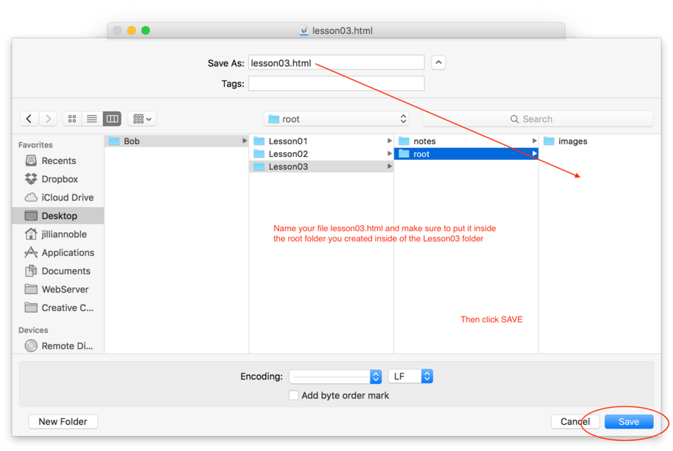
Save and Save Often
In order to preview our site in the browser, we’ll need to save the file as an HTML file inside of our Lesson03 root folder.
- Save your HTML file as lesson03.html inside your Lesson03 root folder. (fig. 3)
Browser it Up
Now let’s open up that file in our browser and double check that everything looks good.
- Launch Safari (or browser of your choice) and use File > Open File and navigate to lesson03.html and hit Open. (fig. 4)

Note: Don’t forget to give your page a unique and descriptive title. When you open your page in the browser, don’t forget to double-check that your site title shows up in the browser chrome!
Now that we have the beginning part of our site ready to go, let’s get to work adding content to our page.
Adding Some Text
Most web pages begin with some large text describing the article or page. In the last lesson we learned that the most common opening to a web page content is a h1. Let’s go ahead and begin our new page that way.
- On a new line right after the body tag, type
<h1>Learning Images</h1> - On the next line, type or copy and paste in the following paragraph:
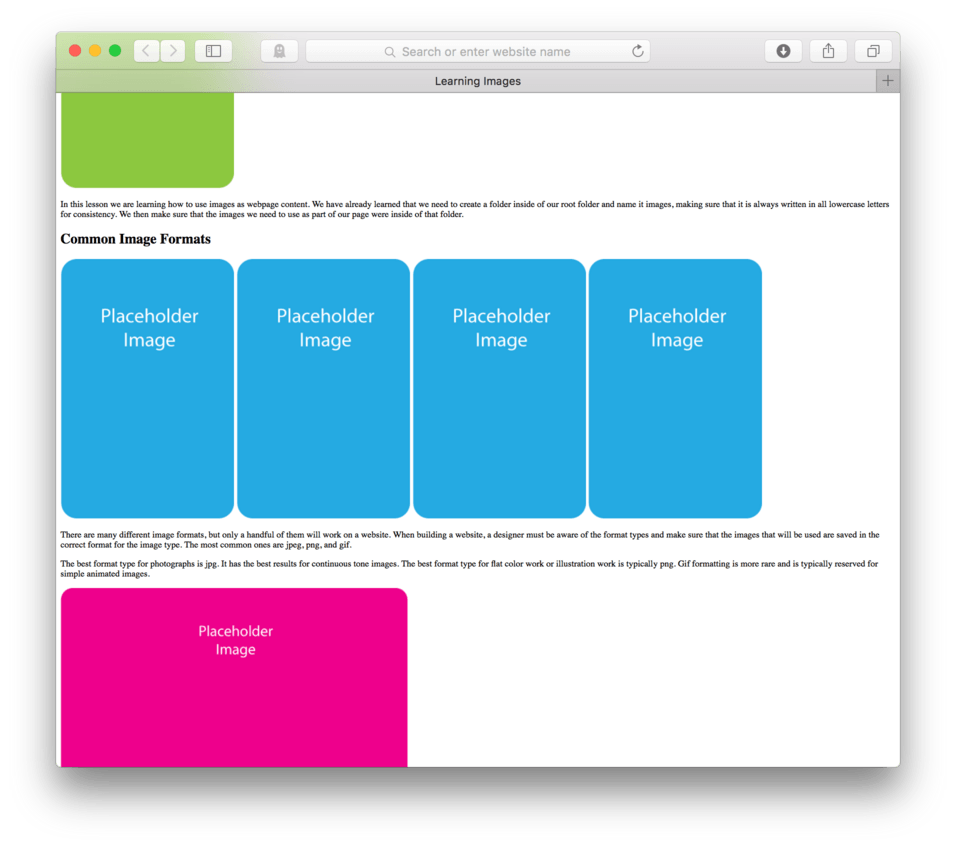
<p>In this lesson we are learning how to use images as webpage content. We have already learned that we need to create a folder inside of our root folder and name it images, making sure that it is always written in all lowercase letters for consistency. We then make sure that the images we need to use as part of our page were inside of that folder.</p>
- Save your HTML file
- Refresh your browser.
Here’s how your HTML should look now:
<!doctype html>
<html>
	<head>
		<title>Learning Images</title>
	</head>

	<body>
		<h1>Learning Images</h1>
		<p>In this lesson we are learning how to use images as webpage content. We have already learned that we need to create a folder inside of our root folder and name it images, making sure that it is always written in all lowercase letters for consistency. We then make sure that the images we need to use as part of our page were inside of that folder.</p>
	</body>

</html>
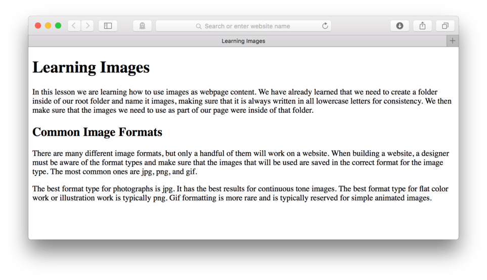
and here’s how it should look in the browser (fig. 5).

Note: By now, we should have a pretty good idea of what this will look like when displayed in the browser, but it’s always a good idea to preview to make sure there aren’t any errors.
Let’s keep this going and get a little more text before we start talking about adding our images. Let’s add a sub heading and a few more paragraphs.
- On the next open line, Type:
<h2>Common Image Formats</h2> - Hit Enter and add the following two paragraphs:
<p>There are many different image formats, but only a handful of them will work on a website. When building a website, a designer must be aware of the format types and make sure that the images that will be used are saved in the correct format for the image type. The most common ones are jpg, png, and gif.</p>
<p>The best format type for photographs is jpg. It has the best results for continuous tone images. The best format type for flat color work or illustration work is typically png. Gif formatting is more rare and is typically reserved for simple animated images.</p>
- Save your file
- Refresh in the browser.
Here’s how your HTML should now look:
<!doctype html>
<html>
	<head>
		<title>Learning Images</title>
	</head>

	<body>
		<h1>Learning Images</h1>
		<p>In this lesson we are learning how to use images as webpage content. We have already learned that we need to create a folder inside of our root folder and name it images, making sure that it is always written in all lowercase letters for consistency. We then make sure that the images we need to use as part of our page were inside of that folder.</p>

		<h2>Common Image Formats</h2>
		<p>There are many different image formats, but only a handful of them will work on a website. When building a website, a designer must be aware of the format types and make sure that the images that will be used are saved in the correct format for the image type. The most common ones are jpg, png, and gif.</p>
		<p>The best format type for photographs is jpg. It has the best results for continuous tone images. The best format type for flat color work or illustration work is typically png. Gif formatting is more rare and is typically reserved for simple animated images.</p>

	</body>

</html>
Note: You might notice that I have added an extra line of space between my paragraph and my h2. I like to do this to help me clearly see where different chunks of information are. You can put in extra return spaces anywhere you like between tag sets to help you read and organize your code.
and here’s how it should look in the browser. (fig. 6)
Adding Images
Adding images in HTML is just a little different from adding text. The HTML tag used for images happens to be a special kind of tag. The image tag is written just a little bit different from the tags we’ve learned so far. It requires an important piece of additional information. It needs an address to the location of the image and it needs to be included inside the tag itself rather than between an opening and closing set of tags.
Let me try to explain this a bit more. If we are using a set of h1 tags, we can simply write: <h1>Hello</h1>. The browser has all the information it needs to display this heading. It knows that it is to be displayed as a level 1 heading. It also knows that the heading text should read “Hello”. This is because the content itself is located between the opening and closing tags. The content, in this case the word hello, is right there, between the tags marking its beginning and its end.
With an image, it isn’t as simple as a few words that are easily marked with a pair of tags. An image doesn’t actually exist inside the HTML like the text can. Remember at the beginning of this lesson where we put three pngs files into a subfolder we named images? Right. That is where those images live.
What the browser needs to do is see the HTML that says, “Hey there is an image that needs to be displayed here. It lives at this address, go grab it”. There isn’t anything like the word “hello” to put between the tags, so we need only one tag in this case.
This tag is what we call a self closing tag. It looks like this: <img />. That’s it. There is no closing tag, just the one. It opens with a left angle bracket (<) and then ends itself with a forward slash and a right angle bracket (/>). Since there is no content to put between the tags, we simply don’t need two tags.
The Source Attribute
I mentioned that a browser sees the image tag and knows that it must go find the image where it lives to display it. This means that images don’t actually live inside of webpages, they instead live in a folder somewhere. If you are familiar with using Adobe InDesign for page layout, you are already probably familiar with this idea. It’s like linking to the image over embedding it. In websites, there really is no such thing as embedding images, only linking to them.
Almost all browsers have the built in ability to follow an address to a folder, find the image inside that folder, and display it on the fly. This is pretty amazing, but it does mean that we have to give the browser a clear address so that it can actually find the image we want or at all.
In order to do this we need to add what’s called the source attribute to the image tag. The source attribute is a little piece of extra code that tells the browser exactly where to find the image. This attribute is written: src="address" and is included right after the <img portion of the tag so it is written: <img src="address" />.
Image Addresses
So, we now know that it’s our job to give clear directions to the browser so it can find the image where it lives. Earlier in this lesson, we put the images we wanted to include in this site inside a folder we named “images” which was located inside of our “root” folder as we learned was best practice. Because we did this we can easily write these directions if we know a few things about how this process works.
To give good directions, we first need to consider what the starting point is for the browser. This is pretty easy to figure out if you remember that what is actually happening when the browser is displaying a page.
The browser is literally reading our HTML file and displaying the content on the page in order as it reads and understands our code. Knowing this means that you know that the starting place is the HTML file, so any directions need to be given from the location of the HTML file itself. Let’s take a look at our folder structure again to get a visual of what we’re talking about (fig. 7).
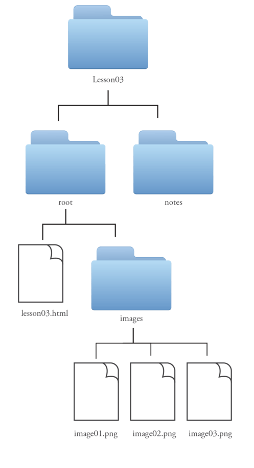
Looking at fig. 7, we see that our HTML file (what the browser is looking at to display our page) is next door neighbors with the folder named images. The images folder holds all three of our images. So, it looks like if we want to tell the browser where image01.png lives, we would say, “There is a folder next door to us named images. If you go inside that folder, you’ll find image01.png living inside.”
Let’s break this up into it’s pieces to see what the conversation is between the HTML code and the browser.
| Component Piece | What it’s Saying |
|---|---|
<img |
Hey browser, there is an image I want you to display here. |
src= |
The address of my image is … |
" |
I’m about to start telling you the address |
images |
I have a neighbor, he is a folder and his name is images. |
/ |
You’ll have to go inside his house |
image01.png |
The image you are looking for is named image01.png. |
" |
This is the end of the address |
/> |
This is the end of my image tag |
Written out it looks like this: <img src="images/image01.png" />. Let’s go ahead and add this to our HTML file to see if it works. Let’s add our first image directly after our h1 but before our first paragraph.
- Hit Enter to make room directly after our h1 but before our first paragraph
- On a new line between our h1 and the first paragraph, type:
<img src="images/image01.png" /> - Save your HTML file
- Refresh in your browser
Here’s how your HTML should look:
<!doctype html>
<html>
	<head>
		<title>Learning Images</title>
	</head>

	<body>
		<h1>Learning Images</h1>
		<img src="images/image01.png" />
		<p>In this lesson we are learning how to use images as webpage content. We have already learned that we need to create a folder inside of our root folder and name it images, making sure that it is always written in all lowercase letters for consistency. We then make sure that the images we need to use as part of our page were inside of that folder.</p>

		<h2>Common Image Formats</h2>
	 	<p>There are many different image formats, but only a handful of them will work on a website. When building a website, a designer must be aware of the format types and make sure that the images that will be used are saved in the correct format for the image type. The most common ones are jpg, png, and gif.</p>
		<p>The best format type for photographs is jpg. It has the best results for continuous tone images. The best format type for flat color work or illustration work is typically png. Gif formatting is more rare and is typically reserved for simple animated images.</p>

	</body>

</html>
and here’s how it looks in the browser. (fig. 8)
Note: You noticed that your
<imgtag is different from the rest because you didn’t have to start and end with two separate tags (opening and closing). We could have, it could look like this.<img src="blah.jpg"></img>, but notice that the image address is entered inside the opening tag itself. Since there is no content inserted in between tags, it makes sense to eliminate extra typing and waste. It can easily be shortened to the self closing tag. There are a few more of these types of tags we’ll eventually come across.
Naming Images
Eliminate any extra punctuation or fancy stuff and keep with simple descriptive names when naming your images. All images also need to be placed inside the images folder in order to load correctly on the page. If you see the blue question mark when you view in browser, you know that the browser knows that there is an image, but it can’t find the file.
Let’s go ahead and add in our other two images for practice. Let’s put one directly following the h2 and one at the very end of the document, following the two consecutive paragraphs.
Your resulting HTML should look like this:
<!doctype html>
<html>
	<head>
		<title>Learning Images</title>
	</head>

	<body>
		<h1>Learning Images</h1>
		<img src="images/image01.png" />
		<p>In this lesson we are learning how to use images as webpage content. We have already learned that we need to create a folder inside of our root folder and name it images, making sure that it is always written in all lowercase letters for consistency. We then make sure that the images we need to use as part of our page were inside of that folder.</p>

		<h2>Common Image Formats</h2>
		<img src="images/image02.png" />
		<p>There are many different image formats, but only a handful of them will work on a website. When building a website, a designer must be aware of the format types and make sure that the images that will be used are saved in the correct format for the image type. The most common ones are jpeg, png, and gif.</p>
		<p>The best format type for photographs is jpeg. It has the best results for continuous tone images. The best format type for flat color work or illustration work is typically png. Gif formatting is more rare and is typically reserved for simple animated images.</p>
		<img src="images/image03.png" />

	</body>

</html>
It should look something like this in the browser (fig. 9).
If all went according to plan, your website now matches mine (fig. 9). We have a few different headings, a few paragraphs of text, and a few images. Though there are countless combinations, these are the basic building blocks of any website.
Adding the Alt Attribute
Attributes are extra bits of code that can be added to HTML tags to give the browser additional information about the content. For example, we added the src attribute (src="address") in order to give the browser the specific address for the image. This was necessary because the browser would otherwise have no way of knowing what image we wanted on our site or where it was to be found. Simply put, without it, there would be no image to display. The browser would have simply posted an error icon instead, usually a small box with a question mark inside. There are other attributes that can be added, the second most important attribute for an image would be the alternate attribute, abbreviated to just “alt=”.
Remember when I said without the src= attribute there would be no image? Well, there are cases where the image itself does not display or does not carry the information it intends to convey properly for the user. There are rare cases where some speciality computer systems do not allow images to display for a variety of reasons. More importantly, there are users out there who can’t make use of the visual image content for other reasons, often these reasons are vision impairment related. People with certain vision impairments use special software called screenreaders to consume website content. This software can read the page aloud to them allowing them to hear the information on the screen.
As you may have already guessed, it is more than just difficult for a piece of software to read an image, it is pretty much impossible, leaving people with certain disabilities or limited computer systems missing the content that an image provides to the page. To help remedy this situation, an attribute tag can be added to the <img /> tag to provide a short text description of the image content. This text description can be read by the screenreader.
The alt attribute is written alt="Text describing the image goes here" and is included usually following the src= attribute like this:
<img src="images/image01.png" alt="Descriptive Text" />
If you add an alt= attribute to your images on any site, you can Save and Refresh in your browser, but it’s unlikely you’ll actually be able to see any changes. The alt= attribute stands for alternate, and is meant to provide an alternate experience for those of us who cannot view the image for whatever reason be it technical or physical. Because of this, it can be easy for those of us who can see the image to forget that there are people out there who cannot.
It is very important that as web content providers, we make a point to always include an alt= attribute and some descriptive text for each image we include in our page. It might not contain all the same exact information that seeing the image would, but at the very least it lets the user know that an image is there and provides some basic context or information about the image, giving everyone the closest thing to an equal experience that we can.
In the case of a screenreader being used, the user will hear the alternate text in place the image and in cases where the browser cannot render the image, the alternate text will appear on the screen indicating an image with this description was intended to be included.
Element Behavior: Inline vs. Block
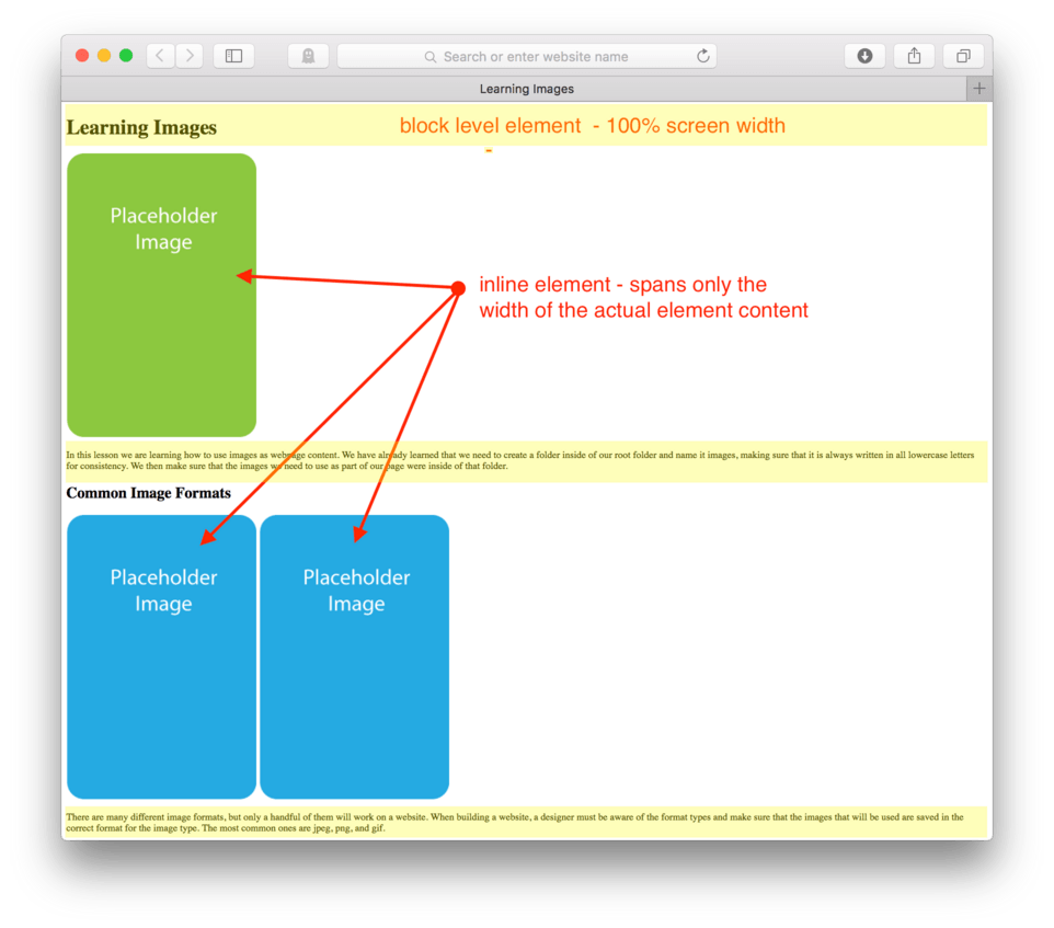
Each HTML element behaves in a certain predictable way. Looking at our website so far, we can see that all text elements are left justified (meaning that they are aligned along the left side of the screen). We can also see that all text elements (<p></p>, <h1></h1>, <h2></h2>, etc.) stretch the full length of the browser window. Go ahead, grab the right side of your browser window and pull left and right. You’ll see that no matter how wide or small the window is, the text flows to fill it.
Images, as you probably noticed when you were pulling your window, behave differently than the text. They don’t respond to the moving of the browser window. They just continue to be whatever width they were originally. When there is enough room, you can see it all. (fig. 10)

When the browser window is too narrow and there isn’t enough room, then well… part of it just gets covered up like we see in our last image. (fig. 11)
There is another big difference between images and text, but in order to see it, we’ll have to add another image.
- Copy the code for your second image:
<img src="images/image02.jpg" /> - Hit Enter and hit Paste so that you have two blue images in a row in your code.
- Make sure to Save and Refresh your browser.
Here’s how your HTML should look:
<!doctype html>
<html>
	<head>
		<title>Learning Images</title>
	</head>

	<body>
		<h1>Learning Images</h1>
		<img src="images/image01.png" />
		<p>In this lesson we are learning how to use images as webpage content. We have already learned that we need to create a folder inside of our root folder and name it images, making sure that it is always written in all lowercase letters for consistency. We then make sure that the images we need to use as part of our page were inside of that folder.</p>

		<h2>Common Image Formats</h2>
		<img src="images/image02.png" />
		<img src="images/image02.png" />
		<p>There are many different image formats, but only a handful of them will work on a website. When building a website, a designer must be aware of the format types and make sure that the images that will be used are saved in the correct format for the image type. The most common ones are jpeg, png, and gif.</p>

		<p>The best format type for photographs is jpg. It has the best results for continuous tone images. The best format type for flat color work or illustration work is typically png. Gif formatting is more rare and is typically reserved for simple animated images.</p>
		<img src="images/image03.png" />

	</body>

</html>
and here’s how it looks in the browser. (fig. 12)
Hopefully you are seeing what I’m seeing. If not, make sure to pull your browser a little wider. With any luck, two blue placeholder images should be sitting side by side on your screen. This is a big difference from the way our text elements are behaving. No matter what we do to the browser width, our text never lets anyone come up and sit next to it, we don’t get columns, for example when making our browser really wide.
With images, if we have more than one image, and enough space, one image allows the next image to pop up and sit alongside it. If we copied and pasted our image a few more times, we could have as many blue placeholder images as our computer screen allows. (fig. 13).
Narrowing the screen kicks some of those blue placeholder images down to the next line. (figs. 14 & 15)
This is the primary difference between the two types of HTML elements, block-level elements and inline elements. Block-level elements take up 100% of the width of the screen no matter how much content they have. They never let any other element sit next to them. All of the heading elements (<h1>, <h2>, <h3>, and so on) and the paragraph elements (<p>) are all block-level elements.
Images behave differently. They allow other images to sit next to them when there is room. When there isn’t, the next image will drop to the next line. This type of element is called an inline element and it refers to the nature of it allowing several of the same type of elements to sit “inline” or on the same line.
Images are inline elements as are a few other tags we will discuss in future lessons. This will be an important factor in later lessons, but is important just to file on the back burner for now. (fig. 16)
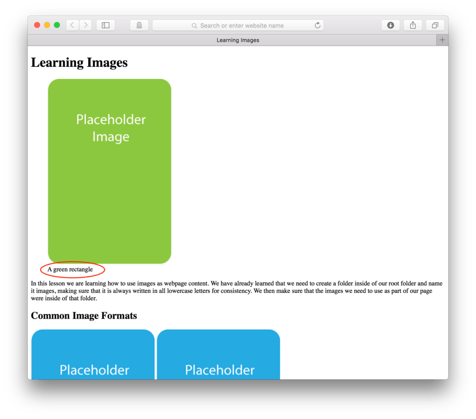
Adding Captions to Images
There will be times when you’ll want to add captions to your images. The good news is that the newest version of HTML (HTML5) has image captions built in. In order to take advantage of this, we’ll need to learn two new HTML tags, <figure></figure> and <figcaption><figcaption/>.
These tags, along with the <img /> tag work as a set. The <figure></figure> tags hold the whole equation together. Nested inside is the <img /> tag identifying the image file to be displayed. Next the caption portion is wrapped in a set of <figcaption><figcaption/> tags to identify the words to be shown under the image.
In practice, it should look like this:
<figure>
	<img src=“images/image01.png” alt="A green rectangle" />
	<figcaption>A green placeholder image</figcaption>
</figure>
Let’s go ahead and modify our code to put a caption on our first image.
- Above our first
<img />tag, hit Enter to make some room - Type
<figure>. - Hit Enter once again to move to the next line.
- After the
<img />tag, hit Enter. - Type
<figcaption>A green placeholder image</figcaption> - Hit Enter.
- Close the figure tag:
</figure> - Save your HTML file
- Refresh and preview in your browser
The beginning portion of your HTML should now look like this:
<!doctype html>
<html>
	<head>
		<title>Learning Images</title>
	</head>

	<body>
		<h1>Learning Images</h1>
		<figure>
			<img src="images/image01.png" />
			<figcaption>A green rectangle</figcaption>
		</figure>
		<p>In this lesson we are learning how to use images as webpage content. We have already learned that we need to create a folder inside of our root folder and name it images, making sure that it is always written in all lowercase letters for consistency. We then make sure that the images we need to use as part of our page were inside of that folder.</p>

		...
and here’s how it looks in the browser. (fig. 17)
You’ll notice that not only do we see that we have a caption for our image, but that our image has taken on a few new visual properties. Our image is now indented and so is our caption. The browser helps us visually pair the image with its caption. There is one small caveat, however. The <figure> tag is a block-level element. This means that nobody is allowed to come up and sit next to it, so if we had more than one figure element in a row, it would not sit side by side by rather stack one on top of the other no matter how wide we pulled the browser.
Just to make sure this is clear, let’s add another <figure> after our first.
- Copy your code,
<figure>through</figure> - Paste it in after the first
<figure> - Save your HTML file
- Refresh your browser
Here’s how your HTML should look:
<!doctype html>
<html>
	<head>
		<title>Learning Images</title>
	</head>

	<body>
		<h1>Learning Images</h1>
		<figure>
			<img src="images/image01.png" />
			<figcaption>A green rectangle</figcaption>
		</figure>
		<figure>
			<img src="images/image01.png" />
			<figcaption>A green rectangle</figcaption>
		</figure>
		<p>In this lesson we are learning how to use images as webpage content. We have already learned that we need to create a folder inside of our root folder and name it images, making sure that it is always written in all lowercase letters for consistency. We then make sure that the images we need to use as part of our page were inside of that folder.</p>

		...
and here’s how it looks in the browser. (fig. 18)
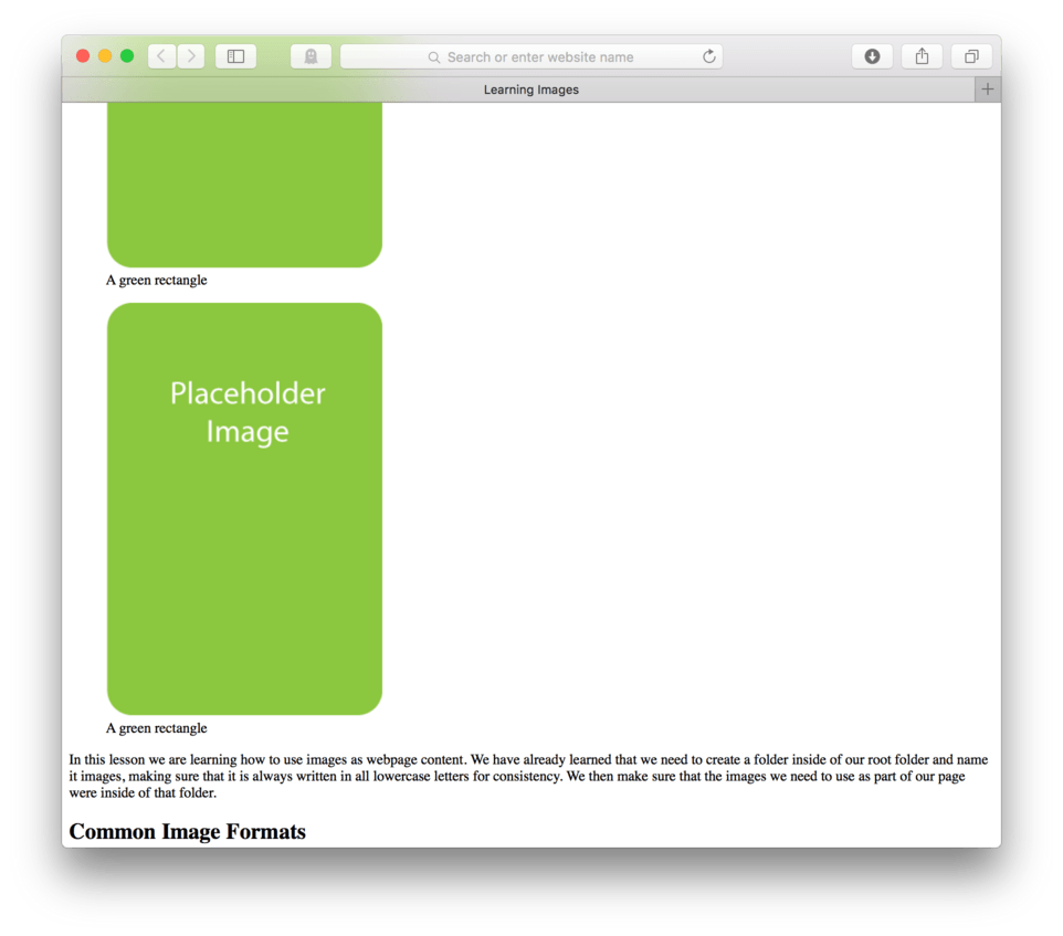
You’ll see that the second figure and its caption will fall to the next available vertical space. Because the <figure> tag is block-level, it won’t let the next <figure> element sit beside it like an <img /> element would. This is both an advantage and disadvantage.
Later we’ll discuss overriding the default settings in the browser for inline and block-level elements to help us control layout, but for now it’s important that we understand the basic difference between the two and memorize what elements are block (text elements like <p>, <h1>, <h2>, <figure>, etc.) and inline (<img /> without <figure> tags).
Lesson Conclusion
In this lesson we briefly reviewed adding both heading and paragraph elements to a webpage and the importance of folder structure and organization including folder structure and management for images to be used in the webpage.
We learned that images need to be located inside a folder typically named “images” (small “i”), who lives inside of the root folder for this particular site. We learned that the HTML tag used for images is a special kind of tag. It is self-closing and is written as one tag rather than two. It also needs to have a special bit of information, called the source attribute, written src= added to let the browser know where the image lives.
We learned how to use a <figure> tag along with a <figcaption> tag to caption our images. We discussed screen readers and situations where images may not be able to be rendered and learned that best practice is to include an alternate attribute (alt=) to provide a text description of an image to be used when the image cannot be.
Lastly, we looked at the difference between a block-level element like text versus an inline element like images, and determined that the primary difference is that all block-level elements span 100% of the screen width whereas inline elements only take up the space they need, and when they don’t get the space they need, they get covered up by the browser window.
In the next lesson, we will learn how to code two more block-level elements – lists and tables.