Forms
- Forms
Overview
Forms allow users to enter certain data into a website. I’m sure you are already somewhat familiar with them. They make up a good portion of the checkout experience in online shopping for example. It’s the part where you enter your billing and shipping information. Forms are also commonly seen on a contact page of a website, usually allowing you to send a message directly to a person or company by entering some text into a few open text boxes and hitting submit. This lesson will introduce you to creating and using forms on your own site.
This lesson is a little like lesson 17 in that I’m about to introduce a topic that we, as designers, usually play only a partial role in. Like javascript additions learned in lesson 17, forms require special programming knowledge and a backend setup that usually requires getting a developer or programmer with special expertise involved.
As a web designer, our role would be to write the HTML and CSS that places the form elements on the page and styles them appropriately to match our site. From there another person would actually handle the special digital wiring (requiring a database among other things) that actually makes the forms functional.
There are a few third party products and services out there that allow us non-programmer types to use forms in our sites. At the end of this lesson, I’ll walk you through one of my favorites, so you too can use some simple form elements in your site whether you have the programming background or not.
Lesson Setup
Let’s go ahead and create our lesson folder structure, our initial HTML file and connect it up with a new stylesheet.
Folder Setup
- Create a new Lesson17 folder inside of Bob
- Create your folders for both notes and root
- Inside the root folder, create a css folder
HTML Setup
- Open up TextMate
- File > New to open a new file
- Code in your boilerplate HTML making sure to add a title to the page. I’m calling mine: Forms.
- Make sure that your boilerplate includes the
<meta name="viewport" content="width=device-width, initial-scale=1" />we learned in lesson 8 to ensure the site works properly on a mobile device. - Save your HTML file to your Lesson17 root folder with the name: lesson17.html
- Open and Preview your page in the browser, checking to make sure your page title is appearing correctly.
CSS Setup
- Open up TextMate
- File > New to open a new file
- File > Save
- Navigate to the “css” folder you created
- Name your file, style.css
- Hit Save
- Attach this stylesheet to our HTML page. Type:
<link href="css/style.css rel="stylesheet" />into the head section of our lesson17.html file. - File > Save the HTML file
Your HTML should now look like this:
<!doctype html>
<html>

	<head>
		<title>Forms</title>
		<meta name="viewport" content="width=device-width, initial-scale=1" />
		<link href="css/style.css" rel="stylesheet" />
	</head>

	<body>

	</body>

</html>
Note: You may have noticed that I’ve shortened the lesson setup to a list of action steps above. If you need a refresher on folder and file organization see the lesson 3 setup section.
Let’s test to make sure our pages connected correctly.
- Navigate back to your new CSS file.
- Let’s change the background color of the body element. Type:
body {on an open line and hit Enter - Now, type the property we want to change:
background-color: - Type:
pink;and hit Enter - Close the CSS block, type:
} - Save this file and Refresh the browser
If your background turned pink, then you are set. Everything is working correctly. You can go ahead and delete that CSS block, so we can start fresh.
The Form Elements
There are a number of different form elements that we can incorporate into our site for our users to input different kinds of information. Some of the most common ones are:
- text
- textarea
- submit
- radio buttons
- check boxes
- drop down lists
- multiple selections
The Input Element
Many of the form elements work by using an <input> tag. <input> is a self-closing tag, so all of the information needed for the tag to function happens by including certain attributes inside the tag, much like how an <img/> tag works.
The most important attribute to include inside an <input> tag is the type= attribute. This attribute identifies what kind of input we would like. I’ll go through these more specifically below, but to give you a sense of what I mean, we might type in type="text" or type="email" to indicate what type of input box we need on the screen and what type of information will be entered.
The second most important attribute to include is the name= attribute. This doesn’t have a visual impact on our form, but instead is sent along with whatever information our user has submitted in order to tell our database what that information is and what to do with it. This is mostly handled by a programmer, but it is our responsibility to give our form elements a unique name= attribute, (like an id=) so that it can be used to specifically identify each piece of user inputted data.
Text Fields
Text fields are simple one line input boxes where our user can type in really anything. A common use for a text field would be a place to type in your name, for example. Though different browsers display text field slightly differently, they tend to look something like (fig. 1).
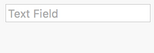
Users can click inside the box and type in any information they would like. Go ahead and give it a try if you like. You can click inside my example and type something. Typically the text fields are short submissions as there are other input types for longer bits of information we’ll talk about in a bit.
The HTML to write the text field is:
<input type="text" name="unique-name" placeholder="initial text">
You can see that our HTML is just a self contained tag with lots of included attributes:
type="text"-indicates we want a text field as our input.name="unique-name"-gives our text field input a unique identifier for our database to use in sorting and storing our data.placeholder="initial text"-allows us to set whatever text we want our user to see inside our text field. This is often a hint as to what should be typed into the input box.
That’s it, all we use in this case is that opening tag and lots of attributes, in the case of the <input> element there is no need for a closing tag.
There are many different types of type= attributes, but I’m going to limit this lesson to just a few that are really common. I wanted to mention type="email" specifically as it will be used a lot and we’ll actually work on incorporating this one into our demo site later in this lesson.
Textarea
A textarea is a lot like a text field only it is used when you need to give your user more room to type. Textarea is meant for body content like messages and answers that require more than a few words. Textarea is set up to be multi-line and can expand to fit as much content as you want to allow.
Like text field, all browsers have a slightly different way of displaying a textarea, (and people can style these using CSS) but they typically look something like (fig. 2).
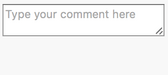
Users can click inside the box and type in any information they would like and hopefully the information you have prompted them to include. Go ahead and give it a try if you like. You can click inside my example and type something.
Typically the textareas are longer submissions. You’ll see that you can keep typing even after you’ve run out of space in the box as it will allow for scrolling.
The HTML to write the text field looks like this:
<textarea name="unique-name" placeholder="Type your comment here"></textarea>
As you probably noticed, this guy is a little different. It uses a pair of tags: <textarea></textarea> to indicate that we want our user to see a textarea. I’ll also point out that it doesn’t have any content between the tags, that is because like the text field, we can pretty much do what we need to do using some attributes inside the opening tag.
You should recognize the specific attributes we use are the same ones we used when we wrote a text field minus the type=. In this case we only need name= to give a unique identifier to our element for our database and a placeholder= to allow us to write some sort of prompt text inside our textarea.
Radio Buttons
Radio buttons allow a user to select from a multiple choice list of items. We can even set a default choice to be marked if we would like to. Radio buttons are nice to use in situations where there are at least a few options and you need your user to choose only one of those options.
Browsers all differ as does CSS styling, but generally speaking radio buttons look something like (fig. 3).
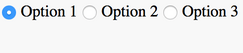
They are little labeled circles that use a dot and sometimes a color to indicate which one is selected. Radio buttons only allow for one item to be selected at a time so choosing another option automatically deselects whatever was previously selected.
The HTML for radio button looks something like this:
<input type="radio" name="options" value="Option 1" checked> Option 1
<input type="radio" name="options" value="Option 2"> Option 2
<input type="radio" name="options" value="Option 3"> Option 3
As you can see, radio buttons use the self-closing <input> tag containing a bunch of attributes. Some of these are familiar but they also use a few new ones:
type="radio"-indicates that you want to use radio buttonsname=-provides a unique identifier for our database. It’s important that each of our radio button inputs are given the same name so our database knows they are from the same set. Notice that each of ours are given `name=”options” to indicate that they are all part of the same list of options.value=-used to identify what the value is for our button. Our user doesn’t see this, but our database does.- we can add the simple word
checkedto indicate which of our options we would like checked by default. Only one of our options can have this included. The others need to be closed with a>.
We need to make sure to label our buttons so our user knows which options are which. After we close our tag, we can add any text we like to be included next to our radio button.
Strangely enough, that’s it. We don’t need anything to follow our text labeling our buttons. There is no need for a closing tag in this case.
Check Boxes
Like radio buttons, check boxes let users select from a list of items. However, instead of being limited to only one option, check boxes allow the user to select some or all options available.
Browsers all differ as does CSS styling, but generally speaking check boxes tend to look something like (fig. 4).
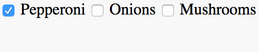
They are little labeled squares that use a checkmark and sometimes a color to indicate which items are selected. Go head and click around on my example if you’d like to see for yourself.
The HTML for check boxes looks something like this:
<input type="checkbox" name="toppings" value="Pepperoni" checked> Pepperoni
<input type="checkbox" name="toppings" value="Onions"> Onions
<input type="checkbox" name="toppings" value="Mushrooms"> Mushrooms
As you can see, check boxes are almost identical to radio buttons. The only differences are that the type= attribute needs to be type="checkbox" to work and that you may add checked to multiple lines to have more than one item checked by default.
Note: Just like with radio buttons, it is important that all items in a set have the
name=attribute set to the exact same thing. There isn’t any other way for the database to know that these guys are part of a group.
Drop Down Lists
When you have more than a handful of options, radio buttons or checkboxes get a little unruly. In cases where you have many options, you might want to choose to use a drop down list instead as they are compact and easier to understand when many options are available.
Styling and browser differences taken into account, drop down lists tend to look something like (fig. 5).
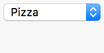
Drop down lists are compact creatures. They generally only take up the space of one list item and can expand to show many options. This is a nice feature when you are concerned about screen real-estate, particularly important when you are taking mobile devices into account.
The HTML used to make this type of list is a little bit different from the others:
<select name="Lunch">
  <option value="Pizza" selected>Pizza</option>
  <option value="Tacos">Tacos</option>
  <option value="Hamburger">Hamburger</option>
  <option value="Veggie Wrap">Veggie Wrap</option>
  <option value="Salad">Salad</option>
</select>
It uses a nested set of options inside a pair of parent tags, a little like an unordered list.
- Dropdown lists begin with a pair of
<select><select>tags. These guys are the parents of the drop down list items. Thename=attribute is included in the opening<select>tag identifying the stuff inside as a set. - Each of our items uses a pair of
<option></option>tags. Inside the opening<option>tag we need to use the attributevalue=to tell our database what the specific value is for that particular choice (like our radio buttons). Each of these should be unique. - In between the
<option></option>tags, we can type what we want each of our drop down items to be labeled. - Now, we can add the simple word
selectedto our opening<option>tag to indicate which item we want selected by default.
Submit Buttons
Whenever we want our user to enter or select data into our website, we need a way for our user to indicate they are finished and ready for the data to be submitted. This is important for two reasons, the first is that we need to make sure we receive the data, and the second is we need to give our user a way to know that they have completed their task. In order to do both, we’ll need to add a button for our user to press when they are ready to send their data.
There are a few ways to do this but the most common way is to use an <input> with the attribute of type="submit". These guys have a wide variety of styling, but essentially what we’re talking about is something like (fig. 6).

Just a simple button labeled in a way that the user understands that when they are finished entering their information, that they need to click it to send the data. You may be thinking that we could use a <a> in this case, but forms are a different kind of animal and require some special stuff so it’s best if we stick to the special form elements. In this case, this is a matter of a simple <input> with a type="submit" attribute, so we already have the basics down.
The HTML to make one of these guys looks like this:
<input type="submit" name="submit" value="Submit">
- We have the single
<input>tag as per usual - We use
type="submit"so our browser and our database know that we want our input to be a button - We use a
name=to give our button a unique identifier in our database - Lastly, we use
value=to put text on our button. Our user will see our value, so choose carefully. Common labels areSendandSubmit.
Using Form Tags
Now that we’ve learned some of the most common form elements available to us, we need to know a little bit about how to combine them for use in our site. No matter which type of inputs, selectors, or buttons we use, we need to nest our form bits together under the parent tags, <form></form>. We also need to include some special attributes that tell our browser and our database what to do with the information.
Essentially you can think of it like this. Any given web page may have separate groupings of form elements. This might mean that you have three different forms on a single page.
For example if we are looking at your contact page, we might see a search bar in your header (unrelated to your contact info, just part of your template), we might see a name, email, and textarea included as part of the main site content, and in your footer, maybe you have a small text field with a submit button to collect email addresses for your newsletter (again unrelated to your contact info, just part of your site template).
Each of these guys can be treated as a separate form, and chunks of any of these can be grouped into a single form. It makes sense to keep your inputs and submit button together in a single form so all the data gets submitted together.
The HTML would look a little like this:
<form action="url" method="POST">
	<input type="text" name="name" placeholder="name (first last)">
	<input type="email" name="email" placeholder="email address">
	<textarea name="comment" placeholder="Type your comment here"></textarea>
	<input type="submit" name="submit" value="Submit">
</form>
My example is meant to show you how you can nest multiple form elements inside a set of <form></form> parent tags. This is necessary to do so that your browser and your database understand that the information is to be submitted together.
You might notice that inside the opening <form> tag I have two new attributes, action= and method=. These guys are important, as they tell the browser where to put the data (essentially directions to our database) and what to do with it when it gets there. It’s more complicated than that, but we’ll talk more on this a bit later.
Whenever you want to include form elements on your page, you’ll always need to wrap them inside a pair of <form></form> tags with these two attributes. The value of the attributes will vary, and often you’ll need to get a programmer involved to know exactly what to put in there and to make sure you have an active database listening for your submissions, but you’ll have done your job to get the elements set up on your page.
Building a Simple Contact Form
Now that we’ve had an overview of the many things that can be accomplished using form elements, I’m going to walk you through actually using some of them to build and style a simple contact form that you might see in a small business website or personal portfolio site.
Writing the HTML
Lucky for us, we’ve already learned the HTML pieces that we’ll need to build this, so we can jump right in.
First we’ll need to find our HTML file that you created at the beginning of this lesson.
- Let’s begin by creating our pair of
<form></form>tags. Inside the opening tag, add:action="url"andmethod="post"to set it up for later connections with a database. - Next, we’ll nest our first input item, a text field where we’ll ask our user to tell us their name. Add:
<input type="text" name="name" placeholder="name (first last)"> - Before we go any further, let’s make sure things are working okay and test in our browser. Save your HTML file and Refresh your browser.
Here’s how your HTML should look so far:
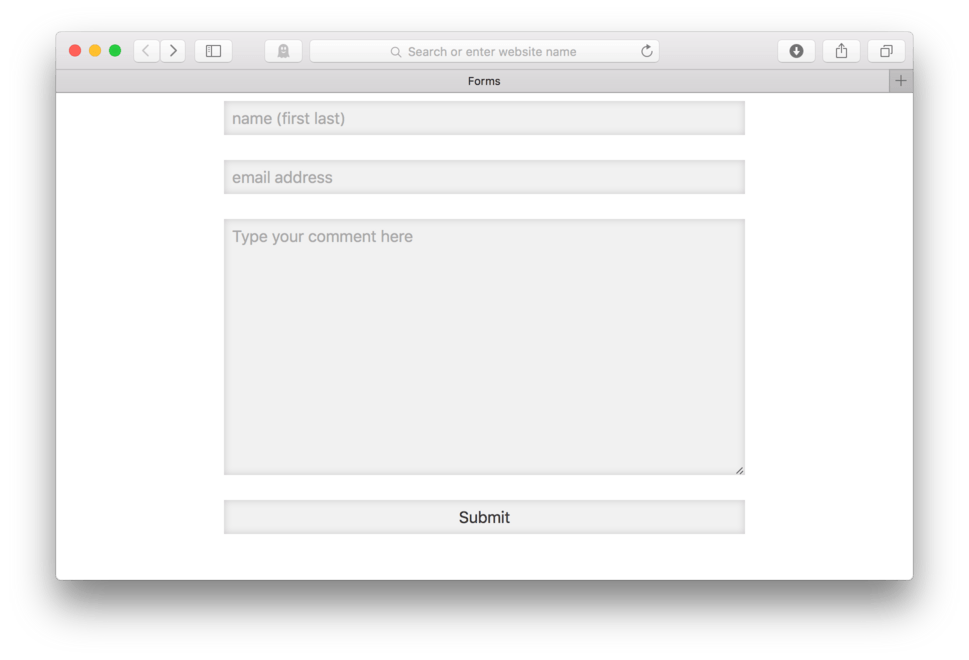
<form action="url" method="post">
	<input type="text" name="name" placeholder="name (first last)">
</form>
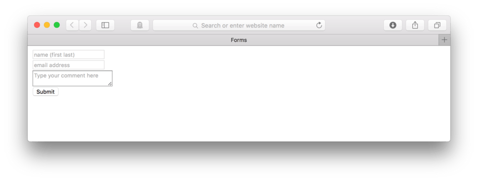
and here’s how it looks in the browser. (fig. 7)
You’ll see that by default the browser draws a box with a thin grey outline. Inside the box should be the text that you typed inside the placeholder= attribute. In this case, we typed, name (first last), which we see as default text in our field box. Go ahead and click inside. Make sure you are able to type in there.
Note: I know that many sites like to separate first name and last name, and this might even be necessary in cases where identity is important like when collecting credit card information, but in the case of a simple contact message, all I really want to know is how to address the person leaving the message, so I keep it simple.
Okay, cool. Now we can add some more HTML to our page.
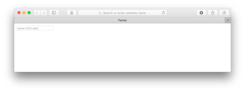
Let’s add another text field, this time to collect an email address so we can email a reply to our user. Then we’ll add a textarea so our user can type in a message of any length.
- Add:
<input type="email" name="email" placeholder="email address">
to add our email input with default text telling our user what we’d like them to type inside.
- Add:
<textarea name="comment" placeholder="Type your comment here"></textarea>
to add a large text field with the default text prompting our user to type a longer message.
- Save your file and Refresh in your browser
Here’s how your HTML should look now:
<form action="url" method="POST">
	<input type="text" name="name" placeholder="name (first last)">
	<input type="email" name="email" placeholder="email address">
	<textarea name="comment" placeholder="Type your comment here"></textarea>
</form>
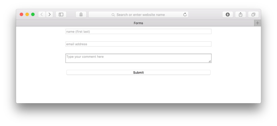
and here’s how it looks in the browser. (fig. 8)
Okay, so the layout leaves something to be desired yet, but we are getting the right pieces showing up and that is half the battle. We successfully have two text fields and one textarea that all do a pretty good job of telling our user what we would like them to do.
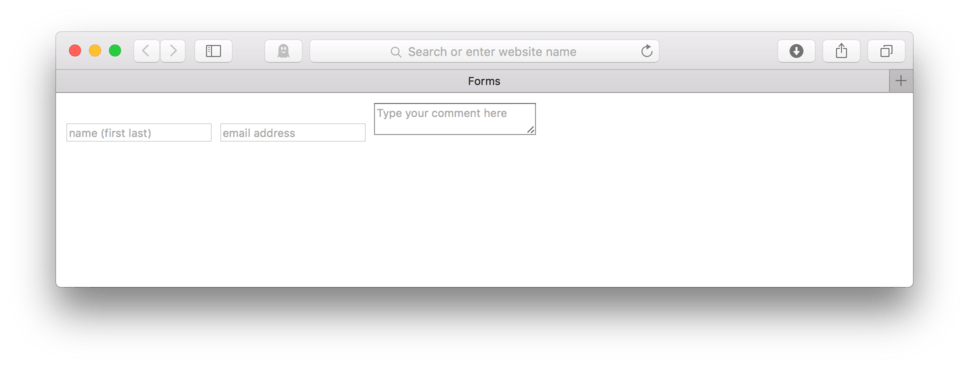
Now, let’s go back and add our submit button.
- Find your HTML file
- Before the ending
</form>tag, we’ll add:
<input type="submit" name="submit" value="Submit">
to add our submit button with the button text, “Submit”.
- Save and Refresh
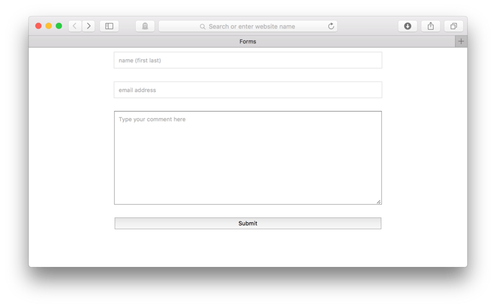
Here’s how your HTML should look with the form finished:
<form action="url" method="POST">
	<input type="text" name="name" placeholder="name (first last)">
	<input type="email" name="email" placeholder="email address">
	<textarea name="comment" placeholder="Type your comment here"></textarea>
	<input type="submit" name="submit" value="Submit">
</form>
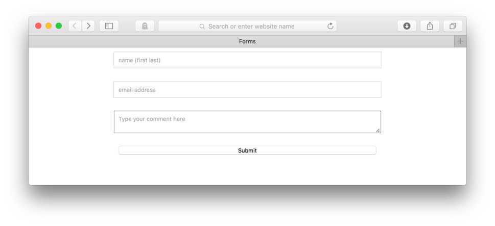
and here’s how it looks in the browser. (fig. 9)
Nice, we’ve done it. That’s it, we have our form. Now for some styling.
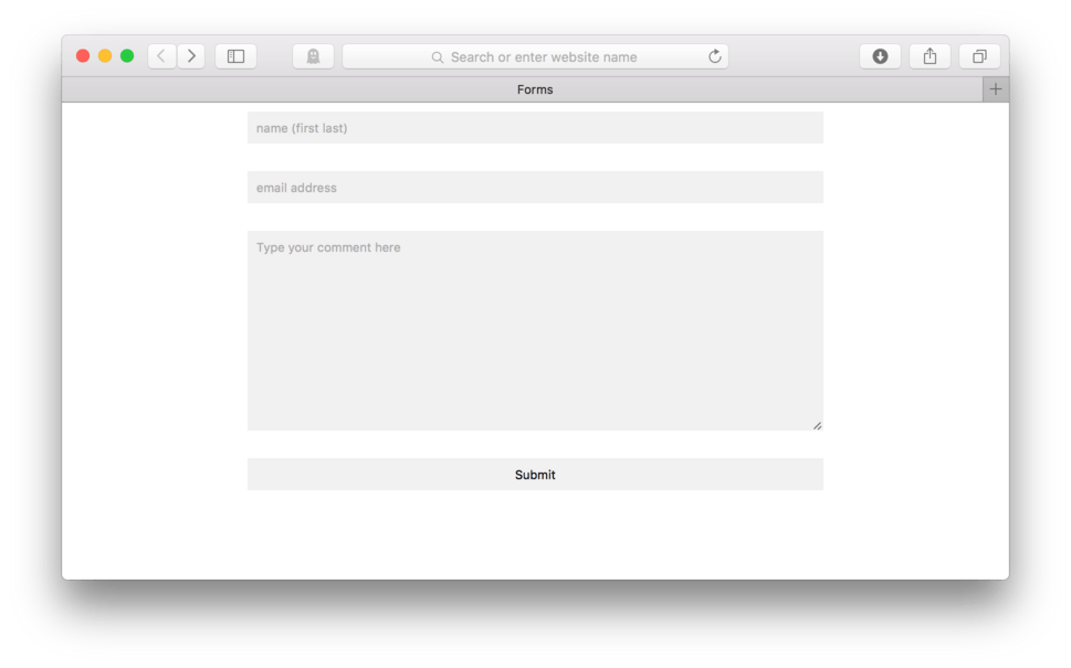
Styling Our Contact Form
As you’ve probably already noticed, form elements come with a boatload of default style settings attached. Most of them do a decent job of making our form usable and somewhat nice looking, the one that bugs me the most is the inline display. Especially when considering the mobile user, side by side inputs are difficult to use. Let’s tackle that first.
- Locate your CSS file
- We have two different elements that need to be addressed,
inputandtextarea. We can combine them into one selector if we use a comma between them. Add:input, textarea {to your CSS. - Now, add:
display: block;to change the default display property. - Save and Refresh
Here’s my CSS:
input, textarea {
	display: block;
}
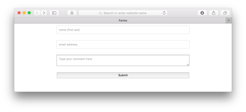
and here’s how it looks in the browser. (fig. 10)
So, obviously it still needs work, but this is a good start.
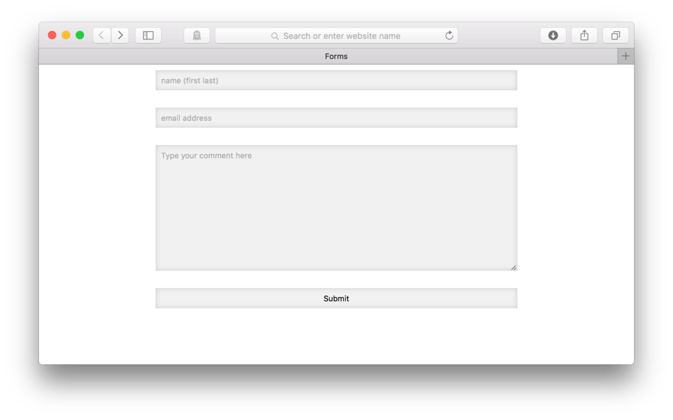
Next, let’s set a width and center our elements. I like to set my width to a percentage, how about 60%.
- Locate your CSS file
- Add:
width: 60%;to tell those elements to span 60% of the available page width. - To center, we’ll need to add a left and right margin set to auto. We can take advantage of the
margin:allowing us to set all four sides so we can make space between our fields. Add:margin: 0 auto 25px auto;to give us an additional 25 pixels of margin on the bottom of all our our elements. - Save and Refresh
Here’s my CSS:
input, textarea {
	display: block;
	width: 60%;
	margin: 0 auto 25px auto;
}
and here’s how it looks in the browser. (fig. 11)
Okay, it’s getting better. We do have some decent width now, but especially for our mobile users, we need to add more room to make more vertical space in each of those fields so it is easier to user if you are using a thumb or a finger to navigate the site.
The easiest way to do begin this is to use a bit of padding.
- Locate your CSS file
- Add:
padding: 8px;to yourinput, textarea { - Save and Refresh
Here’s my CSS:
input, textarea {
	display: block;
	width: 60%;
	margin: 0 auto 25px auto;
	padding: 8px;
}
and here’s how it looks in the browser. (fig. 12)
Everybody except our button responded. Our submit button has a special default setting that is keeping it from participating. By default, it has the CSS setting box-sizing: border-box; which has it measuring differently than the other elements. We can override this default setting by changing it to box-sizing: content-box;.
We need to find a way to talk only to our submit button. We could add a class or id if we wanted, but we have another option that works too. We can, in this case, use input[type="submit"] { as our selector since we only have one input with the type=”submit” on our page. The square brackets (shift curly brackets) allow us to use an attribute to help name a specific element from our HTML.
- Locate your CSS file
- Add a new CSS block using the selector:
input[type="submit"] { - Add:
box-sizing: content-box; - Close the block:
} - Save and Refresh
Here’s my CSS:
input, textarea {
	display: block;
	width: 60%;
	margin: 0 auto 25px auto;
	padding: 8px;
}

input[type="submit"] {
	 box-sizing: content-box;
 }
and here’s how it looks in the browser. (fig. 13)
Good deal, our submit button is now responding to our padding request. It is also now the same width as everyone else which is a nice added benefit.
Setting a Textarea Height
I like to provide more room visually in my textareas so my user clearly sees that they can write as much information as they would like in the box. Even if textarea can automatically expand to accept more text, it is always nice to also visually give a sense of something.
People will tend to write more and make fewer mistakes if they have a larger area to work in. It can be very frustrating if the box is too small to see what they have already written and make for difficult editing if they want to go back and make changes.
To add more vertical space to my textarea, I can simply add a height: property to the text area.
- Locate your CSS file
- Add a new CSS block with selector:
textarea {. I like to put mine above my selector for my button. - Add:
height: 15em; - Close the block:
} - Save and Refresh
Here’s my CSS:
input, textarea {
	display: block;
	width: 60%;
	margin: 0 auto 25px auto;
	padding: 8px;
}

textarea {
	height: 15em;
}

input[type="submit"] {
	 box-sizing: content-box;
 }
and here’s how it looks in the browser. (fig. 14)
Good deal, we did it. We now have a much bigger space for our user to type in their message.
The Extra Fancy Styling
The form as we have it now is already really useable on any device. Even if we view our site in Responsive Design Mode on an iPhone 6 we can see that our form still works fairly well (fig. 15).
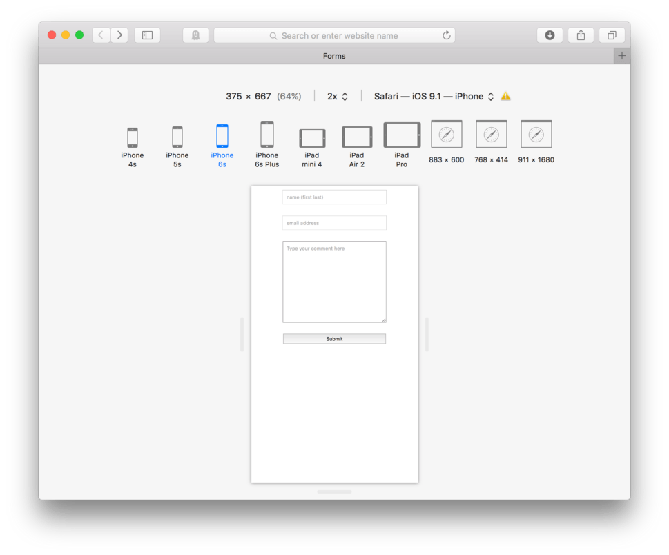
Let’s exit Responsive Design Mode for now.
There are a number of other things we can do to make this form a bit more special and look a little more modern.
I like to remove the border from the fields, and instead use a background color to differentiate the boxes from the background.
- In you CSS selector
input, textarea {, add the property,border:and set the value to0; - Next, add the property,
background-color:and set the value to#f1f1f1; - Save and Refresh
Here’s my CSS:
input, textarea {
	display: block;
	width: 60%;
	margin: 0 auto 25px auto;
	padding: 8px;
	border: 0;
	background-color: #f1f1f1;
}

textarea {
	height: 15em;
}

input[type="submit"] {
	 box-sizing: content-box;
}
and here’s how it looks in the browser. (fig. 16)
I also like to add just a bit more differentiation by adding a box shadow using a special new value inset to tell the browser that I want the shadow to happen inside the box rather than outside.
- Using the same selector we used above,
input, textarea {, add the property,box-shadow:and set the value toinset 0 0 8px #ccc; - Save and Refresh
Here’s my CSS:
input, textarea {
	display: block;
	width: 60%;
	margin: 0 auto 25px auto;
	padding: 8px;
	border: 0;
	background-color: #f1f1f1;
 	box-shadow: inset 0 0 8px #ccc;
}
and here’s how it looks in the browser. (fig. 17)
Now, I’m going to make the text larger on all my elements, and change the font color on my submit button to dark grey.
- In you CSS selector
input, textarea {, add the property,font-size:and set the value to1em; - Next, in the selector,
input[type="submit"] {, add the property,color:and set the value to#333; - Save and Refresh
Here’s my CSS:
input, textarea {
	display: block;
	width: 60%;
	margin: 0 auto 25px auto;
	padding: 8px;
	border: 0;
	background-color: #f1f1f1;
 	box-shadow: inset 0 0 8px #ccc;
 	font-size: 1em;
}

textarea {
	height: 15em;
}

input[type="submit"] {
	box-sizing: content-box;
	color: #333;
}
and here’s how it looks in the browser. (fig. 18).
Now, let’s style the button a bit more. I’m going to round the corners just a bit and change the background color to a medium grey. Let’s also add a hover to change the background to very dark grey and change the text to white when I hover over it.
First, let’s do the modifications to our submit button in its default state.
- In you CSS selector,
input[type="submit"] {, add the property,background-color:and set the value to#aaa; - Next, add the property,
border-radius:and set the value to5px;
Here’s my CSS so far:
input[type="submit"] {
	box-sizing: content-box;
	color: #333;
	background-color: #aaa;
	border-radius: 5px;
}
Now, let’s tackle the hover.
- To create a hover, add a new CSS block with the pseduo class
:hoverto read:input[type="submit"]:hover { - To this selector, add the property,
color:with the value,#fff;to change our text color - Next, add, the property,
background-color:with the value,#333;to change or background - Save and Refresh
Here’s my CSS:
input[type="submit"] {
	box-sizing: content-box;
	color: #333;
	background-color: #aaa;
	border-radius: 5px;
}

input[type="submit"]:hover {
	color: #fff;
	background-color: #333;
}
Here’s how it looks in the browser. (fig. 19).
Forms give us another pseudo class that we can take advantage of :focus. This pseudo class allows us to talk directly to an element when it is selected, which in the case of our forms, means that when it is activated or when a user clicks inside of it. Using :focus on our form elements means we can change any property we want when it is clicked which can be pretty neat.
By default, the :focus makes a glowing blue line around form elements. I like to turn that off using outline: 0 and instead, change the background color of the element.
- After our hover, add a new CSS block using,
input:focus, textarea:focus {as our selector - Add the property,
outline;and the value,0;to turn off the default blue outlines - Next, add the property,
background-color:with the value,#ffffff - Save and Refresh
Here’s my CSS:
input:focus, textarea:focus {
  outline: 0;
  background-color: #ffffff;
}
and here’s what it looks like in the browser (fig. 20).
Pretty cool, huh? Now for the finishing move, I want to apply a CSS3 transition property to all my elements including my button hover so that it smoothly changes color. Remember to use a CSS3 transition, we need to use browser prefixes and make sure to apply it to the default state of our elements.
Here’s the CSS:
input, textarea {
	display: block;
	width: 60%;
	margin: 0 auto 25px auto;
	padding: 8px;
	border: 0;
	background-color: #f1f1f1;
 	box-shadow: inset 0 0 8px #ccc;
	font-size: 1em;
	-webkit-transition: all .25s ease 0s;
	-moz-transition: all .25s ease 0s;
	-o-transition: all .25s ease 0s;
	transition: all .25s ease 0s;
}
and here’s how it looks in the browser. (fig. 21)
We can see that adding that transition did its job and created a nice smooth transition from one color to another.
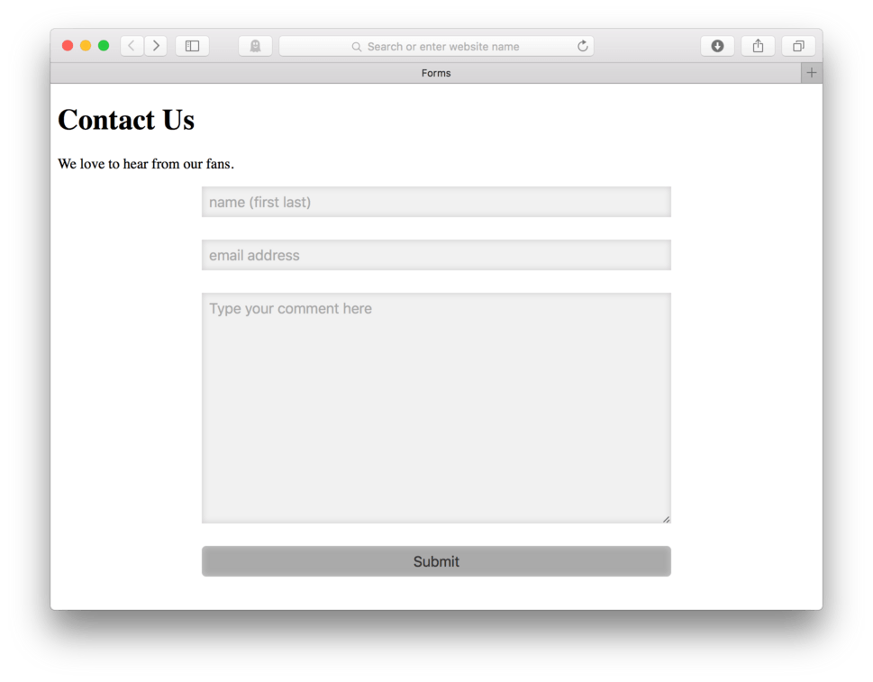
To finish this off, let’s just add a bit more HTML to our page. Let’s add and h1 and a paragraph letting our user know what page they are one and what they should do.
- Locate your HTML file
- At the top, after the opening
<body>tag, add:<h1>Contact Us</h1> - Next, add:
<p>We love to hear from our fans.</p> - Save and Refresh
Here’s how it looks in the browser. (fig. 22)
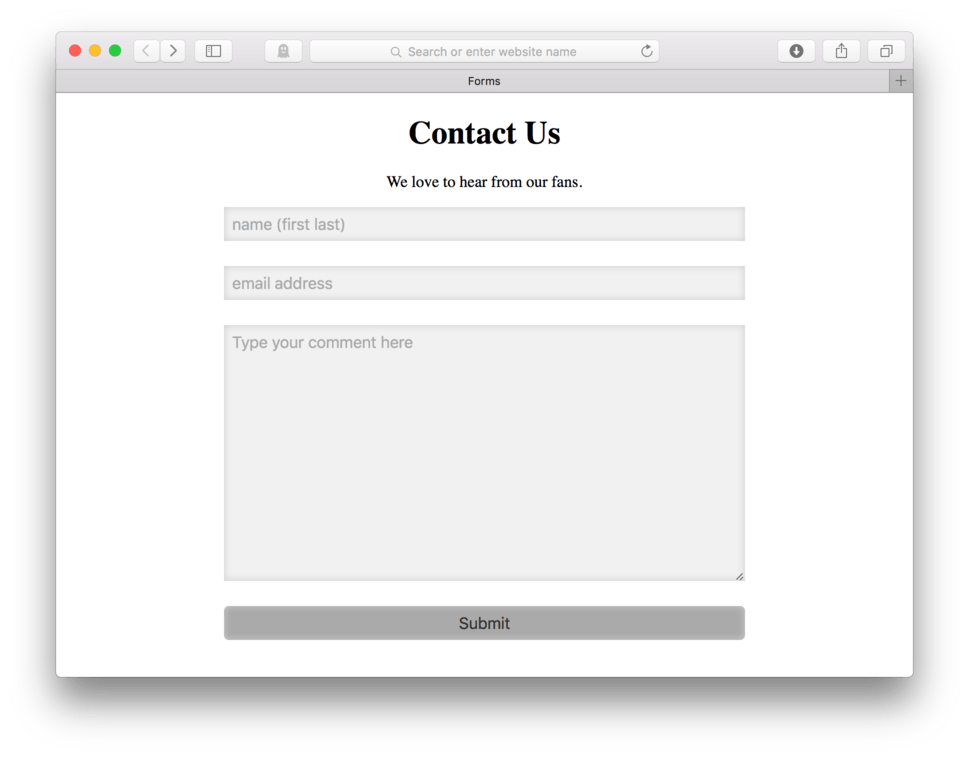
We can center those bits if we like.
- Locate your CSS file
- At the top of your CSS, add:
h1, p {to talk to both your h1 and your paragraph at the same time. - Add:
text-align: center; - Close the block:
} - Save and Refresh
Here is the CSS:
h1, p {
	text-align: center;
}
Note: You might have noticed that I used a comma to separate two elements in the selector. Using a comma allows us to apply the same CSS properties to two or more elements at once. Think of the comma as an “and” so that the selector reads, “ Apply the following CSS to the h1 and the p”. As a reminder, # or . mean an element with the name or class of, a space means inside of, and then our newest addition, a comma, means “and”.
and here’s how it looks in the browser. (fig. 23)
and that’s it. We’ve built and styled a simple contact form. There is still the matter of hooking up our form elements to a database, but remember for that we need a developer or a third party service to make that work. I’ll talk more in the following section about my favorite third party service for hooking these guys up.
Third Party Form Processing
I’ve already mentioned this a few times before, but it’s worth repeating again. Forms require special backend stuff to make them work. We need to have both a database and some programming skills to get this to work without the help of an outside service provider. Many designers work closely with developers to get this part of their websites up and running, but others rely on third party services to handle all of that.
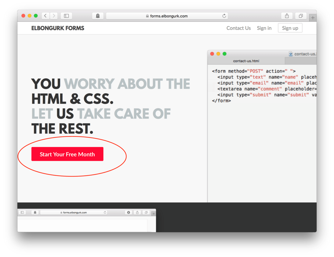
The third party service I’m going to recommend is a product called Elbongurk Forms by a company called Elbongurk. It has a simple to use interface that makes incorporating fully functional forms into our website easy. It has a free trial, so you can try it out for 30 days before deciding whether or not it’s a good addition to your workflow.
The first thing you’ll need to do is to get a Forms account.
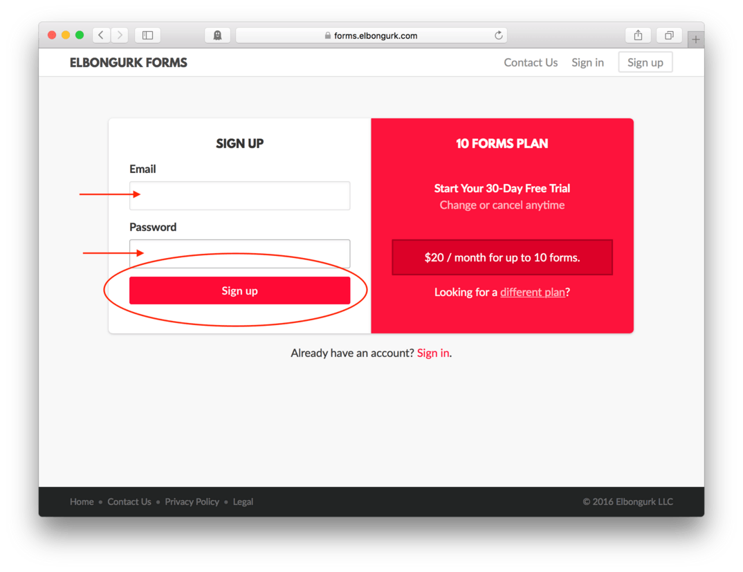
- Visit Elbongurk Forms and click Start Your Free Month. (fig. 24)
- Enter your email address and a new password
- Hit Sign up (fig. 25)
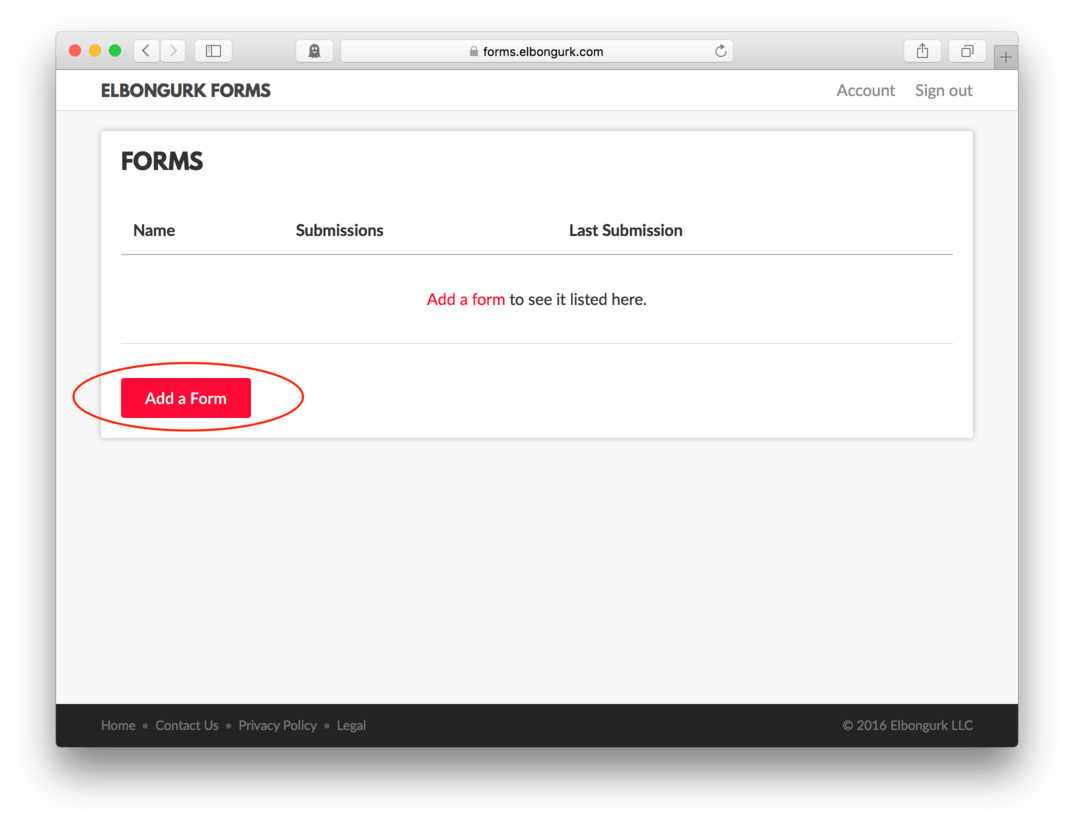
After your get signed up, you’ll automatically be taken to a Forms page.
- Click Add a Form to create your first form. (fig. 26)
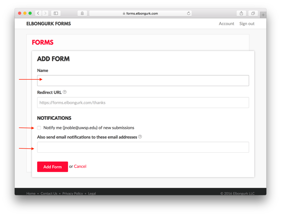
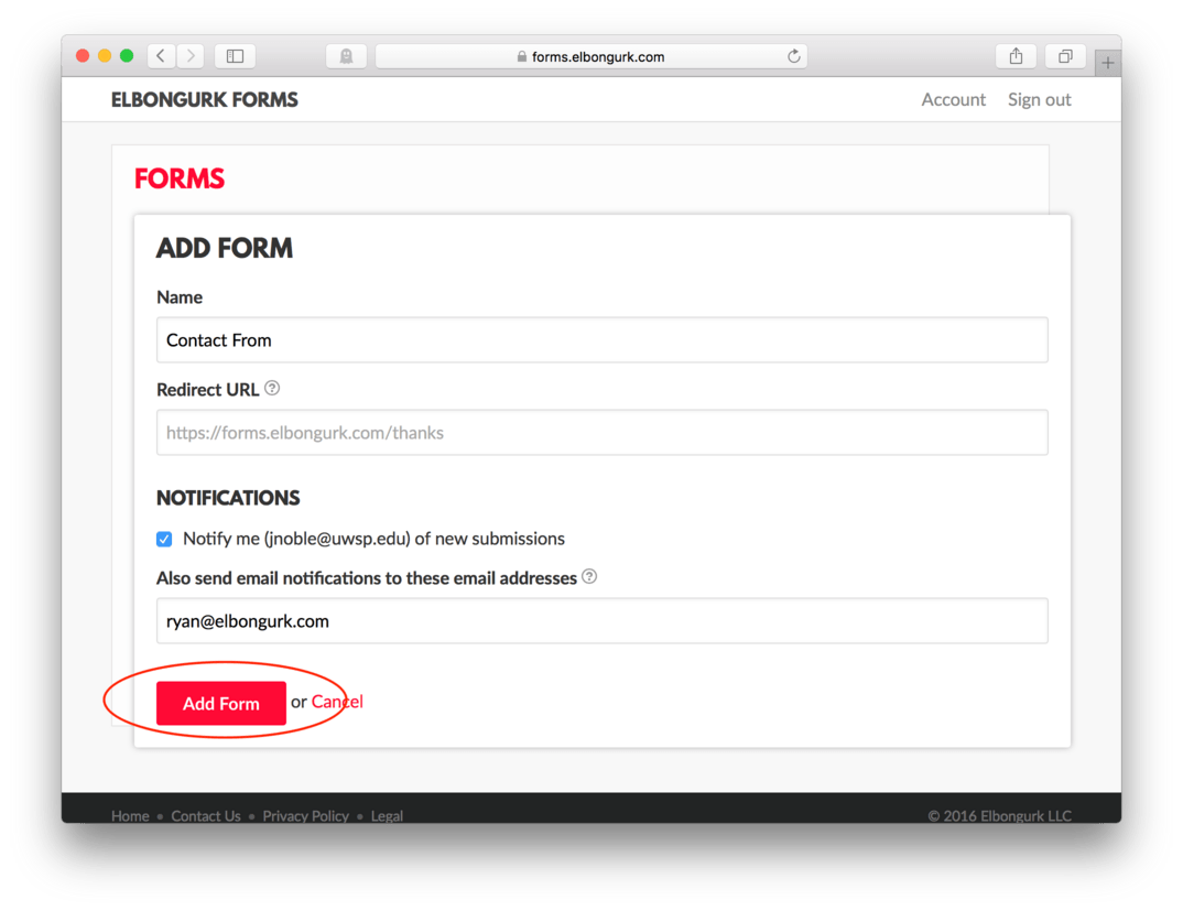
- On the next page, you’ll be asked to choose a name for your form. I’m going to call mine: Contact Form. You’ll also be able to add a redirect page if you have one ready, opt in for email notifications, and include any other person on the notifications by adding their email address. (fig. 27)
Once you have your information complete, click Add Form. (fig. 28)
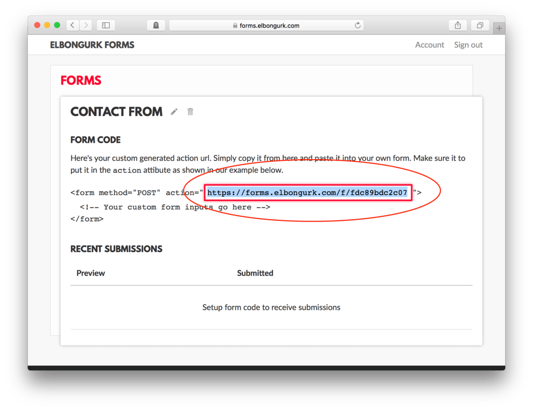
This next page has the code snippet we’ll need to connect our form to the database. Inside the red box, you should see the url that we will need to be include inside the action attribute in our HTML file.
We’ll need to Copy the url from the action= included in the in the red box. (fig. 29)
- Find your HTML file
- Replace
"urlin theaction="url"attribute in your opening<form>tag with the pasted code. Make sure to keep the double quotation marks around it.
Here’s how my HTML looks, yours should be similar but have a unique number on its address
<form action="https://forms.elbongurk.com/f/fdc89bdc2c07" method="POST">
- Save and Refresh
Now, to test, we need to fill out our own form.
Go ahead and fill yours out and hit Submit. As long as you are connected to the internet, this should work. (fig. 30)
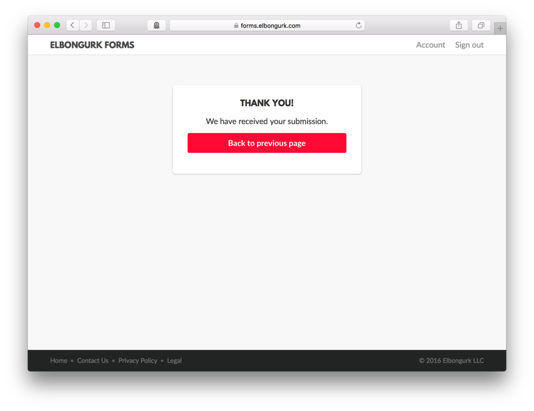
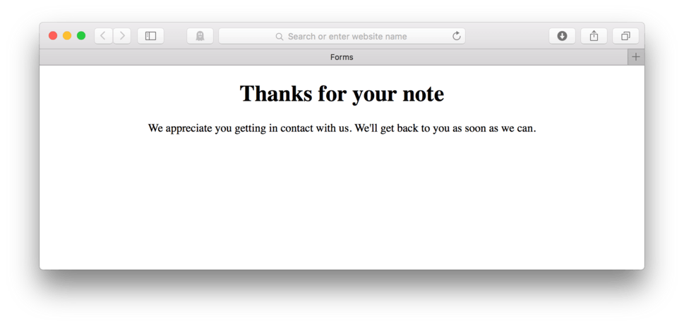
We’ll know it worked in two ways. First, if we get taken to Elbongurk Form’s Thank You page (fig. 31), we know that our redirect worked.
Secondly, we’ll need to check and see if our Elbongurk Forms account received our message.
- Go to Elbongurk Forms and login if you aren’t already.
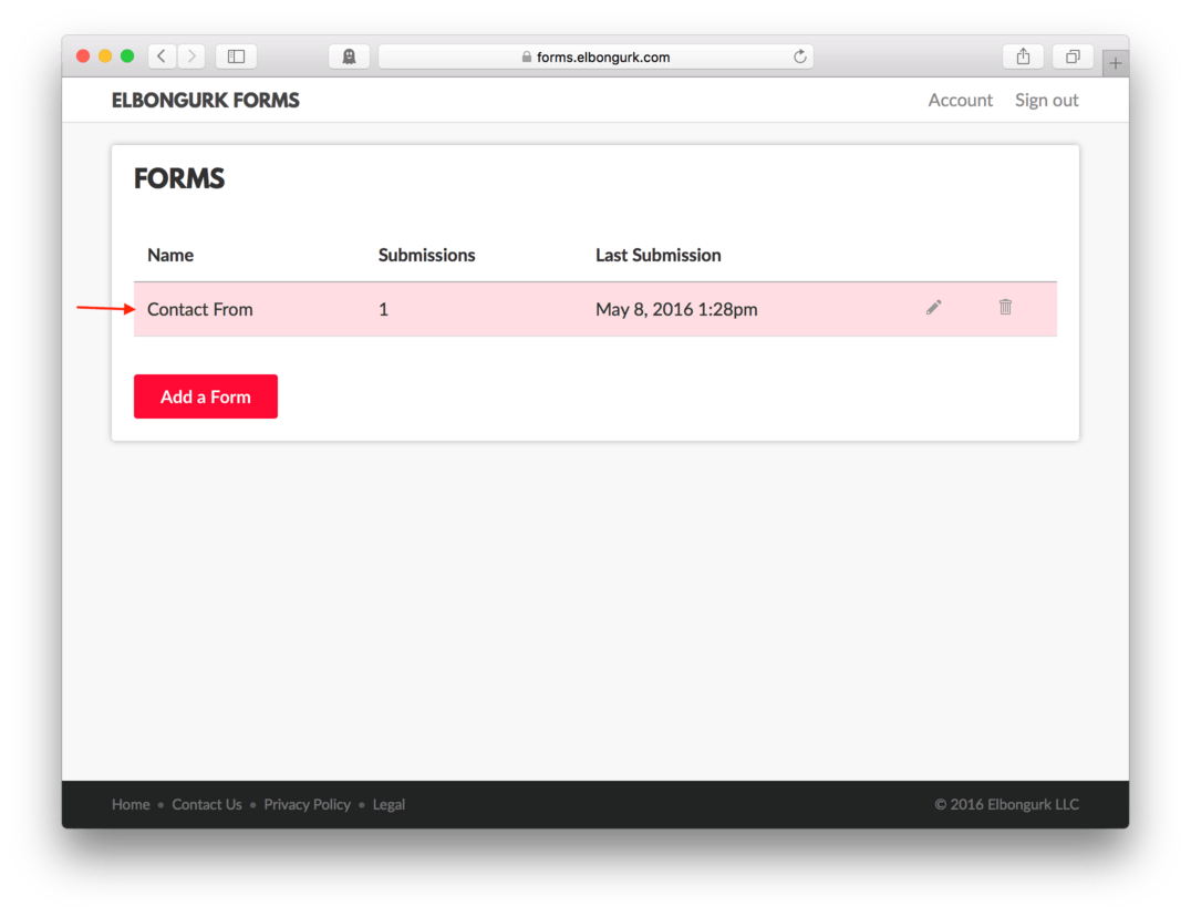
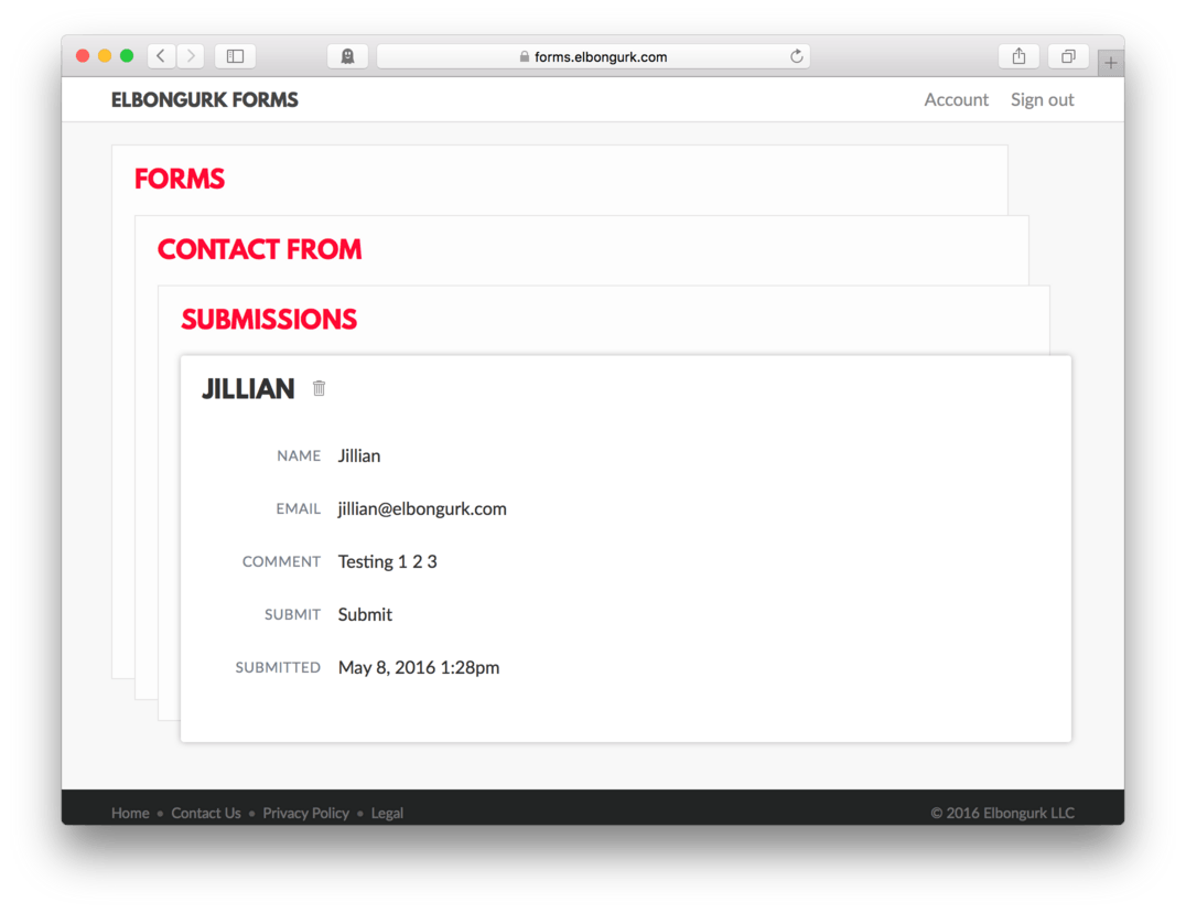
- You should see the form you created a few minutes ago show up, and it should show that you have 1 submission. Click anywhere on that form to view it’s details. (fig. 32)
At the bottom of this page, you should now see your test submission in the list. (fig. 33)
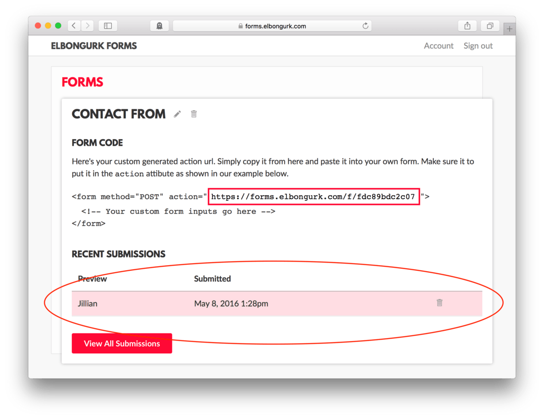
Click anywhere on the submission to view it’s details. (fig. 34)
The other thing is that you should check the email that you entered to make sure you were notified that you received a submission. The email will come with a subject line that says something like: New Submission for Contact Form. Inside the body of the email will be all the information submitted into the contact form.
This is great because you won’t even need to login to Forms to check messages, you can get them delivered right to your inbox.
For most personal websites and many small businesses, you might find that the 1 Form plan, the lowest plan offered, is all you ever need.
Make a Redirect Page
Right now, when our user hits “Submit”, they are taken to Form’s default Thank You page and that is okay but it could be better. We’ll need to create a separate page that matches our website for our user to be taken to instead.
I would recommend creating a page that has the same header and footer as any other page in your site, but for content has a heading that says something along the lines of, “Thanks for your note” and at least a paragraph letting your user know that you appreciate their note and that you will respond as soon as you can.
It’s important to provide this feedback to your user. It’s important for your personal brand, but it is also important because you need to let your user know that you have received their note and that their job is done. You also want to take the opportunity to keep them on your page. They may be interested in other content you have available and might keep browsing even after they have sent their note.
While we’re here, let’s go ahead build ourselves a simple thank you page.
- Find TextMate
- File > New
- Copy the top portion of your boilerplate from your lesson17.html file, everything until after the opening
<body>tag - Paste it in your new file
- Add:
<h1>Thanks for your note</h1> - Add:
<p>We appreciate you getting in contact with us. We'll get back to you as soon as we can.</p> - Add the
</body>and</html>to finish it off - File > Save As
- Name your file thankyou.html and make sure it gets put in your root folder. It should site side by side with your lesson17.html file.
- Save and Refresh
Here’s how your HTML should look:
<!doctype html>
<html>
	<head>
		<title>Forms</title>
		<meta name="viewport" content="width=device-width, initial-scale=1" />
		<link href="css/style.css" rel="stylesheet" />
	</head>

	<body>

		<h1>Thanks for your note</h1>
		<p>We appreciate you getting in contact with us. We'll get back to you as soon as we can.</p>

	</body>

</html>
and here’s how it looks in the browser. (fig. 35)
It’s nothing special, but it does give us a place to send our users after they have finished with their form. It helps them know that we did receive their message and that they should expect to hear from us. If this were our business or portfolio page, we’d make sure to add the other common site things like our header with logo and navigation and our standard footer. This page, essentially would be made to look just like any other page in our site, but it would only be accessible by submitting a message via our contact form.
Note: It’s important to note, even though it might be a bit obvious to some of you, that you have to have a live page for any of this to work. We were able to send a test submission because our site lives on our computer. We’ll need to make sure our redirect address is also a live address. For anyone else to do it, the site has to be published live on a server as does our thank you or redirect page. We’ll cover the details of publishing a site and setting up our official redirect page in the next lesson.
Lesson Conclusion
This lesson gave an overview of HTML forms and the uses associated with them. We learned that forms allow our users to input and send us certain information. We also learned that as web designers, it’s our job to setup the HTML and the CSS to control the layout and styling of our forms and that once those are in place, we’ll need to employ the help of a developer or a third party service like Elbongurk Forms to manage our entries.
In the last part of the lesson we learned how to create and style a basic contact form and get it up and running using an outside service called Elbongurk Forms We learned that it is always a good idea to design a redirect page so our user has some place to land once they’ve submitted their form and lastly we learned that we need to learn how to publish a website in order to really take advantage of any of it. We’ll pick up on that next.
Next up, we will finally publish a website.