CSS3
- CSS3
Overview
By now you should have a pretty good handle on connecting a stylesheet to an HTML file and using it to control the presentation of your site. The CSS we’ve already learned has been around for quite some time and is really well supported by almost all browsers.
More recently, as of the last few years or so, a few new CSS moves have been added to the CSS spec. These new additions allow for things like simple animations on hovers, drop shadows, or even the ability to use a gradient for a background color. Though not all browsers will allow for these things, most do and so we can begin to integrate these into our websites.
Lesson Setup
Let’s go ahead and create our lesson folder structure, our initial HTML file and connect it up with a new stylesheet.
Folder Setup
- Create a new Lesson15 folder inside of Bob
- Create the notes and root folders
- Inside the root folder, create an images folder and a css folder
- Download the lesson 15 resources from here.
- Move those images into your images folder for this lesson
HTML Setup
- Open up TextMate
- File > New to open a new file
- Code in your boilerplate HTML making sure to add a title to the page. I’m calling mine: CSS3.
- Make sure that your boilerplate includes the
<meta name="viewport" content="width=device-width, initial-scale=1" />we learned in lesson 8 to ensure the site works properly on a mobile device. - Save your HTML file to your Lesson15 root folder with the name: lesson15.html
- Open and Preview your page in the browser, checking to make sure your page title is appearing correctly.
CSS Setup
- Open up TextMate
- File > New to open a new file
- File > Save
- Navigate to the “css” folder you created
- Name your file, style.css
- Hit Save
- Attach this stylesheet to our HTML page. Type:
<link href="css/style.css rel="stylesheet" />into the head section of our lesson15.html file. - File > Save the HTML file
Your HTML should now look like this:
<!doctype html>
<html>

	<head>
		<title>CSS3 </title>
		<meta name="viewport" content="width=device-width, initial-scale=1" />
		<link href="css/style.css" rel="stylesheet" />
	</head>

	<body>

	</body>

</html>
Note: You may have noticed that I’ve shortened the lesson setup to a list of action steps above. If you need a refresher on folder and file organization see the lesson 3 setup section.
Let’s test to make sure our pages connected correctly.
- Navigate back to your new CSS file.
- Let’s change the background color of the body element. Type:
body {on an open line and hit Enter - Now, type the property we want to change:
background-color: - Type:
pink;and hit Enter - Close the CSS block, type:
} - Save this file and Refresh the browser
If your background turned pink, then you are set. Everything is working correctly. You can go ahead and delete that CSS block, so we can start fresh.
Initial HTML Content
In the last lesson we built a horizontal navigation inside our header. Let’s go ahead and use that HTML from last time in this lesson.
You can Copy and Paste it from right here:
<header>
	<nav>
		<ul>
			<li><a href=" ">Home</a>
			<li><a href=" ">About</a>
			<li><a href=" ">Services</a>
			<li><a href=" ">Contact</a>
		</ul>
	</nav>
</header>
Save your HTML file and Refresh in your browser.
here’s how it looks in the browser so far. (fig. 1)

Now let’s also go ahead and borrow the CSS we used last time to style this into a top bar navigation.
You can Copy and Paste it here:
header nav ul {
	list-style: none;
	padding-left: 0;
	text-align: right;
}

header nav li {
	display: inline-block;
	margin: 0 2px;
}

header nav li a {
	display: inline-block;
	padding: 5px 20px;
	text-decoration: none;
	color: grey;
}

header nav li a:hover {
	text-decoration: underline;
}
and here’s how that should look in the browser. (fig. 2)

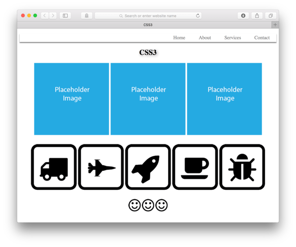
Okay, that’s a good start. Now let’s add some new content.
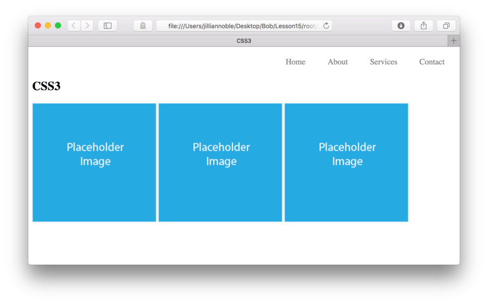
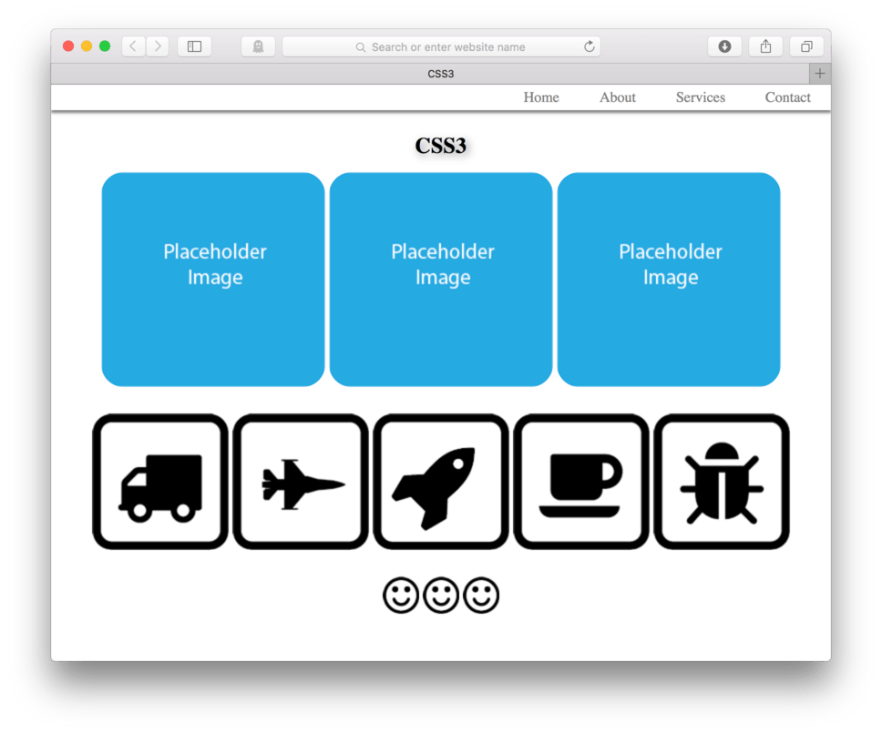
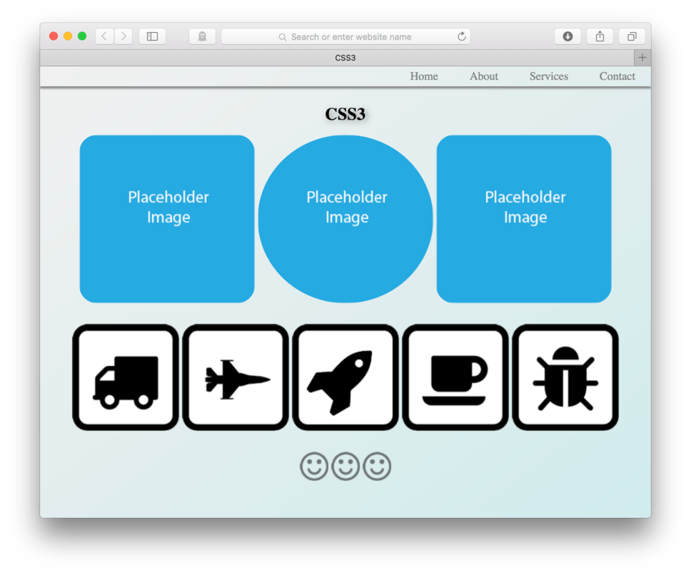
I want to add two sections. The first will have an h1 which includes the text, “CSS3” and three images, each one using “placeholder.png” from our images folder. It’ll look like this in the browser (fig. 3). See if you can code it into the HTML yourself. You can then check your work against my code below.
Here’s how your HTML should look:
<header>
	<nav>
		<ul>
			<li><a href=" ">Home</a>
			<li><a href=" ">About</a>
			<li><a href=" ">Services</a>
			<li><a href=" ">Contact</a>
		</ul>
	</nav>
</header>

<section>
	<h1>CSS3</h1>
	<img src="images/placeholder.png"/>
	<img src="images/placeholder.png"/>
	<img src="images/placeholder.png"/>
</section>
How close did you get? Hopefully you were right on. If not, then you were probably very close and will get the next one.
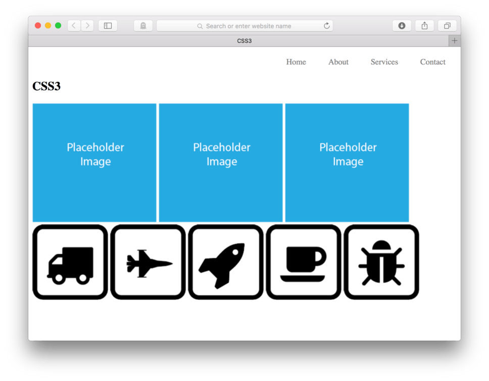
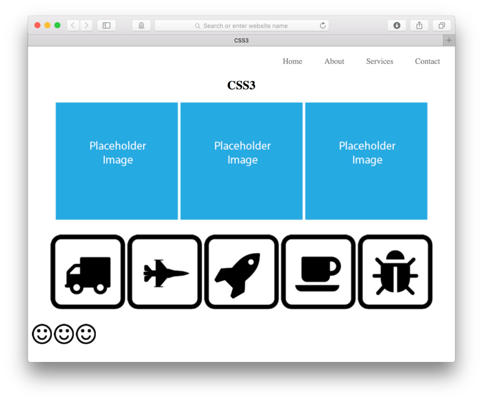
Now, we’ll add another section. This one will contain five images: “truck.png”, “plane.png”, “rocket.png”, “coffee.png”, and “bug.png”. These all should already be in your images folder. When you are done, it should look like this in the browser. (fig. 4). Go ahead, code it in. You can check your work against mine below.
Here’s my HTML for comparison:
<header>
	<nav>
		<ul>
			<li><a href=" ">Home</a>
			<li><a href=" ">About</a>
			<li><a href=" ">Services</a>
			<li><a href=" ">Contact</a>
		</ul>
	</nav>
</header>

<section>
	<h1>CSS3</h1>
	<img src="images/placeholder.png"/>
	<img src="images/placeholder.png"/>
	<img src="images/placeholder.png"/>
</section>

<section>
	<img src="images/truck.png"/>
	<img src="images/plane.png"/>
	<img src="images/rocket.png"/>
	<img src="images/coffee.png"/>
	<img src="images/bug.png"/>
</section>
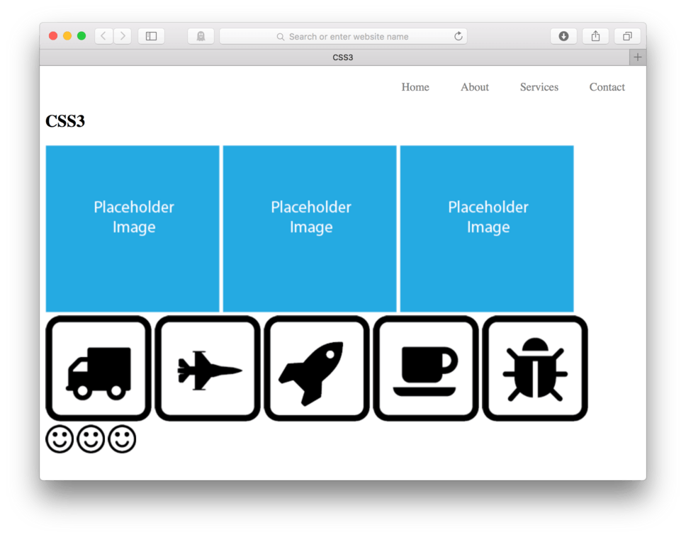
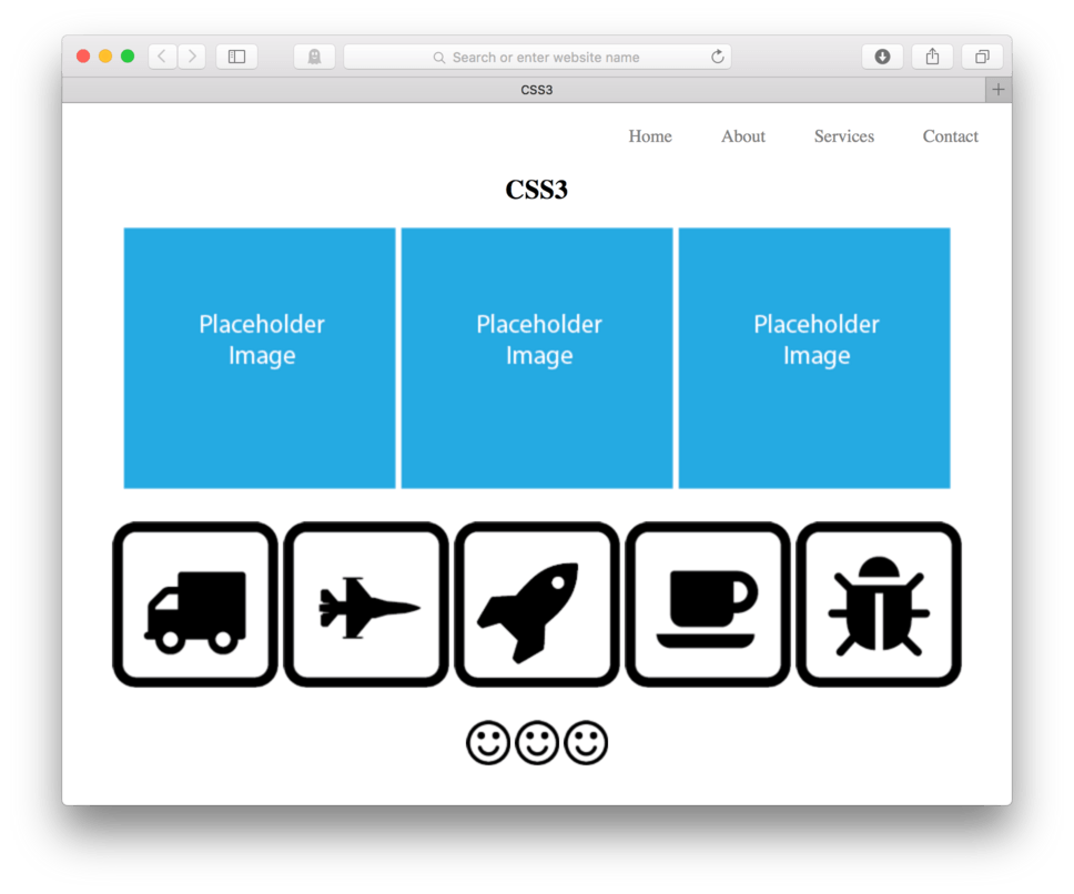
Did you get this one? Good! Okay, one more thing. I’d like to add a footer after our last section. Inside that footer, I want to add three images. All of those images should use “smiley.png” already inside our images folder.
(fig. 5) shows how it should look in the browser. I’ll include my HTML for you to compare once you’ve finished.
Here’s my HTML for comparision:
<header>
	<nav>
		<ul>
			<li><a href=" ">Home</a>
			<li><a href=" ">About</a>
			<li><a href=" ">Services</a>
			<li><a href=" ">Contact</a>
		</ul>
	</nav>
</header>

<section>
	<h1>CSS3</h1>
	<img src="images/placeholder.png"/>
	<img src="images/placeholder.png"/>
	<img src="images/placeholder.png"/>
</section>

<section>
	<img src="images/truck.png"/>
	<img src="images/plane.png"/>
	<img src="images/rocket.png"/>
	<img src="images/coffee.png"/>
	<img src="images/bug.png"/>
</section>

<footer>
	<img src="images/smiley.png"/>
	<img src="images/smiley.png"/>
	<img src="images/smiley.png"/>
</footer>
I bet you got that one. If not, don’t worry, it’ll just take a bit more practice.
Okay, so that’s it for the HTML. Let’s go ahead and add some basic initial CSS to our page.
Initial CSS Styles
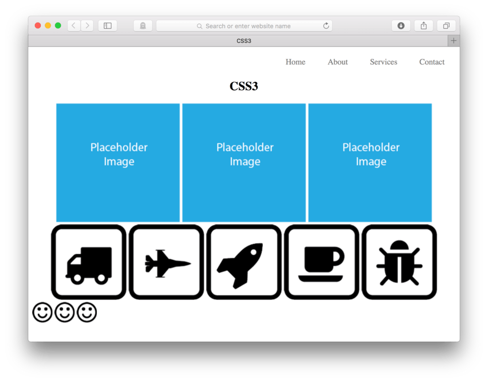
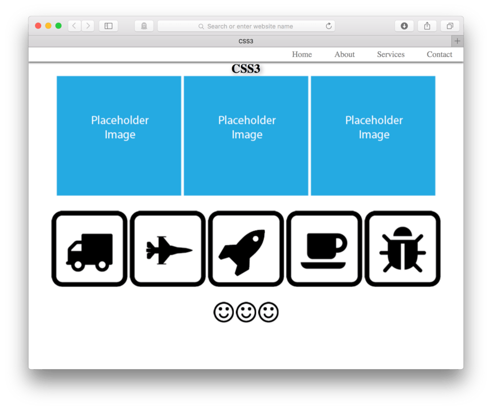
We are going to keep this page pretty simple to start. I’d just like to center all of my images and text and then add a little margin to add some vertical space between our sections.
To center everything inside our sections, we can simply tell our sections { to text-align: center;. It might seem weird that text-align can center images, but really what that does is allow any parent element to center its children. In this case the children are both text and images.
- After you navigation CSS add:
section {and hit Enter - Add:
text-align: center; - Close the block:
} - Save and Refresh
Here’s my CSS:
section {
	text-align: center;
}
and here’s how it looks in the browser. (fig. 6)
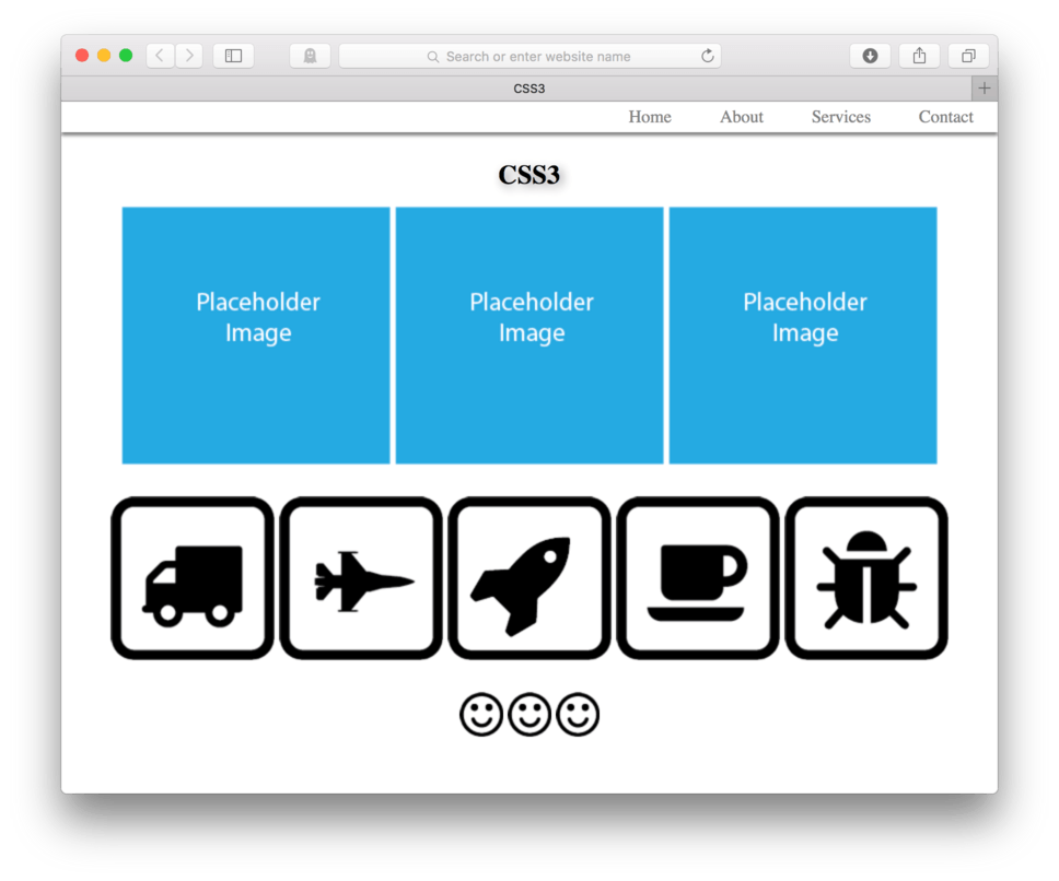
We can see that our images as well as our h1 that lives inside of our sections have all centered themselves. Now let’s add some margin-bottom to each of those sections. Let’s add 25 pixels.
- Add:
margin-bottom: 25px;to oursection {selector - Save and Refresh
and here’s how it looks in the browser. (fig. 7)
Good deal, we did make ourselves a little extra room. Next, let’s center our footer images. We’ll use the same technique as before. Let’s tell our parent, in this case the footer element, to text-align: center; to center its children elements.
- Add:
footer {as a new CSS selector - Add:
text-align: center; - Close the block:
} - Save and Refresh
Here’s my CSS:
footer {
	text-align: center;
}
and here’s how it looks in the browser. (fig. 8)
Good. Now that all of our content is centered, let’s begin to look at what we can do with CSS3.
Text Shadow
Using the CSS3 text-shadow: property, we can apply a drop shadow to any text element in our page. This property has a bit of a complicated value attached to it. It’s like our border, where we have to give a bunch of values to make it work.
Text shadow requires 4 values: x-offset, y-offset, blur, and color. We write the x, y, and blur values as pixel measurements. The color we can set using any web recognized color model (rgb, hexadecimal, or color names).
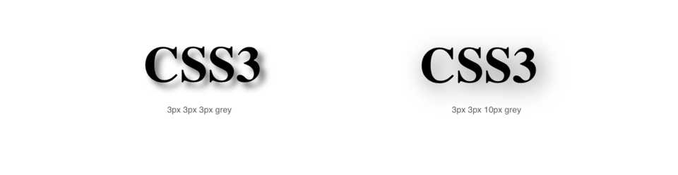
Let’s give this a try. Let’s tell our h1 to have a text shadow that has a 3 pixel x-offset, a 3 pixel y-offset, a 3 pixel blur, and the color grey.
- Add:
h1 {to your CSS - Add:
text-shadow: 3px 3px 3px grey; - Close the block:
} - Save and Refresh
Here’s my CSS:
h1 {
	text-shadow: 3px 3px 3px grey;
}
and here’s how it looks in the browser. (fig. 9)
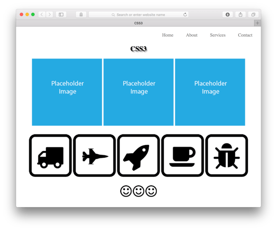
You should see a pretty noticeable grey drop shadow coming off our h1. It should be shifted 3 pixels right as we used a positive 3 pixels (using a negative number for x-offset will shift it left) and 3 pixels down (using a negative number for y-offset will shift it up). Our blur is more difficult to explain. Maybe it’s best if we change it to really see what that number does.
- Change your text-shadow value to:
3px 3px 10px grey; - Save and Refresh
and here’s how it looks in the browser. (fig. 10)
You’ll probably notice that your blur is a lot less defined at 10px than at 3px. That is essentially what happens, the lower the number the more crisp the blur and the higher the number the softer. Here are the two side by side for comparison. (fig. 11)
Box Shadow
Box shadow works much like text shadow. The major difference is just that box shadows are applied to the element boxes rather than the text. So we could put a drop shadow on our header for example. Let’s give that a try.
The property we need to use is box-shadow:. We use the same syntax for our values: x-offset, y-offset, blur, color.
- Locate your CSS file
- Add:
header {to our CSS - Add:
box-shadow: 3px 3px 3px grey; - Close the block:
} - Save and Refresh
Here’s my CSS:
header {
	box-shadow: 3px 3px 3px grey;
}
and here’s how it looks in the browser. (fig. 12)
Two things are going on here that aren’t so great. The first is that we have that annoying default margin on our body tag making a thin white border against the edges of our browser. The second thing is that we can see a noticeable corner, that is when we only really want the drop shadow on the bottom, we don’t really need an x-offset.
Let’s make some changes. First we’ll write a CSS block using our universal selector to get rid of the default margin. Next we’ll adjust our box-shadow value to get rid of the x-offset.
- Locate your CSS file
- Add:
* {to the top of your CSS file - Add:
margin: 0;to clear any default margin - Add:
padding: 0;to clear any default padding - Close the block:
} - Now, replace the x-offset on our
box-shadow {so the value reads:0 3px 3px grey; - Save and Refresh
Here’s my CSS:
* {
	margin: 0;
	padding: 0;
}
and
header {
	box-shadow: 0 3px 3px grey;
}
and here’s how it looks in the browser. (fig. 13)
Our box shadow is looking better, but now that we’ve gotten rid of our default margin and padding, it looks like we should add some margin to the bottom of our header and our h1 to make a little more vertical room.
- Locate your CSS file
- Add:
margin-bottom: 25px;to yourheader {selector - Add:
margin-bottom: 15px;to yourh1 { - Save and Refresh
Here’s my CSS:
header {
	box-shadow: 0 3px 3px grey;
	margin-bottom: 25px;
}
and
h1 {
	text-shadow: 3px 3px 10px grey;
	margin-bottom: 15px;
}
and here’s how it looks in the browser. (fig. 14)
We could keep going on the small adjustments, but at this point I think it’s best if we keep moving with the new and more exciting CSS3 stuff.
Border Radius
Border radius has the ability to round the corners of any element box in your HTML. The property is written: border-radius: and the value is given as a single measurement, usually pixels but really any unit will do.
Let’s go ahead and use the border-radius: property to round the corners of our blue placeholder images. First, we’ll need a way to talk directly to them. Since all three will have the same property applied, we’ll add a class to each of them. Let’s name this class, “rounded”.
- Locate your HTML
- Add:
class="rounded"to each of the<img />tags in the first section which holds the three blue placeholder images. - Save the HTML
- Now, locate your CSS file
- Add:
img.rounded {to your CSS file - Add:
border-radius: 25px; - Close the block:
} - Save and Refresh
Here’s how your HTML should look:
<section>
	<h1>CSS3</h1>
	<img src="images/placeholder.png" class="rounded"/>
	<img src="images/placeholder.png" class="rounded"/>
	<img src="images/placeholder.png" class="rounded"/>
</section>
Here’s my CSS:
img.rounded {
	border-radius: 25px;
}
and here’s how it looks in the browser. (fig. 15)
You’ll see that each of our blue placeholder images now have rounded corners by a radius of 25px. The larger the value, the more rounded the box. Eventually we can make a box have such rounded corners that it becomes a circle (if it starts a square).
Let’s try this out.
- In your HTML, change the class on the center blue placeholder image to be
class="circle" - Save your HTML
- Locate your CSS
- Add:
img.circle {to to your CSS to talk directly to that middle image. - Add:
border-radius: 50%; - Close the block:
} - Save and Refresh
Here’s how your HTML should look:
<section>
	<h1>CSS3</h1>
	<img src="images/placeholder.png" class="rounded" />
	<img src="images/placeholder.png" class="circle" />
	<img src="images/placeholder.png" class="rounded" />
</section>
Here’s my CSS:
img.rounded {
	border-radius: 25px;
}

img.circle {
	border-radius: 50%;
}
and here’s how it looks in the browser. (fig. 16)
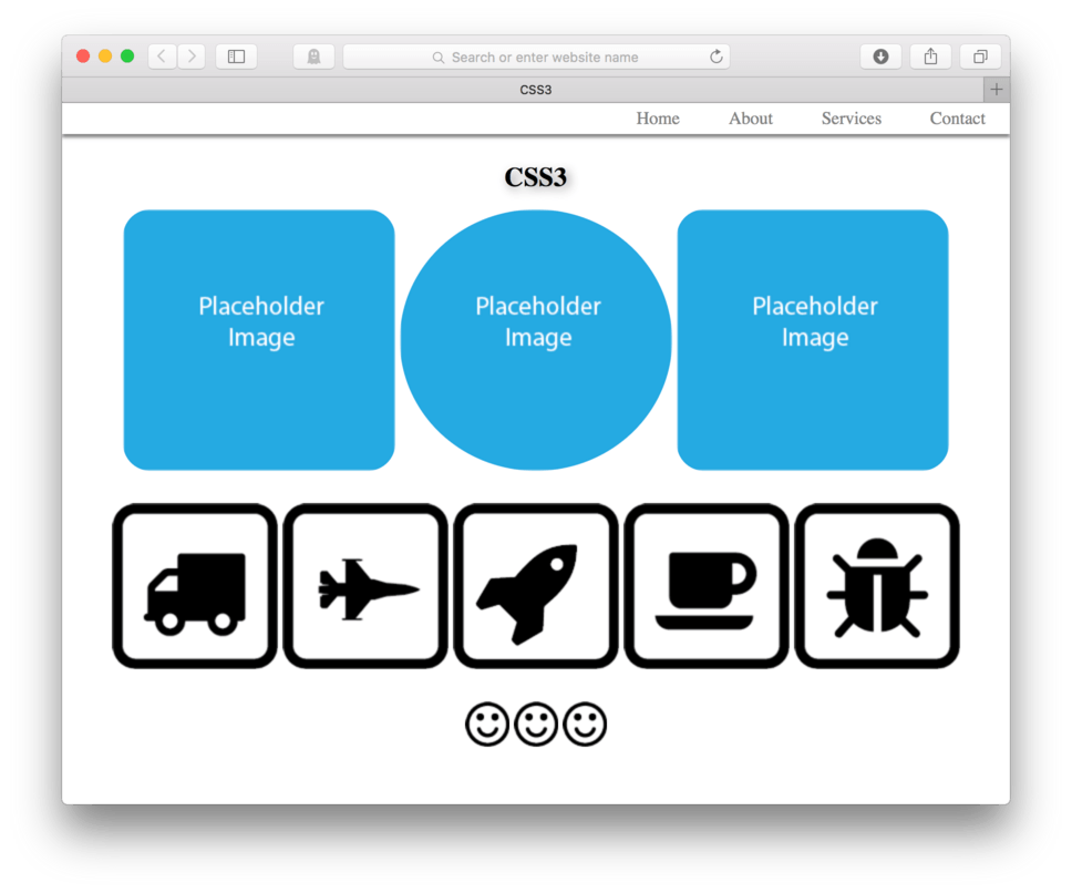
You’ll see that using 50% as the value in that center image makes the image into a circle. Pretty neat, huh.
Border Radius on Element Backgrounds
We can also use border-radius on background colors applied to elements. Let’s say that we wanted a background-color: yellow; applied to our navigation when we hovered. Now, let’s say we wanted that background to have slightly rounded corners. We can achieve this using a border-radius: property applied to the header nav li a:hover {. Let’s go ahead and give that a try.
- Add:
header nav li a:hover {to your CSS - Add:
background-color: yellow: - Add:
border-radius: 5px; - Close the block:
} - Save and Refresh
Here’s my CSS:
header nav li a:hover {
	background-color: yellow;
	border-radius: 5px;
}
and here’s how it looks in the browser. (fig. 17)
If you look closely at that yellow background created on the hover, you’ll see the corners are just so slightly rounded. This is a good example of how the element box is affected by the border-radius: property. It’s more clear that it’s the element box (content + padding + border) rather than just the content as it might appear from the images we did earlier. Just remember that those images don’t have any padding or border applied, so the box then is just the content.
Opacity
The opacity: property allows for setting opacity (transparency) on images in your web page. The value used is the percentage of opacity in decimal form with 1 being 100% opaque and 0 being 100% transparent.
Let’s practice this by asking our footer images to be 50% opaque.
- Locate your CSS file
- Add
footer img {as your CSS selector - Add:
opacity: .5; - Save and Refresh
Here’s my CSS:
footer img {
	opacity: .5;
}
and here’s how it looks in the browser. (fig. 18)
Cool, our images are now 50% opaque. Now let’s ask them to return to 100% opaque when we hover over them.
- Add:
footer img:hover {as a new CSS selector - Add: opacity: 1;
- Close the block:
} - Save and Refresh
Here’s my CSS:
footer img {
	opacity: .5;
}

footer img:hover {
	opacity: 1;
}
and here’s how it looks in the browser. (fig. 19)
You can see that as I hover over the footer images they become 100% opaque and when I move my mouse away, they return to their 50% stage.
It’s neat to see that you can use any of these CSS3 properties as hover properties. They can add a nice bit of surprise when a user interacts with them.
Transform Properties
The transform properties are a set of properties that that can do things like scale, rotate, and move an element around on the page. Each of them starts with the property transform: and is followed by a value with the specific type of transform: scale, rotate, translate, etc. We’ll go though them one by one.
These are not as widely supported by all browsers as the first few properties discussed in this lesson have been. To get around this, we can add what’s called vendor prefixes to make the properties work at least in more modern versions of each of the major browsers.
This means that you often need four lines of code where one would normally do, but it does make your site perform better across browsers. It’s a little like the @font-face where we needed to have a different font file for each browser, resulting in 4 or 5 lines of code, one for each browser.
Typically the browser prefixes are just a small bit of text that needs to be put in front of the property which gets repeated with the next prefix over and over.
The typical prefixes are:
-webkit-for Safari and Chrome-moz-for Mozilla and Firefox-o-for Opera (rare but used mobile browser)
Then you follow those prefixes with the typical property and value. This will likely make more sense when you can see it in practice. I’ll go through each of the transforms and their code below.
Scale
The transform: scale(); property can reduce or enlarge an element. The value used for this specific property is scale followed by a set of (). Inside those parentheses is the number in which we will multiply the original element size. So 1 is equal to the original size, 1.5 is equal to one and half times larger, and .5 is equal to half the original size and so forth.
In order to use any of these transforms we’ll have to use the vendor prefixes discussed above to make sure they work in as many browsers as we can.
Let’s ask our bug.png image to grow to be 1.5 times larger when we hover.
- First, we’ll need to be able to call our bug out in the CSS. Let’s add a
id="bug"to that<img />in our HTML - Save your HTML
- Now, in the CSS, add:
img#bug:hover {as a new selector - Next, we’ll add our property, remember we’ll need to use each browser prefix and then end with just the property and value alone, like this:
-webkit-transform: scale(1.5);
-moz-transform: scale(1.5);
-o-transform: scale(1.5);
transform: scale(1.5);
- Now, close the block:
} - Save and Refresh
Here’s how your HTML should look:
<section>
	<img src="images/truck.png"/>
	<img src="images/plane.png"/>
	<img src="images/rocket.png"/>
	<img src="images/coffee.png"/>
	<img src="images/bug.png" id="bug"/>
</section>
Here’s my CSS:
img#bug:hover {
	-webkit-transform: scale(1.5);
	-moz-transform: scale(1.5);
	-o-transform: scale(1.5);
	transform: scale(1.5);
}
and here’s how it looks in the browser. (fig. 20)
Now, if you hover over the image of the bug, he should grow to be 150% what he was. By moving the mouse away, he should return to his normal size.
Rotate
As you have probably already guessed, the transform: rotate(); property allows us to rotate any element on our page. It uses a degree measurement inside the parenthesis for its value ranging from 0-360 followed by deg to describe how many degrees rotation in will be applied to the element.
Like tranform: scale, this property requires vendor prefixes to ensure that it works properly across many different browsers.
Let’s go ahead and apply it to one of our elements to really see how it works. Let’s ask our coffee.png image element to rotate 90 degrees when we hover over it.
To do this, we’ll need to add an id= to speak to the coffee.png directly. Let’s name it “coffee” to keep things simple.
- Add a
id="coffee"to that<img />in our HTML - Save your HTML
- Now, in the CSS, add:
img#coffee:hover {as a new selector - Next, we’ll add our property, remember we’ll need to use each browser prefix and then end with just the property and value alone, like this:
-webkit-transform: rotate(90deg);
-moz-transform: rotate(90deg);
-o-transform: rotate(90deg);
transform: rotate(90deg);
- Now, close the block:
} - Save and Refresh
Here’s how your HTML should look now:
<section>
	<img src="images/truck.png"/>
	<img src="images/plane.png"/>
	<img src="images/rocket.png"/>
	<img src="images/coffee.png" id="coffee" />
	<img src="images/bug.png" id="bug"/>
</section>
Here’s the CSS:
img#coffee:hover {
	-webkit-transform: rotate(90deg);
	-moz-transform: rotate(90deg);
	-o-transform: rotate(90deg);
	transform: rotate(90deg);
}
and here’s how it looks in the browser. (fig. 21)
You’ll see that now, if you move your mouse to hover over our coffee cup, it will rotate 90 degrees. If you mouse away, it will return to its original orientation.
Translate
The transform: translate(); property allows us to move any element on our page. It uses a value measurement inside the parenthesis that has two numbers.
The first number is the x-offset, telling the browser how much to move the element left or right. A positive x-offset indicates a move to the right and a negative x-offset indicates a move to the left.
The second number is the y-offset, this number tells the browser to move the element up or down. A positive number indicates a down movement where a negative number indicates a movement up. Both of these values need to be given a unit, pixels is very commonly used.
Like transform: rotate and transform: scale, this property requires vendor prefixes to ensure that it works properly across many different browsers.
Let’s go ahead and apply it to one of our elements to really see how it works. Let’s ask our rocket.png image element to translate (move) 10px right, and 20px up when we hover over it. Remember that to move an element up, we’ll need to use a negative number for the y-offset.
To do this, we’ll need to add an id= to speak to the rocket.png directly.
- Add
id="rocket"to our<img />that holds rocket.png - Save your HTML
- Now, find your CSS file
- Add:
img#rocket:hover {as a new selector - Next, we’ll add our property, remember we’ll need to use each browser prefix and then end with just the property and value alone, like this:
-webkit-transform: translate(10px, -20px);
-moz-transform: translate(10px, -20px);
-o-transform: translate(10px, -20px);
transform: translate(10px, -20px);
- Now, close the block:
} - Save and Refresh
Here’s how your HTML should look:
<section>
	<img src="images/truck.png"/>
	<img src="images/plane.png"/>
	<img src="images/rocket.png" id="rocket"/>
	<img src="images/coffee.png" id="coffee"/>
	<img src="images/bug.png" id="bug"/>
</section>
Here’s my complete CSS:
img#rocket:hover {
	-webkit-transform: translate(10px, -20px);
	-moz-transform: translate(10px, -20px);
	-o-transform: translate(10px, -20px);
	transform: translate(10px, -20px);
}
and here’s how it looks in the browser. (fig. 22)
You’ll see that now, if you move your mouse to hover over our rocket, it will reposition itself 10 pixels to the left and 20 pixels up. If you mouse away, it will return to its original location.
Transition Property
Now that we’ve taken a closer look at our set of transform: properties, it’s a good time to explore another property that is often used in conjunction with those properties.
The transition- property is unique in that it actually works alongside another property. It modifies that property so that we can apply that property in a more controlled way. In other words, the transition- property allows us to control the transition between the element in its original state to that in its new state brought on by another property.
The transition property allows for four different values to be entered to control the transition:
- Transition-property: (CSS property to be transitioned ex. background-color, tranform, opacity, etc);
- Transition-duration: (duration is written in seconds and often as a decimal ex. 0.5s);
- Transition-timing-function: (ease and linear are most common, there are others);
- Transition-delay: (written in seconds, how long a transition stays before returning);
The most difficult part of this property is that it also needs vendor prefixes for each of these four components, the code itself can get very out of control. Because of this, it can be written in a shorthand that combines all four values into one long string of values like this:
transition: property duration timing-function delay;
which when we add vendor prefixes is reduced to only four lines of code like this:
-webkit-transition: property duration timing-function delay;
-moz-transition: property duration timing-function delay;
-o-transition: property duration timing-function delay;
transition: property duration timing-function delay;
Like many of these properties, I believe the best way to explain is by example. Let’s see if we can apply a transition to our rocket that we moved in our last example.
Let’s first work on the value string. We can specify which property specifically we want to target, or we can simply say all for the property. This will transition all properties applied. In this case, let’s target our transform: property.
Next, we’ll need to decide what duration we want our transition to happen over. This is usually written in seconds and often appears as a decimal less than 1. Let’s say we want our transition to happen over the course of one-half a second, we would then use 0.5s as our second value entry.
Third, we need to choose what timing function to apply. This is fancy way of saying, do we want our transition to move more quickly at the start, the end, or transition at a consistent rate. Typically people choose ease to start slow and then move faster as it is about the complete or linear to keep a consistent rate. Let’s choose ease for our example.
Last, we need to choose a delay. A delay describes how long in seconds after we hover to we want our transition to start. Typically we would want it to start right away to give our user immediate feedback. This is usually the case with a hover, but if you don’t choose to use a hover state for the transition, but instead a regular state you may want a delay so that a transition happens a few seconds after a page is loaded.
For our example, we’ll keep our delay at 0s.
So here are our four values we’ve decided on:
- Transition-property: transform
- Transition-duration: 0.5s
- Transition-timing-function: ease
- Transition-delay: 0s
So, to write that out in CSS form we need to use those to create a string:
transition: transform 0.5s ease 0s;
now, we need to figure in our vendor prefixes:
-webkit-transition: transform 0.5s ease 0s;
-moz-transition: transform 0.5s ease 0s;
-o-transition: transform 0.5s ease 0s;
transition: transform 0.5s ease 0s;
Good. One last step. We need to apply this transition property to our element when it is in its original or default state. Since right now we only have our rocket in a hover state, we’ll need to add img#rocket { as a selector to address its default state.
- Locate your CSS file
- Add:
img#rocket {as a selector. Make sure this comes before the hover state CSS in the code - Copy and Paste our transition property with all vendor prefixes from above.
- Close the block:
} - Save and Refresh
Here’s my CSS:
img#rocket {
	-webkit-transition: transform 0.5s ease 0s;
	-moz-transition: transform 0.5s ease 0s;
	-o-transition: transform 0.5s ease 0s;
	transition: transform 0.5s ease 0s;
}

img#rocket:hover {
	-webkit-transform: translate(10px, -20px);
	-moz-transform: translate(10px, -20px);
	-o-transform: translate(10px, -20px);
	transform: translate(10px, -20px);
}
Note: Notice that my
img#rocket {block comes before myimg#rocket:hover {block, this is very important! Order matters, the browser reads and applies code from the top down.
and here’s how it looks in the browser. (fig. 23)
Now, when we hover over our rocket, we have a smooth transition from the original spot to the new spot rather than just a blip on our screen. You might also notice that it also has a smooth transition as it returns back to its default position which is a nice added benefit.
If we wanted, we could add a transition to the default states of our coffee cup and our bug. It would be as simple as adding that same block transition CSS to some new selectors who speak directly to those elements is their default state.
Let’s give it a try.
- Locate your CSS file
- Add:
img#coffee {as a selector above the hover version of that same image - Add: Copy and Paste the transition CSS from our rocket in.
- Close the block:
} - Repeat for
img#bug { - Save and Refresh
Here’s my new CSS:
img#bug {
	-webkit-transition: transform 0.5s ease 0s;
	-moz-transition: transform 0.5s ease 0s;
	-o-transition: transform 0.5s ease 0s;
	transition: transform 0.5s ease 0s;
}

img#bug:hover {
	-webkit-transform: scale(1.5);
	-moz-transform: scale(1.5);
	-o-transform: scale(1.5);
	transform: scale(1.5);
}

img#coffee {
	-webkit-transition: transform 0.5s ease 0s;
	-moz-transition: transform 0.5s ease 0s;
	-o-transition: transform 0.5s ease 0s;
	transition: transform 0.5s ease 0s;
}

img#coffee:hover {
	-webkit-transform: rotate(90deg);
	-moz-transform: rotate(90deg);
	-o-transform: rotate(90deg);
	transform: rotate(90deg);
}

img#rocket {
	-webkit-transition: transform 0.5s ease 0s;
	-moz-transition: transform 0.5s ease 0s;
	-o-transition: transform 0.5s ease 0s;
	transition: transform 0.5s ease 0s;
}

img#rocket:hover {
	-webkit-transform: translate(10px, -20px);
	-moz-transform: translate(10px, -20px);
	-o-transform: translate(10px, -20px);
	transform: translate(10px, -20px);
}
and here’s how it looks in the browser. (fig. 24)
Pretty nice, especially if you compare that to before the transition property was applied. This adds a nice interaction effect to our page.
Challenge
Now, let’s see if you can do one on your own. See if you can move the truck.png image 200 pixels left and 0 pixels up or down. Also, transition that move so that it is a linear transition that lasts a total duration of one-second with a half a second delay. All of this should happen when we hover over the truck, so it looks like (fig. 25) in the browser. I’ll put my HTML and CSS below so you can check your work.
Here’s how it should look in the browser. (fig. 25)
Here’s my HTML:
<section>
	<img src="images/truck.png" id="truck"/>
	<img src="images/plane.png"/>
	<img src="images/rocket.png" id="rocket"/>
	<img src="images/coffee.png" id="coffee"/>
	<img src="images/bug.png" id="bug"/>
</section>
Here’s my CSS:
img#truck {
	-webkit-transition: transform 1s ease 0.5s;
	-moz-transition: transform 1s ease 0.5s;
	-o-transition: transform 1s ease 0.5s;
	transition: transform 1s ease 0.5s;
}

img#truck:hover {
	-webkit-transform: translate(-200px, 0px);
	-moz-transform: translate(-200px, 0px);
	-o-transform: translate(-200px, 0px);
	transform: translate(-200px, 0px);
}
Did you get it?
I know it’s not easy, but I’m hoping you are starting to get the hang of how these new CSS3 properties work and work together. They are really quite nice when you find unique ways to combine them.
Applying Multiple Transforms with Transitions
We can apply as many transforms as we want to any given element. We can also add a transition property to make sure that all of them transition smoothly.
Let’s say we wanted to ask our plane.png image to move, rotate, and scale all at once over the course of 1 second when we hover. We can do this by applying multiple transform: properties to the hover of the image while applying a transition to the default state not unlike we have already been doing.
Let’s say we wanted to move our plane 300 pixels up, 400 pixels right, rotate it -45 degrees, and scale it down to 0 over the course of 1 second.
First off we need to add an id="plane" to our image in the HTML so we can talk to it in the CSS.
- Locate your HTML file
- Add:
id="plane"to the<img />element that holdsplane.png - Save your HTML
Your HTML should now look like this:
<section>
	<img src="images/truck.png" id="truck"/>
	<img src="images/plane.png" id="plane"/>
	<img src="images/rocket.png" id="rocket"/>
	<img src="images/coffee.png" id="coffee"/>
	<img src="images/bug.png" id="bug"/>
</section>
Now for the CSS.
Let’s start with the transform: properties first. These need to be added to our hover state of our image with id="plane". They also have to be written as one big transform: property with multiple values.
- Locate your CSS file
- Add:
img#plane:hover {to the end of your CSS file - Add:
-webkit-transform: translate(300px -400px);
-moz-transform: translate(300px -400px);
-o-transform: translate(300px -400px);
transform: translate(300px -400px);
Now, we’ll work on the rotation. Add: rotate(-45deg) to the end of each one:
-webkit-transform: translate(300px -400px) rotate(-45deg);
-moz-transform: translate(300px -400px) rotate(-45deg);
-o-transform: translate(300px -400px) rotate(-45deg);
transform: translate(300px -400px) rotate(-45deg);
Next, we’ll add the scale. Add scale(0) to the end of each one:
-webkit-transform: translate(300px -400px) rotate(-45deg) scale(0);
-moz-transform: translate(300px -400px) rotate(-45deg) scale(0);
-o-transform: translate(300px -400px) rotate(-45deg) scale(0);
transform: translate(300px -400px) rotate(-45deg) scale(0);
Okay, that takes care of our transforms. Now we need to address our transitions. Because we have more than one property we want to transition, we can use all in place of the specific property name. This will transition all properties applied to that element.
Move your cursor above the block that address our hover.
- Add:
img#plane { - Add:
img#plane {
	-webkit-transition: all 1s ease 0s;
	-moz-transition: all 1s ease 0s;
	-o-transition: all 1s ease 0s;
	transition: all 1s ease 0s;
}
- Close the block:
} - Save and Refresh
Here’s my CSS:
img#plane {
	-webkit-transition: all 1s ease 0s;
	-moz-transition: all 1s ease 0s;
	-o-transition: all 1s ease 0s;
	transition: all 1s ease 0s;
}

img#plane:hover {
-webkit-transform: translate(300px, -400px) rotate(-45deg) scale(0);
-moz-transform: translate(300px, -400px) rotate(-45deg) scale(0);
-o-transform: translate(300px, -400px) rotate(-45deg) scale(0);
transform: translate(300px, -400px) rotate(-45deg) scale(0);
}
and here’s how it looks in the browser. (fig. 26)
Okay, so that is pretty crazy, but it’s also pretty darn cool. You can see that we have a ton of control over our interaction with any given element using CSS3 techniques.
Transitioning Other Properties
We’ve just covered transitioning all of our transform: properties, but I didn’t want to move on to another topic until I made sure to mention that you can use the transition: property with any other property. We can transition colors, opacity, size, etc, you name it.
Just to make sure it’s clear, we’ll do an example. Let’s transition our footer images so when we hover they ease more slowly from full opacity to .5 opacity.
- Locate your CSS file
- Find your
footer img {selector - Add:
-webkit-transition: opacity .25s ease 0s;
-moz-transition: opacity .25s ease 0s;
-o-transition: opacity .25s ease 0s;
transition: opacity .25s ease 0s;
- Save and Refresh
Here’s my finished CSS:
footer img {
	opacity: .5;
	-webkit-transition: opacity .25s ease 0s;
	-moz-transition: opacity .25s ease 0s;
	-o-transition: opacity .25s ease 0s;
	transition: opacity .25s ease 0s;
}

footer img:hover {
	opacity: 1;
}
and here’s how it looks in the browser. (fig. 27)
We can see that now we have a much smoother transition between our opacity levels when we hover. We can do this with any property and any element on our page.
Challenge
See if you can transition our h1 from black text to red text on hover over the course of .25 seconds to look like (fig. 28) on your own.
I’ll put my code below for you to check your work.
Here’s my CSS:
h1 {
	text-shadow: 3px 3px 10px grey;
	margin-bottom: 15px;
	-webkit-transition: color .25s ease 0s;
	-moz-transition: color .25s ease 0s;
	-o-transition: color .25s ease 0s;
	transition: color .25s ease 0s;
}

h1:hover {
	color: red;
}
No changes needed to be made to my HTML to make this work.
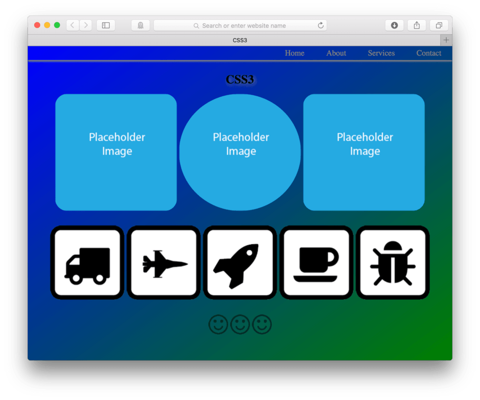
Gradient Backgrounds
CSS3 allows us to use a gradient as the background of any element including the body. We use background-image: as the property, much like we would to set any background image, but instead of a url we use the value: linear-gradient();.
Inside the parenthesis, we let the browser know what direction the gradient moves (to bottom right, for example) and which colors to transition between. These are all separated by commas.
A background gradient property string might look like this: background-image: linear-gradient(to bottom right, blue, green);
Let’s go ahead and apply this to our body.
- Locate your CSS file
- Add:
body {as a selector at the top of your CSS after your universal selector block - Add:
background-image:as the first property - Add:
linear-gradient(to bottom right, blue, green);as the value - Close the block:
} - Save and Refresh
Here’s my CSS:
body {
	background-image: linear-gradient(to bottom right, blue, green);
}
and here’s how it looks in the browser. (fig. 29)

As we can see, the background of the entire website now transitions from blue to green beginning in the top left corner and working its way to the bottom right as we specified.
We have run into an issue. We can see that after our footer images, our background seems to be starting over. This is because we have run out of content. We can override this default by giving two height commands. We need to tell our body { to be height: 100%; and we need to add a new CSS block telling our html { to also be height: 100%; to make this magic happen.
The CSS should look like this:
html {
	height: 100%;
}

body {
	height: 100%;
	background-image: linear-gradient(to bottom right, blue, green);
}
and here’s how it looks in the browser. (fig. 30)
Much better. We now have our gradient spanning our whole page from top to bottom.
Alternative Color Values
We used blue and green to describe the color values we wanted to use in our gradient. The gradient property allows us to enter color values as color names, hexadecimal values, or rbg values. We could also enter additional color values if we wanted more colors introduced to our gradient.
Let’s adjust our body background to be more subtle. Let’s say wanted to go from an off white to a very light blue. Let’s use the hexadecimal #f1f1f1 for the white and #d1ebec for the blue.
- Locate your CSS file
- In your
body {change the blue value in thebackground-image:property to be#f1f1f1and the green value to be#d1ebec - Save and Refresh
Here’s my CSS:
body {
	height: 100%;
	background-image: linear-gradient(to bottom right, #f1f1f1, #d1ebec);
}
and here’s how it looks in the browser. (fig. 31)
This tends to be how many designers out there employ gradients. Subtlety is key, you don’t want any one design decision to overpower the content of the page.
Lesson Conclusion
In this lesson we learned a bunch of new CSS tricks. CSS3 has given us the ability to make changes to elements that we couldn’t in previous versions of CSS. With CSS3 we can add all the fun but unnecessary style add ons to our elements like: drop shadows, opacity changes, rounded corners, gradient backgrounds, and even how to use CSS3 properties in combination to create some fairly sophisticated hover animations.
We learned that not all browsers will be able to display all of these properties, but by using vendor prefixes, most will. In cases where a browser just plain doesn’t support a certain CSS3 technique, we have to know that our page will still be just as functional without it (albeit less fun), so we have to design with this in mind. Like high resolution displays, give those who can take advantage of the bells and whistles enjoy them, but don’t punish those who can’t.
Next up, adding a bit of Javascript.