Creating Navigation for the Big Screen
Overview
In the last lesson we introduced the idea of using media queries to alter our web page based on screen width. We talked about designing our page for the mobile screen first and then making adjustments using media queries as our screen gets larger.
In this lesson, I’d like to talk about some of the bigger adjustments that often get made as the screen gets larger. I’d like to walk you through creating more appropriate navigation for a large screen site, creating a multi-column layout, and hiding and showing certain elements based on screen size using media queries.
Lesson Setup
To get started, we’ll need to first get organized. We’ll need to create our lesson folder structure, our initial HTML file and connect it up with a new stylesheet.
Folder Setup
- Create a new Lesson14 folder inside of Bob
- Create your notes and root folders
- Inside the root folder, create an images folder and a css folder
- Download the lesson 14 resources from here
- Move those images into your images folder for this lesson
HTML Setup
- Open up TextMate
- File > New to open a new file
- Code in your boilerplate HTML making sure to add a title to the page. I’m calling mine: Creating Navigation for the Big Screen.
- Make sure that your boilerplate includes the
<meta name="viewport" content="width=device-width, initial-scale=1" />we learned in lesson 8 to ensure the site works properly on a mobile device. - Save your HTML file to your Lesson14 root folder with the name: lesson14.html
- Open and Preview your page in the browser, checking to make sure your page title is appearing correctly.
CSS Setup
- Open up TextMate
- File > New to open a new file
- File > Save
- Navigate to the “css” folder you created
- Name your file, style.css
- Hit Save
- Attach this stylesheet to our HTML page. Type:
<link href="css/style.css rel="stylesheet" />into the head section of our lesson14.html file. - File > Save the HTML file
Your HTML should now look like this:
<!doctype html>
<html>

	<head>
		<title>Creating Navigation for the Big Screen</title>
		<meta name="viewport" content="width=device-width, initial-scale=1" />
		<link href="css/style.css" rel="stylesheet" />
	</head>

	<body>

	</body>

</html>
Note: You may have noticed that I’ve shortened the lesson setup to a list of action steps above. If you need a refresher on folder and file organization see the lesson 3 setup section.
Let’s test to make sure our pages connected correctly.
- Navigate back to your new CSS file.
- Let’s change the background color of the body element. Type:
body {on an open line and hit Enter - Now, type the property we want to change:
background-color: - Type:
pink;and hit Enter - Close the CSS block, type:
} - Save this file and Refresh the browser
If your background turned pink, then you are set. Everything is working correctly. You can go ahead and delete that CSS block, so we can start fresh.
Creating a Navigation
You might remember that the technique for creating navigation is to nest the links inside an unordered list, and to nest the unordered list inside of a pair of <nav></nav> tags. This is true for any navigation whether it be a footer navigation like we learned previously or a horizontal top navigation bar like we are about to learn.
Navigation HTML
Let’s go ahead and build our navigation in the HTML. Here are the links we’ll be using in our navigation:
- Home
- About
- Services
- Contact
- Because this navigation will live inside our header, let’s begin by adding a pair of
<header></header>tags. - Now, inside the header, let’s add a pair of
<nav></nav>tags to hold our navigation. - Inside of the navigation tags, we’ll begin our unordered list, add:
<ul></ul> - Next, we’ll add our list items between our unordered list tags. Each one should contain a text link using the text above for the link text. For now, we’ll use a blank space between the quotes as a placeholder.
<li><href=" ">link text</a>
Here’s the HTML so you can double-check your work:
<header>
	<nav>
		<ul>
			<li><a href=" ">Home</a>
			<li><a href=" ">About</a>
			<li><a href=" ">Services</a>
			<li><a href=" ">Contact</a>
		</ul>
	</nav>
</header>
- Save and Refresh your browser.
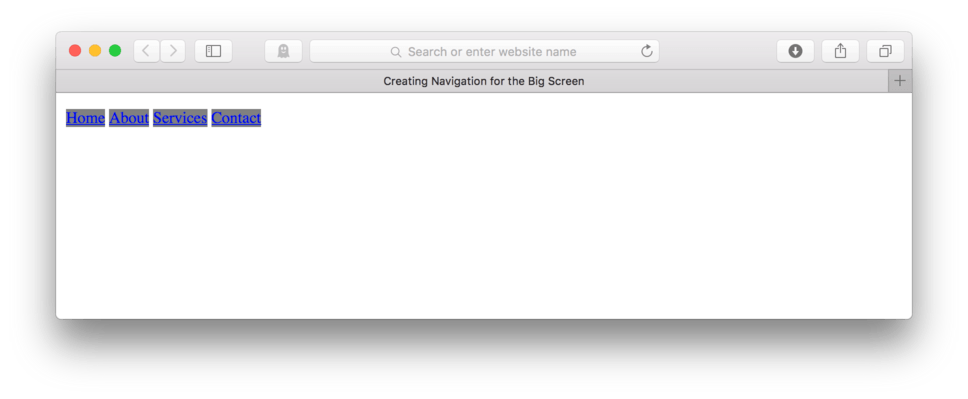
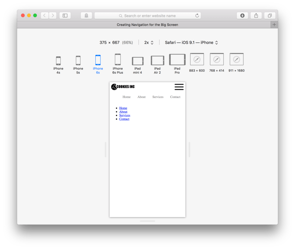
and here’s how it looks in the browser. (fig. 1)
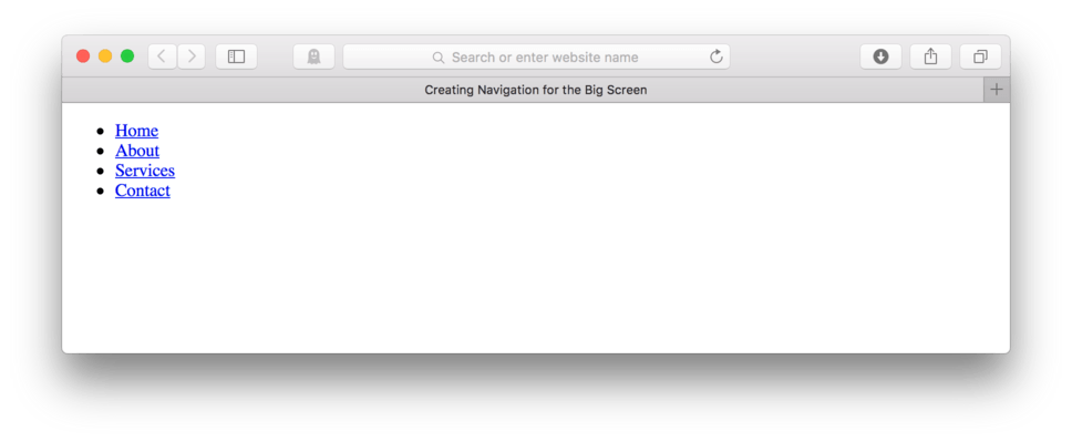
As we’d expect, we have a simple bulleted list of links. Next, we’ll go about styling them into a pretty typical top navigation where they will align themselves horizontally across the page.
Horizontal Navigation CSS
A few lessons ago, we learned how to style our navigation for a mobile footer navigation. The links each were displayed vertically with each link spanning the entire screen width. This made it easier for a mobile user to navigate the site.
Big screens allow us to take advantage of more horizontal space, so we need to tell our links that they can sit side by side.
Our first step is similar to that of our footer navigation. We’ll remove the bullets and the extra left padding on the unordered list since that isn’t necessary in our navigation.
- Locate your CSS file
- Add:
ul { - To remove the bullets, add:
list-style: none; - To remove the extra left padding used to hold the bullets, add:
padding-left: 0; - Close the block:
}
Here’s my CSS:
ul {
	list-style: none;
	padding-left: 0;
}
and here’s how it looks in the browser. (fig. 2)
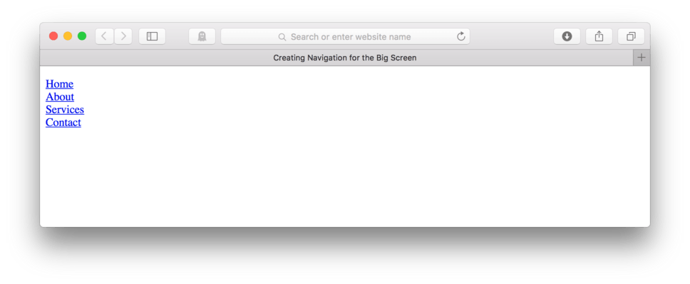
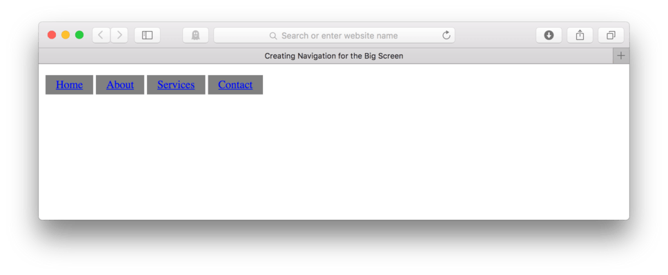
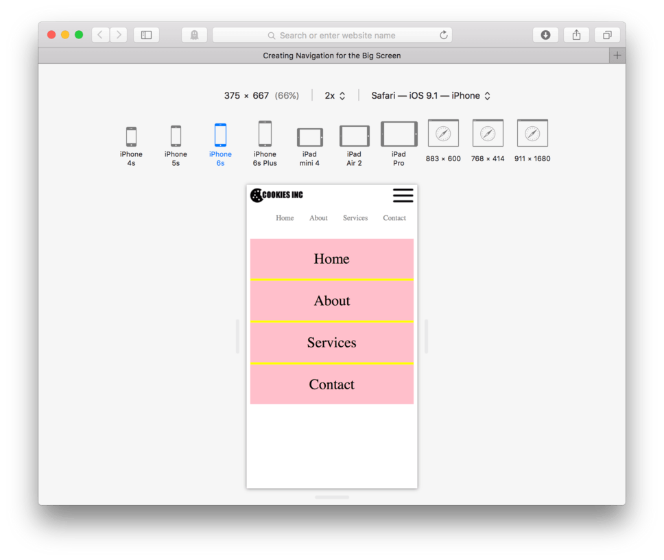
Okay, we’ve successfully stripped our unordered list down to just the list items and the links contained inside. To make our work easier to see, let’s add background colors so we can clearly identify our pieces.
- Add:
li {to talk to our list items directly - Add:
background-color: yellow; - Close the block:
} - Hit Enter twice
- Add:
li a {to talk directly to the links inside of the list items - Add:
background-color: grey; - Close the block:
}
Here’s my CSS:
ul {
	list-style: none;
	padding-left: 0;
}

li {
	background-color: yellow;
}

li a {
	background-color: grey;
}
and here’s how it looks in the browser. (fig. 3)
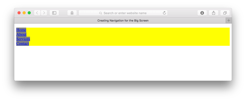
Looking at our page, we notice that our list items are block-level, we can tell because they span the full screen width. Our links, however, are inline elements. We can tell that because the background color wraps tightly around just the content. We’ll have to make some adjustments to the display of each of these to achieve our horizontal layout.
Using Display: Inline-Block
So far we’ve discussed only two types of elements: inline element and block-level elements. By default all elements fall into one of these categories, however, there is another setting we can use, inline-block.
Inline-block is a special hybrid of inline and block-level elements. It has the position qualities of an inline element so inline-block elements can sit side-by-side, but also are powerful enough to control their own padding and margin like a block-level element can.
Using inline-block for our list items and links will allow us to display those elements side-by-side but still able to precisely set padding and margin. This setup is the key to creating our horizontal navigation.
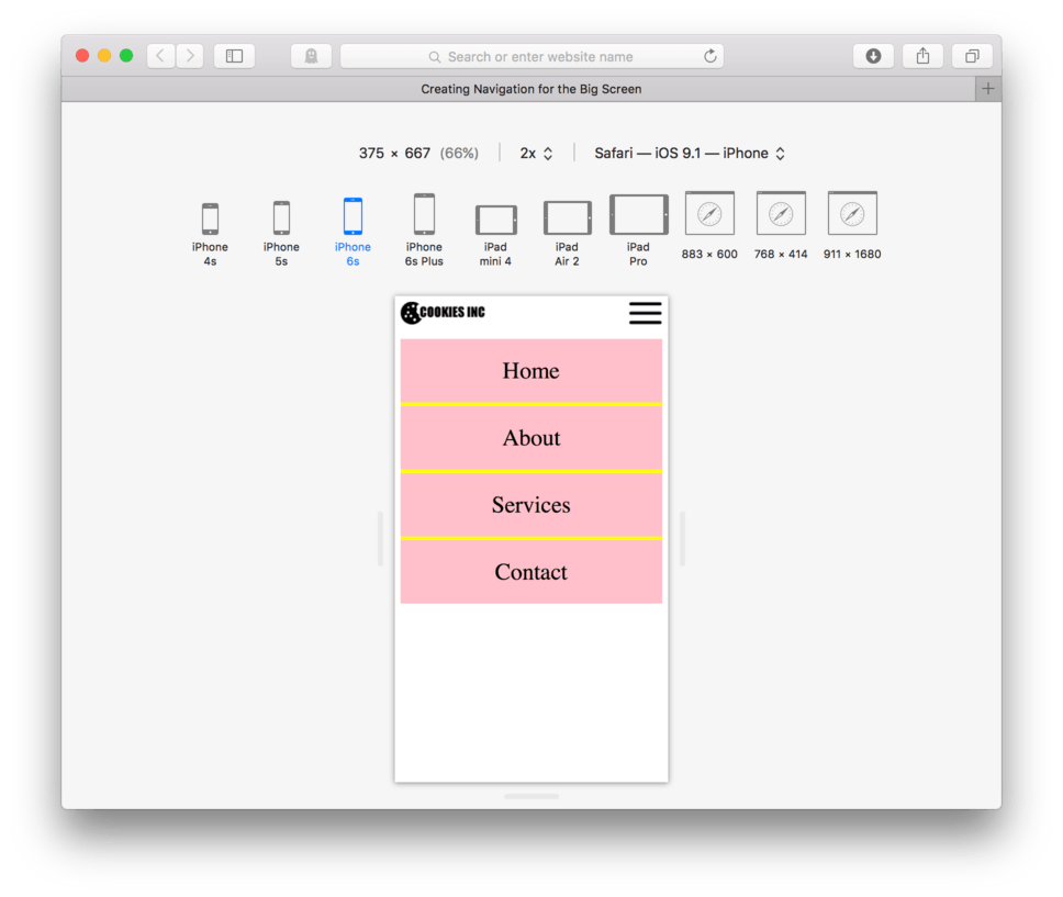
Let’s set this up.
- Add:
display: inline-block;to yourli { - Now, also add:
display: inline-block;to yourli a {
Here’s my CSS:
ul {
	list-style: none;
	padding-left: 0;
}

li {
	background-color: yellow;
	display: inline-block;
}

li a {
	background-color: grey;
	display: inline-block;
}
- Save and Refresh
and here’s how it looks in the browser. (fig. 4)
Good, we are getting closer. Our list items as well as our links are set so they are sitting side-by-side. Notice we can no longer see any of the yellow from our list items. This is because they are sitting exactly behind our links. If we were to delete our background color from our links, we would see the yellow again.
Adding Padding and Margin to Separate Links
Now, we’ll control the look of our navigation using some more CSS. The first thing we need to do is create some separation between our links so our user can easily identify where one stops and the next starts. To do this we’ll need to add margin (margin creates invisible space around the outside of an element) to our list item.
- Add
margin: 0 2px;to your list items under the selector:li { - Save and Refresh
Here’s my CSS:
li {
	background-color: yellow;
	display: inline-block;
	margin: 0 2px;
}
Note: You may have noticed that I did something a little different for the value of my margin property. Instead of typing:
margin-left: 2px;followed bymargin-right: 2px;I used a shorthand. I just typed:margin: 0 2px;. When you use onlymargin:as the property and two values after that, the first value becomes the value for the top and the bottom. The second number becomes the value for both the left and the right. So when I saymargin: 0 2px;, I’m actually writing shorthand for the for different directional properties associated with margin.
and here’s how it looks in the browser. (fig. 5)
We’ve successfully created a little separation between our links. That’s a great start.
Next up, we’ll increase our hit targets so our user has a little wiggle room when clicking as right now they have to click exactly on the text to use the link. To do this we’ll need to add padding to our links. We’ll add a bit of padding on the top and bottom and more on the left and right.
- Add:
padding: 5px 15px;to theli a {selector - Save and Refresh
li a {
	background-color: grey;
	display: inline-block;
	padding: 5px 15px;
}
Note: I used the same shorthand I used for margin in the padding for our link. Instead of writing out all four margin properties, I just used the generic property,
margin:and two number. The first number, 5px, works for top and bottom and the second number, 15px adds the padding to the left and the right.
and here’s how it looks in the browser. (fig. 6)
Looking pretty good. Now let’s say we want to align our navigation to the right side of our screen. This is a little tricky. We need to tell a block-level parent to text-align: right; its children. In our case, the next block-level parent element is the unordered list, so we should just be able to tell our unordered list to text-align: right;. Let’s give it a try.
- Locate your CSS file
- Add:
text-align: right:to yourul {selector - Save and Refresh
Here’s my CSS:
ul {
	list-style: none;
	padding-left: 0;
	text-align: right;
}

li {
	background-color: yellow;
	display: inline-block;
	margin: 0 2px;
}

li a {
	background-color: grey;
	display: inline-block;
	padding: 5px 15px;
}
and here’s how it looks in the browser. (fig. 7)
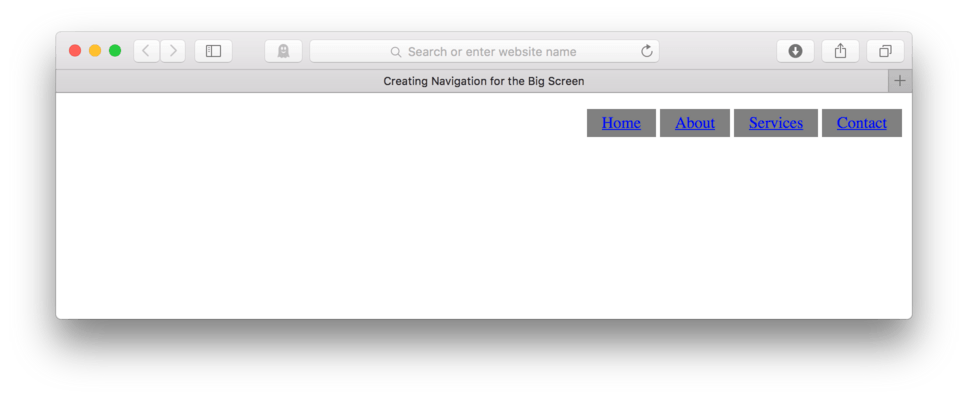
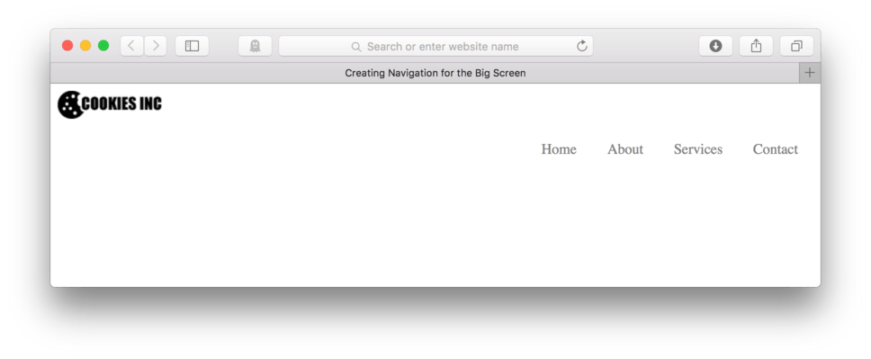
There. We have a right-aligned horizontal navigation. If we wanted to clean this up a bit and make it a little more stylish, we could remove the background colors and underline on the links. We could also change the link color from that obnoxious blue and add a hover.
- Locate your CSS file
- Remove the background colors for the list items and the links
- Remove the underlines by adding:
text-decoration: none;to theli a {selector - Change the link text color by adding:
color: grey;to theli a {selector - Add a new CSS block for the link hover. Remember this is a pseudo class and we need to use
li a:hover {as the selector - Add:
text-decoration: underline;to our hover - Close the block:
} - Save and Refresh
Here’s my CSS:
ul {
	list-style: none;
	padding-left: 0;
	text-align: right;
}

li {
	display: inline-block;
	margin: 0 2px;
}

li a {
	display: inline-block;
	padding: 5px 15px;
	text-decoration: none;
	color: grey;
}

li a:hover {
	text-decoration: underline;
}
and here’s how it looks in the browser. (fig. 8)
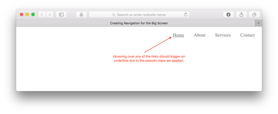
That is looking pretty nice. If you hover over any of the links, you should see an underline appear. In (fig. 8) you can see it on the Home link. You could use any number of techniques for the hover. Applying a background color is also a very popular choice.
To complete our header, let’s add in our logo. Typically this would be in the top left corner above the navigation. Let’s go ahead and code this in our HTML.
- Locate your HTML file
- Add:
<a href=" "><img src="images/logo.png"/></a>above your opening navigation tag. - Save and Refresh
Here’s how your HTML should look:
<header>
	<a href=" "><img src="images/logo.png"/></a>
	<nav>
		<ul>
			<li><a href=" ">Home</a>
			<li><a href=" ">About</a>
			<li><a href=" ">Services</a>
			<li><a href=" ">Contact</a>
		</ul>
	</nav>
</header>
and here’s how it looks in the browser. (fig. 9)
That’s pretty much it, that’s how you create a top navigation for just about any basic large screen website. Next, let’s use a media query to switch between a small screen footer navigation and this new large screen version.
Mobile First Approach
We should first design our site with mobile in mind. So we need to preview our site in a mobile sized browser using Responsive Design Mode. (fig. 10)
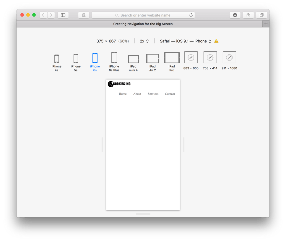
Things actually look semi-ok on mobile, but we can do much better. I’d like to start by switching out our horizontal top navigation for a hamburger button and footer navigation combination. Even though our links look okay on this sized screen, it would be pretty difficult for our user to reach up with a thumb and accurately use them for navigation.
Adding Mobile Navigation Elements
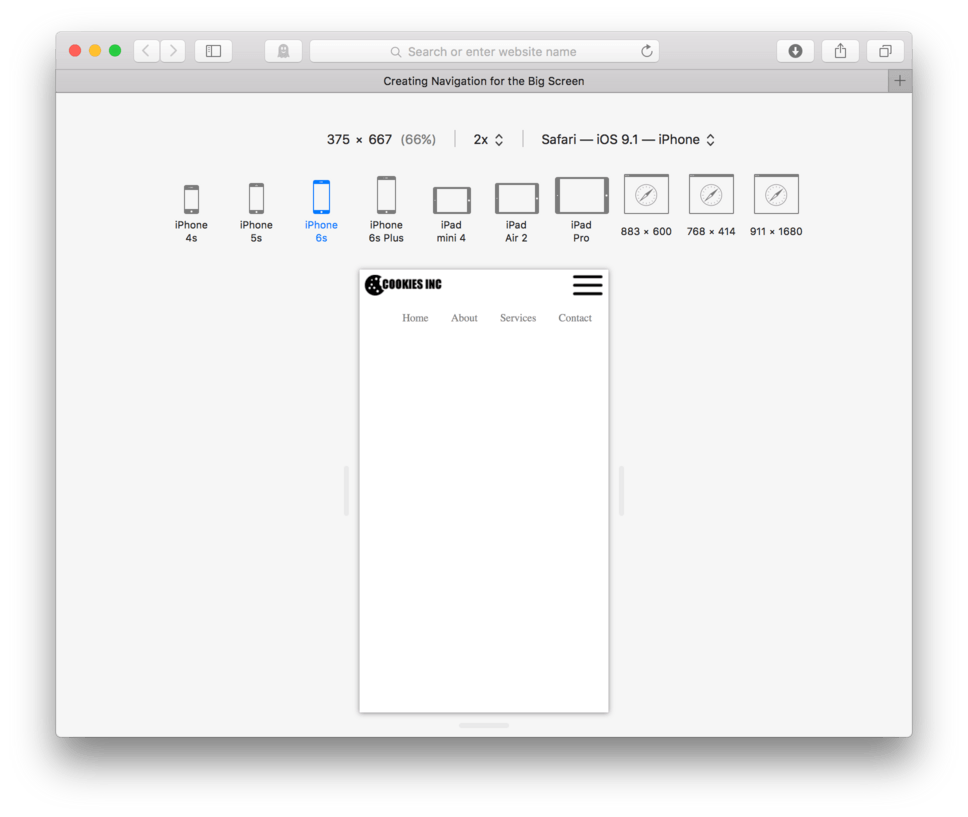
A weird thing needs to happen here. I need to switch out one type of navigation for another entirely here. Instead of this bar navigation, I want a hamburger button up top. First, let’s add our hamburger button.
- Locate your HTML file
- Before your logo link, add an image link using “hamburger.png” from your images folder as the link image. Use a blank for the address as a placeholder:
<a href=" "><img src=images/hamburger.png/></a>Save and Refresh
and here’s how it looks in the browser. (fig. 11)

Because our hamburger button is the first thing in our HTML content, it takes the place of the logo in the top-most left position. If we want to align it to the right, we’ll need to float: right;. Because we now have two image links in the header (the logo and the hamburger) we’ll need a way to talk to them independently. Let’s add and id="logo" to the logo link and id="hamburger" to the hamburger link.
Here’s how your HTML should look:
<a href=" " id="hamburger"><img src=images/hamburger.png/></a>
<a href=" " id="logo"><img src="images/logo.png"/></a>
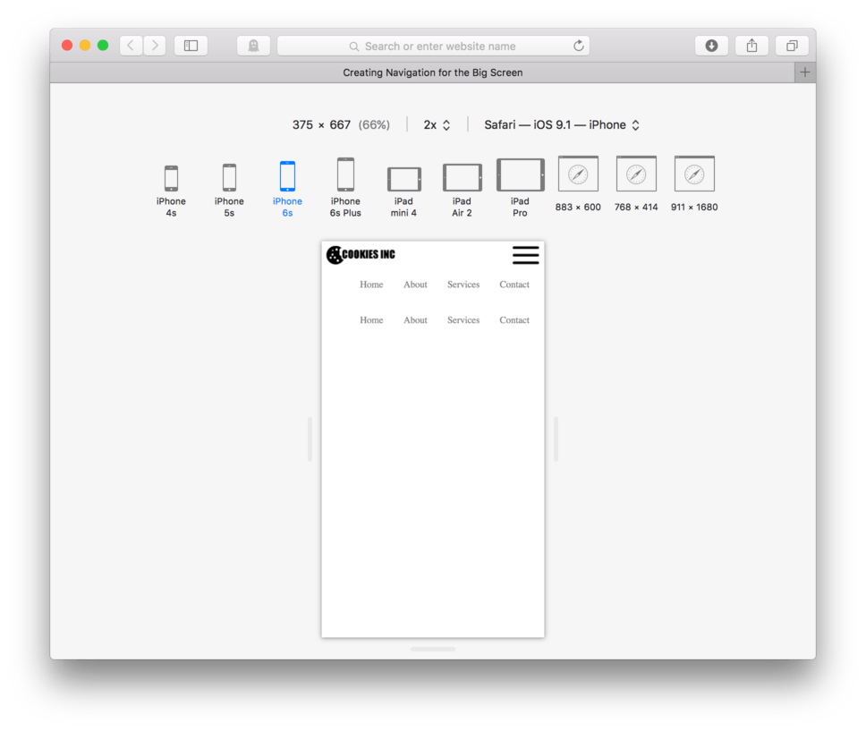
Now, let’s use CSS to tell our hamburger link to float right.
- Locate your CSS file
- Add:
a#hamburger { - Add:
float: right; - Close the block:
} - Save and Refresh
Here’s my CSS:
a#hamburger {
	float: right;
}
and here’s how it looks in the browser. (fig. 12)
Remember that whenever we float any element, it’s important to clear that float using the micro-clear fix. To do this, we need to add class="group" to the parent, in this case the header.
- Locate your HTML
- Add:
class="group"to the opening header tag:<header class="group"> - Save your HTML
Your HTML should look like this:
<header class="group">
	<a href=" " id="hamburger"><img src=images/hamburger.png/></a>
	<a href=" " id="logo"><img src="images/logo.png"/></a>

	<nav>
		<ul>
			<li><a href=" ">Home</a>
			<li><a href=" ">About</a>
			<li><a href=" ">Services</a>
			<li><a href=" ">Contact</a>
		</ul>
	</nav>

</header>

...
Now we need to add our micro-clear fix to our CSS
- Locate your CSS
- Add the micro-clear fix CSS block to the top of your CSS:
.group:after {
  content: "";
  display: table;
  clear: both;
}
- Save your CSS.
Here’s the start of my CSS:
.group:after {
  content: "";
  display: table;
  clear: both;
}

ul {
	list-style: none;
	padding-left: 0;
	text-align: right;
}

...
These changes won’t produce any visible results in our page now, but will save us a lot of frustration later if we put them in before they cause any real issues.
Now, let’s add our matching footer navigation. The neat thing here is that we can mostly reuse the navigation HTML we wrote for the top bar navigation, we just need to change out the <header></header> tags for some <footer></footer> tags. Also, we’ll leave out the two images that live in the header. The rest will stay the same.
Here is our new footer navigation:
<footer>
	<nav>
		<ul>
			<li><a href=" ">Home</a>
			<li><a href=" ">About</a>
			<li><a href=" ">Services</a>
			<li><a href=" ">Contact</a>
		</ul>
	</nav>
</footer>
You can grab this from your HTML file or Copy and Paste from mine above. Put this after your closing header tag.
Here’s how your HTML should look:
<header class="group">
	<a href=" " id="hamburger"><img src=images/hamburger.png/></a>
	<a href=" " id="logo"><img src="images/logo.png"/></a>
	<nav>
		<ul>
			<li><a href=" ">Home</a>
			<li><a href=" ">About</a>
			<li><a href=" ">Services</a>
			<li><a href=" ">Contact</a>
		</ul>
	</nav>
</header>

<footer>
	<nav>
		<ul>
			<li><a href=" ">Home</a>
			<li><a href=" ">About</a>
			<li><a href=" ">Services</a>
			<li><a href=" ">Contact</a>
		</ul>
	</nav>
</footer>
Save and Refresh
and here’s how it looks in the browser. (fig. 13)
Right now both sets of navigation are listening to the CSS we wrote for our unordered list, our list items, an our nested links. We can use specificity to adjust our CSS so that the CSS we already wrote for list items only applies to our header navigation. Let’s add header nav to each our ul {, our li {,our li a {, and our li a:hover {.
Here’s my CSS:
header nav ul {
	list-style: none;
	padding-left: 0;
	text-align: right;
}

header nav li {
	display: inline-block;
	margin: 0 2px;
}

header nav li a {
	display: inline-block;
	padding: 5px 15px;
	text-decoration: none;
	color: grey;
}

header nav li a:hover {
	text-decoration: underline;
}
Save and Refresh
and here’s how it looks in the browser. (fig. 14)
Cool. We now have a regular unordered list, ready to be styled using similar selectors only swapping header nav for footer nav.
We learned to style footer navigation back in lesson 10, let’s borrow our CSS from there. You can Copy and Paste from here:
ul {
	list-style: none;
	background-color: yellow;
	padding-left: 0;
}

ul a {
	background-color: pink;
	display: block;
	padding: 25px;
	margin-bottom: 5px;
	text-align: center;
	text-decoration: none;
	color: black;
	font-size: 2em;
}
We’ll need to adjust this to make sure it is directed at our footer navigation. Add: footer nav in front of each selector.
Here’s my CSS:
footer nav ul {
	list-style: none;
	background-color: yellow;
	padding-left: 0;
}

footer nav ul a {
	background-color: pink;
	display: block;
	padding: 25px;
	margin-bottom: 5px;
	text-align: center;
	text-decoration: none;
	color: black;
	font-size: 2em;
}
Save and Refresh
and here’s how it looks in the browser. (fig. 15)
Great. We now have both a big screen navigation and a small screen navigation. We’ll need to set to work on removing our big screen navigation on our mobile design.
Hiding Elements on Mobile
CSS allows us to hide or show certain elements using a simple CSS declaration, display: none; and display: block; or inline;. These are very powerful lines of code when we work on a responsive web site.
To hide our horizontal navigation on our mobile sized page, we can add: display: none; to our header nav ul {. Later, we’ll use a media query to bring it back.
- Locate your CSS file
- Add:
display: none;toheader nav ul { - Save and Refresh
Here’s my CSS:
header nav ul {
	list-style: none;
	padding-left: 0;
	text-align: right;
	display: none;
}
and here’s how it looks in the browser. (fig. 16)
We’ve done it. Our mobile navigation is the only navigation that now appears. We’ll use a similar but opposite strategy later with a media query to switch out the mobile for the top bar navigation.
Adding More Content
Let’s add some more content to our page. We’ll add three new sections, one with a large banner image, and two containing an h2 and a paragraph each.
Add these new sections in between your header and your footer code. You can Copy and Paste from my HTML below:
<section>
	<img src="images/banner.png">
</section>

<section>
	<h2>Section One</h2>
	<p>Lorem ipsum dolor sit amet, consectetur adipiscing elit. Nulla sollicitudin congue sem et pretium. Sed pulvinar volutpat facilisis. Sed velit risus, consequat sit amet sollicitudin a, ultrices nec nisl. Nullam ac dolor purus. In ac mi quis urna lobortis venenatis. Sed interdum, arcu a volutpat pretium, nisl velit auctor elit, at venenatis turpis mi a nisl. Integer at porttitor urna. Nulla sem mauris, pulvinar bibendum tristique vitae, pulvinar vel elit. Aenean sollicitudin quam sit amet lectus elementum sit amet suscipit sem feugiat. Fusce aliquam euismod diam, at placerat felis fringilla et. Vivamus sagittis suscipit dapibus. Donec molestie tristique quam, sed sodales justo volutpat eu. Sed pellentesque sollicitudin tempus. Donec at sem eu massa tempor porta congue id purus.</p>
</section>

<section>
	<h2>Section Two</h2>
	<p>Lorem ipsum dolor sit amet, consectetur adipiscing elit. Nulla sollicitudin congue sem et pretium. Sed pulvinar volutpat facilisis. Sed velit risus, consequat sit amet sollicitudin a, ultrices nec nisl. Nullam ac dolor purus. In ac mi quis urna lobortis venenatis. Sed interdum, arcu a volutpat pretium, nisl velit auctor elit, at venenatis turpis mi a nisl. Integer at porttitor urna. Nulla sem mauris, pulvinar bibendum tristique vitae, pulvinar vel elit. Aenean sollicitudin quam sit amet lectus elementum sit amet suscipit sem feugiat. Fusce aliquam euismod diam, at placerat felis fringilla et. Vivamus sagittis suscipit dapibus. Donec molestie tristique quam, sed sodales justo volutpat eu. Sed pellentesque sollicitudin tempus. Donec at sem eu massa tempor porta congue id purus.</p>
</section>
Save and Refresh
and here’s how it looks in the browser. (fig. 17)
You’ll notice that our banner image is very large. We’ll need to apply CSS to make the image responsive so it can resize itself to fit our browser. To do this we’ll need to apply our max-width: 100%; to our images.
- At the top of your CSS file, after the boilerplate, add:
img {to target all images on our site and hit Enter - Add
max-width: 100%;and hit Enter to move to the next line - Close out the CSS block with
} - Save and Refresh your browser
Your CSS should look like this:
img {
	max-width: 100%;
}

.group:after {
  content: "";
  display: table;
  clear: both;
}
Your page should now look something like this in the browser: (fig. 18)
Styling our Section Text
Let’s go ahead and make our text easier to read. We’ll control our line lengths and our font size and spacing like we learned last lesson.
Controlling Line Lengths and Styling Text
We can control our line-lengths by constricting our section content. We can do that one of two ways, the first is to set a width on the sections that have text, the second is to add padding. Adding padding is the more simple solution, let’s go with that. The tricky part will be applying the padding only to the sections with text and not the section holding the large banner image. To apply to only the second and third sections, we’ll need to add a class= attribute to both of them.
- Locate your HTML
- Add:
class="text"to the opening tag of the second and third section. - Save your HTML file
Here’s how your HTML should look for each of your three sections so far:
<section>
	<img src="images/banner.png">
</section>

<section class="text">
	<h2>Section One</h2>
	<p>Lorem ipsum dolor sit amet, consectetur adipiscing elit. Nulla sollicitudin congue sem et pretium. Sed pulvinar volutpat facilisis. Sed velit risus, consequat sit amet sollicitudin a, ultrices nec nisl. Nullam ac dolor purus. In ac mi quis urna lobortis venenatis. Sed interdum, arcu a volutpat pretium, nisl velit auctor elit, at venenatis turpis mi a nisl. Integer at porttitor urna. Nulla sem mauris, pulvinar bibendum tristique vitae, pulvinar vel elit. Aenean sollicitudin quam sit amet lectus elementum sit amet suscipit sem feugiat. Fusce aliquam euismod diam, at placerat felis fringilla et. Vivamus sagittis suscipit dapibus. Donec molestie tristique quam, sed sodales justo volutpat eu. Sed pellentesque sollicitudin tempus. Donec at sem eu massa tempor porta congue id purus.</p>
</section>

<section class="text">
	<h2>Section Two</h2>
	<p>Lorem ipsum dolor sit amet, consectetur adipiscing elit. Nulla sollicitudin congue sem et pretium. Sed pulvinar volutpat facilisis. Sed velit risus, consequat sit amet sollicitudin a, ultrices nec nisl. Nullam ac dolor purus. In ac mi quis urna lobortis venenatis. Sed interdum, arcu a volutpat pretium, nisl velit auctor elit, at venenatis turpis mi a nisl. Integer at porttitor urna. Nulla sem mauris, pulvinar bibendum tristique vitae, pulvinar vel elit. Aenean sollicitudin quam sit amet lectus elementum sit amet suscipit sem feugiat. Fusce aliquam euismod diam, at placerat felis fringilla et. Vivamus sagittis suscipit dapibus. Donec molestie tristique quam, sed sodales justo volutpat eu. Sed pellentesque sollicitudin tempus. Donec at sem eu massa tempor porta congue id purus.</p>
</section>
- Now, locate your CSS file.
- Add:
section.text {to the bottom - Add:
padding: 2% 8%;to add 2% padding to the top and bottom and 8% padding to the left and the right. - Close the block:
} - Save and Refresh
Here’s my CSS:
section.text {
	padding: 2% 8%;
}
and here’s how it looks in the browser. (fig. 19)
Better. Now let’s increase our text size and line-height (leading). Let’s go ahead and increase it universally on all our section text.
- Locate your CSS file
- Add:
font-size: 1.5em;to thesection.text {selector - Add:
line-height: 1.5;to the same selector - Save and Refresh
Here’s my CSS:
section.text {
	padding: 2% 8%;
	font-size: 1.25em;
	line-height: 1.5;
}
and here’s how it looks in the browser. (fig. 20)
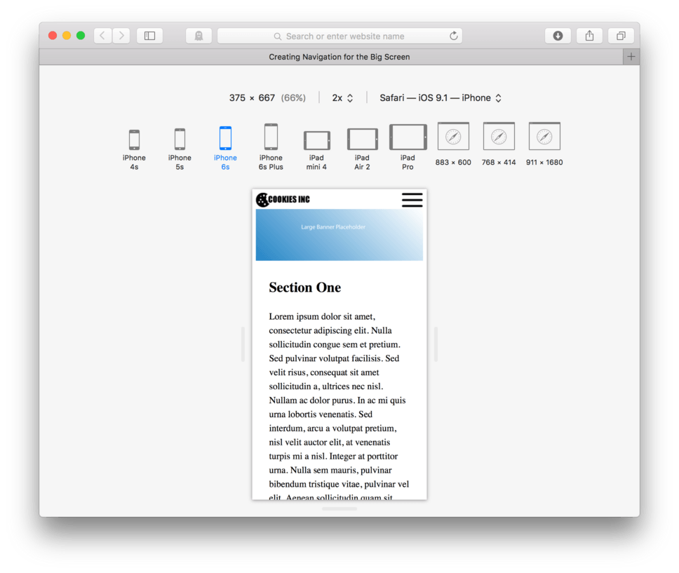
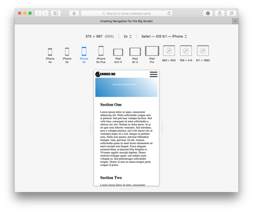
Okay, we’ll call that good for now. We have completed our mobile first design. Now let’s begin to pull the browser larger and smaller to see what happens. (fig. 21)
You can also click through the different device options from the top menu bar on your Responsive Design Mode. You’ll see that for each device things look pretty good. (fig. 22)
So we have good news. At least in my opinion, our site looks pretty decent at all sizes and in all devices. At the very least, you’ll have to admit that it is still functional no matter how big we pull our browser or what device we choose at any orientation. This is the beauty of mobile first design.
Now, we can introduce our bigger screen features, like our new top navigation at whatever screen width we think makes the most sense using a media query.
Adding A Media Query
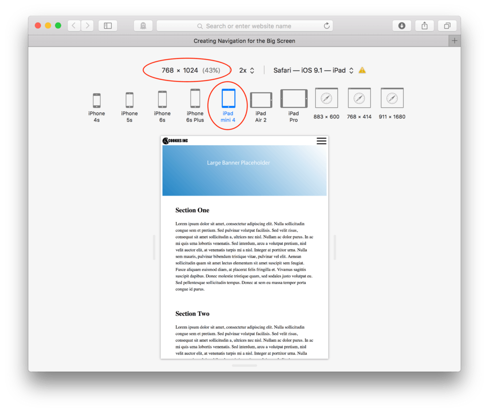
Let’s say the smallest device I want to use a top navigation bar on is a iPad Mini 4 held vertically. I know from my Responsive Design Mode on Safari that the horizontal resolution on that device is 768 pixels (fig. 23)
So in order to plan for this, I’m going to write my first media query to detect when I have a 750 pixel wide screen or larger.
- Locate your CSS file
- At the very bottom of the file, add your media query opener:
@media (min-width: 750px) { - Hit Enter a couple of times to make a little room
Okay, so now after my opening bracket of my media query, I need to decide what code to override. Remember, I hid my header nav ul with a display: none; above. Let’s override that command first. To override a display: none: well still use the display: property, but we’ll need to know if the element was an inline or block-level element. That is what needs to be set in the override. Because we know our unordered list is a block-level element, we’ll use display: block;.
- Inside the media query, add:
header nav ul { - Add:
display: block;to display the nav we hid earlier. - Close the block:
} - Save and Refresh
- Make sure to choose iPad Mini 4 from the device options
Here’s my CSS:
@media (min-width: 750px) {
	header nav ul {
		display: block;
	}
}
and here’s how it looks in the browser. (fig. 24)
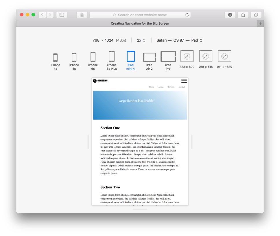
You can see that our horizontal navigation is back. Flip through the device options to see that for everybody bigger than our iPad Mini 4 the horizontal navigation stays, for anybody smaller, it disappears. (fig. 25)
We could pull the browser left or right to see exactly where the change happens as well. Make sure to watch the resolution width above the device options change as we resize. (fig. 26)
Way neat, right?! Okay, so now that we have our top bar navigation working, we’ll need to get rid of our hamburger and footer when we get to the big screen. We can do this in the same media query.
- Locate your CSS file
- After your
header nav ul {block in the media query, add:a#hamburger {to select just the hamburger button - Add:
display: none; - Close the block:
} - Make sure your media query still has its own closing bracket.
- Save and Refresh
Here’s my CSS:
@media (min-width: 750px) {
	header nav ul {
		display: block;
	}

	a#hamburger {
		display: none;
	}
}
and here’s how it looks in the browser at our iPad Mini 4 size. (fig. 27)

Click through all the devices or pull your browser window left and right, check to see that it disappears on smaller screen and reappears on bigger ones (fig. 28)
We’ll need to do the same for our footer navigation.
- Add:
footer nav ul {as the next CSS block in your media query - Add:
display: none;to hide it at 750 pixels or larger - Close the block:
} - Make sure your’ll media query still has its own closing bracket.
- Save and Refresh
Here’s my CSS:
@media (min-width: 750px) {
	header nav ul {
		display: block;
	}

	a#hamburger {
		display: none;
	}

	footer nav ul {
		display: none;
	}
}
and here’s how it looks in the browser. If we scroll down we’ll see that our footer navigation disappears on larger devices and reappears on the smaller ones. (fig. 29)
That is more than half our battle. We now have handled our navigation.
Controlling Line-Lengths on Big Screens
I’d say our site works pretty well no matter the device or screen size at this point. The only real concern I have is that on really big screens, like large desktop computers, our line length can get too long making it difficult for our users to keep their place on the page.
Adding Columns
From a stylistic standpoint we may want to do a layout adjustment like use two columns rather than one when our screen gets large enough. This would help with our line-length as well as take advantage of the extra horizontal space in our window.
Let’s say we wanted to have our layout split to two columns at 1,000 pixels in width. We can add an additional media query to handle this.
- After the closing bracket for your first media query, at the very end of your CSS, hit Enter a few times to make room.
- Add:
@media (min-width: 1000px) {to begin a new media query set to 1,000 pixels or larger. - Make sure to add a closing bracket for that media query:
} - Hit Enter a few times in-between the brackets to make a little more room
Here’s my CSS so far:
@media (min-width: 750px) {
	header nav ul {
		display: block;
	}

	a#hamburger {
		display: none;
	}

	footer nav ul {
		display: none;
	}
}

@media (min-width: 1000px) {

}
We don’t want to override much, we simply want our sections with text to float side by side. We need to be really careful, as you’ll remember floating an element means it needs to have a set width. Setting a width if the element would normally be block-level means we need to take into account content + padding + border + margin = 100%.
We have our sections.text currently set to padding: 2% 8%;. This means that on the left and right of each section is 8% padding or 16% of the screen used up by the padding. We don’t currently have any margin or border, so we’ve got that going for us. If we were to leave our padding as is, and ask our sections to float, we need to remember that side by side, each section will have 16% of the screen dedicated to padding, so 32% total, leaving only 68% screen real estate for the content. Splitting that between two sections means that each can only be a maximum width of 34%.
Let’ give that a try.
- Add:
section.text {as the first block in your new media query - Add:
width: 34%; - Add:
float: left; - Close the block:
} - Close the media query with another
} - Save and Refresh
Here’s my CSS:
@media (min-width: 750px) {

	header nav ul {
		display: block;
	}

	a#hamburger {
		display: none;
	}

	footer nav ul {
		display: none;
	}
}

@media (min-width: 1000px) {
	section.text {
		width: 34%;
		float: left;
	}
}
In your browser, in Responsive Design Mode, you’ll need to select a device larger than 1,000 horizontal pixels. You can also drag the browser larger till the dynamic readout reads over 1,000 pixels on the first number. (fig. 30) starts at our iPad Mini 4.
That works pretty well. The only adjustment I’d like to make is to decrease the gutter between the two columns so the columns can each be a little wider and can be just a tad closer together. They feel a little like they are drifting apart at the larger screen sizes.
Earlier I set the padding on the section.text to be padding: 2% 8%;. Because of my new media query I can adjust this just for the largest screens. Let’s change our padding to be 2% on the top and bottom and 4% on the left and right instead and see how that looks. This also means that we can adjust our width of our section to be 42% instead of only 34%.
Here’s my CSS:
@media (min-width: 1000px) {
	section.text {
		padding: 2% 4%;
		width: 42%;
		float: left;
	}
}
and here’s how it looks in the browser. (fig. 31)
We did it, we managed a two column layout using a media query!
We do need to remember to clear our floats however, but that presents a problem. We don’t currently have a parent element that holds both sections. No problem, we can add one.
Actually, we’ll make it easy, we’ll add a pair of <section></section> tags to hold both sections. It may sound weird, but it’s legit. We can put sections inside of sections, we just need to do it carefully.
- Locate your HTML file
- Add:
<section>before your first<section class="text"> - Let’s add an
class=attribute to this section so it’s accessible to the CSS. Add:class=group"to that opening tag to allow it to clear our floats with the micro-clear fix CSS. - Close our new section after the closing tag of the second section we added earlier:
</section> - Save your HTML
Here’s how your HTML should look:
<section class="group">
	<section class="text">
		<h2>Section One</h2>
		<p>Lorem ipsum dolor sit amet, consectetur adipiscing elit. Nulla sollicitudin congue sem et pretium. Sed pulvinar volutpat facilisis. Sed velit risus, consequat sit amet sollicitudin a, ultrices nec nisl. Nullam ac dolor purus. In ac mi quis urna lobortis venenatis. Sed interdum, arcu a volutpat pretium, nisl velit auctor elit, at venenatis turpis mi a nisl. Integer at porttitor urna. Nulla sem mauris, pulvinar bibendum tristique vitae, pulvinar vel elit. Aenean sollicitudin quam sit amet lectus elementum sit amet suscipit sem feugiat. Fusce aliquam euismod diam, at placerat felis fringilla et. Vivamus sagittis suscipit dapibus. Donec molestie tristique quam, sed sodales justo volutpat eu. Sed pellentesque sollicitudin tempus. Donec at sem eu massa tempor porta congue id purus.</p>
	</section>

	<section class="text">
		<h2>Section Two</h2>
		<p>Lorem ipsum dolor sit amet, consectetur adipiscing elit. Nulla sollicitudin congue sem et pretium. Sed pulvinar volutpat facilisis. Sed velit risus, consequat sit amet sollicitudin a, ultrices nec nisl. Nullam ac dolor purus. In ac mi quis urna lobortis venenatis. Sed interdum, arcu a volutpat pretium, nisl velit auctor elit, at venenatis turpis mi a nisl. Integer at porttitor urna. Nulla sem mauris, pulvinar bibendum tristique vitae, pulvinar vel elit. Aenean sollicitudin quam sit amet lectus elementum sit amet suscipit sem feugiat. Fusce aliquam euismod diam, at placerat felis fringilla et. Vivamus sagittis suscipit dapibus. Donec molestie tristique quam, sed sodales justo volutpat eu. Sed pellentesque sollicitudin tempus. Donec at sem eu massa tempor porta congue id purus.</p>
	</section>
</section>
That’s it. There isn’t any visible result of that clearing of the float just yet, but if we had a footer, we would have trouble with that floating up into our sections.
Controlling Overall Page Width
In order to keep our site under control at very large sizes, we can use some CSS to restrict our whole page to a certain width. If a user decides to pull the browser wider than that width, we can tell our site to remain at the same size, but center itself in the window. We can use a nice background color or pattern at that point to take care of the empty space on the sides.
To do this we simply add to our HTML a new tag. We use <article></article> to wrap all of our page content. This almost takes over the job of the body element.
- Locate your HTML
- After the opening body tag, add:
<article> - After the closing footer tag, add:
</article> - Save your HTML file
Here’s how your HTML should look:
<body>

	<article>
		<header class="group">
			<a href=" " id="hamburger"><img src=images/hamburger.png/></a>
			<a href=" " id="logo"><img src="images/logo.png"/></a>
			<nav>
				<ul>
					<li><a href=" ">Home</a>
					<li><a href=" ">About</a>
					<li><a href=" ">Services</a>
					<li><a href=" ">Contact</a>
				</ul>
			</nav>
		</header>

		<section>
			<img src="images/banner.png">
		</section>
		<section class="group">
			<section class="text">
				<h2>Section One</h2>
				<p>Lorem ipsum dolor sit amet, consectetur adipiscing elit. Nulla sollicitudin congue sem et pretium. Sed pulvinar volutpat facilisis. Sed velit risus, consequat sit amet sollicitudin a, ultrices nec nisl. Nullam ac dolor purus. In ac mi quis urna lobortis venenatis. Sed interdum, arcu a volutpat pretium, nisl velit auctor elit, at venenatis turpis mi a nisl. Integer at porttitor urna. Nulla sem mauris, pulvinar bibendum tristique vitae, pulvinar vel elit. Aenean sollicitudin quam sit amet lectus elementum sit amet suscipit sem feugiat. Fusce aliquam euismod diam, at placerat felis fringilla et. Vivamus sagittis suscipit dapibus. Donec molestie tristique quam, sed sodales justo volutpat eu. Sed pellentesque sollicitudin tempus. Donec at sem eu massa tempor porta congue id purus.</p>
			</section>

			<section class="text">
				<h2>Section Two</h2>
				<p>Lorem ipsum dolor sit amet, consectetur adipiscing elit. Nulla sollicitudin congue sem et pretium. Sed pulvinar volutpat facilisis. Sed velit risus, consequat sit amet sollicitudin a, ultrices nec nisl. Nullam ac dolor purus. In ac mi quis urna lobortis venenatis. Sed interdum, arcu a volutpat pretium, nisl velit auctor elit, at venenatis turpis mi a nisl. Integer at porttitor urna. Nulla sem mauris, pulvinar bibendum tristique vitae, pulvinar vel elit. Aenean sollicitudin quam sit amet lectus elementum sit amet suscipit sem feugiat. Fusce aliquam euismod diam, at placerat felis fringilla et. Vivamus sagittis suscipit dapibus. Donec molestie tristique quam, sed sodales justo volutpat eu. Sed pellentesque sollicitudin tempus. Donec at sem eu massa te	mpor porta congue id purus.</p>
			</section>
		</section>
		<footer>
			<nav>
				<ul>
					<li><a href=" ">Home</a>
					<li><a href=" ">About</a>
					<li><a href=" ">Services</a>
					<li><a href=" ">Contact</a>
				</ul>
			</nav>
		</footer>
	</article>

</body>
Now, to add some CSS.
- Locate your CSS file
- At the top of your CSS, after your clear fix (this guy doesn’t have anything to do with your media query, it’s just regular CSS) add:
article { - Add:
max-width: 1200px;to tell our page to never allow itself to grow larger than 1,200 pixels wide. - Close the block:
} - Save and Refresh
Here’s my CSS:
.group:after {
  content: "";
  display: table;
  clear: both;
}

article {
	max-width: 1200px;
}

img {
	max-width: 100%;
}
Now, pull your browser larger than 1200 pixels wide. You’ll see that your site stops growing just a bit after we break into a two column layout. (fig. 32)
This is what we want, now the next step is to tell it to be centered. Since we have a set a width in our CSS, max-width: 1200px;, we can use margins set to auto; to automatically center this.
- Locate your CSS file
- Add:
margin: 0 auto;to yourarticle {selector - Save and Refresh
Here’s my CSS:
article {
	max-width: 1200px;
	margin: 0 auto;
}
Note: I’m using my shorthand to write my margin as I have before, but this time I’m introducing a new value:
auto;. This only really works in rare occasions, but setting margin on the left and right of an element with a set width will automatically center it on the page. It’s really handy, especially in this case.
and here’s how it looks in the browser. You’ll see now when you pull the browser, your site stays in the center of the window once it stops growing. (fig. 33)
This makes for a much more aesthetic solution. Now, we can control our line-lengths using columns when our screens get larger, but we can also control our layout when our screens get really large. This is helpful as most sites do hit a point where it would be crazy to let it keep expanding forever.
Now, if you wanted to, you could change the background color of both the article and the body to have a color appear on the left and right side where we now have available space.
- Locate your CSS file
- Add:
body {near the top - Add:
background-color: #black; - Close the block:
} - Add:
background-color: white;toarticle { - Save and Refresh
Here’s my CSS:
.group:after {
  content: "";
  display: table;
  clear: both;
}

body {
	background-color: black;
}

article {
	max-width: 1200px;
	margin: 0 auto;
	background-color: white;
}
and here’s how it looks in the browser. (fig. 34)
Some sites will use this technique to make a more clear separation between site and background and others will let it blend. It’s a design decision to be made for each site you build.
Lesson Conclusion
In this lesson we continued our discussion on using media queries to help us adjust our page for larger screen sizes. We learned how to make certain elements disappear at various screen sizes as well as appear at others to help transform a mobile navigation structure to a large screen navigation system.
Additionally we learned how to take advantage of the horizontal space that only the largest screen sizes provide by adding columns. In fact, we learned that sometimes screen sizes become so large, that it is necessary to restrain our websites to a width that is more reasonable.
Next up, we will learn about the newer features of CSS3.