Advanced Positioning
Overview
Whenever possible, floating should be used to do most of the heavy lifting for page layout. It offers lots of control over the interactions of elements while maintaining the flexibility necessary to accommodate all screen sizes.
There are however, times where floating just won’t cut it. There are some rare occasions where you might need to do more precise positioning of certain elements on a page, it is that that kind of precise positioning that we’ll be looking at in this lesson.
Lesson Setup
To get started, we’ll need to create our lesson folder structure, our initial HTML file and connect it up with a new stylesheet.
Folder Setup
- Create a new Lesson12 folder inside of Bob
- Now, create your notes and root folders
- Inside the root folder, create an images folder and a css folder
- Download the lesson 12 resources from here.
- Move those images into your images folder for this lesson
HTML Setup
- Open up TextMate
- File > New to open a new file
- Code in your boilerplate HTML making sure to add a title to the page. I’m calling mine: Advanced Positioning.
- Make sure that your boilerplate includes the
<meta name="viewport" content="width=device-width, initial-scale=1" />we learned in lesson 8 to ensure the site works properly on a mobile device. - Save your HTML file to your Lesson12 root folder with the name: lesson12.html
- Open and Preview your page in the browser, checking to make sure your page title is appearing correctly.
CSS Setup
- Open up TextMate
- File > New to open a new file
- File > Save
- Navigate to the “css” folder you created
- Name your file, style.css
- Hit Save
- Attach this stylesheet to our HTML page. Type:
<link href="css/style.css rel="stylesheet" />into the head section of our lesson12.html file. - File > Save the HTML file
Your HTML should now look like this:
<!doctype html>
<html>

	<head>
		<title>Advanced Positioning</title>
		<meta name="viewport" content="width=device-width, initial-scale=1" />
		<link href="css/style.css" rel="stylesheet" />
	</head>

	<body>

	</body>

</html>
Note: You may have noticed that I’ve shortened the lesson setup to a list of action steps above. If you need a refresher on folder and file organization see the lesson 3 setup section.
Let’s test to make sure our pages connected correctly.
- Navigate back to your new CSS file.
- Let’s change the background color of the body element. Type:
body {on an open line and hit Enter - Now, type the property we want to change:
background-color: - Type:
pink;and hit Enter - Close the CSS block, type:
} - Save this file and Refresh the browser
If your background turned pink, then you are set. Everything is working correctly. You can go ahead and delete that CSS block, so we can start fresh.
Adding Content
We’ll be building this lesson site in a few different steps. Initially I’d like to focus just on the header.
- Begin by adding a pair of
<header></header>tags - After the opening
<header>tag hit Enter to make room - We’ll add our logo as an image link using the file “logo.png” already inside your images folder. For now, just use a “space” for the address.
<a href=" "><img src="images/logo.png"/></a> - Next, add in an image link using the “hamburger.png” for our mobile navigation link.
<a href=" "><img src="images/hamburger.png"/></a>
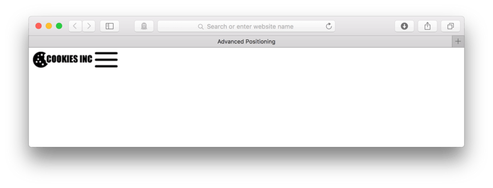
Here’s how your HTML should look:
<header>
	<a href=" "><img src="images/logo.png"/></a>
	<a href=" "><img src="images/hamburger.png"/></a>
</header>
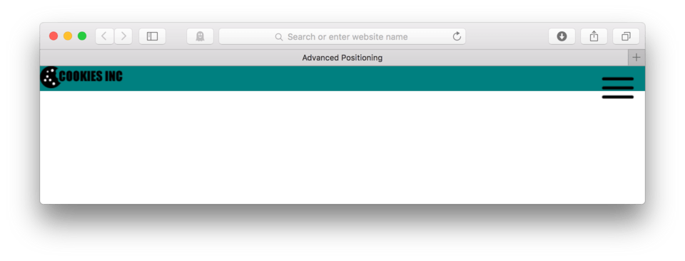
and here’s how it looks in the browser. (fig. 1)
Styling the Header
Let’s add a background color to our header section so we can more easily see what we’re dealing with.
- We’ll need to use
header {as the selector - The property is:
background-color: - Let’s use teal as our value:
teal; - Close the CSS block:
} - Save and Refresh
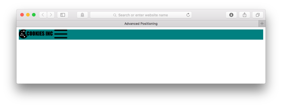
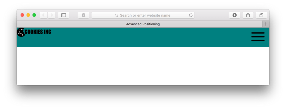
Here’s my CSS so far:
header {
	background-color: teal;
}
and here’s how it looks in the browser. (fig. 2)
We see that there is a small white border around our header. If we think back a few lessons, we discussed where this is coming from. Remember that the body has some default margin applied? Let’s go ahead and remove any margin applied by default.
- To remove margin from ALL elements, we want to use the universal selector (means all elements no matter what) we use
* {. Put this at the very top of your CSS before any other CSS blocks. - To remove any default margin, we say:
margin: 0;for the property and value - It’s also a good idea to reset any default padding as well. Add:
padding: 0;to the block. - Close the CSS block:
} - Save and Refresh
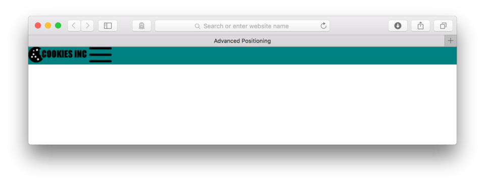
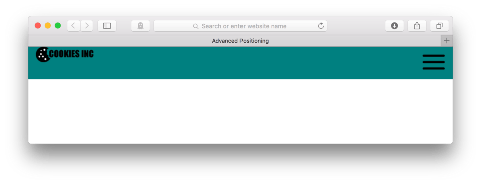
Here’s my CSS:
* {
	margin: 0;
	padding: 0;
}

header {
	background-color: teal;
}
and here’s how it looks in the browser. (fig. 3)
Next let’s deal with our hamburger button. What if we wanted it to be on the right side rather than next to our logo? To do that, we can float it right, but first we’ll need to find a way to talk directly to it. We’ll need to add and id= attribute.
- Locate your HTML file
- Add
id="hamburger"to the link that holds the hamburger button:<a href=" " id="hamburger"><img src="images/hamburger.png"/></a> - Save your HTML file
Here’s how your HTML should look:
<header>
	<a href=" "><img src="images/logo.png"/></a>
	<a href=" " id="hamburger"><img src="images/hamburger.png"/></a>
</header>
Now let’s work on our CSS.
- Locate your CSS file
- Add a CSS block with the selector
a#hamburger { - Now to float it to the right side, we add:
float: right; - Close the CSS block:
} - Save and Refresh
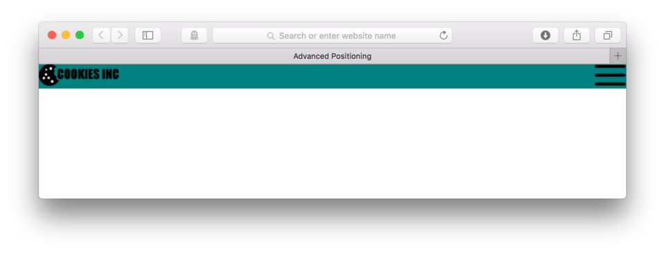
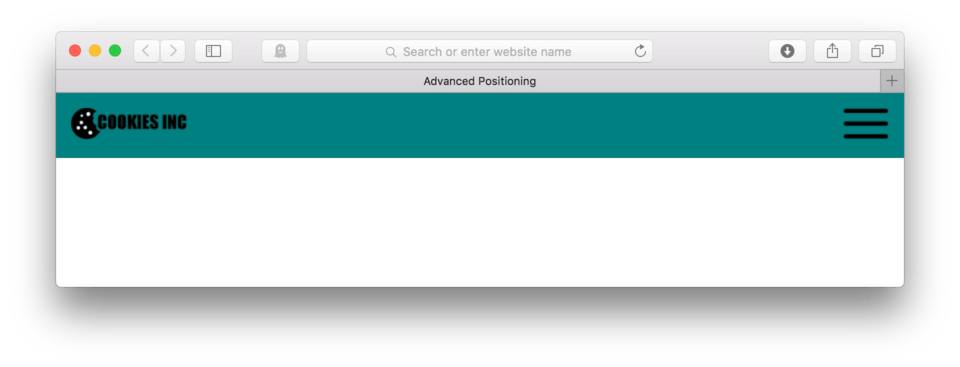
Here’s my CSS:
a#hamburger {
	float: right;
}
and here’s how it looks in the browser. (fig. 4)
That’s better, but now I need to add some breathing room around it. Let’s add some padding to the hamburger button.
- Locate your CSS file
- Add
padding: 15px;to youra#hamburger {. - Save and Refresh
Here’s my CSS:
a#hamburger {
	float: right;
	padding: 15px;
}
and here’s how it looks in the browser. (fig. 5)
It looks like adding the padding did give the hamburger button some breathing room, but it broke our background. The background no longer contains both the logo and the hamburger button. Now what happened? Well remember in lesson 12 when we learned that floating elements requires us to use a micro-clear fix on our parent element. Doing so will allow the parent element to properly contain its floated children.
Let’s give this a try.
- Locate your HTML file
- To use the micro-clear fix, we’ll need to add
class=groupto our parent element. Sinceheaderis the parent to both our floated hamburger button, we’ll add the class to it:<header class="group"> - Save your HTML file
Here’s how your HTML should look:
<header class="group">
	<a href=" "><img src="images/logo.png"/></a>
	<a href=" " id="hamburger"><img src="images/hamburger.png"/></a>
</header>
Now we need to add our micro-clear fix to our CSS
- Locate your CSS file
- Add the micro-clearfix to the top of your file, just after our universal selector CSS block.
.group:after {
  content: "";
  display: table;
  clear: both;
}
- Save and Refresh
Here’s my CSS:
* {
	margin: 0;
	padding: 0;
}

.group:after {
  content: "";
  display: table;
  clear: both;
}

header {
	background-color: teal;
}

a#hamburger {
	float: right;
	padding: 15px;
}
and here’s how it looks in the browser. (fig. 6)
Cool. That looks much better. Now let’s match the space around the logo to that around the hamburger button. Let’s add 15 pixels of padding to our logo.
- Locate your HTML file
- First, we’ll need to add an
id=attribute to our link that contains our logo image to use as a handle. Addid="logo"to our link:<a href=" " id="logo"><img src="images/logo.png"/></a> - Save your HTML file
Here’s how your HTML should look:
<header class="group">
	<a href=" " id="logo"><img src="images/logo.png"/></a>
	<a href=" " id="hamburger"><img src="images/hamburger.png"/></a>
</header>
Now let’s work on our CSS
- Locate your CSS file
- Add a CSS block using the selector
a#logo { - Add
padding: 15px; - Close the block:
} - Save and Refresh
Here’s my CSS:
a#logo {
	padding: 15px;
}
and here’s how it looks in the browser. (fig. 7)
Huh, that’s weird. We did get our padding on the left, but not on the top. What happenend? Well, remember when we discussed the major differences between block-level and inline elements? Yep, that’s what’s happening. Remember that a link is an inline element, so it isn’t important enough to respond to all of our styling, this happens with margin and padding. Inline elements just don’t have enough power in the web flow to apply these commands. What should we do?
We could promote our logo to a block-level element using display: block;. That would allow the padding to take effect, however, it would then knock our hamburger button down below our logo because of the width it would require. Instead, we can ask our logo to float left. Floating will take the logo out of the normal flow, but it will allow us to apply padding without bothering our hamburger.
- Locate your CSS
- Add
float: left;to youra#logo { - Save and Refresh
Here’s my CSS:
a#logo {
	float: left;
	padding: 15px;
}
and here’s how it looks in the browser. (fig. 8)
Looks like we did it. Remember that whenever you use a float you must:
- Make sure there is an assigned width (either inherent or set)
- Make sure the parent of the floating element(s) has
class="group"applied to the opening tag - Make sure the micro clear fix is included in the CSS to clear the float
Adding a Banner
Next we’ll add a hero image banner and a button for our user to click to respond to our call to action request. Let’s put both of these things into their own section to stay organized.
- Locate your HTML file
- After your closing header tag, hit Enter twice to make some room
- Add a pair of
<section></section>tags - In-between those tags, add our banner. The image is named: banner.png and is already inside your images folder.
<img src="banner.png"/> - Add our button. This is an image link that uses button.png as the link image. For now, use a space for the address.
<a href=" "><img src="images/button.png"/></a> - Save your HTML file
Here’s how your HTML should look:
<section>
	<img src="images/banner.png"/>
	<a href=" "><img src="images/button.png"/></a>
</section>
and here’s how it looks in the browser. (fig. 9)
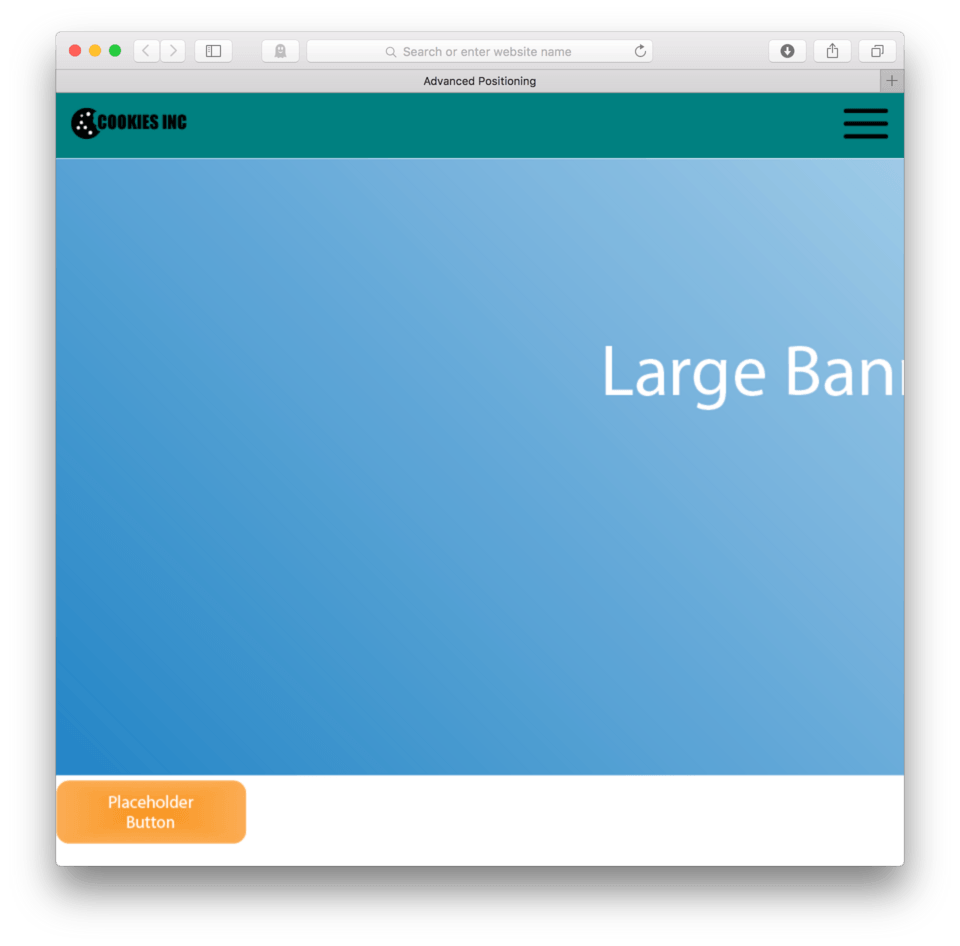
The first thing we notice is that our banner image is huge! We want it to be large so that high resolution screens can have a really clear image, but what about the rest of us? It’s an easy fix. Remember back a few lessons when we learned how to deal with large images and responsive sites? We told all images to have a max-width: 100%;. This CSS tells the images that the largest they are allowed to be is 100% of the available screen width. Let’s apply this to our CSS.
- Locate your CSS
- After your micro-clear fix, add the selector
img { - Add:
max-width: 100%; - Close the block:
} - Save and Refresh
Here’s my CSS:
* {
	margin: 0;
	padding: 0;
}

.group:after {
  content: "";
  display: table;
  clear: both;
}

img {
	max-width: 100%;
}

header {
	background-color: teal;
}

a#hamburger {
	float: right;
	padding: 15px;
}

a#logo {
	float: left;
	padding: 15px;
}
and here’s how it looks in the browser. (fig. 10)
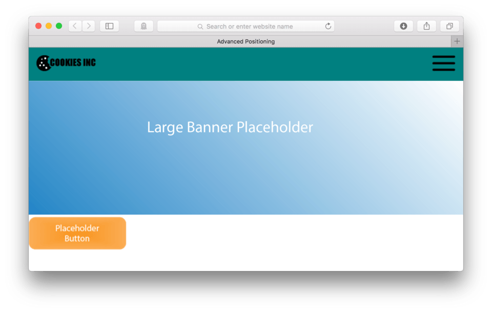
Much better. Now no matter how big or small we have our browser, our image will scale itself to fit. Any other images we add later will too.
Absolute Positioning
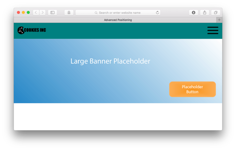
Okay, so now looking at our current layout, let’s say that we’d prefer to have our button layered on top of our banner image so it looks something like this: (fig. 11)

Floating can’t help us with this one. What we really need is a way to tell our button exactly where we want it to be. In the case of my example, I told my button to be exactly 25 pixels from the right and 25 pixels from the bottom of its parent element. In this case, its parent is the section element.
Establishing the Parent Child Relationship
A few things need to happen to make this work. First off we need to have a parent element for the element I want to position. In this case, we already do.
Because we used a set of <section></section> tags to hold both our banner and our button, the section is the parent and our banner and button become its children. If we want to position our children inside the parent, we must first tell the parent. We do this using a new CSS property: position: relative;. Let’s do it.
- Locate your HTML file
- First off, it’s best if we isolate just the element we want to talk to. We’ll add an
id=attribute to our section, let’s call it banner:<section id="banner"> - Save your HTML file
Here’s how your HTML should look:
<section id="banner">
	<img src="images/banner.png"/>
	<a href=" "><img src="images/button.png"/></a>
</section>
Okay, now we need to talk to our banner section in the CSS and let it know it’s about to officially become a parent. Essentially you are making it aware that it is responsible for the positioning of its children elements.
- Locate your CSS file
- In a new CSS block, use the selector
section#banner { - We’ll establish it’s position as relative,
position: relative; - Save and Refresh
Here’s my CSS:
section#banner {
	position: relative;
}
and here’s how it looks in the browser. (fig. 12)

And… no change. That is because we’ve only set the hook. We still need to tell our button what to do, which is our next step. We need to talk directly to our button, telling it that it is going to be positioned in relation to its parent. Just like with our section, we’ll need to first add a handle to talk directly to it.
- Locate your HTML file
- Add
id="button"to our link that has our button image:<a href=" " id="button"><img src="images/button.png"/></a> - Save your HTML file
Here’s how your HTML should look:
<section id="banner">
	<img src="images/banner.png"/>
	<a href=" " id="button"><img src="images/button.png"/></a>
</section>
Since we know there won’t be any change in the browser yet, let’s skip right to the CSS. We need to tell our button that it has an absolute (or coordinate based) position against its parent. We do this using the property: position: just like its parent.
This time, however, we use: absolute; as the value indicating that it will be positioned absolutely relative to its parent. We will also need to provide coordinates relative to the edges of the parent.
- Locate your CSS file
- Add a CSS block with the selector:
a#button { - Add
position: absolute;to mobilize it - Now, to give coordinates, we need to tell the button exactly where to be relative to its parent. This means we can tell it exactly how many pixels to be from any edge of that parent. Let’s tell it to be 25 pixels from the bottom of its parent. We use the property:
bottom:and the value:25px; - Let’s also tell it to be 25 pixels from the right:
right: 25px; - Save and Refresh
Here’s my CSS:
section#banner {
	position: relative;
}

a#button {
	position: absolute;
	bottom: 25px;
	right: 25px;
}
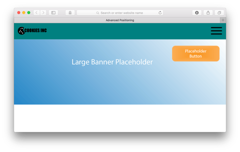
and here’s how it looks in the browser. (fig. 13)
Ta da! We did it. Our button is now exactly 25 pixels from the right and 25 pixels from the bottom of its parent, the <section>. The reason it looks like it is being positioned over the banner image is because the banner image is actually another child element, the child element that is holding the section open.
Let me try this in other words. Empty elements don’t actually occupy any space on our page. They need actual content to hold them open and they wrap tightly around that content. Once we take an element out of the natural flow, like when we float or absolutely position an element, that element no longer holds its parent open. So, essentially our parent element, the section, is tightly wrapped around our banner image. Because we knew this to be the case, we could position our button to appear to be positioned over the banner image itself.
Note: If we don’t have a specific parent element or we don’t specify that the parent will be
position: relative;the default parent will be the body tag. This means that any element set toposition: absolute;will be positioned against the body tag, essentially positioning against the browser window itself.
If we wanted to align our button with the top of our section, we could use: top: rather than bottom:. Let’s give it a try.
- Locate your CSS file
- Adjust your
a#button {to read:
a#button {
	position: absolute;
	top: 25px;
	right: 25px;
}
- Save and Refresh
and here’s how it looks in the browser. (fig. 14)
Our button now positioned itself 25 pixels from the top rather than the bottom of our section. We can also use left: instead of right: if we wanted to.
Fixed Positioning
Fixed positioning is similar to absolute positioning in that you get to tell an element exactly where to be using coordinates, but there are two major differences.
The first is that you don’t get to specify the parent. Elements using fixed positioning only position themselves against the body, meaning they can only be positioned against the browser window, not any individual element.
The second major difference is that fixed position elements don’t scroll with the page. Absolutely positioned elements move with the page, but fixed position elements stay put no matter what is happening around or behind them.
Fixed positioning is pretty rarely used, but there are some cases where you might want this effect. Some of the more common fixed position elements that we see, especially in mobile websites, are the header and navigation elements.
Some designers choose to keep the header or the hamburger button at the top of the site and allow the rest of the site to scroll underneath it. The thinking is that users will always have access to both the branding and the navigation for the site.
Fixed Headers for Mobile
In order to really experience the difference between fixed positioning and absolute positioning, we’re going to need to add content so our page will scroll.
To make things easy, we’ll borrow some of our content from a previous lesson. You can just copy and paste the following HTML into your HTML file after you banner section:
<section class="bgorange">
	<h2 id="Do">What We Do</h2>
	<p>Lorem ipsum dolor sit amet, consectetur adipiscing elit. Nulla sollicitudin congue sem et pretium. Sed pulvinar volutpat facilisis. Sed velit risus, consequat sit amet sollicitudin a, ultrices nec nisl. Nullam ac dolor purus. In ac mi quis urna lobortis venenatis. Sed interdum, arcu a volutpat pretium, nisl velit auctor elit, at venenatis turpis mi a nisl. Integer at porttitor urna. Nulla sem mauris, pulvinar bibendum tristique vitae, pulvinar vel elit. Aenean sollicitudin quam sit amet lectus elementum sit amet suscipit sem feugiat. Fusce aliquam euismod diam, at placerat felis fringilla et. Vivamus sagittis suscipit dapibus. Donec molestie tristique quam, sed sodales justo volutpat eu. Sed pellentesque sollicitudin tempus. Donec at sem eu massa tempor porta congue id purus.</p>

	<h3>Exciting Things to Come</h3>
	<p>Lorem ipsum dolor sit amet, consectetur adipiscing elit. Morbi consectetur ullamcorper eleifend. Mauris dapibus ligula vitae leo semper a aliquam felis fringilla. Pellentesque dapibus lacus sed orci vulputate ultrices. Quisque mollis nisl id nibh cursus sodales pretium non justo. Sed id dui vel velit posuere consectetur eget quis elit. Sed est augue, euismod et scelerisque nec, consectetur eget odio. Ut volutpat blandit velit lobortis tempus. Phasellus at ante a augue iaculis hendrerit tempor in felis. Aliquam justo massa, tempor vitae dignissim ultricies, semper et augue. Nam mollis pretium purus at faucibus. Etiam a metus arcu, ut vestibulum ligula.</p>

	<p>Proin dictum viverra orci, eu condimentum lorem vulputate quis. Proin suscipit pulvinar est. Quisque tincidunt, tellus sed scelerisque posuere, nulla orci pellentesque ante, non scelerisque tellus arcu at mi. Aenean lobortis interdum dolor, et dapibus elit volutpat vitae. Duis massa leo, aliquam eu posuere non, porta quis lorem. Sed dapibus leo vel diam lacinia id consequat enim egestas. Donec a purus vitae turpis iaculis scelerisque.</p>
	<p>Nunc eget tincidunt ipsum. Quisque nec turpis tortor. Phasellus vitae sapien ante. Nunc suscipit faucibus commodo. Duis vel semper metus. Sed suscipit tempus ligula id posuere. Integer lectus massa, tempor gravida scelerisque ut, varius nec tellus. In metus purus, faucibus non condimentum in, elementum ac ligula. Curabitur pharetra, lectus volutpat viverra auctor, ligula nulla condimentum lorem, eu venenatis orci massa vel est. Donec sem mi, adipiscing ut scelerisque congue, egestas non neque.</p>
</section>

<section>
	<h2>What We've Done</h2>
	<p>Aenean egestas urna non quam pellentesque nec rhoncus lacus adipiscing. Proin condimentum aliquam metus, nec auctor elit cursus vel. Nam posuere lectus augue, vitae ullamcorper lorem. Morbi pellentesque, nunc ut iaculis imperdiet, erat ante vehicula tortor, interdum congue dolor neque quis nibh. Suspendisse hendrerit lectus in ante vestibulum vitae luctus felis tempor. Cras viverra sagittis felis vitae elementum. Vestibulum est elit, varius adipiscing interdum sed, pulvinar ac mauris. Sed turpis erat, rhoncus non viverra in, rutrum vitae nisi.</p>
	<p>Vivamus mollis quam et tellus scelerisque auctor. Donec nisl lacus, semper sit amet interdum eu, fringilla tempus sapien. Lorem ipsum dolor sit amet, consectetur adipiscing elit. Aenean ut dui justo. Nullam vel dolor ante. Sed non massa ut nunc posuere sollicitudin. Suspendisse potenti. In viverra ante eu quam dignissim ac condimentum lacus tincidunt. Praesent semper justo eget eros sodales id lobortis lectus iaculis. Praesent ornare ante eget nibh hendrerit quis ornare libero ornare.</p>

	<h3>Awards and Recognition</h3>
	<p>Curabitur vel purus turpis, blandit fringilla justo. Donec imperdiet gravida imperdiet. Nunc dui sem, tincidunt id mollis non, ultricies id libero. Maecenas in elit id mauris auctor aliquet. Duis ullamcorper egestas lorem a consequat. Praesent blandit laoreet ligula, vel cursus elit pretium sit amet. Praesent pharetra, massa vel volutpat vehicula, neque lorem sollicitudin dui, at placerat leo metus vel magna. Aliquam facilisis diam id massa mollis fringilla. Praesent sit amet ornare urna. Aliquam a est arcu. Vivamus scelerisque aliquam tempor. Etiam tempus libero eget orci faucibus vehicula. Aliquam volutpat erat turpis. Mauris lacus neque, sollicitudin vitae hendrerit id, mollis vitae elit. Vestibulum eu velit lectus.</p>
	<p>Nam varius condimentum eros non lacinia. Proin a dolor dui. Nam vel adipiscing mi. Nam vel mauris eget arcu lobortis dapibus. Sed sollicitudin magna ac mauris gravida quis semper felis commodo. Etiam libero nisl, congue in ornare ac, vulputate at metus. Mauris ut convallis sem. Cras lobortis lacus id leo tristique et mattis lorem malesuada. Phasellus ac neque orci. Sed nec justo a libero placerat egestas. Donec congue, odio tincidunt semper pretium, diam nisi vestibulum est, nec vulputate nunc nibh semper elit. Morbi non nibh ut velit cursus venenatis. Nam pellentesque, ligula vitae eleifend pellentesque, orci diam bibendum massa, non luctus lorem nulla congue nisi.</p>
</section>

<section class="bgorange">
	<h2>What We're Thinking</h2>
	<p>In hac habitasse platea dictumst. Etiam malesuada, nisl consequat convallis congue, nisl nisi viverra lacus, vitae sagittis nibh ante at dolor. Sed consectetur, enim sit amet molestie gravida, libero odio aliquam mauris, at euismod risus urna nec leo. Nulla rutrum mattis tincidunt. Nulla lacus felis, tincidunt a bibendum eget, commodo nec risus. Quisque quis eros magna, id sollicitudin neque. Nunc ut nibh non justo faucibus condimentum eget sit amet arcu.</p>

	<h3>We Are Passionate About our Process</h3>
	<p>Suspendisse eleifend nisl ut enim imperdiet pulvinar venenatis ante tempus. Pellentesque eu metus eu purus vestibulum vulputate vulputate vitae mi. Morbi justo nisi, ullamcorper at interdum sit amet, mollis ac neque. Phasellus id odio nec eros lobortis dignissim sed a libero. Ut vitae arcu neque, eget consectetur velit. Pellentesque sed massa vel tellus vehicula iaculis eu a arcu. Nunc semper lobortis orci sit amet ullamcorper.</p>
	<p>Donec luctus bibendum mi, id aliquet eros semper egestas. Curabitur sed velit id dui vestibulum fermentum. Maecenas venenatis ultrices nunc, vitae interdum enim pretium ut. Quisque vestibulum, augue sit amet blandit placerat, tellus justo egestas nisi, a gravida justo nulla sit amet risus. Curabitur congue aliquam congue. Praesent mi diam, feugiat eu congue at, tempus ut lectus. Morbi sapien turpis, interdum eget semper vitae, congue sit amet lorem. Integer luctus enim ut urna vehicula hendrerit. Mauris id arcu ligula, sit amet auctor augue. Nullam tincidunt turpis vitae libero rhoncus ut laoreet tortor ornare. Quisque et lectus purus, ultrices ultrices lorem. Vestibulum vel libero ut mi luctus suscipit. Quisque viverra, neque in auctor dignissim, justo eros euismod libero, at tincidunt augue massa eget lorem. Fusce tincidunt nunc eu arcu pretium interdum. Phasellus ultricies, est id facilisis imperdiet, sapien dolor consequat ligula, et ornare massa lacus vel enim. Vivamus pellentesque risus ac ante faucibus elementum.</p>
	<p>Nulla ultricies dolor ac lorem fermentum lobortis et fermentum enim. Phasellus lobortis bibendum arcu, a hendrerit tellus pulvinar ac. Duis sit amet consequat purus. Cras ultrices pellentesque quam, at adipiscing lectus auctor eu. Morbi ante augue, malesuada vestibulum luctus id, suscipit ac nisi. Morbi consequat massa et est vulputate eleifend. Nam facilisis viverra dolor quis feugiat. Mauris leo lacus, tristique sit amet iaculis vitae, feugiat sed mi. Proin at vehicula eros. Proin et ante purus. In non nisl augue, id pulvinar dui. Aenean pharetra tempus sapien, id consequat dui luctus at. Donec non ipsum eget mauris sagittis elementum.</p>
</section>

<section>
	<h2>Who We Are</h2>
	<p>Etiam et justo in magna pharetra venenatis. Integer mollis est et mauris iaculis hendrerit. Quisque non risus sem, nec volutpat lacus. Mauris lacinia metus suscipit massa consequat non vulputate sapien vulputate. Donec mattis, neque eget mollis dictum, urna diam laoreet purus, eu ultrices diam elit sit amet orci. Proin eget mi et orci viverra malesuada. Morbi ac justo quam, in varius orci. Curabitur id justo sed erat tristique rhoncus id id massa. Aliquam vitae tortor a lectus porttitor ultricies.</p>

	<h3>Our Staff</h3>

	<h4>Bill Bobs</h4>
	<figure>
		<img src="images/placeholder.png"/>
	</figure>
	<p>Lorem ipsum dolor sit amet, consectetur adipiscing elit. Morbi consectetur ullamcorper eleifend. Mauris dapibus ligula vitae leo semper a aliquam felis fringilla. Pellentesque dapibus lacus sed orci vulputate ultrices. Quisque mollis nisl id nibh cursus sodales pretium non justo. Sed id dui vel velit posuere consectetur eget quis elit. Sed est augue, euismod et scelerisque nec, consectetur eget odio. Ut volutpat blandit velit lobortis tempus. Phasellus at ante a augue iaculis hendrerit tempor in felis. Aliquam justo massa, tempor vitae dignissim ultricies, semper et augue. Nam mollis pretium purus at faucibus. Etiam a metus arcu, ut vestibulum ligula.</p>

	<h4>Clementine Brown</h4>
	<figure>
		<img src="images/placeholder.png"/>
	</figure>
	<p>Proin dictum viverra orci, eu condimentum lorem vulputate quis. Proin suscipit pulvinar est. Quisque tincidunt, tellus sed scelerisque posuere, nulla orci pellentesque ante, non scelerisque tellus arcu at mi. Aenean lobortis interdum dolor, et dapibus elit volutpat vitae. Duis massa leo, aliquam eu posuere non, porta quis lorem. Sed dapibus leo vel diam lacinia id consequat enim egestas. Donec a purus vitae turpis iaculis scelerisque.</p>

	<h4>Dave Biggs</h4>
	<figure>
		<img src="images/placeholder.png"/>
	</figure>
	<p>Nunc eget tincidunt ipsum. Quisque nec turpis tortor. Phasellus vitae sapien ante. Nunc suscipit faucibus commodo. Duis vel semper metus. Sed suscipit tempus ligula id posuere. Integer lectus massa, tempor gravida scelerisque ut, varius nec tellus. In metus purus, faucibus non condimentum in, elementum ac ligula. Curabitur pharetra, lectus volutpat viverra auctor, ligula nulla condimentum lorem, eu venenatis orci massa vel est. Donec sem mi, adipiscing ut scelerisque congue, egestas non neque.</p>
</section>

<section class="bgorange">
	<h2 id="Contact">Contact Us</h2>
	<p>Morbi cursus est at lacus semper pretium et sed eros. Nullam tortor dolor, lacinia eu tincidunt in, pharetra nec elit. Ut adipiscing convallis nunc, imperdiet eleifend justo vestibulum hendrerit. Maecenas auctor tristique dui, ac pulvinar orci vulputate nec. Proin id tortor risus, vel aliquet orci. Integer ligula dolor, pretium id ultrices sit amet, elementum in orci. Integer mollis felis at turpis eleifend ullamcorper consectetur libero aliquet. Cras ac mollis massa. Cras sed orci magna. Nam et ante a lectus placerat pharetra sed at sem. Maecenas quam orci, eleifend et rutrum ut, tincidunt vitae massa. Suspendisse id metus magna. Duis fringilla lacus quis neque facilisis porta. Nullam id aliquam diam.</p>

	<h3>Join Our Staff</h3>
	<p>Aenean egestas urna non quam pellentesque nec rhoncus lacus adipiscing. Proin condimentum aliquam metus, nec auctor elit cursus vel. Nam posuere lectus augue, vitae ullamcorper lorem. Morbi pellentesque, nunc ut iaculis imperdiet, erat ante vehicula tortor, interdum congue dolor neque quis nibh. Suspendisse hendrerit lectus in ante vestibulum vitae luctus felis tempor. Cras viverra sagittis felis vitae elementum. Vestibulum est elit, varius adipiscing interdum sed, pulvinar ac mauris. Sed turpis erat, rhoncus non viverra in, rutrum vitae nisi.</p>
	<p>Vivamus mollis quam et tellus scelerisque auctor. Donec nisl lacus, semper sit amet interdum eu, fringilla tempus sapien. Lorem ipsum dolor sit amet, consectetur adipiscing elit. Aenean ut dui justo. Nullam vel dolor ante. Sed non massa ut nunc posuere sollicitudin. Suspendisse potenti. In viverra ante eu quam dignissim ac condimentum lacus tincidunt. Praesent semper justo eget eros sodales id lobortis lectus iaculis. Praesent ornare ante eget nibh hendrerit quis ornare libero ornare.</p>

	<p>Email us at <a href="mailto:hello@elbongurk.com">hello@elbongurk.com</a> for more information</p>
</section>
- Save your HTML file
- Refresh in the browser
Here’s how it looks in the browser. (fig. 15)
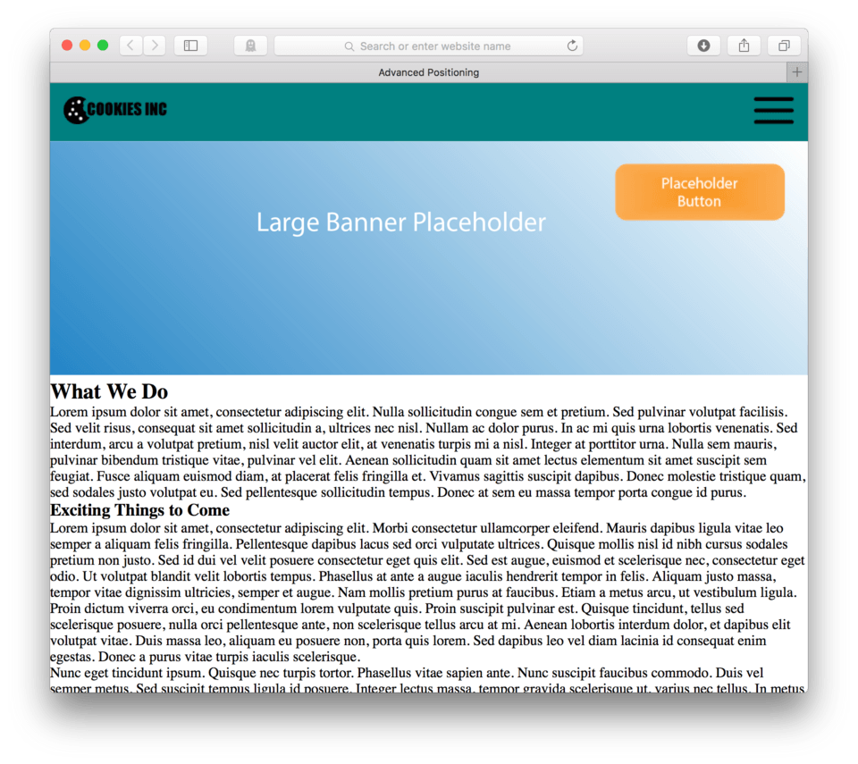
The text is in desperate need of styling, but that is okay. We’ll ignore that for now and focus just on our positioning in this lesson. What I want you to notice is that when you scroll the page, your absolutely positioned button moves with the page as we can see in (fig. 16).
Now, let’s explore fixed positioning. We are going to fix position our hamburger button. To write the CSS, we can just add it to our a#hamburger { selector.
- Locate your CSS file
- Add:
position: fixed;to youra#hamburger {selector block - Now, we add coordinates based off our body tag parent. (fixed elements all use the body as the parent, no exceptions). Add
top: 0;to position our hamburger button at the top of our window. - Add:
right: 0;to position it exactly at the right edge of our window. - Save and Refresh
Here’s my CSS so far:
a#hamburger {
	float: right;
	padding: 15px;
	position: fixed;
	top: 0;
	right: 0;
}
and here’s how it looks in the browser. (fig. 17)
So something really weird happens, our hamburger button initially looks the same, but as we start to scroll, the hamburger button stays in place, but for some reason the banner image scrolls over the top of it. Then, once we scroll past the banner, our hamburger button reappears exactly in place.
This is close to what we wanted, but we need to fix the part where the hamburger button falls behind the banner. This is happening because we’ve altered the natural order of things. When we set the position of section#banner to be relative, we gave it a special place in the natural order, we made it more important that then other elements and now it likes to sit on top of everybody.
This normally wouldn’t cause any problems, but when we combine it with a fixed position element who is also out of the natural order, we get some special kind of problems.
Adjusting the Z-Index
To address the stacking order of our positioned elements, we need to adjust what’s called the “z-index” or the order of things in space from back to front. Elements with a higher z-index are actually in front of elements with a lower z-index. Right now, the banner section has the higher z-index so it is in front of our hamburger button. To fix this, we’ll give our hamburger button a higher z-index.
- Locate your CSS file
- Add:
z-index: 1to youra#hamburger {selector - Save and Refresh
Here’s my CSS:
a#hamburger {
	float: right;
	padding: 15px;
	position: fixed;
	top: 0;
	right: 0;
	z-index: 1;
}
and here’s how it looks in the browser. (fig. 18)
We have made some progress, but as you can see now our hamburger button is difficult to see once it leaves the header. To fix this, we will give our hamburger button a background color.
- Locate your CSS
- Add:
background-color: teal;to youra#hamburger {selector - Save and Refresh your browser
Here’s my CSS:
a#hamburger {
	float: right;
	padding: 15px;
	position: fixed;
	top: 0;
	right: 0;
	z-index: 1;
	background-color: teal;
}
and here’s how it looks in the browser. (fig. 19)
Looks like we’ve won. As you can see in figure 19, when we scroll, the header now not only stays in place, but also has a background color with some padding to make it more visible.
Okay, so now that we’ve finally got things working correctly, we can see the advantages of this. No matter how far down our page we get, we always have access to our navigation. The disadvantages are complexity of code and the loss of the screen real estate that is now always occupied by our hamburger button. This is especially the case when we are using smaller mobile devices. Let’s set our browsers to Responsive Design Mode to test this out. (fig. 20)
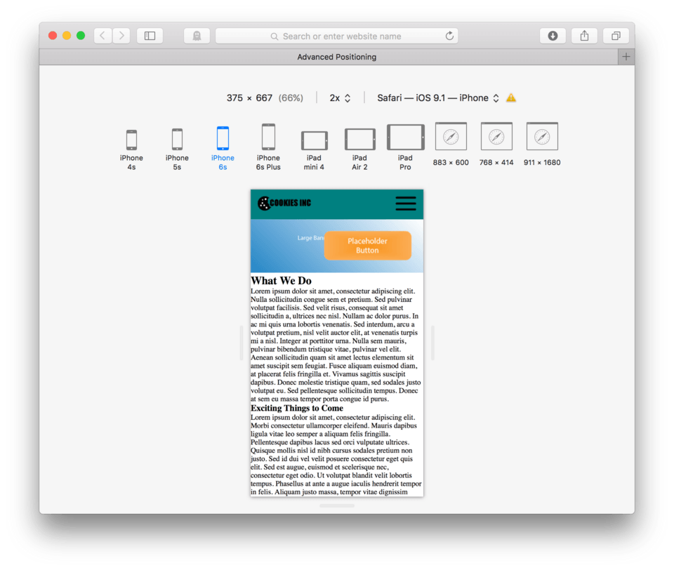
If we have the iPhone 6 selected, we see that our hamburger button seems to work nicely. However, on our mobile devices a good portion of the top portion of our screen is now dedicated to the fixed hamburger button. We still get the advantages of always accessible navigation, but we do lose some valuable real estate. This is a decision that every designer needs to think carefully about.
The good news is that we can see that our design still does pretty well on any of our mobile sized screens. With the exception of our unstyled text, we have made a site that is adaptable to big or small screens.
Lesson Conclusion
In this lesson we learned more about positioning elements to achieve certain page layouts. We can use absolute positioning or fixed positioning to tell an element exactly where to be on a page.
Next up, we will look at media queries for width specific design.