Basic Positioning
Overview
In this lesson we’ll learn some techniques for controlling our page layout using some basic CSS commands. We’ll learn how to wrap text around images and also how to do some basic multi-column layouts.
Lesson Setup
Let’s create our lesson folder structure, our initial HTML file and connect it up with a new stylesheet.
Folder Setup
- Create a new Lesson11 folder
- Create the notes and root folders
- Inside the root folder, create an images folder and a css folder
- Download the lesson 11 resources from here.
- Move those images into your images folder for this lesson
HTML Setup
- Open up TextMate
- File > New to open a new file
- Code in your boilerplate HTML making sure to add a title to the page. I’m calling mine: Basic Positioning.
- Make sure that your boilerplate includes the
<meta name="viewport" content="width=device-width, initial-scale=1" />we learned in lesson 8 to ensure the site works properly on a mobile device. - Save your HTML file to your Lesson12 root folder with the name: lesson11.html
- Open and Preview your page in the browser, checking to make sure your page title is appearing correctly.
CSS Setup
- Open up TextMate
- File > New to open a new file
- File > Save
- Navigate to the “css” folder you created
- Name your file, style.css
- Hit Save
- Attach this stylesheet to our HTML page. Type:
<link href="css/style.css rel="stylesheet" />into the head section of our lesson11.html file. - File > Save the HTML file
Your HTML should now look like this:
<!doctype html>
<html>

	<head>
		<title>Basic Positioning</title>
		<meta name="viewport" content="width=device-width, initial-scale=1" />
		<link href="css/style.css" rel="stylesheet" />
	</head>

	<body>

	</body>

</html>
Note: You may have noticed that I’ve shortened the lesson setup to a list of action steps above. If you need a refresher on folder and file organization see the lesson 3 setup section.
Let’s test to make sure our pages connected correctly.
- Navigate back to your new CSS file.
- Let’s change the background color of the body element. Type:
body {on an open line and hit Enter - Now, type the property we want to change:
background-color: - Type:
pink;and hit Enter - Close the CSS block, type:
} - Save this file and Refresh the browser
If your background turned pink, then you are set. Everything is working correctly. You can go ahead and delete that CSS block, so we can start fresh.
Adding Some Content
Let’s add some HTML to our file.
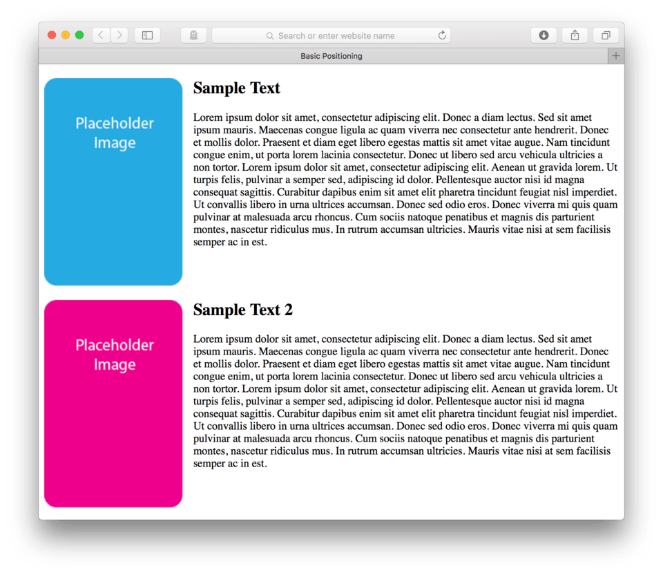
- First add an image tag to your HTML, the image is named “sample.png”
- Then add, an h2:
<h2>Sample Text</h2> - Lastly, we’ll add the following paragraph:
<p>Lorem ipsum dolor sit amet, consectetur adipiscing elit. Donec a diam lectus. Sed sit amet ipsum mauris. Maecenas congue ligula ac quam viverra nec consectetur ante hendrerit. Donec et mollis dolor. Praesent et diam eget libero egestas mattis sit amet vitae augue. Nam tincidunt congue enim, ut porta lorem lacinia consectetur. Donec ut libero sed arcu vehicula ultricies a non tortor. Lorem ipsum dolor sit amet, consectetur adipiscing elit. Aenean ut gravida lorem. Ut turpis felis, pulvinar a semper sed, adipiscing id dolor. Pellentesque auctor nisi id magna consequat sagittis. Curabitur dapibus enim sit amet elit pharetra tincidunt feugiat nisl imperdiet. Ut convallis libero in urna ultrices accumsan. Donec sed odio eros. Donec viverra mi quis quam pulvinar at malesuada arcu rhoncus. Cum sociis natoque penatibus et magnis dis parturient montes, nascetur ridiculus mus. In rutrum accumsan ultricies. Mauris vitae nisi at sem facilisis semper ac in est.</p>
Here’s how your HTML should look between the body tags:
<img src="images/sample.png">
<h2>Sample Text</h2>
<p>Lorem ipsum dolor sit amet, consectetur adipiscing elit. Donec a diam lectus. Sed sit amet ipsum mauris. Maecenas congue ligula ac quam viverra nec consectetur ante hendrerit. Donec et mollis dolor. Praesent et diam eget libero egestas mattis sit amet vitae augue. Nam tincidunt congue enim, ut porta lorem lacinia consectetur. Donec ut libero sed arcu vehicula ultricies a non tortor. Lorem ipsum dolor sit amet, consectetur adipiscing elit. Aenean ut gravida lorem. Ut turpis felis, pulvinar a semper sed, adipiscing id dolor. Pellentesque auctor nisi id magna consequat sagittis. Curabitur dapibus enim sit amet elit pharetra tincidunt feugiat nisl imperdiet. Ut convallis libero in urna ultrices accumsan. Donec sed odio eros. Donec viverra mi quis quam pulvinar at malesuada arcu rhoncus. Cum sociis natoque penatibus et magnis dis parturient montes, nascetur ridiculus mus. In rutrum accumsan ultricies. Mauris vitae nisi at sem facilisis semper ac in est.</p>
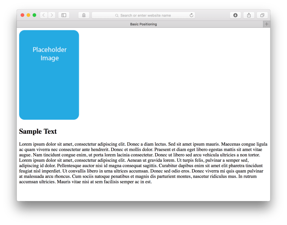
and here’s how it looks in the browser. (fig. 1)
Floating
The most basic positioning strategy available to us is called floating. Floating allows any element to be positioned inside its parent element to either the right or the left. Floating an element changes the elements default behavior allowing elements that are below the floated element in the HTML to “float” up and sit next to it – creating a wrap effect around the floated element.
Floating Images for a Text Wrap Effect
Floating came about as a way to deal with images and text together. Often a person would want to include an image inside of the text, or maybe better said, someone wanted the text to wrap around the image.
Designers could then use just a basic CSS declaration to float an image left or right, meaning telling the image to be right or left aligned inside of its parent and have any text below it fill the available space to the left or right of it.
Let’s test this out.
- Locate your CSS file
- Write a selector to talk to your image:
img { - We’ll use the property:
float: - Let’s start with a left float. Use the value:
left; - Close the CSS block:
}
Here’s my CSS:
img {
	float: left;
}
Save and Refresh
and here’s how it looks in the browser. (fig. 2)
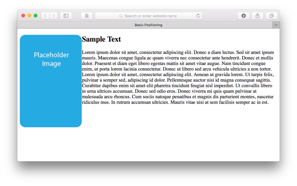
We can see that the text now occupies the space to the right of this image. This is because floating that image left to its parent, in this case the body, left aligns it and essentially makes it almost invisible to the other elements below it. They wrap around it without having to do a thing to either the h2 or the paragraph elements that follow the image in the HTML.
You might be thinking that it is pretty tight between that image and the text. I would agree, in this case, it never hurts to add a little bit of space between these things. Let’s add some margin to the right of our image.
- Add:
margin-right: 15px;to our CSS block for our image. - Save and Refresh
Here’s my CSS:
img {
	float: left;
	margin-right: 15px;
}
and here’s how it looks in the browser. (fig. 3)
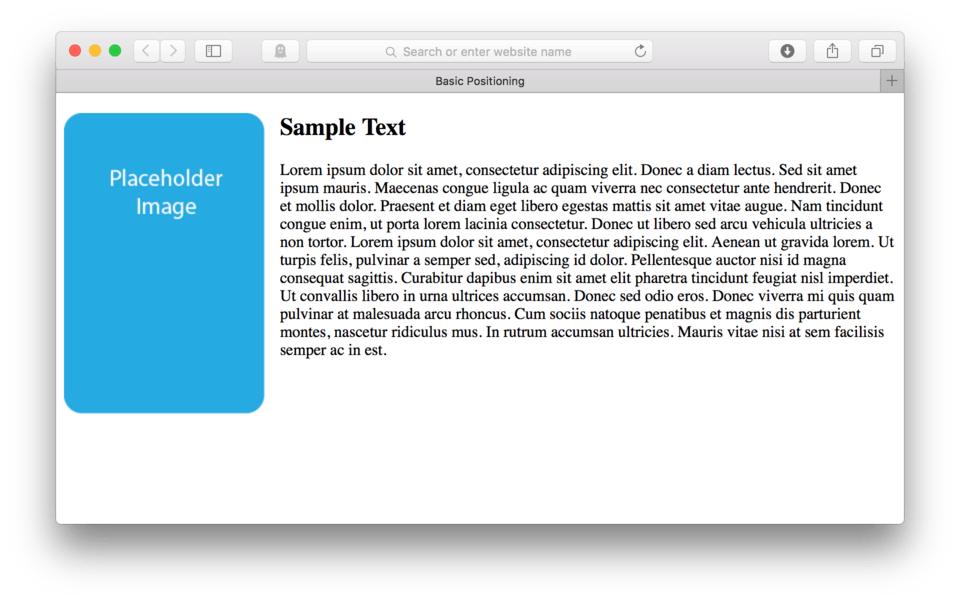
That looks much better. We now have a little bit of breathing room between our image and our text.
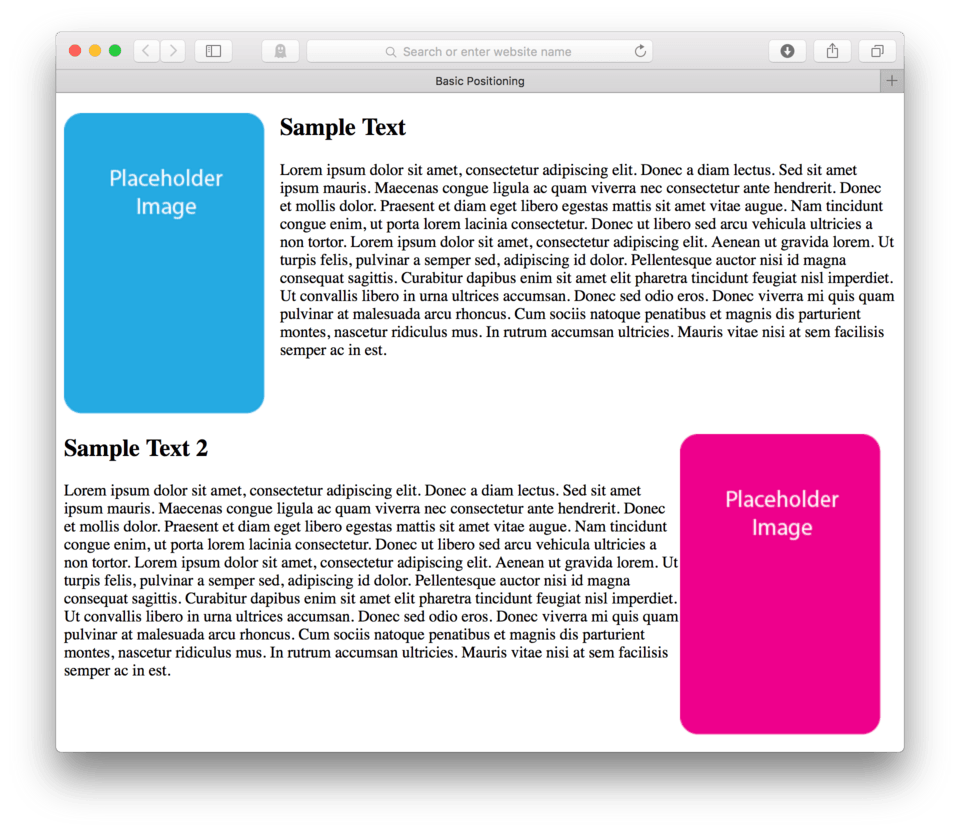
Now let’s try this again, let’s try floating an image to the right. First we’ll have to add a little more content.
- Make some room after your paragraph in the HTML
- Add a new image using sample2.png from your images folder to your page:
<img src="images/sample2.png"/> - Let’s add an h2:
<h2>Sample Text 2</h2> - And we’ll just Copy and Paste the paragraph we used last time:
<p>Lorem ipsum dolor sit amet, consectetur adipiscing elit. Donec a diam lectus. Sed sit amet ipsum mauris. Maecenas congue ligula ac quam viverra nec consectetur ante hendrerit. Donec et mollis dolor. Praesent et diam eget libero egestas mattis sit amet vitae augue. Nam tincidunt congue enim, ut porta lorem lacinia consectetur. Donec ut libero sed arcu vehicula ultricies a non tortor. Lorem ipsum dolor sit amet, consectetur adipiscing elit. Aenean ut gravida lorem. Ut turpis felis, pulvinar a semper sed, adipiscing id dolor. Pellentesque auctor nisi id magna consequat sagittis. Curabitur dapibus enim sit amet elit pharetra tincidunt feugiat nisl imperdiet. Ut convallis libero in urna ultrices accumsan. Donec sed odio eros. Donec viverra mi quis quam pulvinar at malesuada arcu rhoncus. Cum sociis natoque penatibus et magnis dis parturient montes, nascetur ridiculus mus. In rutrum accumsan ultricies. Mauris vitae nisi at sem facilisis semper ac in est.</p>
Here’s how your HTML should look:
<img src="images/sample.png">
<h2>Sample Text</h2>
<p>Lorem ipsum dolor sit amet, consectetur adipiscing elit. Donec a diam lectus. Sed sit amet ipsum mauris. Maecenas congue ligula ac quam viverra nec consectetur ante hendrerit. Donec et mollis dolor. Praesent et diam eget libero egestas mattis sit amet vitae augue. Nam tincidunt congue enim, ut porta lorem lacinia consectetur. Donec ut libero sed arcu vehicula ultricies a non tortor. Lorem ipsum dolor sit amet, consectetur adipiscing elit. Aenean ut gravida lorem. Ut turpis felis, pulvinar a semper sed, adipiscing id dolor. Pellentesque auctor nisi id magna consequat sagittis. Curabitur dapibus enim sit amet elit pharetra tincidunt feugiat nisl imperdiet. Ut convallis libero in urna ultrices accumsan. Donec sed odio eros. Donec viverra mi quis quam pulvinar at malesuada arcu rhoncus. Cum sociis natoque penatibus et magnis dis parturient montes, nascetur ridiculus mus. In rutrum accumsan ultricies. Mauris vitae nisi at sem facilisis semper ac in est.</p>

<img src="images/sample2.png">
<h2>Sample Text 2</h2>
<p>Lorem ipsum dolor sit amet, consectetur adipiscing elit. Donec a diam lectus. Sed sit amet ipsum mauris. Maecenas congue ligula ac quam viverra nec consectetur ante hendrerit. Donec et mollis dolor. Praesent et diam eget libero egestas mattis sit amet vitae augue. Nam tincidunt congue enim, ut porta lorem lacinia consectetur. Donec ut libero sed arcu vehicula ultricies a non tortor. Lorem ipsum dolor sit amet, consectetur adipiscing elit. Aenean ut gravida lorem. Ut turpis felis, pulvinar a semper sed, adipiscing id dolor. Pellentesque auctor nisi id magna consequat sagittis. Curabitur dapibus enim sit amet elit pharetra tincidunt feugiat nisl imperdiet. Ut convallis libero in urna ultrices accumsan. Donec sed odio eros. Donec viverra mi quis quam pulvinar at malesuada arcu rhoncus. Cum sociis natoque penatibus et magnis dis parturient montes, nascetur ridiculus mus. In rutrum accumsan ultricies. Mauris vitae nisi at sem facilisis semper ac in est.</p>
- Save and Refresh
and here’s how it looks in the browser. (fig. 4)
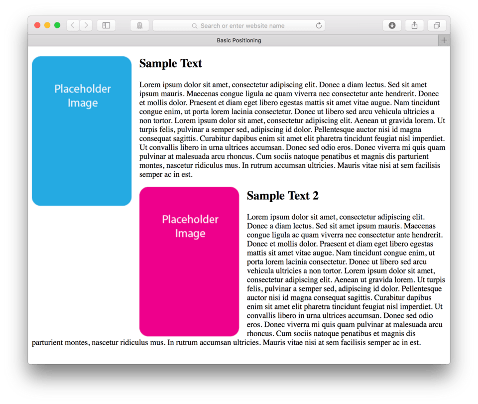
Wait, that’s weird, right? Depending on how big or small you are pulling your browser, you’ll see that the new content is getting sucked up into our float. This may initially seem surprising, but it actually makes total sense. Remember I said any elements that fall below our floated item in the HTML will come up and occupy any open space? Well, that’s what is happening here, only with an additional complexity, the pink image is also following the float command since it too is just an image. We used a generic selector so any image we add will float.
Let’s work on sorting this out a bit. First, I’d like to stop the new content from floating up into my first image float. There are a number of ways to tackle this, but I think the best way is to use what’s called a micro clear fix.
Micro Clear Fix (quick digression)
This is essentially a bit of extra code we can add to any parent element to let it know that once it hits the closing tag of that parent, that the floating stops. Right now our only parent element is our body tag. We’ll need to create some new parents to help us. We’ll use <section></section> tags to wrap each “chunk” of content, becoming a parent to that content.
- Add a
<section>tag before your first image - Add a
</section>tag after the first paragraph - Do this same process for the second image and second paragraph
Here’s how your HTML should look:
<section>
	<img src="images/sample.png">
	<h2>Sample Text</h2>
	<p>Lorem ipsum dolor sit amet, consectetur adipiscing elit. Donec a diam lectus. Sed sit amet ipsum mauris. Maecenas congue ligula ac quam viverra nec consectetur ante hendrerit. Donec et mollis dolor. Praesent et diam eget libero egestas mattis sit amet vitae augue. Nam tincidunt congue enim, ut porta lorem lacinia consectetur. Donec ut libero sed arcu vehicula ultricies a non tortor. Lorem ipsum dolor sit amet, consectetur adipiscing elit. Aenean ut gravida lorem. Ut turpis felis, pulvinar a semper sed, adipiscing id dolor. Pellentesque auctor nisi id magna consequat sagittis. Curabitur dapibus enim sit amet elit pharetra tincidunt feugiat nisl imperdiet. Ut convallis libero in urna ultrices accumsan. Donec sed odio eros. Donec viverra mi quis quam pulvinar at malesuada arcu rhoncus. Cum sociis natoque penatibus et magnis dis parturient montes, nascetur ridiculus mus. In rutrum accumsan ultricies. Mauris vitae nisi at sem facilisis semper ac in est.</p>
</section>

<section>
	<img src="images/sample2.png">
	<h2>Sample Text 2</h2>
	<p>Lorem ipsum dolor sit amet, consectetur adipiscing elit. Donec a diam lectus. Sed sit amet ipsum mauris. Maecenas congue ligula ac quam viverra nec consectetur ante hendrerit. Donec et mollis dolor. Praesent et diam eget libero egestas mattis sit amet vitae augue. Nam tincidunt congue enim, ut porta lorem lacinia consectetur. Donec ut libero sed arcu vehicula ultricies a non tortor. Lorem ipsum dolor sit amet, consectetur adipiscing elit. Aenean ut gravida lorem. Ut turpis felis, pulvinar a semper sed, adipiscing id dolor. Pellentesque auctor nisi id magna consequat sagittis. Curabitur dapibus enim sit amet elit pharetra tincidunt feugiat nisl imperdiet. Ut convallis libero in urna ultrices accumsan. Donec sed odio eros. Donec viverra mi quis quam pulvinar at malesuada arcu rhoncus. Cum sociis natoque penatibus et magnis dis parturient montes, nascetur ridiculus mus. In rutrum accumsan ultricies. Mauris vitae nisi at sem facilisis semper ac in est.</p>
</section>
Cool, now we have created two new parent elements. Each section becomes the parent element to the content that lives inside of it. We can now tell those sections to do what we call “clear” our floats when the section ends. To do this we need to add a class to each section element.
- Add
class="group"to each of the opening section tags:<section class="group">
Here’s how your HTML should look:
<section class="group">
	<img src="images/sample.png">
	<h2>Sample Text</h2>
	<p>Lorem ipsum dolor sit amet, consectetur adipiscing elit. Donec a diam lectus. Sed sit amet ipsum mauris. Maecenas congue ligula ac quam viverra nec consectetur ante hendrerit. Donec et mollis dolor. Praesent et diam eget libero egestas mattis sit amet vitae augue. Nam tincidunt congue enim, ut porta lorem lacinia consectetur. Donec ut libero sed arcu vehicula ultricies a non tortor. Lorem ipsum dolor sit amet, consectetur adipiscing elit. Aenean ut gravida lorem. Ut turpis felis, pulvinar a semper sed, adipiscing id dolor. Pellentesque auctor nisi id magna consequat sagittis. Curabitur dapibus enim sit amet elit pharetra tincidunt feugiat nisl imperdiet. Ut convallis libero in urna ultrices accumsan. Donec sed odio eros. Donec viverra mi quis quam pulvinar at malesuada arcu rhoncus. Cum sociis natoque penatibus et magnis dis parturient montes, nascetur ridiculus mus. In rutrum accumsan ultricies. Mauris vitae nisi at sem facilisis semper ac in est.</p>
</section>

<section class="group">
	<img src="images/sample2.png">
	<h2>Sample Text 2</h2>
	<p>Lorem ipsum dolor sit amet, consectetur adipiscing elit. Donec a diam lectus. Sed sit amet ipsum mauris. Maecenas congue ligula ac quam viverra nec consectetur ante hendrerit. Donec et mollis dolor. Praesent et diam eget libero egestas mattis sit amet vitae augue. Nam tincidunt congue enim, ut porta lorem lacinia consectetur. Donec ut libero sed arcu vehicula ultricies a non tortor. Lorem ipsum dolor sit amet, consectetur adipiscing elit. Aenean ut gravida lorem. Ut turpis felis, pulvinar a semper sed, adipiscing id dolor. Pellentesque auctor nisi id magna consequat sagittis. Curabitur dapibus enim sit amet elit pharetra tincidunt feugiat nisl imperdiet. Ut convallis libero in urna ultrices accumsan. Donec sed odio eros. Donec viverra mi quis quam pulvinar at malesuada arcu rhoncus. Cum sociis natoque penatibus et magnis dis parturient montes, nascetur ridiculus mus. In rutrum accumsan ultricies. Mauris vitae nisi at sem facilisis semper ac in est.</p>
</section>
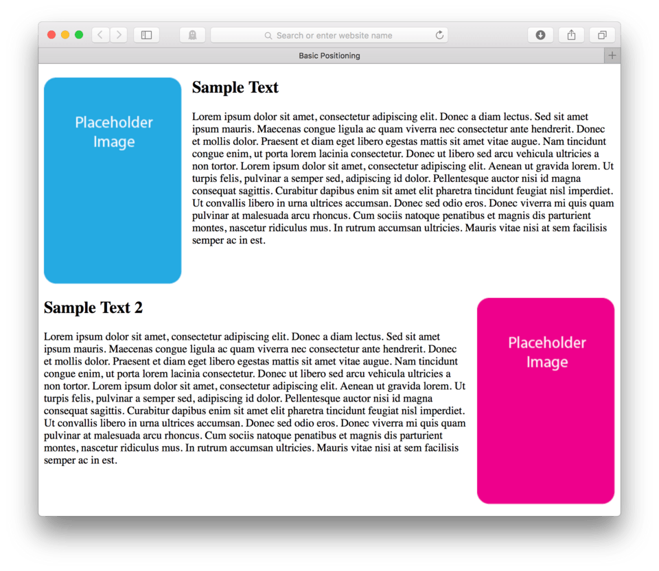
Great, now we can use that class to apply the CSS micro-clear fix to those sections.
- Save your HTML file
- Locate your CSS file
- Add a brand new CSS block and add this code:
.group:after {
  content: "";
  display: table;
  clear: both;
}
Here’s my CSS:
img {
	float: left;
	margin-right: 15px;
}

.group:after {
  content: "";
  display: table;
  clear: both;
}
- Save and Refresh
and here’s how it looks in the browser. (fig. 5)
So that was some fancy CSS we just added, but it did seem to do the trick. I’m not going to dissect it all for you as it has some pretty heavy stuff. Let’s just say that a very smart developer worked really had to make that bit of code work for us. You can simply copy and paste it to use anytime you want a parent element to “clear” the float.
The kicker is that you have to make sure there is a parent element (like our section elements) that holds only the floated element and any other elements you want to float around that one specific element.
Make sure that parent element has a closing tag where you want the float to stop. Then make sure the opening tag of the parent element has that class="group" which connects with that crazy CSS block we just learned.
It might take a little practice, but it does a good job of making sure we keep our floats under control.
Floating an Image Right
Okay, we were about to float our second image to the right. Normally we could just add a CSS block saying float: right; rather than left to an image selector, but because we have two images that we want to behave differently, we’ll have to find a handle to talk just to that second image.
There are many different approaches, but in this lesson we’re going to add id= attributes to the sections so we can use those later for more floating fun.
- Add
id="one"to the opening tag of the first section:<section class="group" id="one"> - Add
id="two"to the opening tag of the second section:<section class="group" id="two"> - Save your HTML File
Here’s how your HTML should look:
<section class="group" id="one">
	<img src="images/sample.png">
	<h2>Sample Text</h2>
	<p>Lorem ipsum dolor sit amet, consectetur adipiscing elit. Donec a diam lectus. Sed sit amet ipsum mauris. Maecenas congue ligula ac quam viverra nec consectetur ante hendrerit. Donec et mollis dolor. Praesent et diam eget libero egestas mattis sit amet vitae augue. Nam tincidunt congue enim, ut porta lorem lacinia consectetur. Donec ut libero sed arcu vehicula ultricies a non tortor. Lorem ipsum dolor sit amet, consectetur adipiscing elit. Aenean ut gravida lorem. Ut turpis felis, pulvinar a semper sed, adipiscing id dolor. Pellentesque auctor nisi id magna consequat sagittis. Curabitur dapibus enim sit amet elit pharetra tincidunt feugiat nisl imperdiet. Ut convallis libero in urna ultrices accumsan. Donec sed odio eros. Donec viverra mi quis quam pulvinar at malesuada arcu rhoncus. Cum sociis natoque penatibus et magnis dis parturient montes, nascetur ridiculus mus. In rutrum accumsan ultricies. Mauris vitae nisi at sem facilisis semper ac in est.</p>
</section>

<section class="group" id="two">
	<img src="images/sample2.png">
	<h2>Sample Text 2</h2>
	<p>Lorem ipsum dolor sit amet, consectetur adipiscing elit. Donec a diam lectus. Sed sit amet ipsum mauris. Maecenas congue ligula ac quam viverra nec consectetur ante hendrerit. Donec et mollis dolor. Praesent et diam eget libero egestas mattis sit amet vitae augue. Nam tincidunt congue enim, ut porta lorem lacinia consectetur. Donec ut libero sed arcu vehicula ultricies a non tortor. Lorem ipsum dolor sit amet, consectetur adipiscing elit. Aenean ut gravida lorem. Ut turpis felis, pulvinar a semper sed, adipiscing id dolor. Pellentesque auctor nisi id magna consequat sagittis. Curabitur dapibus enim sit amet elit pharetra tincidunt feugiat nisl imperdiet. Ut convallis libero in urna ultrices accumsan. Donec sed odio eros. Donec viverra mi quis quam pulvinar at malesuada arcu rhoncus. Cum sociis natoque penatibus et magnis dis parturient montes, nascetur ridiculus mus. In rutrum accumsan ultricies. Mauris vitae nisi at sem facilisis semper ac in est.</p>
</section>
Note: You’ll notice that our sections now have both a class and an
id=attribute. This is fine. As long as we are careful when we write our CSS we can use one or the other to help style the section or elements inside the section. Remember the class allows us to style this section along with any other element with that same class. So right now, that section can be clearing floats, so can any other section with that same class. I can now use theid=attribute, however to call each section by name, styling just one or the other.
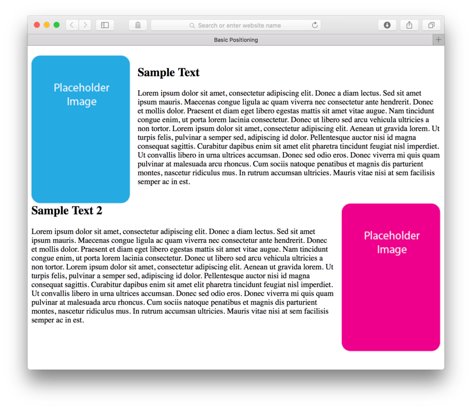
Now let’s add some CSS to float that image in the second section right.
- Locate your CSS file
- Add a new CSS block with the selector:
section#two img { - Add:
float: right; - Close the block:
} - Save and Refresh
Here’s my CSS:
img {
	float: left;
	margin-right: 15px;
}

.group:after {
  content: "";
  display: table;
  clear: both;
}

section#two img {
	float: right;
}
and here’s how it looks in the browser. (fig. 6)
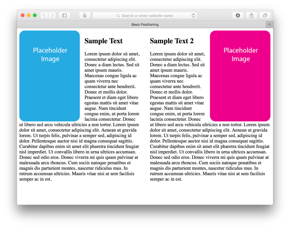
Our second image is now floating to the right side of its parent, which is now the section element. Because the section element spans the whole page width, just like the body did, we don’t actually see the difference on the screen. We do, however, still need to add a little margin to separate our text from our image and remove the margin-right: that our new image is inheriting from our initial img { CSS.
- Add:
margin-left: 15px;to our CSS block for thesection#two img { - Add:
section#oneto the CSS selectorimg { - Save and Refresh
Here’s my CSS:
.group:after {
  content: "";
  display: table;
  clear: both;
}

section#one img {
	float: left;
	margin-right: 15px;
}

section#two img {
	float: right;
	margin-left: 15px;
}
and here’s how it looks in the browser. (fig. 7)
Now that we have our site looking pretty good, I wanted to back up for just a second and look at the selectors we just used: section#one img { and section#two img {.
This is the most specific set of selectors I think we’ve written so far. Remember that id= attributes are specified with # signs and those are attached directly to the element name without a space indicating that they are one unit. We use a space when we want to say, “inside of”. If we were to say it out loud, we would say, “Hey image that lives inside of a section with the id= attribute of…”.
Floating Columns
Let’s say we wanted our page layout to be a two column layout rather than one. We can easily accomplish this using the floating techniques we just learned. We can simply add a float to our first section allowing the second section to float up.
- Locate your CSS
- Add a CSS block addressing section with the
id="one"directly:section#one { - Tell it to float left using the float property,
float: left; - Close the block:
} - Save and Refresh
Here’s my CSS:
section#one {
	float: left;
}
and here’s how it looks in the browser. (fig. 8)
You probably noticed that there was a twitch, but very little actually difference. Why is that? Well, it’s because even though the first section is floating, its width takes up the whole browser width.
Unlike an image, who has a set width dependent on its own resolution, text just spans the whole screen. To allow something to float up, we have to restrict our section to a set width. Let’s tell our section#one that it can only take up 50% of the total screen width.
- Add:
width: 50%;to our CSS block - Save and Refresh
Here’s my CSS:
section#one {
	float: left;
	width: 50%;
}
and now here’s how it looks in the browser. (fig. 9)
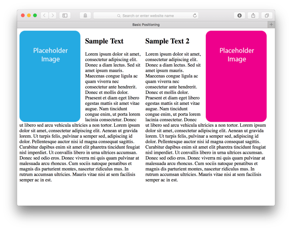
Okay, good work. Now let’s add some margin to the right side of that same section to give us a little better gutter between our columns.
- Add:
margin-right: 15px;to oursection#one { - Save and Refresh
Here’s my CSS:
section#one {
	float: left;
	width: 50%;
	margin-right: 15px;
}
here’s how it looks in the browser now. (fig. 10)
We still have a small containment issue to deal with. Notice how the first h2 is a little lower than the second? This is because the second section is trying to wrap around our first section rather that actually sit right next to it. To fix this we need to also float our second section.
Let’s add some more CSS
- Begin a new CSS block:
section#two { - Float this section left:
float: left; - Set the width:
width: 50%; - Save and Refresh
Here’s my CSS:
section#two {
	float: left;
	width: 50%;
}
and here’s how it looks in the browser. (fig. 11)
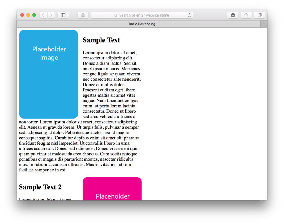
So, we broke it, or so it seems. We now have two sections that both are set to float left and both are allowed to only take up 50% of the screen. Why is it then that they won’t sit side by side?
Remembering the Box Model
Remember the box model? It says that the width is actually the content + the padding + the border + the margin. So, because we have that extra 15 pixels of margin on the first section, we have 50% + 50% + 15 pixels, which equals 100% + 15 pixels. Since this is more than 100%, they actually don’t both fit side by side.
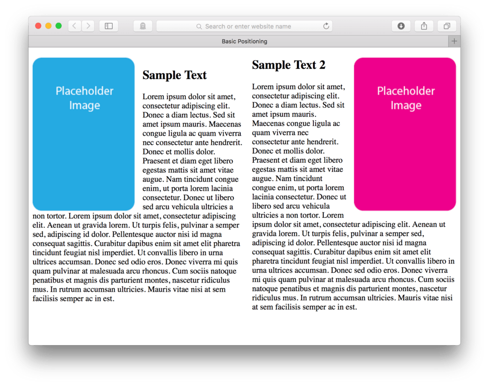
To fix this we need to adjust our widths so that our final width of both sections plus margin is equal to 100% or less. Let’s adjust our sections so that they only take up 48% of the screen width each.
- Locate your CSS file
- Change your
width:property for each floating section from 50% to 48%. - Save and Refresh
Here’s my CSS:
section#one {
	float: left;
	width: 48%;
	margin-right: 15px;
}

section#two {
	float: left;
	width: 48%;
}
and here’s how it looks in the browser. (fig. 12)
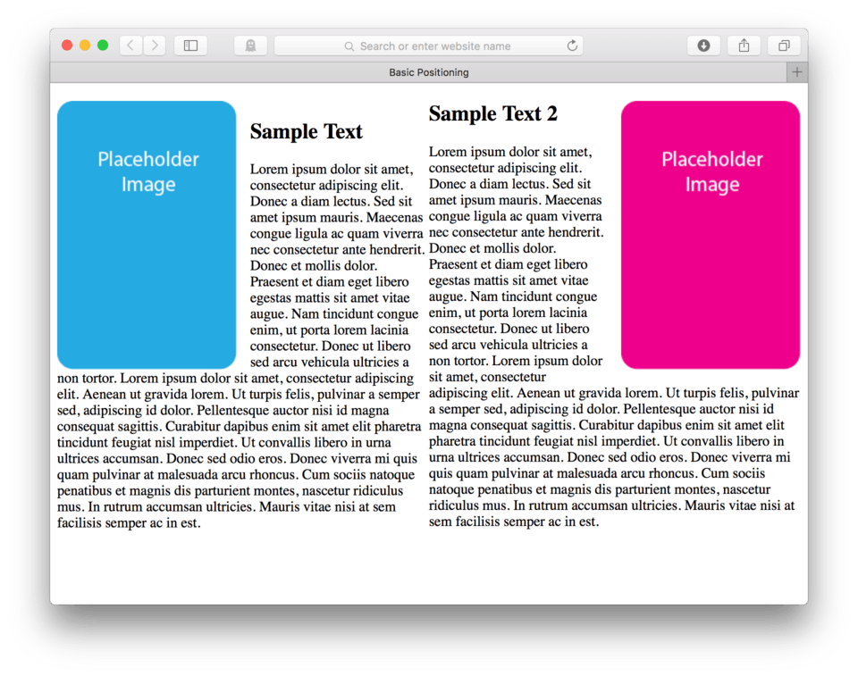
Looking much better, but to make this honest, we really should adjust our margin so that our math is solid. If we have 48% + 48%, we end up using up 96% of the space. If we want to add up to 100%, we need to find a place for that 4% leftover. Our best use is to convert that margin-right: 15px; that we have on our first section over to a percentage, but let’s do one better. Let’s split the difference between margin-right: on section#one and margin-left: on section#two, giving each of those 2%. So we get 48% + 48% + 2% + 2% = 100%.
Here’s my CSS:
section#one {
	float: left;
	width: 48%;
	margin-right: 2%;
}

section#two {
	float: left;
	width: 48%;
	margin-left: 2%;
}
and here’s how it looks in the browser. (fig. 13)
So not only have we fixed our widths to equal 100%, we also evened out our columns by applying equal margin to the each, adding up to 4% of the screen real estate dedicated to the gutter between the columns. Percentages are nice as they can expand or contract based on the size of the browser window. This can go a long way in terms of symmetry when designing a page.
Lesson Conclusion
In this lesson we learned how to float elements to achieve certain page layouts. We learned how to wrap text around an image and also how to do a multiple column layout using large floated parent elements side by side.
The most important thing to remember when working with floats is that only things with a set width can really float. Images work great because they have an inherent width. Floating other elements like paragraphs means making sure to set appropriate widths in the CSS to make sure there is room for the elements below to float up into any available space.
Another good tidbit that is worth remembering in this lesson is using the micro-clear fix to make sure you can contain and control your floats using their parent elements as gate keepers.
Next up, we will go into some more advanced positioning concepts.